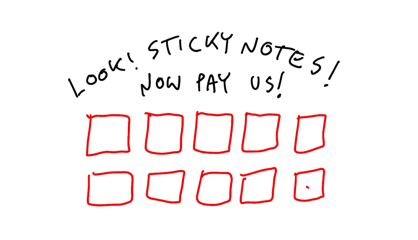
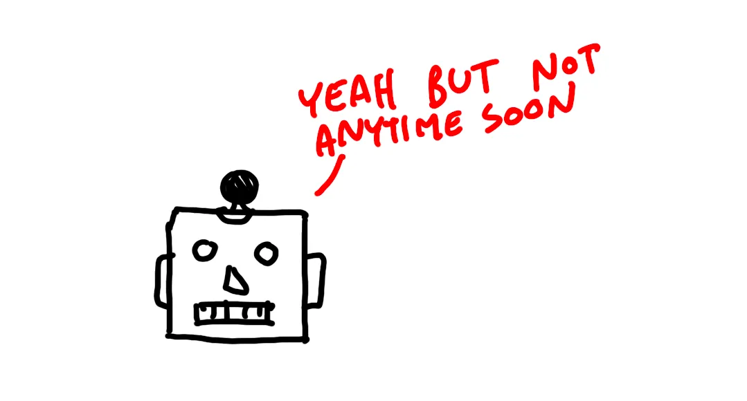
Golden age of UX is over?
We’re living in a post-design era. It needs to be said. The UX industry as we know it is over. It was nice (was it?) while it lasted, but time to say our goodbyes. Now, that doesn’t mean we’ll end up without designers and with clunky, horrible products in the future. “UX” will still happen. The principles of UX will stay. What dies is innovation and the core of that industry based on exploration and learning.
It needs to be said.
The UX industry as we know it is over. It was nice (was it?) while it lasted, but time to say our goodbyes.
Now, that doesn’t mean we’ll end up without designers and with clunky, horrible products in the future.
“UX” will still happen.
The principles of UX will stay. What dies is innovation and the core of that industry based on exploration and learning.
We were always thinking designers are crucial to a success of an organization. Well… maybe it was the truth in the past, but it’s not anymore.
Design driven said out loud now even sounds kinda funny. Or pretentious. Or fake.

Should you quit?
If you’re a beginner this may be the last moment to start learning traditional UX and get good fast. You’re still going to need these foundations in that new reality.
Oh no! Michal is doing clickbait!!
Wait , hear me out!

Move things, breakfast?
Here’s a thought exercise. What is the most important thing for a business that has a digital product? You know — an app or a website.
erm, UX?
WRONG!
Money.
All decisions are business driven now, and not in that risky “move fast break things” kinda way. No. Instead it’s all “do it fast, cheap and safe”.

Visual design example
Elon Musk crowdsourced a free logo for his X platform on Twitter.
I made an exercise about it by the way, showing how a process like that should look like if it was a small part of a branding exercise.
I wanted to show you a small part of how these processes often start.
Did this one?
Nope.
A single image made from a unicode character was picked, then slightly tweaked to avoid copyright issues.
then the animation of the new logo was made using a cheap envato template.
See how the role of designers has been minimised here?

CEO’s being CEO’s
It’s a whim of a CEO, and in reality we’ve seen that in our work, when CEO’s take the projects we do and ruin them because they feel they need to have it their own way. Usually without any design sense or skill.
So many times, after a heated debate with a CEO or stakeholder I heard:
What you say makes some sense. Sure, maybe my idea is not gonna work. But we’re going with it. Period.
With Elon it is the same but 100x because people follow Elon Musk on Twitter… or X.
And many other CEO’s who will now be fond of this “agile” screw-design approach don’t realise they don’t have billions of dollars or 150M followers to push through even a bad idea or a botched, sped up, cheaper process.
And it’s actually genius of him to realise what he can do and do it.

Design? More like patterns.
There are design systems in place, UI kits with everything and hundreds of existing products to copy entire processes off of.
You can just ask your developers — copy this app and just make the buttons purple. Easy. Cheap.
Money talks.

2025
By 2025 the difficulty of breaking into design will be difficult even by Today’s standards. I call it the post-UX era, but it can also be called post-design in general.
There simply won’t be as many designers needed anymore. And the ones needed will be of a couple specific kinds.
You can still succeed here as a junior — and I will share a little bit of “why” at the end of the article.
Not a hack, it will require quite a lot of work.
This is also why in 2025 I am making most of my video courses free. I believe it will be the best counter measure to those tough conditions because that knowledge by then will be the bare minimum to know.
But that is in two years, so you ask yourself is it worth the wait.

The glorious 2009
To better understand why UX industry is shrinking with less hires and huge layoffs we need to go back in time a little.
In 2009 it was the golden age of UX. I’ve been doing web design for a decade already back then, and the shift in mindset was apparent.
User testing got super big. Low fidelity wireframes.
Informed decisions.
New frontiers with the first massively popular touch devices.
A true revolution.
UX Agencies of the era were famous for abusing that growing interest in doing things right. Overbilling, adding useless processes to charge more, all fancy stuff.
Eventually the clients have caught onto those practices and by 2017 the industry has become much leaner and faster. The bad taste remained.
When the UX process is considered a scam by clients, it means the uxers are doing something wrong.

Humans are fast learners
Another thing was natural evolution of how humans use interfaces.
The touch-interface boom made everyone a user and after over a decade even the most non-tech-savvy people already understood what they like about apps and websites and what frustrates them.
Patterns were established.
Design systems were created.
Most of design got boring and predictable and that’s not necessarily a bad thing.
But it also means that many things are taken for granted and just copied from what’s been done before. There’s less need for research, except for maybe market viability research.
There’s less need for UI, because using a pre-made kit is cheaper.
We, as humans now know quite well how to make apps and websites.

The AI threat?
And yes, eventually AI will speed up many design processes, but won’t really replace designers.
No. the future will still be about highly skilled, creative and curious, forward thinking people. Hiring juniors is already very rare and they need to be exceptional to succeed (overlay: my courses do help with that a little).
It will be an even worse time for juniors in two years.
So instead of being a figma rectangle mover, think about actually becoming a designer. It’s NOT the same thing.
I thought about it and realised that next to nailing the design fundamentals (show course covers) is to learn the designers mindset. That thing that through curiosity and experimentation pushes our industry forward.
Here’s one example from our community — thinking about some unusual, new solution and writing about it.
Designing for daily nice-to-haves
In the flourishing world, we can see great headway in technology, but we can’t feel the improvement when it comes to…
Here’s another, inspired by my Spatial Case Study exploration.
UX Case Study: Spatial Design
With the Spatial UI for Apple Design Pro, designers can transcend the limitations of traditional 2D interfaces and…
Designer mindset
Long story short — you need to go beyond just making some boring screens and into coming up with something completely new and different.
You need to be curious and explore stuff. Not just move rectangles.
Then write about it from your own perspective, share the journey.
This is kind of exploration is a skill that gets better the more you do it.
Do it regularly and write medium or linkedin articles about it. It’s a perfect way to stand out, get some social media exposure AND get that designer mindset.
If you need some guidance, I’m announcing a special course called “don’t be boring” — it’s a part of my portfolio course bundle.
If you already own the bundle, you’ll get it for free.
If not you can preorder it right now much cheaper, link in the description. Or get the full bundle and learn how to present your work and write engaging case studies.
In the course I’ll take you step by step through how to come up with these ideas, how to plan them and then how to write them as articles.
The future will be all about curiosity, exploration and strong fundamentals combined into one. And you still have one or two years to get awesome.
I hope you will.
Have a beautiful day!
What's Your Reaction?


![[VIP] DesignCode: Build Beautiful Apps with GPT-4 and Midjourney](https://design.rip/uploads/cover/blog/designcode-gpt4.webp)
![[VIP] AppCoda: Mastering SwiftUI - Professional Packet (Updated 04.2023)](https://design.rip/uploads/cover/blog/appcoda-mastering-swiftui-professional-packet-worth.webp)
![[VIP] AppCoda: Beginning iOS Programming with Swift (Updated 04.2023)](https://design.rip/uploads/cover/blog/appcoda-beginning-ios-programming-with-swift.webp)
![[VIP] Whoooa! 156 vector Lottie animations](https://design.rip/uploads/cover/blog/whoooa-156-vector-animations.webp)


