


![[VIP] DesignCode: Build Beautiful Apps with GPT-4 and Midjourney](https://design.rip/uploads/cover/blog/designcode-gpt4.webp)
![[VIP] AppCoda: Mastering SwiftUI - Professional Packet (Updated 04.2023)](https://design.rip/uploads/cover/blog/appcoda-mastering-swiftui-professional-packet-worth.webp)
![[VIP] AppCoda: Beginning iOS Programming with Swift (Updated 04.2023)](https://design.rip/uploads/cover/blog/appcoda-beginning-ios-programming-with-swift.webp)
![[VIP] Whoooa! 156 vector Lottie animations](https://design.rip/uploads/cover/blog/whoooa-156-vector-animations.webp)


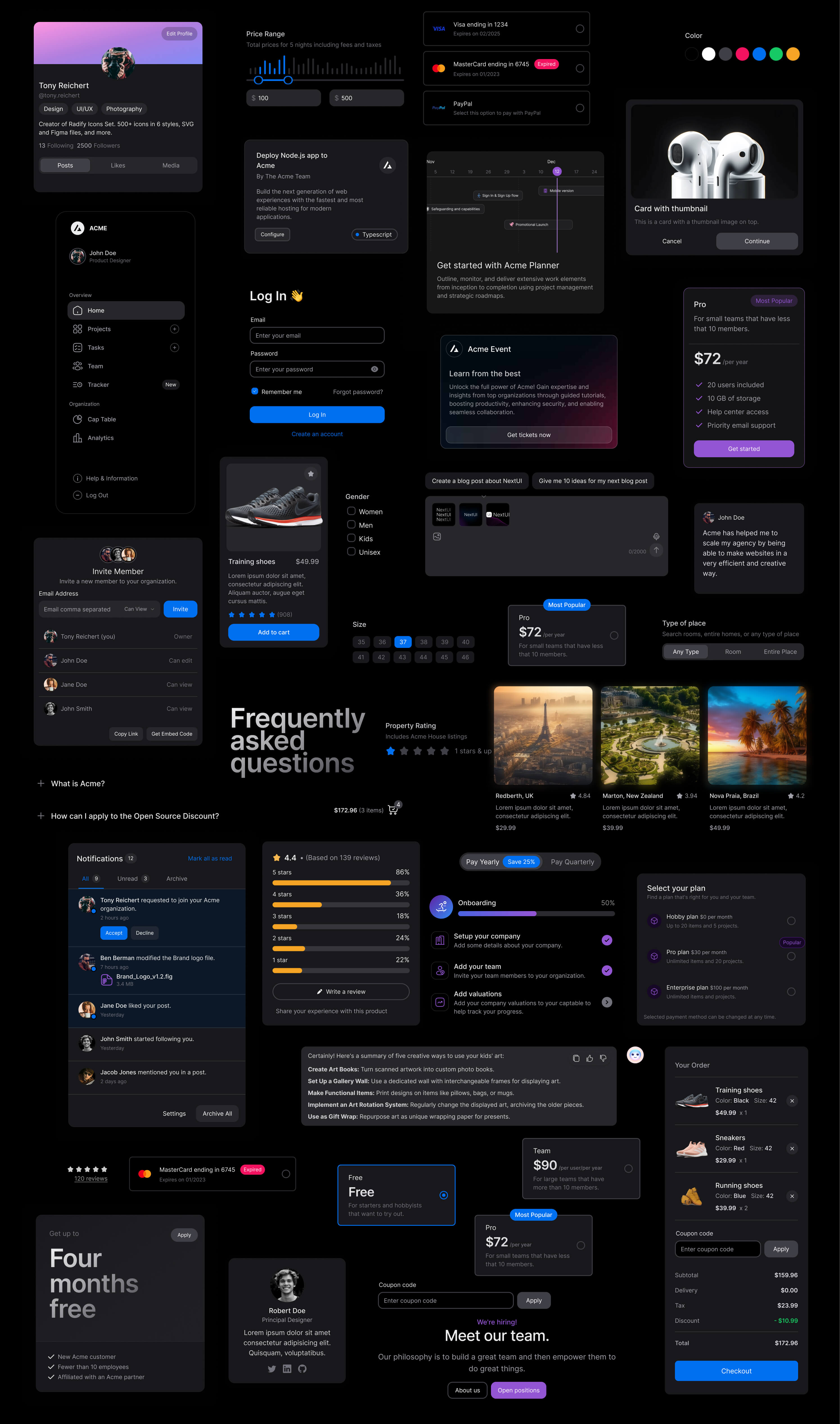
[VIP] HeroUI Pro: Ship faster v2.6.14 (NextUI)
NextUI Pro is now HeroUI Pro. We’re excited to announce that NextUI Pro has officially rebranded to HeroUI Pro! The same powerful components you love, now with a fresh identity.
Ship faster with beautiful components
Explore a collection of over 180+ beautiful and responsive components, professionally created by the team behind NextUI.
Explore Components
Make beautiful websites regardless of your design experience.
Beautiful, fast and modern React UI library.
- Themeable
Provides a plugin to customize default themes, you can change all semantic tokens or create an entire new theme.
- Fast
Built on top of Tailwind CSS, which means no runtime styles, and no unnecessary classes in your bundle.
- Light & Dark UI
Automatic dark mode recognition, NextUI automatically changes the theme when detects HTML theme prop changes.
- Unique DX
NextUI is fully-typed to minimize the learning curve, and provide the best possible developer experience.
Apply your own theming decisions.
NextUI provides a custom TailwindCSS plugin that allows you to customize the default themes or create your own.
Accessibility out of the box.
NextUI components are built on top of React Aria ensuring exceptional accessibility support as a top priority.
- Keyboard navigation
- Managed focus
- Collision aware
- Alignment control
- Screen reader support
- Typehead support
Dark mode is effortless.
NextUI comes with a fully well-scaled default dark theme that you can apply to your application with just adding the dark attribute to your html.
Customization made easy.
NextUI is based on Tailwind Variants, it simplifies component slots customization while avoiding Tailwind class conflicts.
Last but not least.
A fully-featured React UI library.
- React server components
All NextUI components already include the "use client" directive, which means you can import and use them directly in your RSC.
- Accessible components
NextUI components follow the WAI-ARIA guidelines, provide keyboard support and sensible focus management.
- Focus interactions
Focus ring will appear only when user navigates with keyboard or screen reader.
- Multiple packages
NextUI is divided into multiple packages, so you can install only the components you need.
- TypeScript based
Build type safe applications, NextUI has a fully-typed API to minimize the learning curve, and help you build applications.
- Override components tags
A polymorphic `as` prop is included in all NextUI components.
- No runtime styles
NextUI is based on Tailwind CSS, it means that there are no runtime styles, and no unnecessary classes in your bundle.
- Beautifully designed
NextUI components are unique and are not tied to any visual trend or design rule, which makes us unique and of course your projects as well.
What's Your Reaction?


![[$] Material Me React: UI Components Library (NextJS & Tailwind)](https://design.rip/uploads/cover/blog/materialme-react.webp)
