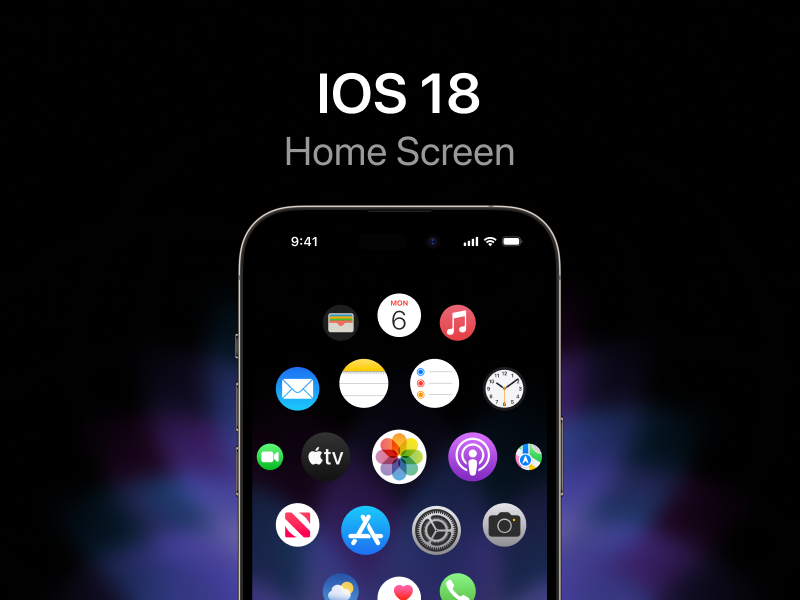
Apple’s all new design language
iOS 18 and Apple’s all new design language. Of course as a design enthusiast, i was always inspired by how Apple kept pushing the boundaries further and further where every product was a design statement.
iOS 18 and Apple’s all new design language
My name is Ameer, currently the designer of Sigma. I’ve been in love with design since i was a kid. It was just my thing. To make things work better and look more beautiful. Of course as a design enthusiast, i was always inspired by how Apple kept pushing the boundaries further and further where every product was a design statement.
Over the year’s Apple has revolutionized the industry over and over. In terms of UI’s they did it multiple times with Lisa (Personal computing), iPhone (Mobile Computing), Lately Vision pro (Spatial computing) and so many other iterations in between. I think we can agree that the Introduction of iOS 7 set the path for GUI’s for the past decade, But i think it’s about time.
UI’s are suppose to make things work better as well as looking more beautiful.
I love this quote by Steve Jobs:
Design is not just what it looks like and feels like. Design is how it works.
I think that’s the point that a lot of designers might be missing that the ultimate goal is actually solving a problem. While aesthetics play an important role on the experience they’re certainly not the whole story. So the question is what’s the key to this next visual language to take advantage of new opportunities including a whole new spatial computing era.
Connecting the Dots
If you pay deep attention you can see that Apple has been making some changes here and there through out their UIs. While every platform has its limitations and advantages, new design principles should work throughout Apple’s ecosystem seamlessly. Inspired by the new platform Vision Pro, are are interesting changes happening to IOS as well and i think that’s where it’s going.


Incoming call screen on iOS 17
I think you already should be seeing a pattern but let me explain.
Immersive, Sense of physicality paired with motions.
I can break it down in these three main principles straight forward. With the rise of Spatial computers there are critical changes that needs to be made. Over the years we’ve been limited by a screen where everything will be presented in a 2D environment. So as designers we didn’t really had to be worried about the space, depths, physics and more yet these factors play a huge role in this 3d world that we live in. They simply add layers of new experiences. With spatial computers there are endless possibilities to UIs to unlock new experiences.
Immersion
Take this as an example. In a weather app where you perviously had to look straight into a 2d surface, now you can actually be standing in the snow to check out the weather. Flakes could fall in your hands. I mean just imagining it gives me chills.
But of course it can’t happen on IOS right? Instead i think the pattern here is to give apps their uniques space. They take advantage of the whole display so they can be represented as more immersive than “inside the box”.
In addition to examples above, i redesigned settings with the new principles to you a more clear vision of how i think it’ll be transforming.


Sense of physicality
Just like the world that we live it, everything inside of Vision OS has physics. It has depth, shadows, reflections and more to embrace reality. I think the trend will be like that in our 2D UIs as well. In fact i think that’s one of the reasons that we see a new form of Skeuomorphism coming back and it’s becoming popular. Same principles applied. A great example i think would be the Action button settings in iPhone 15 Pro.

Action button settings on iPhone 15 Pro
Whole new sophisticated level of motions
Dynamic island was a profound idea to generously turn a hardware challenge into a software advantage. Something that i think we only see from apple. In addition to that animation is so fluid, and has accurate physics in a “magical” way. And we’ve been looking at this pattern a lot on iOS 17. Beautiful Shazam animation in Dynamic Island, Airdrop and more.

In conclusion
Trends only become standards when they unlock tremendous new possibilities, they actually solve problems, and they feel more human like.
I think we’re right at the edge of a new era where designers should start learning more about 3D graphics and environments, Truly thinking “outside the box” and motion interactions. while always keeping the problem solving approach at the core.
What's Your Reaction?


![[VIP] DesignCode: Build Beautiful Apps with GPT-4 and Midjourney](https://design.rip/uploads/cover/blog/designcode-gpt4.webp)
![[VIP] AppCoda: Mastering SwiftUI - Professional Packet (Updated 04.2023)](https://design.rip/uploads/cover/blog/appcoda-mastering-swiftui-professional-packet-worth.webp)
![[VIP] AppCoda: Beginning iOS Programming with Swift (Updated 04.2023)](https://design.rip/uploads/cover/blog/appcoda-beginning-ios-programming-with-swift.webp)
![[VIP] Whoooa! 156 vector Lottie animations](https://design.rip/uploads/cover/blog/whoooa-156-vector-animations.webp)


![[VIP] Motion Sound Vol. 1](https://design.rip/uploads/cover/blog/designrip-svx.webp)
