![[VIP] Unlimited Pass 2025.01.16](data:image/gif;base64,R0lGODlhAQABAIAAAP///wAAACH5BAEAAAAALAAAAAABAAEAAAICRAEAOw==)


![[VIP] DesignCode: Build Beautiful Apps with GPT-4 and Midjourney](https://design.rip/uploads/cover/blog/designcode-gpt4.webp)
![[VIP] AppCoda: Mastering SwiftUI - Professional Packet (Updated 04.2023)](https://design.rip/uploads/cover/blog/appcoda-mastering-swiftui-professional-packet-worth.webp)
![[VIP] AppCoda: Beginning iOS Programming with Swift (Updated 04.2023)](https://design.rip/uploads/cover/blog/appcoda-beginning-ios-programming-with-swift.webp)
![[VIP] Whoooa! 156 vector Lottie animations](https://design.rip/uploads/cover/blog/whoooa-156-vector-animations.webp)


![[VIP] Motion Sound Vol. 1](https://design.rip/uploads/cover/blog/designrip-svx.webp)
10 Usability Heuristics for User Interface Design
10 general principles for interaction design. They are called "heuristics" because they are broad rules of thumb and not specific usability guidelines.
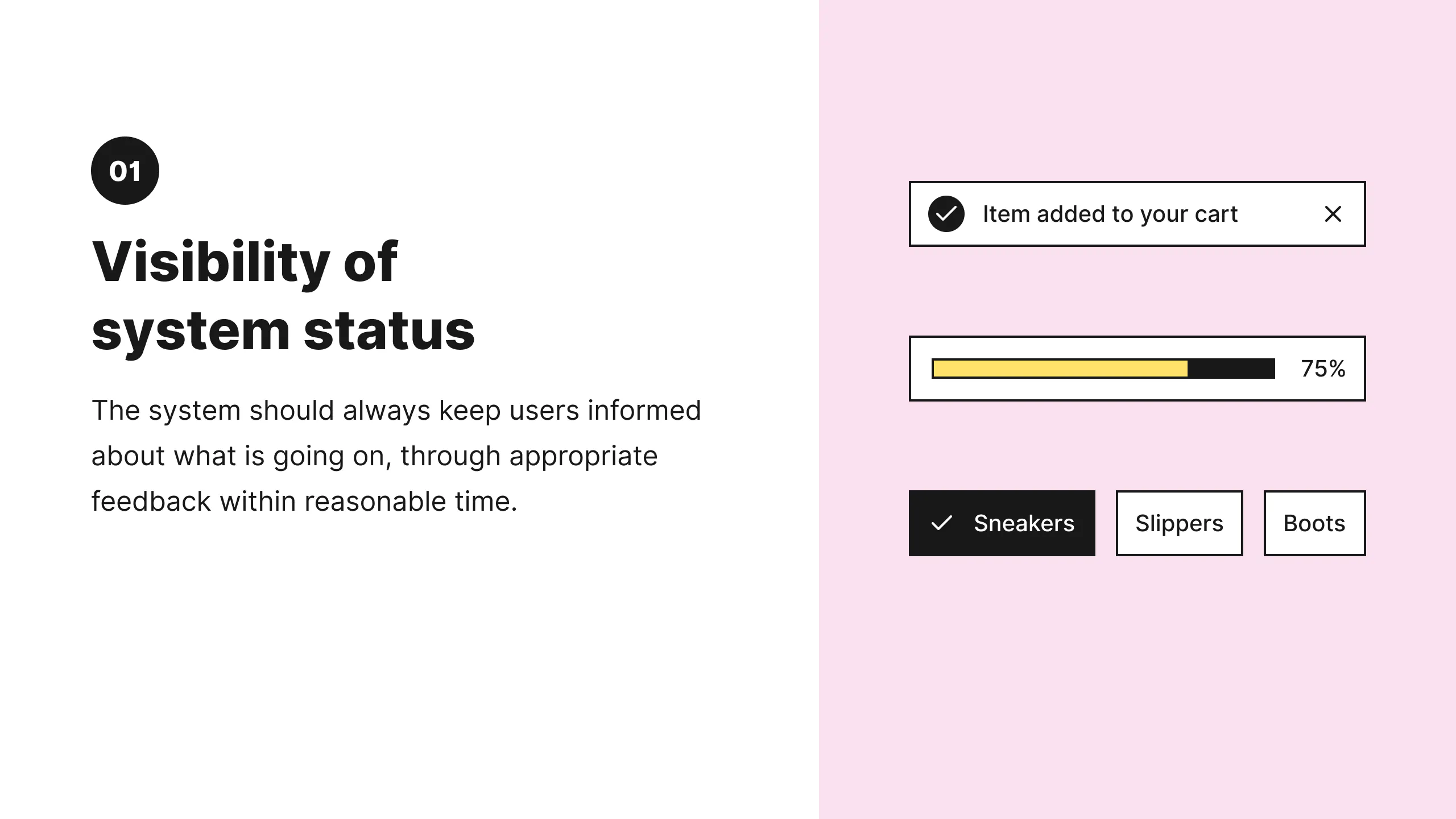
1: Visibility of System Status
The design should always keep users informed about what is going on, through appropriate feedback within a reasonable amount of time.
When users know the current system status, they learn the outcome of their prior interactions and determine next steps. Predictable interactions create trust in the product as well as the brand.
Tips
- Communicate clearly to users what the system’s state is — no action with consequences to users should be taken without informing them.
- Present feedback to the user as quickly as possible (ideally, immediately).
- Build trust through open and continuous communication.
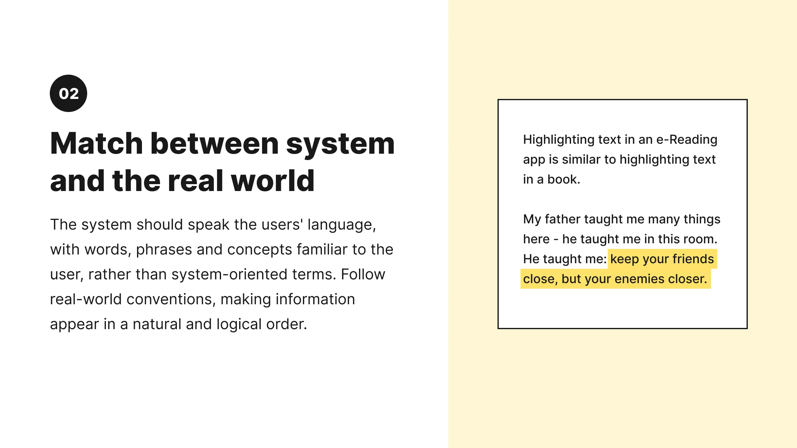
2: Match Between the System and the Real World
The design should speak the users' language. Use words, phrases, and concepts familiar to the user, rather than internal jargon. Follow real-world conventions, making information appear in a natural and logical order.
The way you should design depends very much on your specific users. Terms, concepts, icons, and images that seem perfectly clear to you and your colleagues may be unfamiliar or confusing to your users.
When a design’s controls follow real-world conventions and correspond to desired outcomes (called natural mapping), it’s easier for users to learn and remember how the interface works. This helps to build an experience that feels intuitive.

Tips
- Ensure that users can understand meaning without having to go look up a word’s definition.
- Never assume your understanding of words or concepts will match that of your users.
- User research will uncover your users' familiar terminology, as well as their mental models around important concepts.
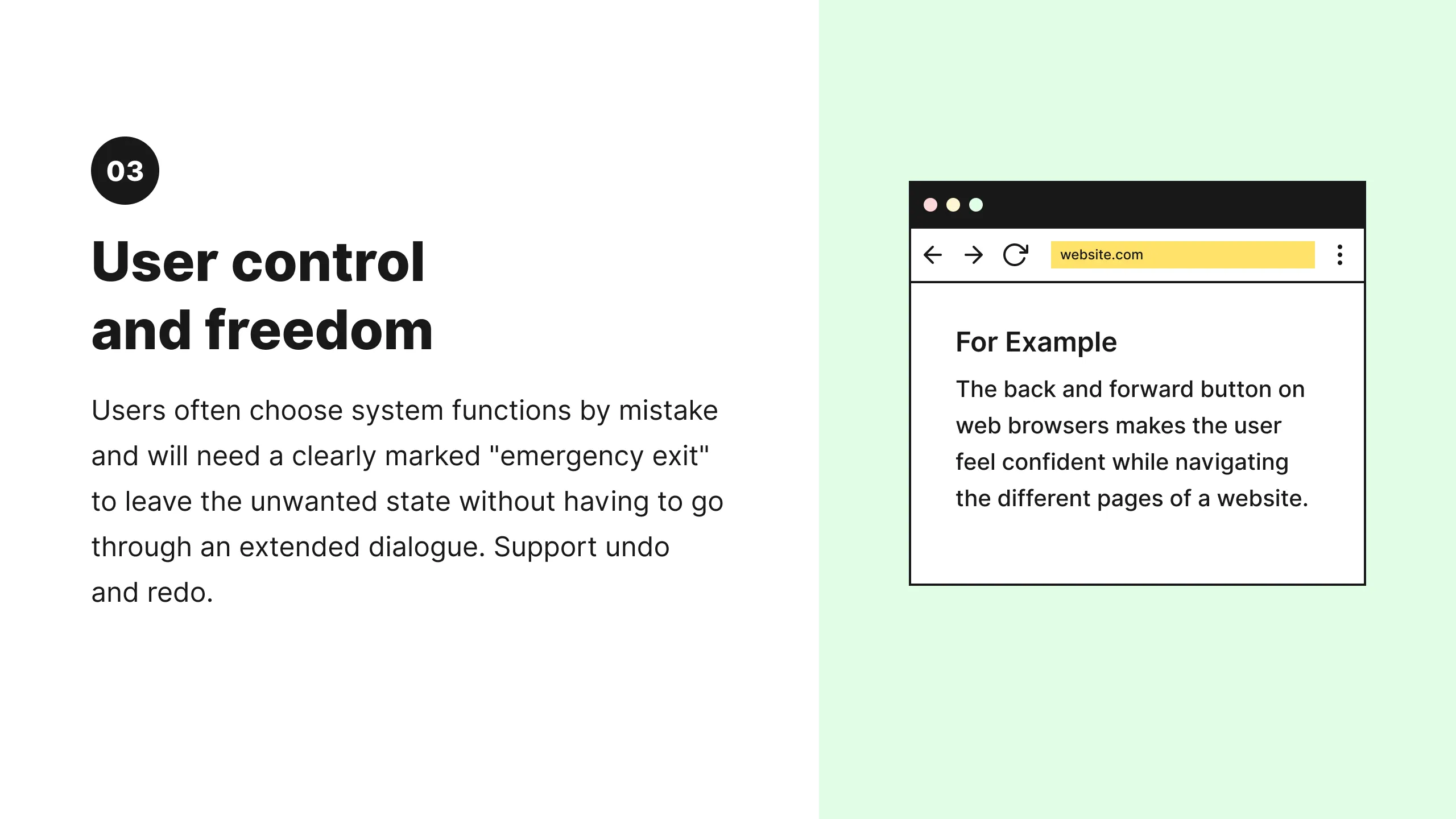
3: User Control and Freedom
Users often perform actions by mistake. They need a clearly marked "emergency exit" to leave the unwanted action without having to go through an extended process.
When it's easy for people to back out of a process or undo an action, it fosters a sense of freedom and confidence. Exits allow users to remain in control of the system and avoid getting stuck and feeling frustrated.

Tips
- Support Undo and Redo.
- Show a clear way to exit the current interaction, like a Cancel button.
- Make sure the exit is clearly labeled and discoverable.
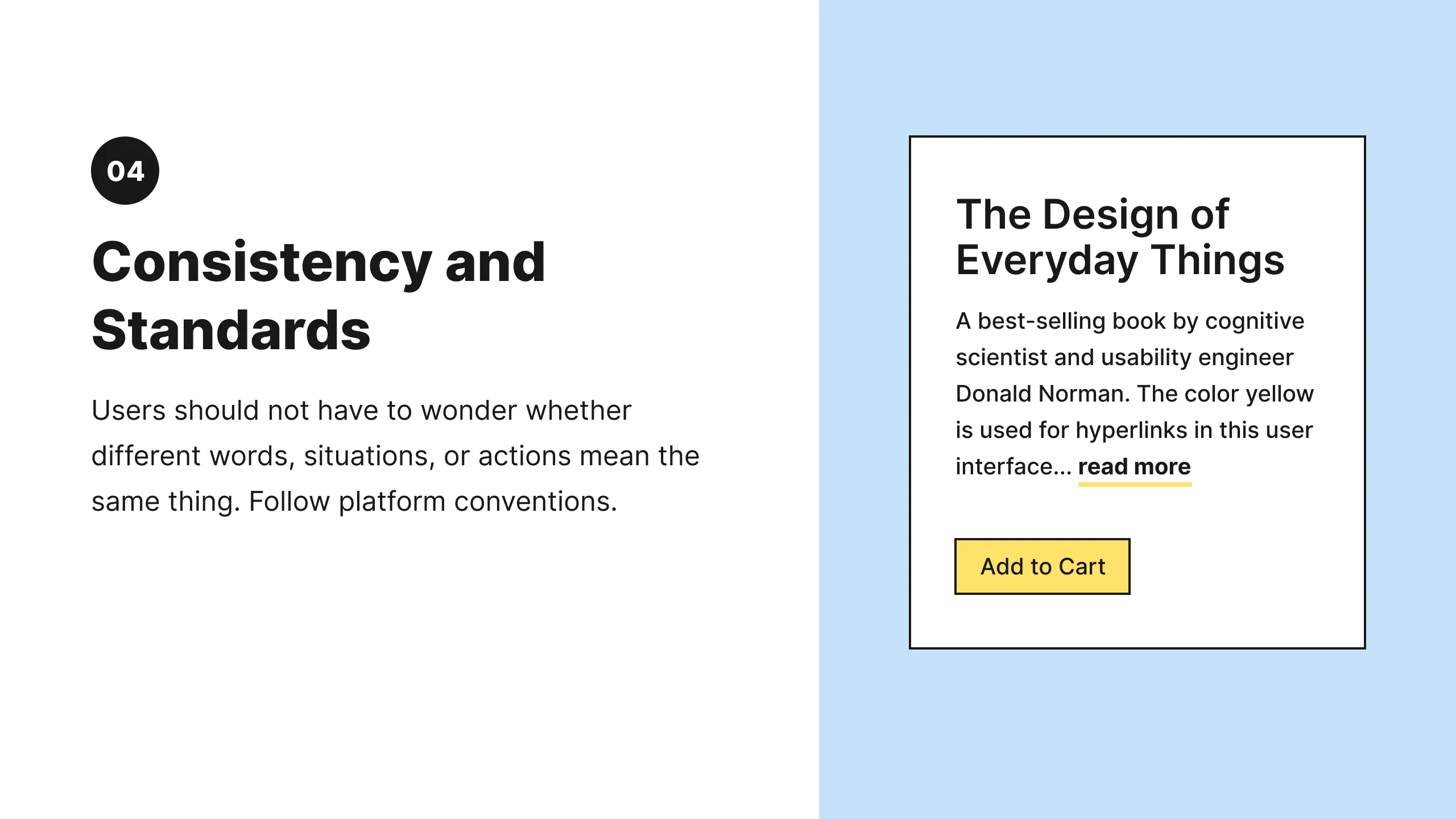
4: Consistency and Standards
Users should not have to wonder whether different words, situations, or actions mean the same thing. Follow platform and industry conventions.
Jakob's Law states that people spend most of their time using digital products other than yours. Users’ experiences with those other products set their expectations. Failing to maintain consistency may increase the users' cognitive load by forcing them to learn something new.

Tips
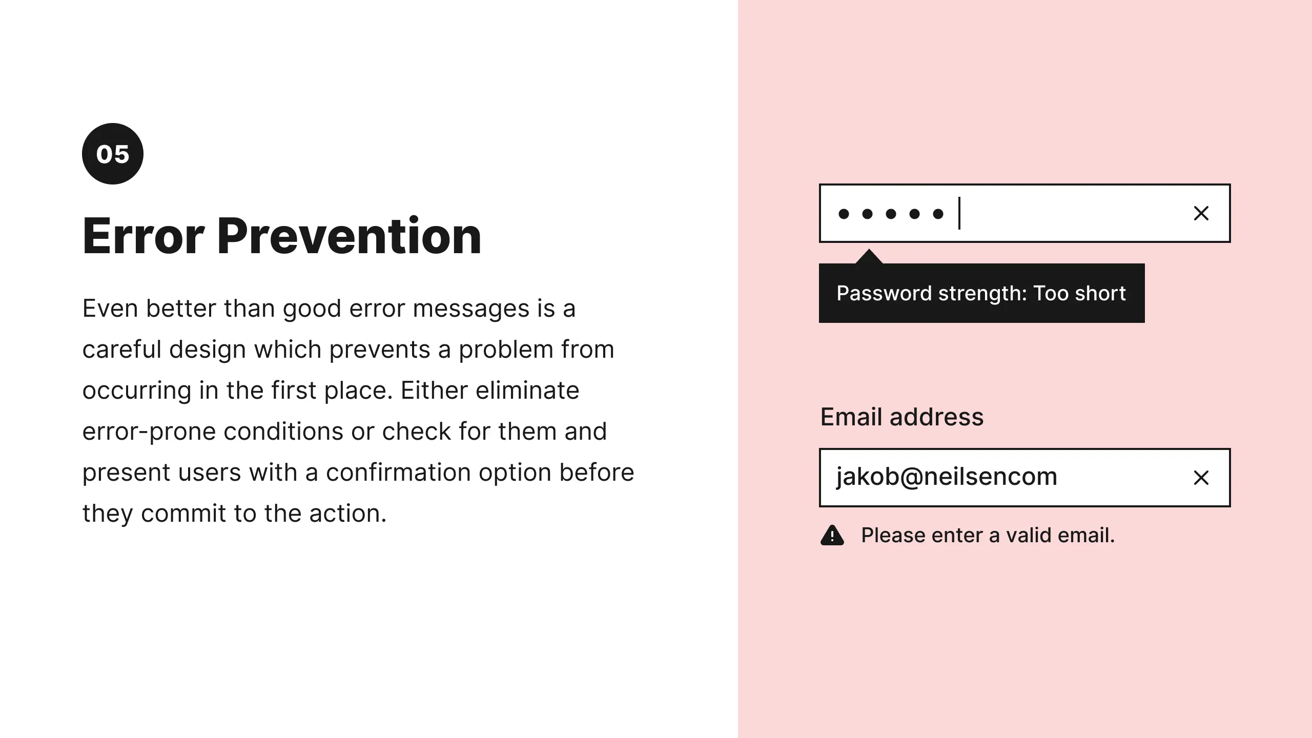
5: Error Prevention
Good error messages are important, but the best designs carefully prevent problems from occurring in the first place. Either eliminate error-prone conditions, or check for them and present users with a confirmation option before they commit to the action.
There are two types of errors: slips and mistakes. Slips are unconscious errors caused by inattention. Mistakes are conscious errors based on a mismatch between the user’s mental model and the design.

Tips
- Prioritize your effort: Prevent high-cost errors first, then little frustrations.
- Avoid slips by providing helpful constraints and good defaults.
- Prevent mistakes by removing memory burdens, supporting undo, and warning your users.

6: Recognition Rather than Recall
Minimize the user's memory load by making elements, actions, and options visible. The user should not have to remember information from one part of the interface to another. Information required to use the design (e.g. field labels or menu items) should be visible or easily retrievable when needed.
Humans have limited short-term memories. Interfaces that promote recognition reduce the amount of cognitive effort required from users.

Tips
- Let people recognize information in the interface, rather than forcing them to remember (“recall”) it.
- Offer help in context, instead of giving users a long tutorial to memorize.
- Reduce the information that users have to remember.
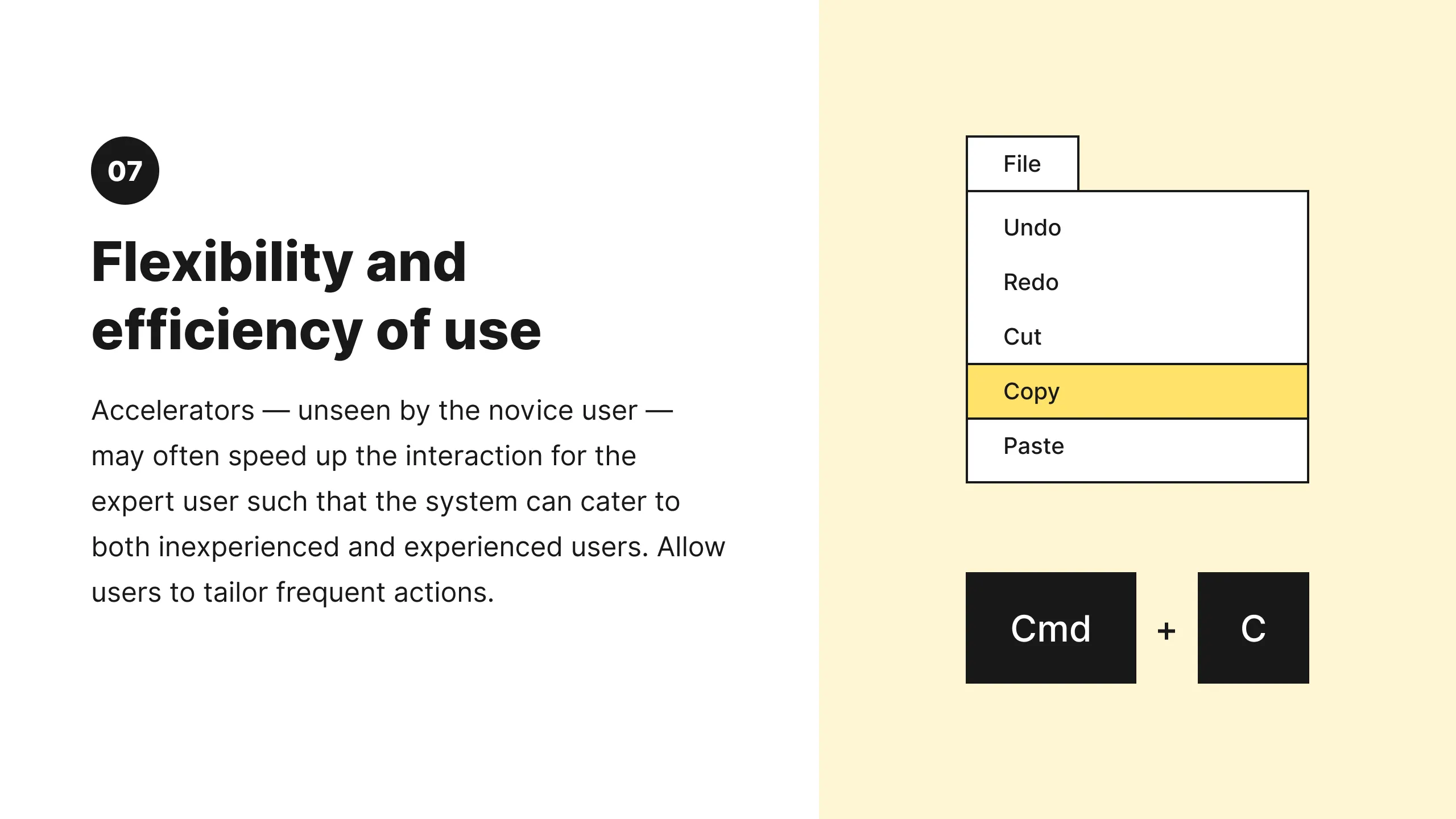
7: Flexibility and Efficiency of Use
Shortcuts — hidden from novice users — may speed up the interaction for the expert user so that the design can cater to both inexperienced and experienced users. Allow users to tailor frequent actions.
Flexible processes can be carried out in different ways, so that people can pick whichever method works for them.

Tips
- Provide accelerators like keyboard shortcuts and touch gestures.
- Provide personalization by tailoring content and functionality for individual users.
- Allow for customization, so users can make selections about how they want the product to work.

8: Aesthetic and Minimalist Design
Interfaces should not contain information that is irrelevant or rarely needed. Every extra unit of information in an interface competes with the relevant units of information and diminishes their relative visibility.
This heuristic doesn't mean you have to use a flat design — it's about making sure you're keeping the content and visual design focused on the essentials. Ensure that the visual elements of the interface support the user's primary goals.

Tips
- Keep the content and visual design of UI focused on the essentials.
- Don't let unnecessary elements distract users from the information they really need.
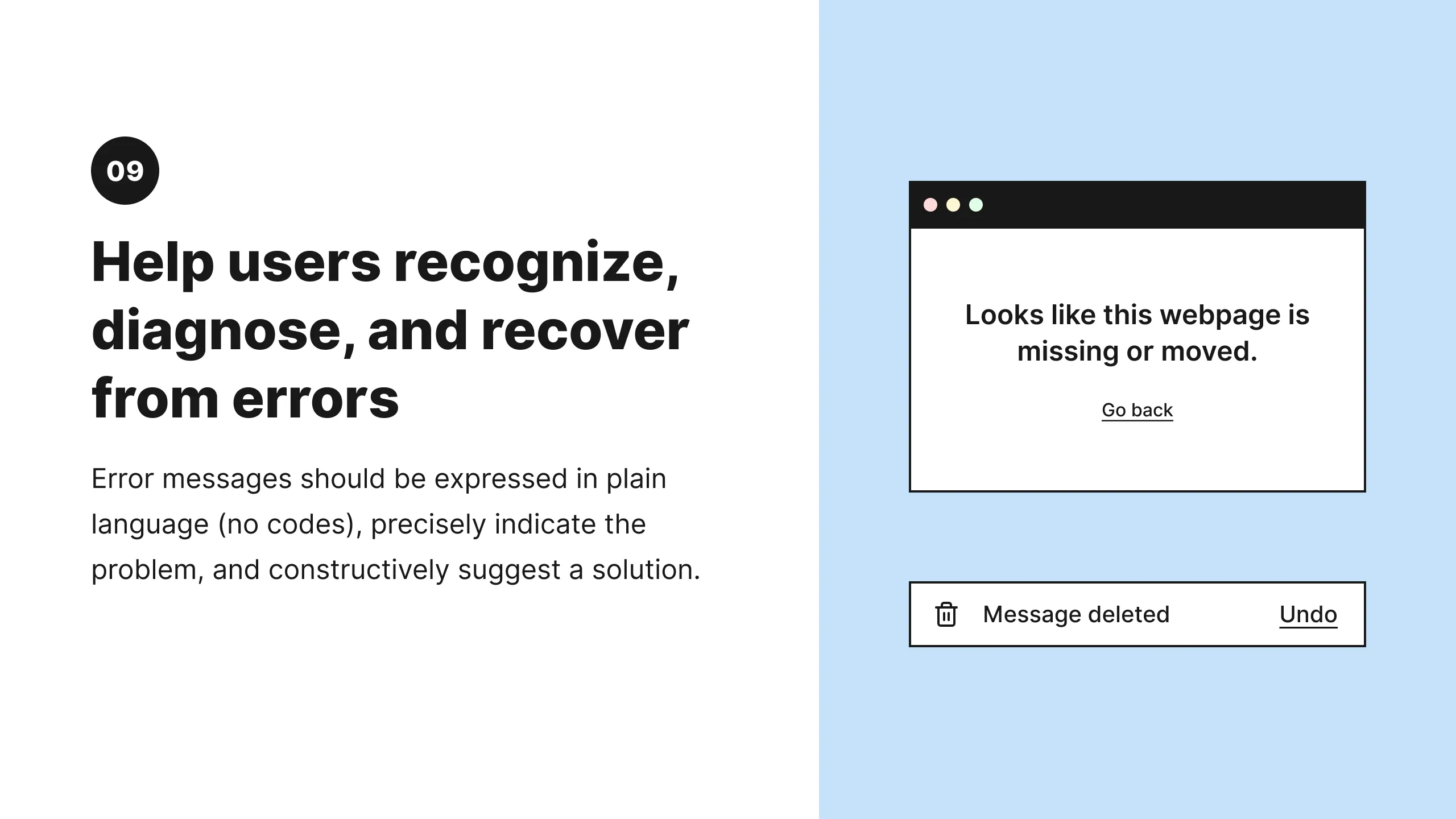
9: Help Users Recognize, Diagnose, and Recover from Errors
Error messages should be expressed in plain language (no error codes), precisely indicate the problem, and constructively suggest a solution.
These error messages should also be presented with visual treatments that will help users notice and recognize them.
Tips
- Use traditional error-message visuals, like bold, red text.
- Tell users what went wrong in language they will understand — avoid technical jargon.
- Offer users a solution, like a shortcut that can solve the error immediately.
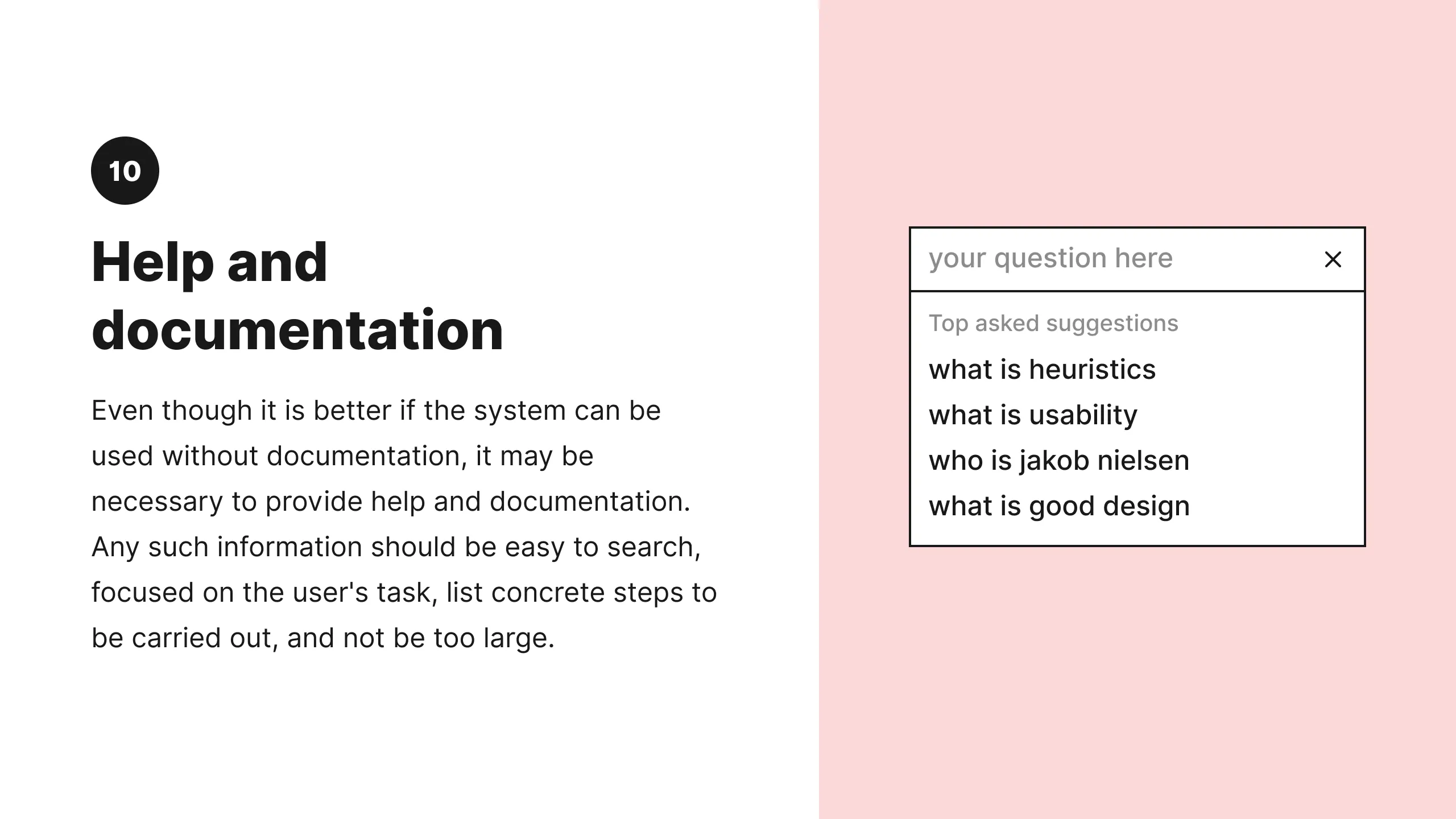
10: Help and Documentation
It’s best if the system doesn’t need any additional explanation. However, it may be necessary to provide documentation to help users understand how to complete their tasks.
Help and documentation content should be easy to search and focused on the user's task. Keep it concise, and list concrete steps that need to be carried out.

Tips
- Ensure that the help documentation is easy to search.
- Whenever possible, present the documentation in context right at the moment that the user requires it.
- List concrete steps to be carried out.
Note from Jakob
I originally developed the heuristics for heuristic evaluation in collaboration with Rolf Molich in 1990 [Molich and Nielsen 1990; Nielsen and Molich 1990]. Four years later, I refined the heuristics based on a factor analysis of 249 usability problems [Nielsen 1994a] to derive a set of heuristics with maximum explanatory power, resulting in this revised set of heuristics [Nielsen 1994b].
In 2020, we updated this article, adding more explanation, examples, and related links. While we slightly refined the language of the definitions, the 10 heuristics themselves have remained relevant and unchanged since 1994. When something has remained true for 26 years, it will likely apply to future generations of user interfaces as well.
See Also
Examples
- 10 Usability Heuristics Applied to Complex Applications — Examples of the heuristics applied to complex and domain-specific software applications.
- 10 Usability Heuristics Applied to Virtual Reality — See the heuristics applied to 3D virtual environments.
- 10 Usability Heuristics Applied to Video Games — Great examples of the 10 heuristics in highly interactive and highly visual user interfaces that have an entertainment purpose.
Checklists & Guidelines
- Full set of 2,397 UX design guidelines (across multiple reports).
- Bruce "Tog" Tognazzini's list of basic principles for interface design. The list is slightly too long for heuristic evaluation but serves as a useful checklist.
What's Your Reaction?