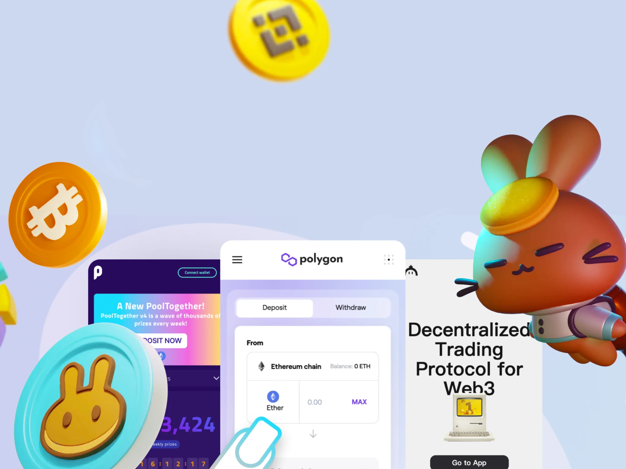
Web3 Trends on the Blockchain
Design UX/UI for decentralised applications. In this article, we will explore some of the common themes/trends in this new type of application, good and bad examples of UX/UI.

Design UX/UI for decentralised applications
In this article, we will explore some of the common themes/trends in this new type of application, good and bad examples of UX/UI.
Previously I discussed the UX of buying NFT’s on the Blockchain, which covered NFT marketplaces, here we will explore common themes across all blockchain websites/applications.

Trends:
- Connect your wallet — not a theme, a must-have. However also the biggest barrier
to entry - Real money shown in light grey under ETH amounts
- Common navigation — Search, Explore, Wallet
- Data & Stats — Stats often in the nav
- Black & White minimal UI
- Bold clear typography
- Mobile-first (sites often accessed through browsers inside wallets)
- One task — often only one action or task for the user to take ✅
- No marketing — homepage is the application, not marketing website that you login to
access the app — as all data is publically available apps are not private experiences but
shared - Speed of application development — new apps can be built fast and often share
similar GitHub repos so look and behave similarly - No ads —At least for now…
Connect your wallet
Not a theme, a must-have. However also the biggest barrier to entry
- Log in with your wallet
- Wallet login is a clear sign of a decentralised app, any app wanting you to sign in with
your email is not anonymous and can connect your identity to your wallet - Accessed through main CTA on websites, often a dropdown or a modal if many wallets
can connect

Real money
Converting crypto into USD or your chosen local currency
- Real money — preferably your chosen currency (in this example from Zapper it does
not use my local currency which was not ideal - Exchange rate to local currency is often shown in small grey text under the crypto
amount — see exchange example - Some currencies will show conversion to a stable coin instead of in fiat

Common navigation
App like navigation blends search engine layouts with applications
- Prominent search bar (not the pattern on Facebook in 2008)
- CTA — Connect Wallet
- Explore or dropdowns allow access to content
- Mobile native app layouts

Data & Stats
Crypto coins fluctuate in value so visualising data is key to understanding many
blockchain applications.
- Visualising tends over time
- Sortable tables
- Conversions of percentages and local currencies

Black & White minimal UI
You find too much colour, and where you do it’s usually reserved for buttons.
- Black and white interface
- Grey text
- Colour pop in buttons (see the gradient button on Foundation)
- Lack of border outlines
- Use of shadows and blurs

Bold clear typography
From the marking websites through to the applications, the blockchain has some
talented typographers
- Bold
- Large
- Clear hierarchy
- Shades of grey


Mobile-first
You might browser a lot of these sites/apps on your phone, or even through the browser
in your wallet
- Mobile navigations (sticky footer with icons)
- Large hit areas
- Single actions per page
- Large typography

One task
Amazon once patented the one-click purchase button. When users sign in with their
wallets, one-click purchases have come to the new norm.
- One button/action per page
- Clear accent colours are used to indicate where users should take action
- Build with mobile in mind
- Amazon-like one-click purchases

No marketing
Why build a marketing website when you could build an app? Any dApps that use
marketing websites are usually looking for investment, not users.
- Some sites have marketing websites, but the best dApps allow users to go straight into
the application, as there are no sign-up flows and all the data is publicly available there
is no reason to limit access to - Marketing can often be found under the about or info tabs inside dAapps


These dApps all have marketing websites…why?
Speed of application development
SushiSwap folked UniSwap on Github and rapidly introduced new features. Enter
PancakeSwap and BackerySwap and the pace of development and new features is
staggering.
- Github allows developers to build existing dApps, as many are publically available
- Users can vote on features
- Users can contribute through DAO’s (decentralized autonomous organizations)


No ads
This might depend on what you consider an advertisement. The further from the
mainstream dApps you go the more the lines blur.
- Banner ads
- Homepage dashboard ads
- Buy NFT ads
- Pool/Farm ads


dApps may not sell you products, but they strongly encourage you to invest your coin in their
assets. It’s an odd balance between shopping and investing. A bit like buying art in that regard.

SpookySwap with all the charm you could hope for

Bonus content
Although there are clear trends when it comes to UX, there are also a lot of unique
experiences and outliers that deserve a special mention.
Most unique: Curve

Curve looks like the early 90’s and users seem to love it
Most unique theme: SpookySwap

There is a theme for everyone, SpookySwap has the charm of…well Charmed
Marketing site examples:


Dark mode:


The one trend across all the dApps I’ve used is that the most popular dApps often have
good UX design at their core.
With many dApps sharing their work on GitHub, new dApps can inherit the UX patterns
and expand on them.
We are currently seeing the start of a new language for a new type of internet where
‘connect wallet’ replaces ‘sign up’ and ‘doing’ replaces ‘posting’…personally I can’t
wait to see what we will be able to do next on the web3
What's Your Reaction?


![[VIP] DesignCode: Build Beautiful Apps with GPT-4 and Midjourney](https://design.rip/uploads/cover/blog/designcode-gpt4.webp)
![[VIP] AppCoda: Mastering SwiftUI - Professional Packet (Updated 04.2023)](https://design.rip/uploads/cover/blog/appcoda-mastering-swiftui-professional-packet-worth.webp)
![[VIP] AppCoda: Beginning iOS Programming with Swift (Updated 04.2023)](https://design.rip/uploads/cover/blog/appcoda-beginning-ios-programming-with-swift.webp)
![[VIP] Whoooa! 156 vector Lottie animations](https://design.rip/uploads/cover/blog/whoooa-156-vector-animations.webp)


