[VIP] DesignCode: Build SwiftUI apps for iOS 18 with Cursor and Xcode
In this course, we'll explore the exciting new features of SwiftUI 6 and Xcode 16 for building iOS 18 apps. From mesh gradients and text animations to ripple effects, you'll learn how to create polished, highly custom apps using the latest workflows. Whether you're just starting or have a passion for crafting delightful UI experiences, this journey will give you all the skills you need to create stunning iOS apps.
In this course, we'll explore the exciting new features of SwiftUI 6 and Xcode 16 for building iOS 18 apps. From mesh gradients and text animations to ripple effects, you'll learn how to create polished, highly custom apps using the latest workflows. Whether you're just starting or have a passion for crafting delightful UI experiences, this journey will give you all the skills you need to create stunning iOS apps. We'll also dive into using Cursor and Claude AI for AI-driven coding, helping you start strong and customize your apps.
Requirements
To get the most out of this course, you'll need a Mac running Sequoia or later and Xcode 16 installed. Having a basic familiarity with computers and experience with HTML and CSS can be helpful but isn't mandatory. Our friendly approach, guided by visual learning, makes it easy to follow along—even for beginners. We'll take on coding challenges step-by-step, focusing on how to bring your design visions to life with tools like SwiftUI, Cursor, and AI-driven development resources.
Learning Path
We recommend using this course as a reliable companion alongside the SwiftUI handbook and our other great SwiftUI courses. As you become more comfortable with SwiftUI and Swift, you're welcome to progress to our more advanced courses. Here's a simple plan to help you with your learning path.
Beginners
- SwiftUI Handbook
- Build an iOS app for iOS 17
- Build an iOS app for iOS 16
- Create your Dream Apps with Cursor and Claude AI
- Build a SwiftUI app with Claude AI
Intermediate / Advanced
Cursor + Xcode Workflow

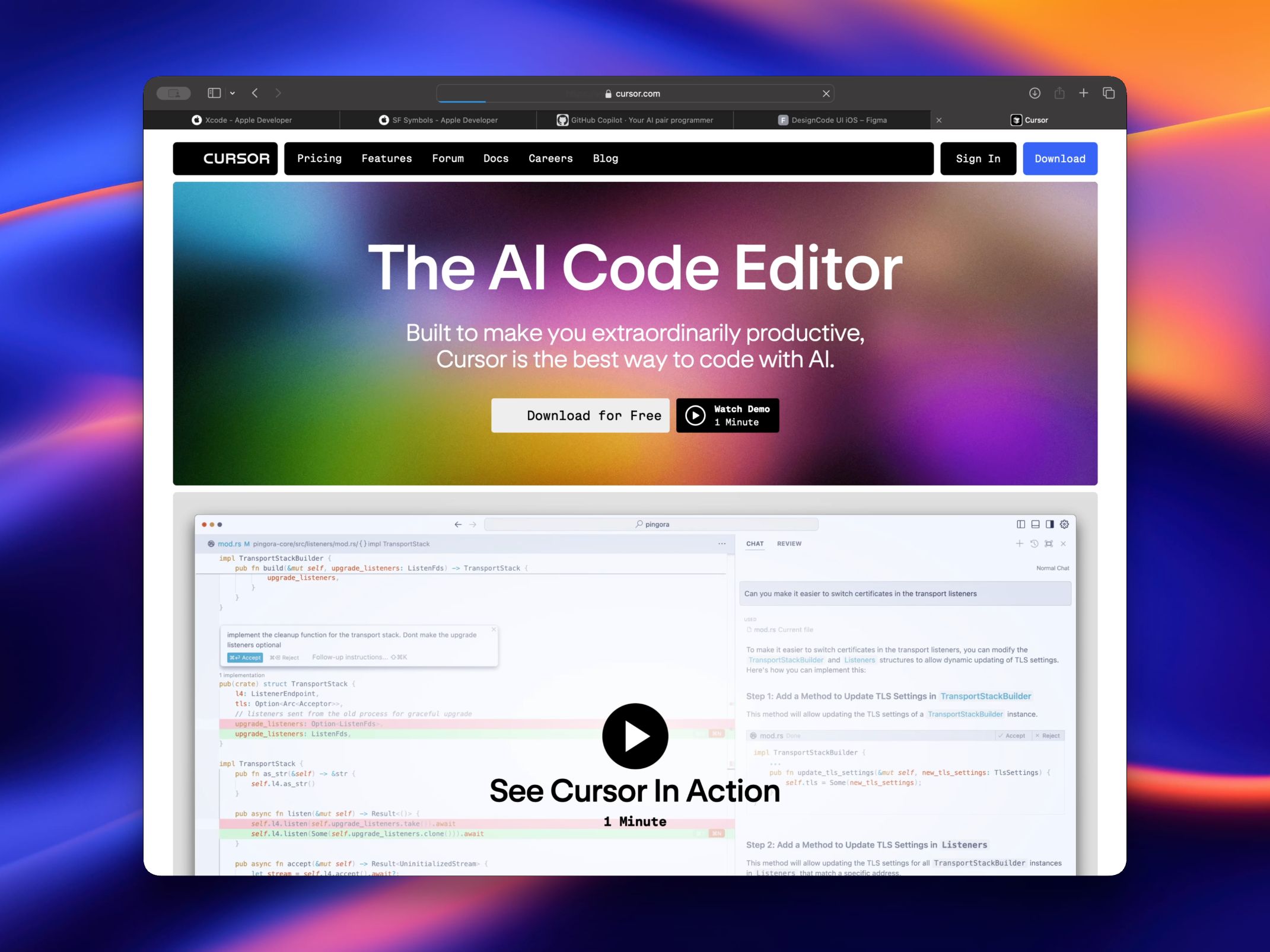
Using Cursor with Xcode makes building iOS apps faster and easier, especially with SwiftUI. Cursor leverages AI to help you quickly generate and refine code, making it a great tool for creating UI elements, integrating APIs, and speeding up development cycles. With Cursor’s AI-driven suggestions and the ability to handle repetitive coding tasks, you can focus more on customization and fine-tuning.
When used alongside Xcode, you gain the benefit of instant code previews and debugging capabilities. This combination allows you to see changes in real-time and make adjustments on the fly. By integrating Cursor into your workflow, you can quickly go from idea to functional app, whether you're a beginner or an experienced developer, making the app-building process more efficient and enjoyable.
What's New in SwiftUI 6
The launch of iOS 18 and SwiftUI 6 brings significant advancements to app development with features like Transition Modifier for smoother animations, Text Renderer for improved text clarity, Scroll Transition for immersive scrolling, and Mesh Gradient for complex color transitions. The Metal Shader enhances graphics performance, creating a more refined, robust environment for developing innovative applications.
Scroll Transitions
Scroll Transitions allow you to create fluid and engaging scrolling experiences. With built-in support for various transition effects, you can now customize how your content appears and disappears as users scroll through your app.
ScrollView(.horizontal) {
    HStack {
        ForEach(0 ..< 5) { item in
            Rectangle()
                .containerRelativeFrame(.horizontal)
                .cornerRadius(36)
                .scrollTransition(axis: .horizontal) { content, phase in
                    content.scaleEffect(phase.isIdentity ? 1 : 0.95)
                }
        }
    }
}
.contentMargins(32)
.scrollTargetBehavior(.paging)
.scrollIndicators(.hidden)
Navigation Transitions
Navigation Transitions provide a new way to handle view transitions within navigation stacks. These transitions bring smooth animations and enhanced control over how views are presented and dismissed, improving the overall user experience.
struct CardsView: View {
    @Namespace var namespace

    var body: some View {
        NavigationStack {
            ScrollView {
                ForEach(cards) { card in
                    NavigationLink {
                        CardView(card: card)
                            .navigationTransition(.zoom(sourceID: "card\(card.id)", in: namespace))
                    } label: {
                        CardView(card: card, show: false)
                            .matchedTransitionSource(id: "card\(card.id)", in: namespace)
                            .cornerRadius(20)
                            .padding(.top, 12)
                    }
                }
                .padding(.horizontal, 30)
                .padding(.vertical, 60)
            }
            .background(Color(.systemGray5))
            .cornerRadius(30)
            .ignoresSafeArea()
        }
    }
}
Ripple Effect Metal Shader

In iOS 18, the Ripple Effect Metal Shader brings dynamic, water-like ripple animations to your app’s user interface. This effect is achieved using Metal, Apple’s graphics framework, which allows for high-performance rendering directly on the GPU.
struct ContentView: View {
    @State var counter: Int = 0
    @State var origin: CGPoint = .init(x: 0.5, y: 0.5)

    var body: some View {
        VStack {
            Text("Ripple Effect")
                .font(.largeTitle.bold())
                .frame(maxWidth: .infinity, maxHeight: .infinity)
        }
        .foregroundColor(.white)
        .background(.blue)
        .cornerRadius(30)
        .onPressingChanged { point in
            if let point {
                origin = point
                counter += 1
            }
        }
        .modifier(RippleEffect(at: origin, trigger: counter))
        .padding()
    }
}
Text Renderer

In SwiftUI 6, introduced with Xcode 16, Apple has enhanced text rendering capabilities by introducing the TextRenderer protocol. This protocol allows developers to customize the rendering behavior of text views, enabling the creation of dynamic text effects and animations.
struct ContentView: View {
    @State var isVisible = true

    var body: some View {
        VStack {
            if isVisible {
                Text("Share your Achievements")
                    .font(.system(.largeTitle, weight: .bold))
                    .customAttribute(EmphasisAttribute())
                    .transition(TextTransition())
            }
            Button("Toggle") {
                isVisible.toggle()
            }
            .buttonStyle(.borderedProminent)
            .controlSize(.large)
        }
        .padding(40)
    }
}
Mesh Gradients

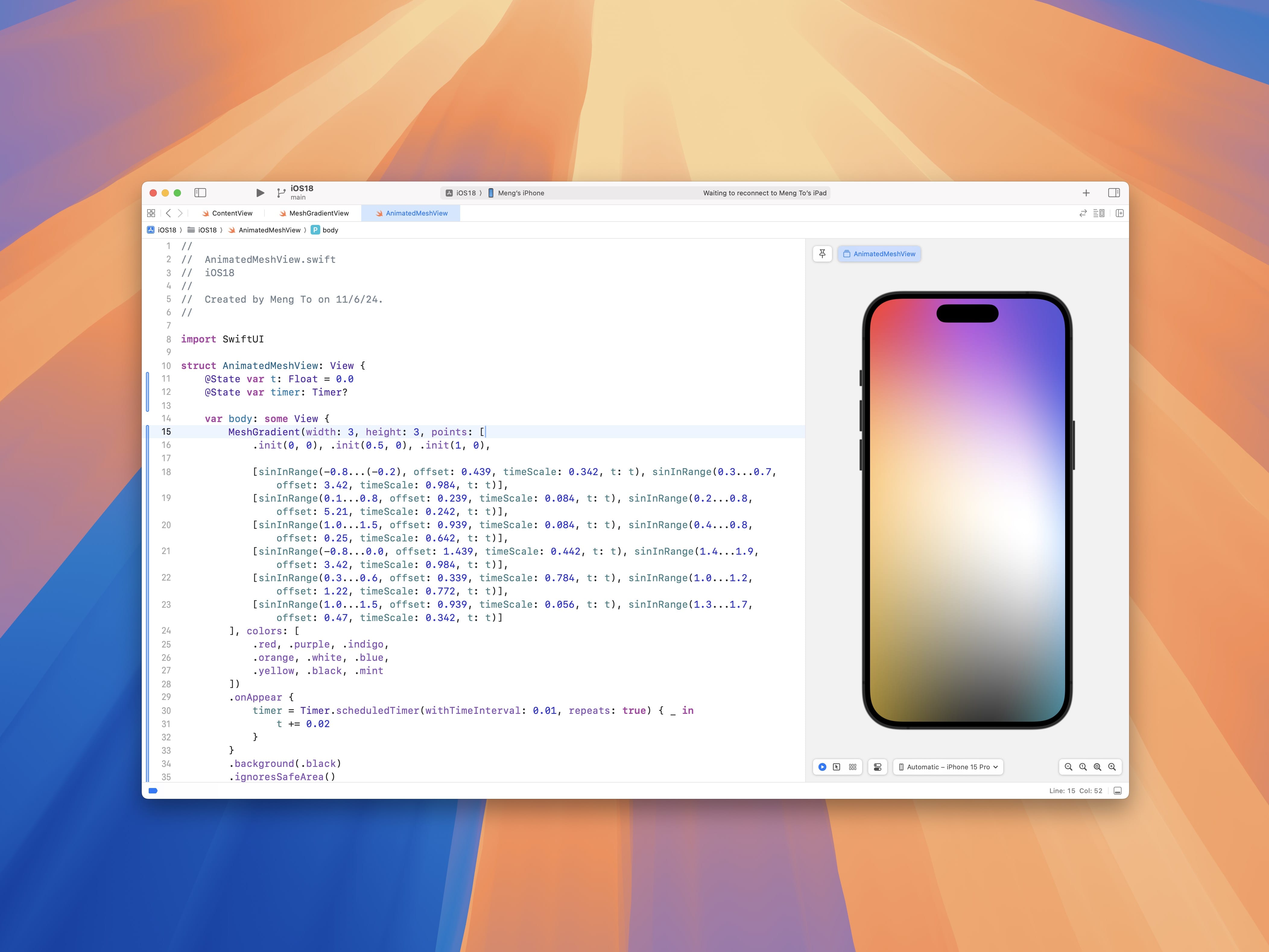
Mesh Gradients enable you to create complex and eye-catching gradient backgrounds with ease. By defining a mesh of control points and colors, you can produce intricate gradient patterns that add a new level of visual appeal to your app interfaces.
- Mesh Gradients can work as a ForegroundStyle, so on texts and shapes during animations.
- You can animate using TimelineView or Timer.
struct ContentView: View {
    var body: some View {
        MeshGradient(
            width: 3,
            height: 3,
            points: [
                .init(0, 0), .init(0.5, 0), .init(1, 0),
                .init(0, 0.5), .init(0.3, 0.5), .init(1, 0.5),
                .init(0, 1), .init(0.5, 1), .init(1, 1)
            ],
            colors: [
                .red, .purple, .indigo,
                .orange, .cyan, .blue,
                .yellow, .green, .mint
            ]
        )
    }
}
SF Symbols 6

With the addition of SF Symbols 6, you now have access to an even larger collection of 6,000 high-quality, customizable icons. These symbols are designed to seamlessly integrate with your app’s design language, offering consistency and clarity across different devices and screen sizes. There are new animation presets, including Replace, Wiggle, and Rotate.
- Replace allows you to smoothly transition between two symbols.
- Wiggle adds a playful movement to symbols, which can be used to draw attention to interactive elements.
- Rotate provides a rotating effect, ideal for indicating ongoing processes or status changes.
Here’s how you can implement and customize these animations in your SwiftUI views:
struct ContentView: View {
    @State private var isActive = false

    var body: some View {
        VStack(spacing: 20) {
            // Replace Animation
            Image(systemName: isActive ? "star.fill" : "star")
                .font(.system(size: 40))
                .symbolEffect(.replace)
                .onTapGesture {
                    withAnimation(.easeInOut(duration: 0.5)) {
                        isActive.toggle()
                    }
                }

            // Wiggle Animation
            Image(systemName: "heart.fill")
                .font(.system(size: 40))
                .foregroundColor(.red)
                .symbolEffect(.wiggle)
                .onAppear {
                    withAnimation(.easeInOut(duration: 1).repeatForever()) {
                        isActive = true
                    }
                }

            // Rotate Animation
            Image(systemName: "house.fill")
                .font(.system(size: 40))
                .foregroundColor(.blue)
                .symbolEffect(.rotate, options: .init(duration: 2).repeatForever())
                .onAppear {
                    isActive = true
                }
        }
    }
}
What's New in Xcode 16
Xcode 16 comes packed with features that enhance the SwiftUI development experience. Here are some of the improvements:
Predictive Code Completion
Xcode 16 introduces more thorough code suggestions thanks to on-device coding models specifically trained for Swift and Apple SDKs. These models leverage the surrounding code context, such as function names and comments, to provide faster and more accurate completions. This feature is available when running Xcode 16 on macOS Sequoia, powered by Apple Silicon.
Swift Assist (Coming 2025)

Swift Assist is an advanced feature introduced in Xcode 16 that leverages AI to assist developers by generating code automatically. This feature aims to significantly enhance productivity by reducing the amount of manual coding required, allowing developers to focus more on higher-level design and logic.
Improved Previews
Xcode 16 offers more reliable and faster previews, allowing you to see your changes in real-time without running the app on a simulator or device. This significantly speeds up the development cycle and helps you iterate faster.
SwiftUI Charts for iOS 18

SwiftUI 6 introduces powerful charting capabilities. You can now create beautiful and interactive charts to visualize data directly within your SwiftUI views. These charts are highly customizable, enabling you to tailor them to your specific needs.
Grid Layout
The new grid layout system in SwiftUI simplifies the creation of complex grid structures. With intuitive APIs, you can define rows, columns, and spacing to build structured and responsive grid-based layouts effortlessly.
struct ContentView: View {
    let items = Array(1...12)

    var body: some View {
        LazyVGrid(columns: [GridItem(.adaptive(minimum: 80))]) {
            ForEach(items, id: \.self) { item in
                Text("\(item)")
                    .frame(width: 80, height: 80)
                    .background(Color.blue)
                    .foregroundColor(.white)
                    .cornerRadius(8)
            }
        }
        .padding()
    }
}
Size Class
SwiftUI 6 offers improved support for adaptive layouts, making it easier to create views that look great on all device sizes and orientations. This includes better handling of dynamic type, accessibility settings, and various screen sizes.
struct ContentView: View {
    @Environment(\.horizontalSizeClass) var sizeClass

    var body: some View {
        VStack {
            if sizeClass == .compact {
                Text("Compact Size Class")
                    .font(.largeTitle)
            } else {
                Text("Regular Size Class")
                    .font(.largeTitle)
            }
        }
        .padding()
        .background(Color.orange)
        .cornerRadius(10)
    }
}
Figma Plugins
Figma plugins have become an essential part of enhancing the workflow for designers and developers, particularly when bridging the gap between design and code. When working with SwiftUI, several Figma plugins provide powerful features for exporting, converting, and generating SwiftUI code. Here’s a closer look at three useful plugins:
Dev Mode
Dev Mode is a feature that allows you to streamline your handoff process and export designs as SwiftUI code. By providing ready-to-use code snippets, it bridges the gap between design and development. This makes it easier for teams to ensure pixel-perfect implementation and reduces friction in transitioning from design to development.
Figma to Code

The Figma to Code plugin supports multiple code frameworks, including SwiftUI. It converts Figma designs into SwiftUI code, providing a foundation for building iOS applications. This tool is especially useful for generating initial layouts and structure directly from your designs, helping you accelerate the development process.
SwiftUI Code Generator
SwiftUI Code Generator focuses exclusively on converting Figma designs into SwiftUI code. It offers precise translation of design elements, making it easier to replicate your UI designs within Xcode projects. This plugin emphasizes accuracy and layout fidelity, saving time while building SwiftUI interfaces.
These plugins empower designers to produce high-quality, production-ready SwiftUI code, making design-to-code translation faster and more efficient. By integrating them into your workflow, you can maintain consistency between your Figma designs and SwiftUI projects, improving overall collaboration and productivity.
Conclusion
SwiftUI 6 and Xcode 16, along with tools like Cursor and Claude AI, create a comprehensive toolkit for building exceptional iOS 18 applications. Cursor's support for SwiftUI accelerates development with real-time code generation and previews, enhancing efficiency and reducing iteration times. Meanwhile, Claude AI offers intelligent code suggestions and explanations, helping developers navigate complex SwiftUI tasks with ease. These AI-driven tools streamline workflows, enabling more productive and seamless app development.
Additionally, plugins like Dev Mode, Figma to Code, and the SwiftUI Code Generator transform Figma designs into production-ready SwiftUI code. This integration ensures a consistent visual language across the development process and enhances collaboration between design and code. With Xcode 16 and iOS 18, developers are equipped with advanced tools and a robust framework to create stunning, high-performance apps, making this an ideal time to innovate on Apple's platforms.
What's Your Reaction?


![[VIP] DesignCode: Build Beautiful Apps with GPT-4 and Midjourney](https://design.rip/uploads/cover/blog/designcode-gpt4.webp)
![[VIP] AppCoda: Mastering SwiftUI - Professional Packet (Updated 04.2023)](https://design.rip/uploads/cover/blog/appcoda-mastering-swiftui-professional-packet-worth.webp)
![[VIP] AppCoda: Beginning iOS Programming with Swift (Updated 04.2023)](https://design.rip/uploads/cover/blog/appcoda-beginning-ios-programming-with-swift.webp)
![[VIP] Whoooa! 156 vector Lottie animations](https://design.rip/uploads/cover/blog/whoooa-156-vector-animations.webp)


![[VIP] SuperHi: Foundation HTML, CSS + Javascript](https://design.golf/uploads/images/202311/image_430x256_655dc38ca98a7.webp)
