Proxima Nova: Font Family – 126 Fonts
Each distinctive family of fonts is created as a tool for making things, not ends in themselves. For graphic designers and typographers, this means that each detail included was well-considered and will help your work look its very best.
A quick search on Font Reach reveals that Proxima Nova is used by over 25,000 websites. It’s the main typeface of some of the most popular companies in digital media, including BuzzFeed, Mashable, NBC News, Wired, and — you guessed it — Mic. Since our 2014 relaunch, Proxima Nova, along with Stag, has been a core part of our identity across branding, website, mobile app and internal projects.
As a designer who uses Proxima Nova day in and day out, I was curious about the typeface’s history and why so many media companies choose it to tell their stories. So I reached out to Mark Simonson, the creator of Proxima Nova. What exactly is the key that makes Proxima Nova so popular among content companies? “I don’t really know,” he told me, “but I like to think it has to do with the qualities I put into the font: The proportions, the spacing, the overall look and feel.”
The history
Tri Vo: How did Proxima Nova initially come together for you — Were you trying to solve a specific typographic problem? Were you experimenting?
Mark Simonson: It was a reworking of an earlier release of mine, Proxima Sans. When I did Proxima Sans in the early nineties, I only did three weights with italics. I had bigger plans for it, like more weights, condensed styles, and features like small caps and alternate characters, but at the time I just got too busy with other things in my life. The basic design of Proxima Nova is the same, but Proxima Sans was first. Proxima Nova is a more refined and developed version.
Before there was Proxima Nova, there was Zanzibar, an early concept that Simonson developed in 1981. By that point, Simonson only had the lowercase set of characters; the uppercase set took him another decade.

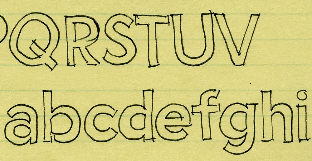
In 1991, Simonson was working as an art director for the magazine Business Ethics, in which he used Gill Sans. While he liked the font, he wanted to go for a plainer, more geometric approach, so he built upon Zanzibar to create a new font called Visigothic.
Some existing faces influenced the look of Visigothic. I wanted the general proportions and stroke contrast of Helvetica or Akzidenz Grotesk, but with construction and details borrowed variously from Futura, Kabel, the ATF gothics (Copperplate Gothic, News Gothic, Franklin Gothic, etc.) and the U.S. Federal Highway signage typeface. The result was a hybrid; a face combining modern, even-width proportions with a somewhat geometric appearance. — Mark Simonson, Proxima Nova Overview
In 1994, Visigothic was publicly released through FontHaus under the name Proxima Sans. “Visigothic was a silly name,” Simonson explained in an interview with entrepreneur Cameron Moll. “Plus it didn’t showcase some of the font’s stronger features, such as the ‘s’ and the ‘a’. Sometimes font names are chosen specifically to showcase certain letters, and that was the case with Proxima Sans.”
Despite Simonson’s years of hard work, Proxima Sans was not successful. Sales were low, and Simonson was occupied with his new job and the birth of his child. Proxima Sans was put in the back burner.
But in the early 2000s, the geometric simplicity of Proxima Sans regained momentum. In 2002, Rolling Stone used it in a major rebranding. Two years earlier, Tobias Frere-Jones released a geometric, New York City-inspired typeface, called Gotham, on commission from GQ magazine. Gotham quickly became popular, appearing on the cornerstone for the Freedom Tower in 2004 and in President Barack Obama’s 2008 campaign materials.

Seeing a growing opportunity for geometric fonts, Simonson revisited Proxima Sans. He refined every character and built a new italic set from scratch. In 2005, Proxima Sans was re released under the name Proxima Nova, with many more weight and style variations.
While Proxima Nova was initially more successful than previous versions, it didn’t get off to as strong of a start as Gotham did. But with the launch of Typekit in 2009, a high-quality web font hosting service, Proxima Nova was available to use for web, while Gotham was unavailable for another four years. As a result, many Gotham users switched to Proxima Nova, since the two typefaces have a similar geometric look. After two decades of development, Proxima Nova finally got mainstream recognition.

Why Proxima Nova is everywhere
TV: Why is Proxima Nova a font people can easily connect with?
MS: I don’t really know, but I like to think it has to do with the qualities I put into the font — the proportions, the spacing, the overall look and feel. I tried to make the shapes of the letters simple and clear. It doesn’t have a lot of fussy details or mannerisms. Maybe it has to do with the open, circular forms, which perhaps give it a “friendly” appearance, especially in the lowercase.
In 2015, over 25,000 websites have chosen the geometric typeface to represent themselves. As Simonson said, it’s a simple, friendly font, but that’s not the only reason we all decided to jump on the Proxima Nova bandwagon. There are a few others, like:
1. It works well for screens.
The rise of computer, mobile and tablet devices means there’s a higher demand for designs for screen, which means sans-serif fonts move to the front of the line. Choosing a sans-serif font when designing for screens and mobile has become a normal and standard practice in the design world. It’s clean, minimalistic and works well at different screen resolutions. Even Google, after sticking with its iconic serif logo for more than 15 years, introduced us to a brand new sans-serif look in September that is cleaner, more modern and geometric.
MS: I think the trend has to do with computer screens which, until fairly recently, have had fairly low resolution. I think that’s why sans-serif faces became more popular; they hold up better on low-res screens. We have screens now that can handle the detail, but people prefer what they are used to, and everybody is used to sans-serif faces now.
Does that mean sans-serif fonts are always a better choice? Not necessarily. Many designers — Medium’s, for example — still think the curves of serif fonts help guide you through the page, or screen, better than sans-serif fonts.
2. It has great flexibility.
While sans-serif fonts are generally plain and minimal, many fonts have a lot of personality that may not be suitable for everything. As a designer at a media company, I try not to over-design so that the content speaks for itself. Proxima Nova does just that.
Simonson agrees, “I like to think Proxima Nova could be used for anything, but in general it works best in situations where you want something kind of invisible that doesn’t call attention to itself. It doesn’t really convey much beyond the words you set in it. It’s not a ‘personality’ typeface.”
3. It’s trendy.
Longtime favorites like Helvetica and Futura are clean, versatile and go perfectly fine with many design projects, but they have also been around for so long that many young designers find them quite stale. Proxima Nova offers a modern and trendy look, while maintaining the simplicity and versatility of Helvetica. Some would even go as far as claiming Proxima Nova is the new Helvetica.
Simonson is “very flattered, but… As a type designer, you may dream of ‘creating the next Helvetica,’ and I did imagine it as being something that could be used instead of Helvetica. At the same time you don’t really expect that to actually happen, no matter how good you think your typeface is… eclipsing Helvetica? That’s a tall order.”
What's Your Reaction?


![[VIP] DesignCode: Build Beautiful Apps with GPT-4 and Midjourney](https://design.rip/uploads/cover/blog/designcode-gpt4.webp)
![[VIP] AppCoda: Mastering SwiftUI - Professional Packet (Updated 04.2023)](https://design.rip/uploads/cover/blog/appcoda-mastering-swiftui-professional-packet-worth.webp)
![[VIP] AppCoda: Beginning iOS Programming with Swift (Updated 04.2023)](https://design.rip/uploads/cover/blog/appcoda-beginning-ios-programming-with-swift.webp)
![[VIP] Whoooa! 156 vector Lottie animations](https://design.rip/uploads/cover/blog/whoooa-156-vector-animations.webp)


![[VIP] Motion Sound Vol. 1](https://design.rip/uploads/cover/blog/designrip-svx.webp)

