Design principles for Web 3.0
So everyone and their cat seems to be talking about blockchain. More importantly, it’s on the radar of huge companies, and we know that where there’s money, there’s traction. However, as a designer what I really wanted to know was what this meant for user experience and design in web3.
So everyone and their cat seems to be talking about blockchain. More importantly, it’s on the radar of huge companies, and we know that where there’s money, there’s traction. However, as a designer what I really wanted to know was what this meant for user experience and design in web3. For the record, I’m mainly concentrating around the blockchain space — specifically, design around dApps (which stands for decentralised applications and are basically apps as we know it, but built off the Ethereum blockchain)
What does it mean to design for web 3? What practices can be brought over from web 2.0? What are the new challenges and key considerations that designers have to be cognizant of? How does the evolving space of web 3 impact on the role of design? In other words, how does one prepare themselves for this new revolution if it was here to stay?
This article is formed from an analysis of design case studies from DeepWork+ a lot of consuming various content (podcasts, videos, articles) of experts + my own opinions based off my journey breaking into the space and experience with dApps.
The internet evolved — web 1.0, web 2.0, web 3.0
No one asked for a history lesson but here it is because each internet evolution has fundamental differences in the way people used the web (and therefore how design for users was done). Learning the evolution of something and the different characteristics of each phase gives us an insight into the design challenges faced then. Take for example, the first automobile in 1886 and current-day self-driving Teslas. The design considerations between both would’ve been massively different because of contextual differences. The same thing applies here for the web.
Web 1.0 was characterised by users being passive consumers of content. There were limited creators (developers), pages were ‘designed’ in a static environment.
Web 2.0 (aka the internet largely, right now) is characterised by heavier user participation, interaction and personalisation. No longer were users just passively consuming, they were creating, sharing, and uploading in dynamic environment. Think apps, podcasting, social media, blogging, tweeting etc.
The ability for us to so effortlessly navigate the internet this way was due to the success of a small number of software companies (think Twitter, Facebook, Instagram) with incredibly easy platforms. As more people hopped onto the internet and began using it for everything and anything, design started to take another meaning. Companies cared not just about aesthetics but also the whole ‘experience’ someone had when navigating their platform and services. Large tech firms went from focusing on user growth to monetizing users’ activities, the internet became more centralised dominated by a few large monopolies and we began to question the ethics of their data usage, security and privacy.
Web 3.0 (aka what everyone’s hyping up) aims to solve a lot of these monopolistic problems, with the spotlight on decentralisation. A lot of apps built on blockchain (known as dApps) take with it the characteristics that blockchain embodies such as openness, security, fair distribution, community-driven and self-governing. Without getting too deep into it, essentially it means a landscape where overlords (investors/CEOs) won’t have concentrated power and it’ll be distributed amongst us, the plebians, the average joe who aren’t rolling in cash. You’re probably noticing that it’s a whole new way of doing things compared to web 2.0 — we’re moving from company-owned internet platforms to community-owned internet platforms.
So what does this mean for design?
Design plays an incredibly important role in the uptake and adoption of web3. As most users will be onboarded into the world of blockchain through dApps, how they journey through this technical space can be heavily hindered or supported by design.
Similar to normal web 2.0 apps, design considerations will change slightly depending on the dApp type (e.g. finance vs gaming vs arts and collectibles). However, due to the nature and current stage of blockchain adoption, there’s a few generalised design principles to consider that I talk about more in-depth below: educating through design, fostering trust and irreversibility.
1. Enable blockchain literacy
One thing that’s glaringly obvious about the state of web 3 is that it’ll require new mental models and ways of thinking that people don’t generally have (yet). As people learn about blockchain and its potential, it’s on the onus of designers to help people overcome the learning curve of blockchain. Just like it’s our job to communicate the value of SaaS products or services in an easily digestible manner, we’ll need to channel our product design knowledge from 2.0 and transfer it into web3 so that the masses can easily grasp fundamental principles around security, trust, and process. As Denelle Dixon, CEO of Stellar XRP says:
“…One of the things that we need to do better in this industry, and I think we’re working in that direction is much like the early days of the web, we need to focus on consumer-oriented products that have a lot of information about the challenges, and also brings the person through from a literacy standpoint. So they understand you look at user experience, you look at UX design, all of these things are really, really important. And as we saw in the early days of the web, it happened, it came together. We became better at educating the audience about what’s available and what’s out there.”
As blockchain becomes more mainstream, education will be needed less. But for now, companies are rightfully concentrating efforts in this space. A look at a few product designer role touts the designer’s mission in helping the average person understand blockchain.

Source: Ethereu
As designers, helping educate can be done by:
- Connecting users back to what they do know to help them bridge the knowledge gap. As a report by decentpatterns.xyz puts it pretty neatly, this means “listening to users to understand existing social practices, habits, and mental models….iteratively user testing different explanations. Metaphors and stories best describe new technology in an accessible and clear way”. A great example is MetaMask’s video, which uses easy language like “The internet isn’t very safe, credit cards are stolen, identities get hacked…”. Ethereum also provides a great metaphor by mentioning Twitter, when touting their free from censorship benefits — a platform users would already be familiar with.

- Reducing the amount of technical jargon. There’s a whole new lingo that’s floating around when it comes to blockchain. Websites that simplify languages for the average person to digest will be miles ahead. I’m thinking of de-fi (aka decentralised finance) dApps especially, with words like liquidity pools, mining, tokens, protocols, smart contracts… I mean if you’re not in the world of blockchain, you might as well have had been reading hieroglyphics. Using technical language makes it harder for users to understand the value of your dApp. Where language can’t be obfuscated, glossaries and help icons should be implemented to help the user understand and refer back to. (See example of Ethereum’s glossary). Understandably, where dApps might have different target audiences (e.g. Golem for developers), this might warrant different language. But for the majority of dApps that are aimed at the general masses, keep the language accessible, especially on the home page.
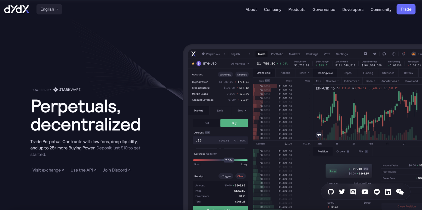
Dydx’s Homepage, ft. difficult lingo like “Perpetual Contracts”, “Deep liquidity”, “Buying Power’.

Dydx’s About page, which is weirdly more easier to understand than their home page…
- Showing enough without overwhelming. As the user experiences the dApp, education should be weaved into their whole experience in nuggets so that they’re not overwhelmed and instead feel guided. As they learn more about blockchain, progressively increase their exposure to blockchain mechanisms. Other ways of not overwhelming can include segregating into two levels for basic users and more advanced users. A great example of communicating value is Diem’s website (formerly Libra, and backed by Facebook), which provides users with 3 levels of knowledge through their cards. The first level shows headings, the second level upon hover shows more information, and the third level lets users ‘read more’ and takes them to a page with more details. Many de-fi dApps also have noob/advanced settings for users to toggle between.

Diem’s homepage (who also has *chefs kiss* content copy)

Sushi Swap offers an expert Mode
- Communicate using value, not technical how-to. The classic ‘show don’t tell’. Don’t go too deep in the roots of how the technicalities of blockchain work, instead communicate what value it’ll bring. For example, don’t talk about how great Layer 2 is on your homepage, instead emphasise faster transactions and lower fees. A great example of communicating value is Audius, they communicate the value of a free streaming service in such a simple manner it almost feels like a normal website.
- Presenting actionable routes/next steps. For users unfamiliar with the space, actionable routes are key in helping them guide them to the next steps. Peter Ramsey describes them as routes that are ‘common’ and ‘commonly preferable’. For example, watching a Netflix episode one actionable route they display is to watch the next episode, whilst another is to watch another series. An example of this not done well is in POAP, a dApp that allows you to bookmark events in your life in digital mementos. However, there are no actionable routes on the home page that tell the user how to get started. I’m left wondering how I even attend an event in the first place — is there a place to browse for them? This inability to do anything is confounded when I press ‘click here’ to mint a POAP (which I know I don’t have yet), but I’m not given any route to let me progress if I wanted to get started.

Source: POAP app
Establishing trust through transparency
The importance of this lies partially because of the newness of the tech, but also because trust and transparency are key characteristics of blockchain since it’s decentralised. Expectations should be managed by communicating capabilities clearly to users.
Being clear about security
Often words like ‘decentralisation’ and ‘open-source’ can instill a sense of false security into users that blockchain is impenetrable. However, the level of security behind dApps lies in the strength of its blockchain code, and the 2016 DAO hack on Ethereum proved that hacks can in fact happen. Tell users about security measures taken e.g. if your smart contracts have been audited, as this helps instils trust in the protocol. Allow technical users to delve deeper into docs. that outline security measures and fallbacks, but make it easy for the average user to understand just how secure it is without relying on your word for it.

Source: 1inch
Transparency of transactions
Particularly for De-Fi dApps that host many transactions, all relevant information regarding transactions should be available for users. For design this includes:
- Showing the breakdown of the transaction. Giving users the ability to see all fees affiliated with the transaction. The level of detail to initially show depends on a number of considerations, but giving users the ability to at least expand details via good affordance, and helping them understand the transaction is important. Common good design principle aside, it helps users with understanding more about the technology especially when aided with explanations

Examples of different transactions being broken down
- Showing pending and confirmed transactions. As dApps require you to first connect through a wallet (e.g. MetaMask/Trust Wallet/Coinbase) before instigating transactions, ensure that the state of a successfully completed transaction is reflected in the actual dApp itself and not just through the wallet. If wait times apply for transactions, make this clear to users and manage expectations of wait times through constant feedback.
- Showing the value in FIAT currency. As ‘normal’ money currently is still being considered in fiat currencies like the US dollar, help users understand the value of components in the transfer by displaying USD (or whatever currency).

“(~$43.85)” displayed as the fiat currency value (probably USD, but not sure). Souce: 1inch
- Visibility of gas fees and time implications. Many dApps incur fees, and those building on Ethereum’s blockchain will most likely come across gas price to transact. Visibility of these fees along with clarification of technical lingo will be especially useful for new users to the scene. For gas prices (aka the price of computation for the transaction) specifically, since a range exists, help users understand the implications of choosing different gas routes using easy language.

Example of gas fee ranges with time and fee implications. Another improvement includes showing the fiat currency. Source: Trust Wallet Community
No take backsies
A big part of blockchain is the immutability and self-governing aspect. From transactions to sign-ins, certain steps during user tasks need to be called out if it’s irreversible or outside the control of the dApp (since it’s decentralised). Benefits of this include 1) helping support education as the repeated emphasis on irreversibility helps people develop their mental mode in the blockchain space, and 2) generally being ethical, especially where livelihoods can be impacted or changed instantly through accidental taps and swipes (on that note, use interactions and gestures that are less prone to mistakes, e.g. swiping/sliding instead of tapping for a transaction to go through)
- Account recovery. Due to the centralisation of platforms in web 2.0, a lot of us are familiar with recovering lost passwords and accounts. However, in web 3.0, put simply, you’re kinda screwed if you lose your security keys. Emphasise this to users multiple times when they’re first ‘onboarding’ with you. A great example is the wallet creation process with MEWwallet. During multiple stages of the journey, they use a combination of colours, bolding, appropriate copy, pop-ups, micro texts during the task flow to communicate to users consequences and helpful suggestions.
In web 3, data interoperability is a big thing. This means that users’ data and assets go with them where ever they go — users can hop across different products with one portable ‘username’ (aka their recovery phase or .eth address). Helping users keep their recovery phase secure means enabling them with the keys to their kingdoms (quite literally). For example, if users know their recovery phase for MetaMask, and they decide to switch to another wallet, as long as they have that phrase they can import their assets across seamlessly. Due to the interoperability-ness of this new world, UX is going to help play a key differentiator between dApps because no one has time for shit designs anymore. This Twitter thread explores this more in-depth.
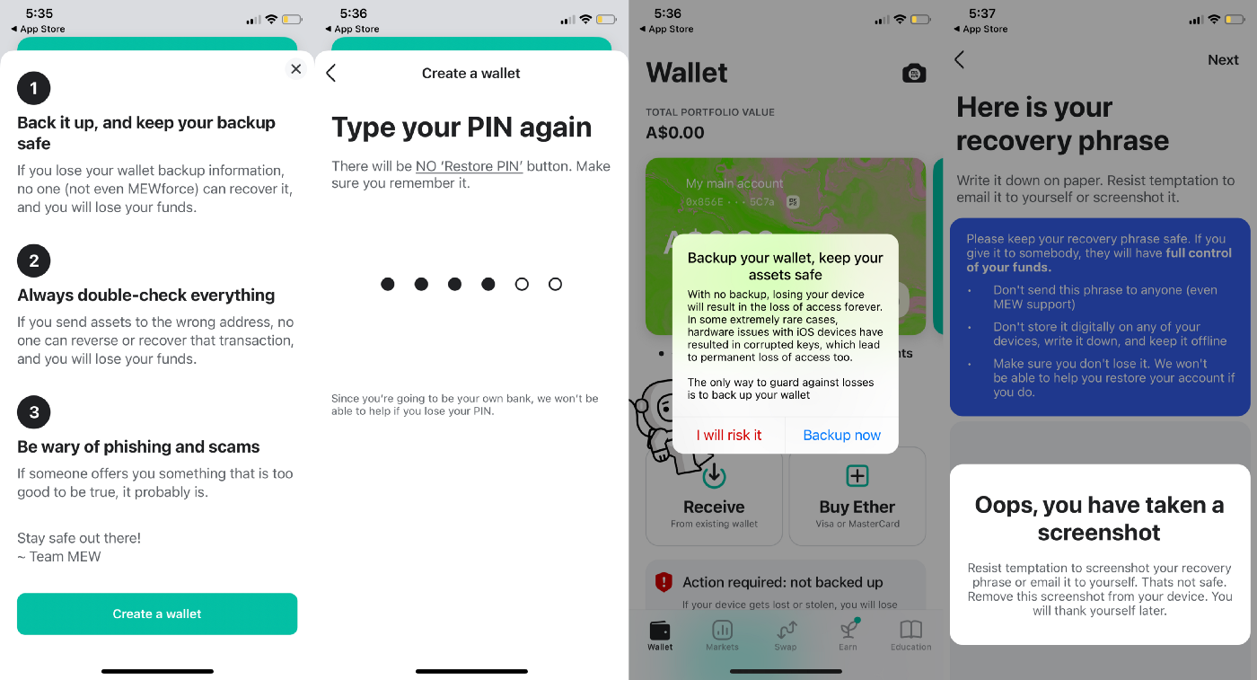
Source: MEW Wallet
- Prevent possible errors, educate on consequences. As users are familiarising themselves with the space, catch them before they fall by alerting them to the implications of risky moves. Display what step users are on in the overall flow so that they’re able to navigate back and know how close they are to ‘finishing’ a task.

Source: Metamask
- Irreversible transactions. Once transactions are confirmed on the blockchain, they’re designed to be irreversible. While there’s a whole process that users can possibly do on ETH to reverse a pending transaction, design elements alert users to the permanency of the transaction through colours, warnings and appropriate copy. Employ double confirmations or more steps for ‘larger’ transactions.
(Note: Well well well, as I’m typing and researching this topic I just came across ReverseCoin, apparently the first coin that lets users reverse transactions. Haven’t read about it properly yet but for anyone interested)

Afterthoughts, and the future
There’s a lot left to be discussed around user experience problems for the blockchain itself that is more backend based -security and performance issues to name a few-, but which also affects user experience. Many innovative companies are trying to solve them right now, as poor user experience can easily be a deterrent for many entering the space. (One of my favourites right now are the guys over at Immutable)
As designers, just like it’s incredibly useful in web 2.0 to understand the problems and limitations that our developers face when developing backend and frontend, it’s even more important in web 3.0 to understand the mechanics of blockchain. Doing so helps us empathise and foster communication with developers, and averting the need to rely on them to tell us what’s possible and design based on that. Communication is half the battle in design, and being able to speak the same language as the stakeholders around us means design doesn’t come as an afterthought.
You might’ve noticed that there’s actually a lot of 2.0 design patterns in the following — which is good news. As people become more familiar with the tech, just like how people became more familiar with web 2.0 capabilities, design slowly matured from text hyperlink dominant pages to the sleek pages we have now. I assume web 3.0 will go through the same phase as it makes its way into mass adoption.

*tries to measure time on task*
As for where it’s all headed now? 2021s been a rollercoaster for web 3.0 and this article I feel like barely even scratches the surface of it all. Whether this is a phase or not, the possibilities of blockchain have us questioning legacy ways of doing things and to me, well, that’s always a good thing.
Extra resources:
- Web 3 Design resources:
✨Deep Work Studio✨
Giving this first place and a shout out as Deep Work Studio is a literal goldmine of web3 related design case studies giving you full in-depth access to their facilitation sessions, UI links and research reports. I did a lot of analysis on their current case studies reviewing their themes to understand considerations for dApps.
Deep Work Studio
Deep Work Studio - Create high-end design in as little as 7 days.
deepwork.studio
Beltran — Web3 Design Principles
A literal bible and deeper look into the nitty grittys around web3 design (long but worth it read!)
Sarah Mills — Blockchain Design Principles
Also a really great read from IBM designers who’ve worked on blockchain projects
ConsenSys Media — Design Tab
The company behind MetaMask, this sections dedicated to designing on blockchain.
2. Blockchain in general
MIT Introduction to Blockchain Course
Gary Gensler is probably one of the best (if not, the best) lecturers I’ve come across. Would recommend watching all, but if not then at least finish lecture 11 on Blockchain Economics
3Blue1Brown — But how does bitcoin actually work
A great comprehensive 11-minute video that’s really easy to understand. One of the best breakdowns I’ve seen.
Crypto Congress 2020
A lot of different viewpoints from key players in the crypto world explaining it to congress that aren’t so well versed in the space.
3. Plugging a dApp I’ve really liked so far (it’s a wallet fyi)
Rainbow
Rainbow is a fun, simple, and secure Ethereum wallet that makes managing your assets a joy.
What's Your Reaction?







![[VIP] DesignCode: Build Beautiful Apps with GPT-4 and Midjourney](https://design.rip/uploads/cover/blog/designcode-gpt4.webp)
![[VIP] AppCoda: Mastering SwiftUI - Professional Packet (Updated 04.2023)](https://design.rip/uploads/cover/blog/appcoda-mastering-swiftui-professional-packet-worth.webp)
![[VIP] AppCoda: Beginning iOS Programming with Swift (Updated 04.2023)](https://design.rip/uploads/cover/blog/appcoda-beginning-ios-programming-with-swift.webp)
![[VIP] Whoooa! 156 vector Lottie animations](https://design.rip/uploads/cover/blog/whoooa-156-vector-animations.webp)


![[VIP] Motion Sound Vol. 1](https://design.rip/uploads/cover/blog/designrip-svx.webp)

