Claymorphism in user interfaces
There is a new design trend emerging and this time it’s also stepping outside of the UI world and into the art space.

There is a new design trend emerging and this time it’s also stepping outside of the UI world and into the art space.
Hello, Claymorphism!
We’ll get to the defining traits and features of this style in a minute. Before we do, we need to address the Neumorphic elephant in the room.

Depth reimagined. Again.
Let me start with the obvious. For reasons I stated in the very first article, Neumorphism didn’t really take off. I don’t think the biggest issue with it was accessibility, as it could be made accessible with a few tweaks. No, the bigger issue was that it was simply visually boring in most of the examples. To achieve a level of fidelity that would compensate for that, it would require a lot of artistic skills and almost impossible front-end capabilities.

It had a group of very strong supporters in the dev community, and some products were actually built using that style — for better or for worse.
However, designers were increasingly becoming bored with the typical flat-layered designs of most products. It seems like people wanted more depth, even if fake, but not necessarily done in the way neumorphism tried it.
Some real products were actually built using the Neumorphic style.
Neumorphism 2.0?
Since the early days of flat displays, we tried to simulate depth on them. That high-level skeuomorphic approach helps us better process what we’re looking at, while also being more friendly, organic and simply human.

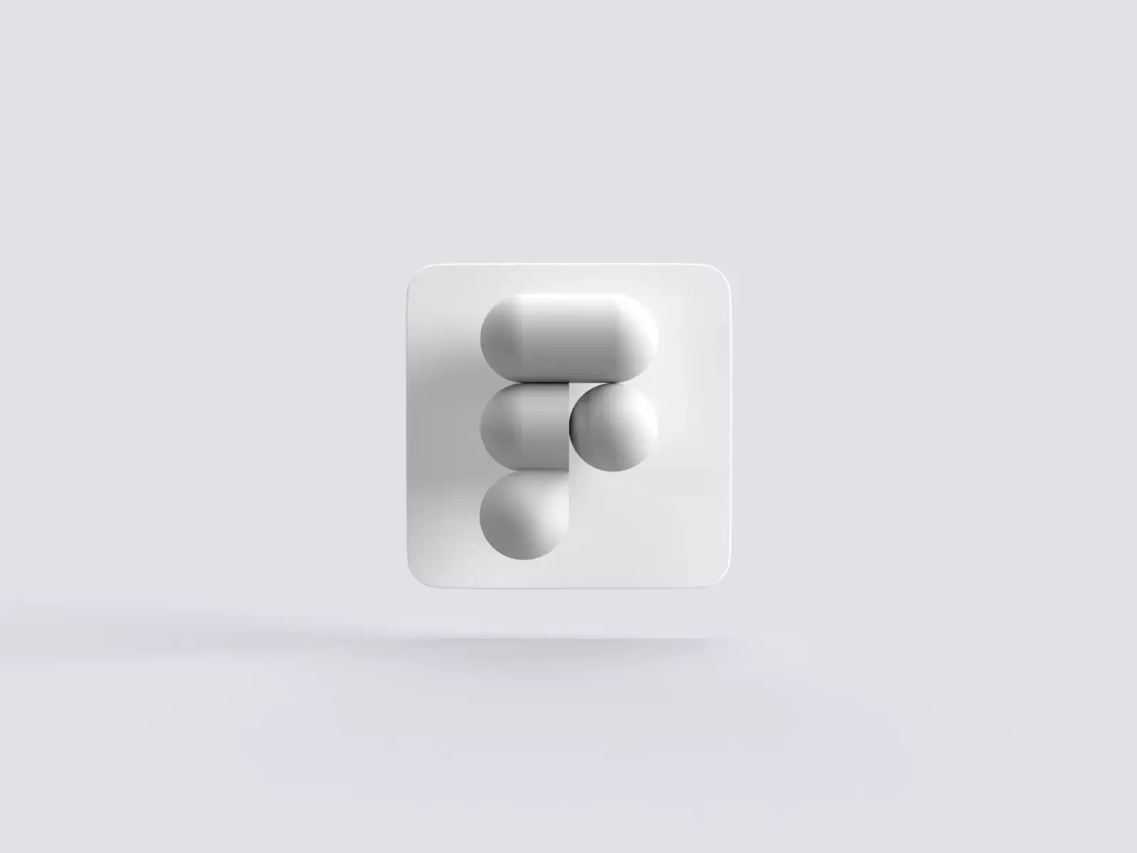
Fluffy, friendly, 3d
With the advent of metaverses and rising popularity of NFT’s the 3D scene exploded. Tools like Spline also democratised the landscape the way Sketch did when all designers worked in Photoshop.
3D became hip and trendy as an art style.
But one particular style of 3D seems to be gaining popularity, often mixed with otherwise minimal designs. I call it „fluffy 3d” and the first time I noticed it go mainstream was when the startup Pitch used it as their cute key visuals. Since then Amrit Pal Singh, Sam Briskar, the team at Icons8 and others explored this style pushing it further through artwork, UI assets and iconography.

NFT
This particular style got so beloved by people all over the world, that it spawned a whole other, artistic endavour in the NFT space. Both Amrit’s friendly faces, and many other art styles got transformed into fluffy 3d and generated millions of dollars in revenue for the artists.
People seem to love these characters.
A perfect match
Fluffy 3d fit quite well in the otherwise minimalist design world, but one by one those flat surfaces began to inflate a little to match the style of the graphics.

Inflating 3d shapes
The best way to think about is, if you simply inflated your neumorphic shapes. Instead of mostly flat surfaces with a little concave, they are now 3d dome-like structures — very round, very three-dimensional and soft.
In one of my larger UI studies back in 2015 we actually tested a „fluffy 3d” button against other option, and it anihiliated the competition among the general population. Only in the tech-savvy group it wasn’t the main preference.

The friendliness of those shapes, along with the 3d imagery creates a slightly child-like interface. To counter it, it’s good to use minimal typography, strong accent colors good contrast.
It’s not really possible to achieve in CSS just yet, but some clever developers are already working on modifiable SVG’s so it’s only a matter of time when it can get coded.
We created a simple CSS generator you can use right now to get the inner shadows right.

How to achieve the effect?
Similarly to Neumorphism, Claymorphism is also a combination of inner and outer shadows. However, the depth against the background is only done using one larger shadow — often also moved along the X axis a little which breaks most of the conventional UI shadow rules.

The whole effect is achieved using two inner shadows that give it that clay-like, 3d look. The top-left inner shadow has to be slightly lighter, while the bottom-right inner shadow has to be a little bit darker.

That gives us a lot more flexibility with styling and allows use on various background types.
Shapes.
It always starts with a rectangle or a square. Then the next step is rounding the corners, usually beyond 50% roundness possible for the size of our rectangle.

Then we use the path tool to add additional points exactly in the middle of each side of the rectangle, switch them to mirror-style handles and drag them outwards. As an example, the top point will go to the top, bending the top edge and making it slightly curved.
If your edge is forming a sharp corner with two straight lines, you must switch it to the mirror option and drag the handles out to both sides.

Light or Dark?
Claymorphism also works in dark mode, but only when the shape itself isn’t completely black. As with neumorphism, we need to be able to see the inner shadows against the background for the effect to work.
Merging trends
As Glassmorphism has become one of the cornerstones of modern UI design, it can be merged with Claymorphism too, for interesting results. Adding a delicate inner-shadow to a fluffy glassmorphic pane works, and can look interesting and fresh when done right.

VR/AR
Both virtual, and augmented reality are likely here to stay. Whether it’s the rumored Apple glasses, or Facebook’s Metaverse — there will be more interfaces right before our eyes.
The benefit of Claymorphism is that it’s tangible. The fake 3d effect allows for much faster processing of panels and buttons by our brains. A scenario that’s perfect for all kinds of realities, both augmented and virtual.

Of course, with real 3d, the effect won’t have to be simulated, as panels could simply be real, 3d objects.
Conclusion
Claymorphic 3d has been on our radar for a while with growing popularity of both easier to use 3d tools, and a possible mindset shift among the population.
With a rather gloomy worldwide situation, we may want to relieve our childhood moments, where everything was a little fluffy and inflated. Maybe after so many meetings, workshops and discussions we don’t want our interfaces to be as serious as they used to be.

Utilitarian minimalism has its uses, but it seems like the consumers want their interfaces to be friendly.
What's Your Reaction?


![[VIP] DesignCode: Build Beautiful Apps with GPT-4 and Midjourney](https://design.rip/uploads/cover/blog/designcode-gpt4.webp)
![[VIP] AppCoda: Mastering SwiftUI - Professional Packet (Updated 04.2023)](https://design.rip/uploads/cover/blog/appcoda-mastering-swiftui-professional-packet-worth.webp)
![[VIP] AppCoda: Beginning iOS Programming with Swift (Updated 04.2023)](https://design.rip/uploads/cover/blog/appcoda-beginning-ios-programming-with-swift.webp)
![[VIP] Whoooa! 156 vector Lottie animations](https://design.rip/uploads/cover/blog/whoooa-156-vector-animations.webp)


![[VIP] Motion Sound Vol. 1](https://design.rip/uploads/cover/blog/designrip-svx.webp)


