2022 UI design trends guide
Minimalism, Claymorphism, Brutalism and a look into the future of NFT, VR and Metaverse. 2021 was an exciting year for designers — the introduction of Metaverse caused quite a disruption in the industry.
2021 was an exciting year for designers — the introduction of Metaverse caused quite a disruption in the industry. Many assumptions from the 2021 article has become more than just a trend — and many of them evolved into something completely new.
Let’s see what 2022 will bring to a designers’ table!
1. Minimalism and simplification

Left to right: Revolut, Meta/Oculus, MoRas ✪, AR Shakir, Clari
Take a look at the most well-known, leading tech companies and you can spot a strong preference for simple, informative, minimal interfaces (Revolut, Meta, Oculus etc.) Year by year, this trend is getting bigger and bigger and more brands are starting to use it.
2. Brutalism (and return of the flat)

From left to right: Gumroad.com, Figma.com, Spotify Wrapped, Michal Skvarenina, Tomasz Mazurczak
Another trend from 2021 is on the rise. Brutalism seems to be a counter trend for all the designs that are full of gradients, shadows and smiling 3d characters.
Brutalism embraces flat design, strong outlines, contrasting colors, bold typography and real/life photography. However, this new iteration of Brutalism forgoes one of its main defining factors — the seemingly absent grid. Currently, it uses all of the other traits, but conforms to a more standard layout, often seen in other design styles.
As much as I’ not a fan of it (those designs are often very inaccessible) brutalism definitely has its 5 minutes of fame now.
One of the most recent examples of brutalism is this year’s Spotify Wrapped. Some of those designs are definitely hard to forget.
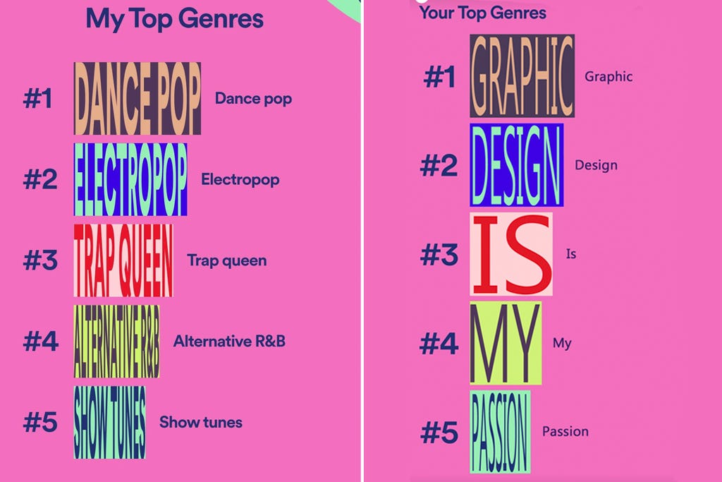
“Graphic design is my passion”
3. Glassmorphism and glass inspired elements

From left to right: iOS “Hello” welcome screen, M Wildan Cahya Syarief, Heydar Hasanov, Gleb Kuznetsov✈
Glassmorphism is everywhere – that’s a fact. There’s a background blur, semi transparent objects like cards, „watercolor”, glass-looking spheres and more. From native elements in Mac OS Big Sur and Windows 11, to applications, glass inspired effect is here to stay.
4. Aurora backgrounds

Left to right: Afterglow, Emy Lascan, Daniel Sun, Lukas Horak, Layo
You probably remember this trend from the previous year – it became very popular and even got a proper name – Aurora backgrounds.
Subtle, colorful, blurred splashes of color look very friendly and organic – and definitely more visually attractive. Those splashes can be used as an entire background or just an emphasis under some important UI elements.
5. Holographic/Neon

From left to right: Meta (Facebook) Horizon Worlds trailer, Fauzi Akmal, Baten, Vasjen Katro, Virtual desktop by Cosmin Capitanu
This cyber holo/neon trend seems to fit well into the era of Metaverse, VR and hologram interfaces. Designers are getting inspired by all the new possibilities that the virtual worlds have to offer. Vibrant, glowing colors, abstract, round shapes, hologram-looking textures, are typical for this trend.
It’s also widely used in a lot of the crypto-space, as a way to show how futuristic those interfaces are.
6. Eco-conscious “cardboard” style

Left to right: Halo Mobile, Vladimir Gruev, WeTransfer, Afterglow
We, as consumers, are getting more and more eco-conscious every year. Most of us are willing to choose eco-friendly solutions on everyday basis. It looks like you can incorporate that “eco” look and feel into digital products.
I’m seeing more and more brands catching up with this trend that reminds me of “cardboard and spray” — backgrounds are usually greyish to resemble a recyclable cardboard. Typography is minimal in style. Contrast is high. Colors are quite strict and seem “dimmed”. No cute 3D objects this time — this style embraces real life photography, real life textures and doodles.
7. Wild typography

Left to right: Tran Mau Tri Tam ✪, Rron Berisha, Layo, Tomasz Mazurczak, Imran Molla
Typography rules were far more strict 10 years ago, back when I was starting my product designer career. Right now, it seems that you can do whatever you want with your headers and paragraphs — it’s completely up to you and your imagination. Mix fonts with shapes, photos and emojis, put a texture on it, choose a font that is very sophisticated in its form — and experiment with the grid as you like.
It can result into an intriguing, eye-catching effect, but it can also be completely unreadable and irritating — I would still recommend to keep user’s comfort in mind and in the first place when designing.
8. Claymorphism 3D

Left to right: Aneesh, Amrit Pal Singh’s Toy Faces, Nathan Riley, Hype4.com, Reijo Palmiste
3D is evolving into a more simplified version of what we already saw. The newest, trending style in 3D illustration and 3D UI elements is claymorphism (read Michals article about it). The 3D objects resemble an object made from clay (simple in shape, cylindrical/oval, with both inner and outer shadows to create depth, but in a different, more fluffy 3d way than it was done in neumorphism.
9. NFT’s and democratisation of art

Left to right: Gal Shir, Asal Design, WantLine, Anatoliy, Outcrowd
You may understand it or not, but NFT’s are probably the biggest internet craze right know.
NFT’s have given almost everyone a new possibility of earning money – if you can create something visual online, you can simply sell it as a piece of art. „Democratization of art” means that absolutely everyone can sell their work online and that almost everything can be identified as an art (from pixel kangaroos to 3D avatars). This also means, that you could hypothetically sell your Dribbble shots. And more.
10. A glimpse into VR and Metaverse

From left to right: Joël Dos Santos, Volodymyr Kurbatov, tubik, Roman Klčo, Huy Kieu ✪
Virtual reality has gone from bulky, uncomfortable and low-fidelity headsets and more into the mainstream with the new devices from Meta and a wide range of apps coming to the platform.
While the idea for the Metaverse itself is a more romantic, Web3 based concept, in reality it will likely be the big players who will control that entire cake, through more Web 2 style means.
The Apple Glasses are still unannounced, but it seems like a style for both VR and AR emerges, with gesture based window control, eye-tracking and holographic, 3d shapes.
While the headsets still need to catch-up on processing power, most of the visuals are purposefully presented as easier to render, lower polygon representations, giving them a bit of a claymorphic look.
What's Your Reaction?




![[VIP] DesignCode: Build Beautiful Apps with GPT-4 and Midjourney](https://design.rip/uploads/cover/blog/designcode-gpt4.webp)
![[VIP] AppCoda: Mastering SwiftUI - Professional Packet (Updated 04.2023)](https://design.rip/uploads/cover/blog/appcoda-mastering-swiftui-professional-packet-worth.webp)
![[VIP] AppCoda: Beginning iOS Programming with Swift (Updated 04.2023)](https://design.rip/uploads/cover/blog/appcoda-beginning-ios-programming-with-swift.webp)
![[VIP] Whoooa! 156 vector Lottie animations](https://design.rip/uploads/cover/blog/whoooa-156-vector-animations.webp)


