11 steps to keep Figma clean
We all probably already know how it is to receive a project from someone else. Not everyone works the same way, it’s what makes our field so varied. We need to spend some time focusing on adapting. In this article, I will go over 11 steps that may help you and your teammates in organizing your work in Figma.
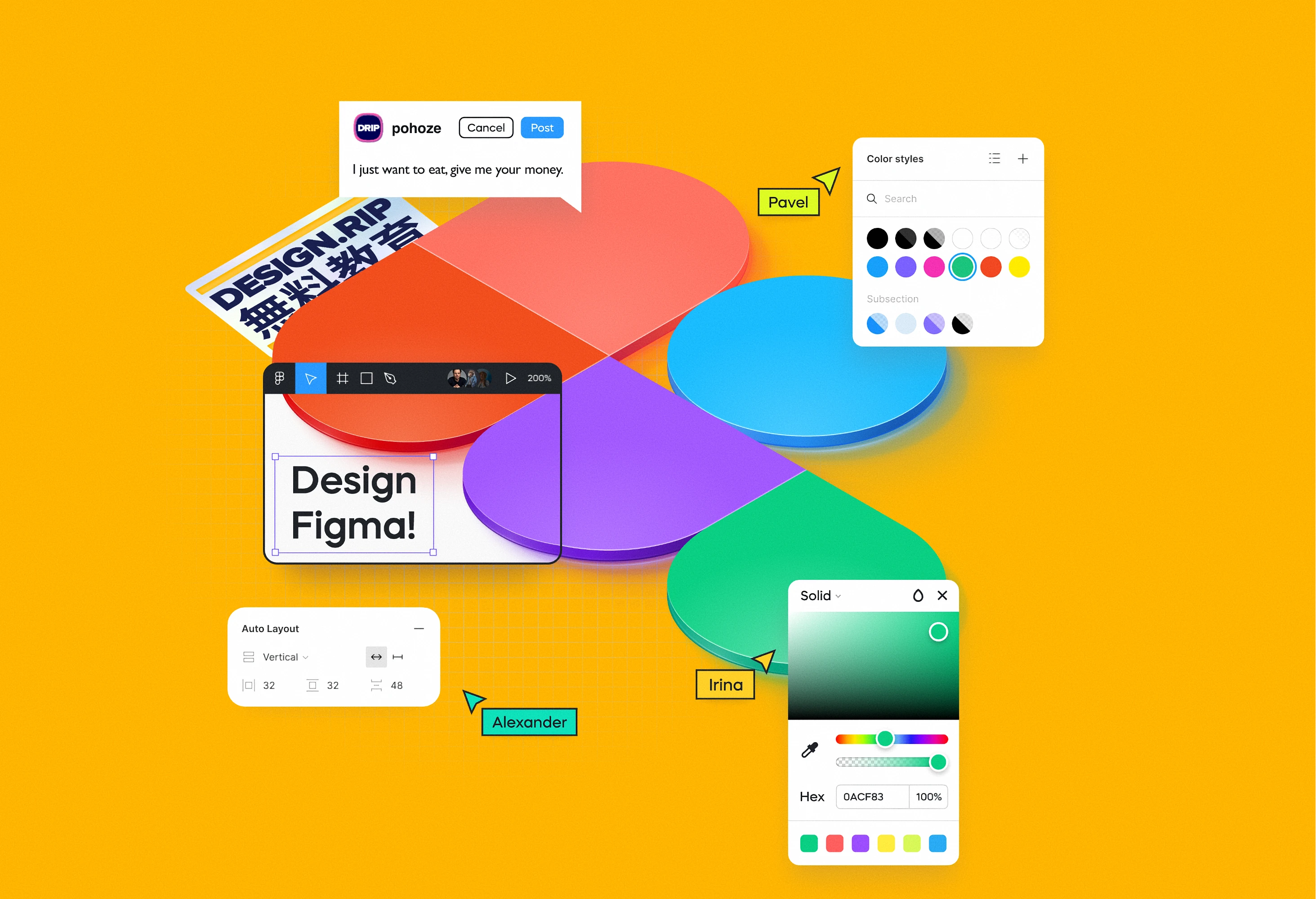

We all probably already know how it is to receive a project from someone else. Not everyone works the same way, it’s what makes our field so varied. We need to spend some time focusing on adapting.
In this article, I will go over 11 steps that may help you and your teammates in organizing your work in Figma.
···
1. Figma variants

Let’s start with a simple one. Figma variants let you create different variants that you may later use. For example a button. We may have different states of a button - primary, secondary with an icon or without an icon.
All of these options can be nested within variants of one component in Figma. Remember to do it each time you see a new variant and also remember to add auto-layout. It will greatly accelerate your work.
···
2. Thumbnails / Cover Photos

All projects scale at some point. Having a clear cover photo will help you organize your projects within a team. I like to organize projects into design sprints, phases or code names for products. Project covers will help you find what you need at first sight when entering a team space in Figma.
Plugins that may help you:
- Use Better File Thumbnails or
- Cover Status to quickly generate thumbnails
···
3. Auto-layout

Auto-layout gives you access to design responsive layouts without actually designing them. It works like magic and is really close to how real websites are made.
To create auto-layout you first need to have at least two elements in one group and then you can activate this option. After that, you are able to edit paddings and space between objects inside the group. And then you can simply resize the group of elements which could be in a form of a card and that will break down the text. It may be essential if you are working on a system that is used by many different devices from tiny screens of a smartwatch up to huge TV screens.
Check:
···
4. Process description and screen flow

Screen flow gives everyone involved in the project, a sense of direction. We can simply check the screen flow for a specific use case to know what the user path looks like. I like to create simple paths and keep them horizontal so one path = one horizontal line with key screens.
Each paths may start from a short note or even a presentation where we describe the idea and main goal. This will help you and the whole team know where you are and understand the whole flow, especially in major projects.
Check:
···
5. Proper naming for the artboards

I have my own naming conventions but I always suggest first asking the rest of the team what would be the best and most understandable way of naming them. I usually start with a basic name of the artboard connected to the task I have. The template is as follows
[Screen_Title] - [User Role] - [State of a screen]
example:
“Insights-Admin-edit”
Nothing creative but it shouldn’t be — we are trying to do work here — don’t be lazy!
···
6. Name your pages!

Each project in Figma consists of different pages. You can use pages to divide your project into sections. I assure you that will help everyone in the project.
Example:
- Final Designs
- Prototyp
- Moodboards
- UX Mockups
- Ice box (archive)
···
7. UX Specification for developers

Specification and documents are something that almost no one likes in a Designer’s world but it’s something that may really change the course of a project.
For me, UX documentation is a wireframe with notes that describes what each functional element on a mockup do and how it works. UX documentation also gives context to the product’s lifespan from the initial concept to the current iteration. UX documentation can’t be a forgotten document somewhere in your cabinet.
I’ve seen projects without documentation or with documentation miles long, that no one wanted to read. My best approach was to write descriptive comments right on the artboards in Figma.
Check:
- Documenting Your File: Spec Cards
- Annotation Kit
- [Orbit Design System] Design annotations & helpe..
- Screen Annotations
Worth reading:
···
8. Link between projects and pages

Prototypes may be one of the most important parts of UX designer work. Most people struggle to create usable prototypes because they try to create one huge prototype on one page. Instead of doing that you can link components between different prototypes and projects using the ‘open link’ functionality in Figma. It's not perfect but it works.
Try to divide pages into bigger parts because using this tweak will cause a screen to load again.
···
9. Notes on team

Figma gives us the possibility to create a team and then place a short comment on it. I personally love to use it since working as a freelancer and in an agency which is connected to working in various teams. In this description I like to put:
- Important links,
- Important roles in the team
- Additional information that may help other people like timezone or the language we use to communicate in the project.
···
10. Divide your projects

We usually work at the same pace with developers — like sprints or phases. It can really help to have one ‘Main Project’ and then divide the rest of the projects into sprints to be sure we clearly see the history of our work.
···
11. Create a pitch deck

As UX Designers we tend to focus on end-users but we should remember who will first see our designs — usually, it’s someone from a business unit. I found out that the best way to speed up communication is to create a pitch deck that you or your colleagues will present to the stakeholders. You can use Figma or a typical tool like Keynote or PowerPoint but for me, the best mix is to use Figma with Pitchdeck presentation studio — a plugin that helps you convert artboards into Keynote or PowerPoint presentation format if needed.
Plugins that may help you:
- Use Pitchdeck presentation studio to export presentation slides.
- Use Animated Presentation by Rachel How as a presentation template.
At the very end, I just have to put Alber Einstein famous quote:
“Genius is making complex ideas simple, not making simple ideas complex.”
I hope that all of us, thanks to those rules or your own rules, will keep our Figma projects and amazing ideas, a bit simpler to understand not only for end-users but also for your colleagues :)
What's Your Reaction?








![[VIP] DesignCode: Build Beautiful Apps with GPT-4 and Midjourney](https://design.rip/uploads/cover/blog/designcode-gpt4.webp)
![[VIP] AppCoda: Mastering SwiftUI - Professional Packet (Updated 04.2023)](https://design.rip/uploads/cover/blog/appcoda-mastering-swiftui-professional-packet-worth.webp)
![[VIP] AppCoda: Beginning iOS Programming with Swift (Updated 04.2023)](https://design.rip/uploads/cover/blog/appcoda-beginning-ios-programming-with-swift.webp)
![[VIP] Whoooa! 156 vector Lottie animations](https://design.rip/uploads/cover/blog/whoooa-156-vector-animations.webp)


