UI/UX Design Trends Of 2022 You Need To Сatch Up To
Was 2021 better than 2020? Yes — if we’re talking about UI and UX design. New amazing websites and apps were created, new software for graphic designers was released, creativity seemed to flow fountain-like.
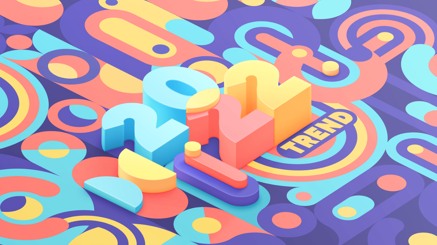
Was 2021 better than 2020? Yes — if we’re talking about UI and UX design. New amazing websites and apps were created, new software for graphic designers was released, creativity seemed to flow fountain-like.
When designers are forced to sit at home, they create more and have time to reflect on what already exists. Boredom is the worst enemy of an artist, and they will go miles to break the ennui.
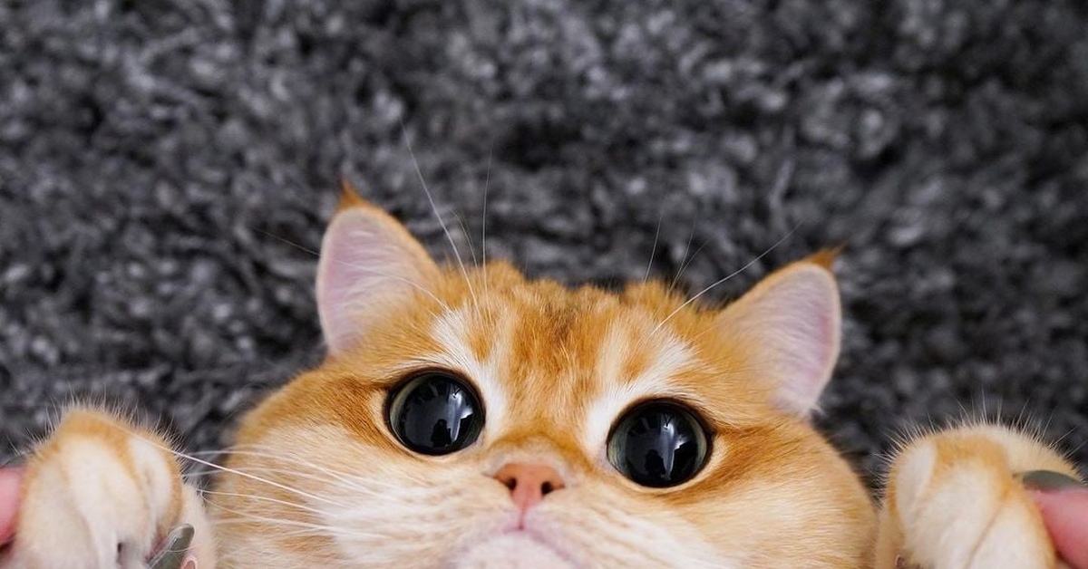
For the rest of the world, 2021 was quite difficult. The oldest living cat in the world celebrated its 34th birthday. Hmm, yes, that’s probably the only good thing that happened. By the way, you’ll find this cat’s cutest little face at the end of this article.
 Undying meme by kc green, illustrating the last couple of years
And what of UX/UI design trends for 2022? Looking at how things are now, we can already predict most of the forthcoming tendencies in design, like we did (pretty accurately, mind you) for 2021. This year’s trends will stay for the next too, of course. If you want to get more acquainted with them, we recommend our story from last year. Also, don’t miss our post on top mobile UI trends for 2022.
In this article, discover:
- Why you’ll probably lose your job as a 3D designer if you don’t prepare for the craziest competition
- Ways in which artists can make difficult data entertaining even for unprepared viewers
- How many new leads you’ve missed because you don’t have your website design optimized for mobile device
- How scrollytelling will rule the world, and boost conversions in 2022 (if you don’t know what it is, see below)
Scrolling is dead. All hail scrollytelling
Scrolling is boring. If you want to grab attention, you need to implement scrollytelling.
 The NY Times was one of the first to use scrollytelling in their article “Snow Fall”
It’s a form of narrative that can be presented both on a page and in an app. Imagine making a website where with each scroll illustration, fonts, snippets of text and other elements begin to come to life. Of course, you’ll want to see the end of this story. The story that, like a video game, takes you through a maze of symbols. You can’t influence its course, but you feel like a participant in the events on screen.
Scrollytelling will be pretty much on every popular website you’ll see in 2022. Users are sick of pages stuffed with information they didn’t ask for.
Let’s say, you want to go to the gym. You find a local gym’s website. Click on it, and you’ll see slogans like “Get fit with us!” — exceedingly interesting and new, btw, — scroll down to find all of the team’s biography, fitness values, mission… This is so common, the users don’t even notice it anymore.
 I need to go over 4 screens to get to the relevant information — this sucks
Scrollytelling, on the other hand, is what makes users actually read. You can make them excited with dynamic texts, like Google. Their team knows how to make instructions look good:

Scrollytelling is activated when a user scrolls down, hence its name. No clicks, no hassle of choice, no pop-ups. It seems that you stay in one place, but by scrolling, the story on the screen unfolds. This requires not only designers to create cool visuals. You need to really think of a story that you want to tell: the plot, and the people you are telling it to. The best websites can’t be built in 2 days.
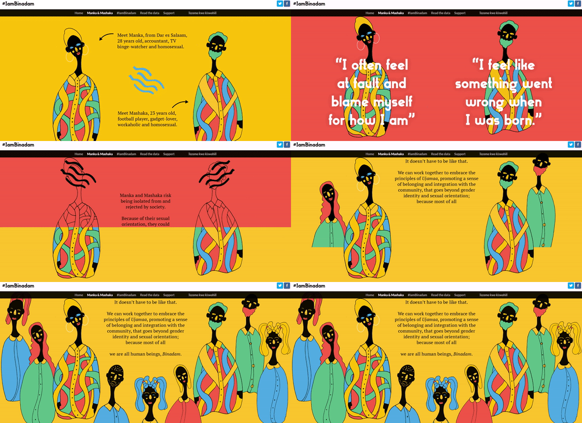 Amazing scrollytelling by IAmBinadam
Projects in the scrolling format usually require a lot of time and effort. The results are worth it, though. A page becomes “alive”. Something new happens every second, — so it’s much harder to get bored while reading.
And what about mobile applications? Pure, a dating app, created the story that I’d like to call “tappytelling” (it’s activated when you tap and open the app for the first time):

Scrollytelling was created for users, and they love it. They don’t need to go to any other pages to read the whole story. On the contrary, the entire narrative of web designing is thought out in advance and built in the most entertaining way possible.
Users love data. Make data lovable
“I’m a struggling actor, but if I’m asked by a stranger what I do
I usually end up telling a lie, because there’s too much to get through”
— “I’m an Accountant” by Rocky Paterra
How to make a decent corporate website in 2022? You don’t want to tell users that you are a “recognized leader in ___, one of the best in the field.” This standard advertisement expression doesn’t convey anything specific.
It is better to remove adjectives and show facts: how many branches you have, in which cities, who are your clients, and how you helped them. Abstract information is not reliable. Facts are. But if you have a lot of data you want to share, you need to make it not just simple, but also entartaining.

Stock market changes data made simple by Shakuro
Visualization of data helps to convey the right message in an engaging way. It’s also directly connected with scrollytelling. This is how IAmBinadam shows data:

Teams design websites to make information easier for readers to perceive by removing the complexity of datasets.
 Different levels of data in different sizes, so users know where to look first
A reader can quickly notice the conclusion to which the author is trying to lead with the help of the picture. And given the huge amount of data people consume these days, numbers that aren’t just scattered around in chaos make a difference.
 Some graphs don’t even look like graphs at first glance… This makes them even more dramatic
There is also a phenomenon called the COVID hangover. It’s a long-term effect of Covid on companies and their employees. According to the Office of National Statistics of the UK, in 2018 stress and anxiety scores averaged about 2.7/10. Since Covid happened the scores have increased to 4.0/10 and rarely went below that point. Also because of the pandemic, the workload has increased by 4 hours in the last 2 years.
People are too stressed and tired to look at complicated data. But artists know how to make pandemic less dramatic.
Designers also visualize data to keep people’s attention. Remember that complex information is usually ignored because readers are trying to save their time and are more likely to use the scroll button.
 Illustration by Mona Chalabi
Here are some options in which we recommend to represent data:
- Charts and graphs
- Illustrations (including illustrations with handwritten phrases)
- Static infographics
- Interactive infographics
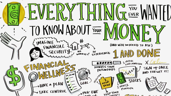
Illustration by Ink Factory
How to make infographics look good?
A great graph, or any other form of data visualization, should have a set of features that are described in Edward Tufte’s “Visual Display of Quantitative Information”. In his book, Tufte explains the 3 principles of genuine storytelling through charts.
1. The ratio of graphic elements that show data in comparison to the total number of elements on the graph should tend to be one. In simple terms, you should not get carried away with decorating charts. Delete. Unnecessary. Stuff. OK?
 Graph by Hootsuite
2. Use the maximum of the graph space. That is, you need to arrange data tightly, and compactly.
 Graph by Hootsuite
3. The concept of a lie factor: you need to portray data objectively. Don’t use hyperbolizing graphics, and give honest statistics. Visualization of data needs to look cool, but honesty is always the bigger priority.
Mobile apps overrated?
According to We Are Social, 5.22 billion people use mobile phones in 2021 — that is roughly 66% of the world’s population. Since January 2020, the number of unique mobile users has grown by 1.8% (93 million), while the total number of mobile connections has increased by 72 million (0.9%) and reached 8.02 billion by the beginning of 2021.

Lady Gaga prefers mobile phones to stationary ones
The number of social media users has increased by more than 13% over the past year. By the beginning of 2021, almost half a billion new users had registered on social networks. According to App Annie, Android users spend more than 4 hours a day on their phones. In 2020, the Android crowd spent more than 3.5 trillion hours surfing the web.
Impressive numbers, huh? It seems that in 2022 an app for your product will be the next must-have-thingy. Or is it? How to know if your business will really need an app next year? Well, you probably need to start accumulating a budget for it, if:
- Users visit your website from their mobile devices
This is important data that you should know about. The longer the client is with you, the more opportunities you have to engage them, learn about their habits, and give them what they want.
- You need to make your inner business processes more effective
If you want to increase the productivity of your employees, improve the workflow, or increase profits, make a mobile application that helps you manage business processes. Yes, your personal cool little inner app.
Nowadays, apps like these make it possible for businesses to perform more and more complex and varied tasks. Make repetitive daily operations and document management faster. Create algorithms that can help with complex decisions. Monitor how and what your personnel are doing.
- You want to implement some new features that are not available on the website
If you think that your app opens up new touchpoints with your audience and makes the user experience more successful, then it’s worth considering its development. Ask yourself what new business opportunities mobile apps can provide. E.g., with the pandemic around, many people turn to health and fitness apps to exercise at home:
BUT…
Applications are pretty much useless to agencies who deal in photos or interior design. Companies like these need portfolios, and it’s not very convenient to look at large pictures from mobile devices. Better invest in web development.
- Your competitors use mobile apps
It is important to understand what competitors are doing, whether they have mobile applications, what they can do, and whether they are really so useful to the buyer. Check out the statistics in the App Store and Google Play.
The number of downloads and reviews will tell you how customers are using competitors’ apps. If their services are really convenient and necessary, then you will be left behind without making an application with the same or better functionality.
- Repeat sales are your thing
An app helps to keep those who are used to buying from you. Have you decided to launch a promotion for regular customers? Send them a push notification with a call to action. Planning a Christmas Sale?
Give users a promo code with a discount. The more attractive the offer at the right time is, the higher the likelihood that a person will buy it.
 Taxi services companies have repeat sales, and definitely need an app
- You have a loyalty system
With an app you won’t need to spend money on design and production of physical cards, and clients won’t have to carry plastic with them. Integrate your loyalty program into the mobile app and share useful promotions, discounts, and bonuses electronically.
Mobile app or mobile-friendly browser version?
Developing mobile sites requires less work than creating mobile apps, which in turn can reduce the overall cost of promotion.
This is partly due to the emergence of responsive design, which allows you to adjust the site to the screen of the device on which it is opened. As for applications, they must be saved and written for many mobile platforms: Android, IOS, Windows, etc.
There is also one small trend that will stay in 2022. It’s that the apps have become more similar to each other. At the same time, they preserve some level of uniqueness.
Some designers think that “a front-end-driven web experience” is a great opportunity for 2022. We can only agree!
Mother of all 3D
We didn’t put it in the first place because the designer’s world went mental for 3D graphics and animation a long time ago.
 Cardi B rhymes with 3D
3D has been around for the last 4 years, and it’s not going anywhere soon. Moreover, we predict that 3D graphics will become more diverse, and inclusive.
Over the past few years, 3D art and animation have been featured in numerous UI design trends reviews from various media resources. This means more and more designers are integrating them into websites and landing pages.
3D certainly deserves to be one of the top trends and predictions for 2022, as realistic 3D shapes combined with movement are always striking when compared to classic animation.
Satellite landing page animation by Conzeptzilla
This is what we said in the article on top mobile UI trends of 2022 about 3D:
“It is technically easier to convey energy, texture, and meaning through 3D because it is closer to our perception than a flat picture. 3D illustrations are deeper, more informative, and more interactive.”
Many designers style 3D objects seamlessly “settled” in 2D space. It allows you to create more interesting compositions, but also serves as an excellent working approach with great potential.

Ukrainian government website imitates the Matrix with 3D hands
Here’s a tip from our team: before integrating heavy content such as 3D graphics, make sure your application is high-performance and loads all elements quickly.
The Metaverse Campaign
— Facebook, are you ready for school?
— Mom! I told you to call me Meta!!
The thing with Meta’s logo is that it’s neither 2D, nor 3D. Or is it both? It received quite a heavy critique because you can almost call it a stock picture — the logo’s that simple. It’s the Mobius strip and Schrodinger’s cat of the coming 2022.

 Variations of Meta’s logos in 3D
You should probably see the Reddit version of it, too.
Balenciaga x The Simpsons: 2D strikes back
Fashion house Balenciaga in collaboration with the creators of The Simpsons, presented a new episode of the animated series at Paris Fashion Week to show its new spring-summer 2022 collection:
In the episode, classic 2D Simpsons get some new details drawn in 3D. Of course, one of them is a dress. The episode got mixed critiques from fans of the series, but Balenciaga’s message was one of the strongest this year.
Animate or disappear
More and more companies are using animation on websites and in mobile applications to improve user immersion and their experience, to make content more interesting and fun.
 How much animation do you want? Yes.
Animation is an important web design trend for 2022. Next year, your product will most probably look unfinished and bland without it. The mixed style of animation is gaining more and more popularity: a combination of stop-motion and 3D, 2D and 3D animation. Designers do it to obtain unusual stylistic solutions, as well as to improve the quality of the final product.
In 2022, motion design will be an important and well-thought-out part of brand positioning in the market. Think of a new visual identity for a company — the animated identity.
As the number of professionals in this field grows, so do the opportunities to implement new ideas.
How to use web animation in 2022?
- To make a story
Animation can convey a certain message by creating an emotional connection between the interface and the user.

- To make loading entertaining
Customers wait for no one. Except when the loading screen is fun. Animation with percentages not only entertains the user, but also informs her or him how much time it will take to load a page. Don’t like percentages? Use a progress bar. Or whatever else you can come up with to show the passing of time.

- To captivate with cursor effects
The user looks exactly at the spot the cursor is positioned. Make her or him explore the website by adding smart interactive animations that react to this cursor. Such effects were insanely popular in the 2000s. As you know, fashion tends to repeat itself every 20 years.
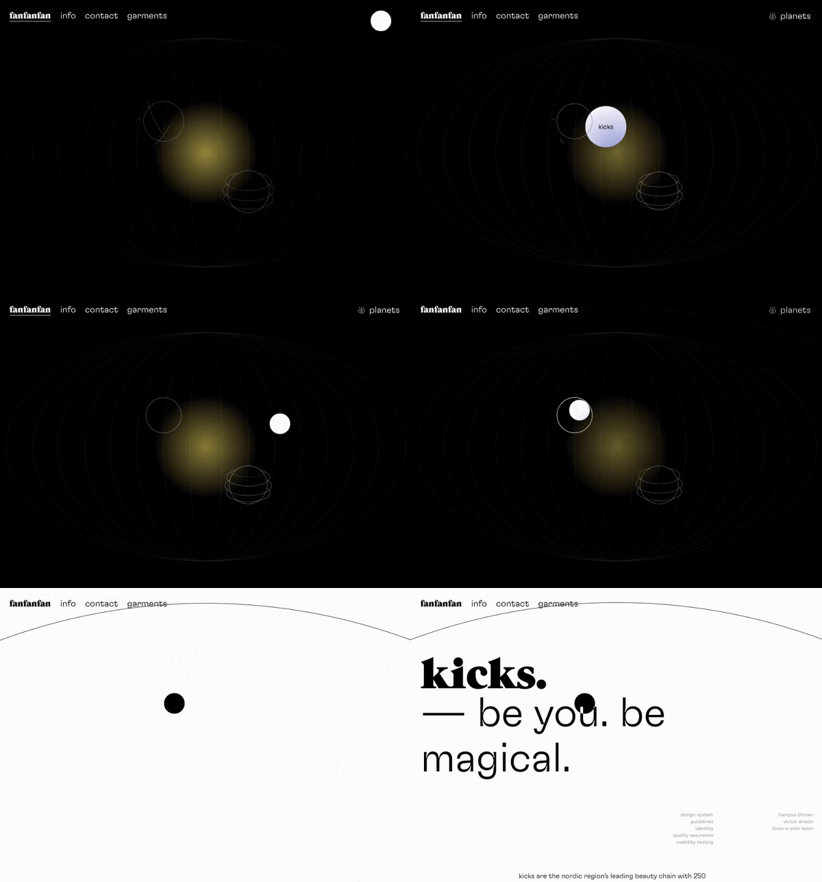
- To wreak havoc with kinetic typography
Have you ever thought of making letters dance?

Talking about letters… Did you know that there are Emmy Nominations for main title design in movies? Check out the amazing animation for The Queen’s Gambit main title (nominee for 2021):

Animated illustrations to add character
According to Statista, in 2020 the global animation market reached $270 billion. The trend is moving towards video, not static information. Global brands use animation both on social networks and to create commercials. The undoubted advantage of animated illustrations is that they are very flexible and diverse.
 BMW History of Horsepower animation
Such works are often used in 2 cases:
- For explainer videos
- As commercials
 Illustration by Creative X
The trend for animated explanations appeared a few years ago. Explainer videos clearly show where to click or what the company’s project is about. Ordinary videos can’t show things that don’t exist. In animation, on the contrary, everything you can imagine, you can draw.
In recruiting or commercial videos, users prefer to watch drawn characters rather than abstract shapes or items. Drawn characters can evoke friendship and compassion just as much as living people.
Microinteractions, macro influence
Microinteractions are small interface changes that help users navigate a website or an app. Usually, these are visual or sound effects that serve as prompts for the user: they show what happened, what action will lead to, what needs to be done next.
 Very cute hover effect by Awwwards
The devil is you-know-where. Animated interactions will breathe life into your design and help keep users engaged. Attention to every detail is a key aspect of a designer’s work, as attention to all elements in a design can lead to a positive user experience.
It is important to reach harmony in the elements, and not to scatter attention to all sides of the monitor. A significant part of microinteractions are the colors. They bring meaning to the elements of the interface. Better remind yourself how to use cold and warm color palettes before 2022.
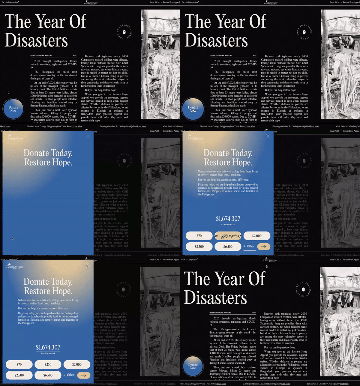 CTA animated
Microinteractions should help navigate pages or apps, explain their functionality, and effortlessly introduce new users to them. One of the most important aspects is to speed up and simplify previously lengthy procedures to achieve a specific action.
Interactions can improve UX through gamification. Showing the importance of some UX actions, the brand makes clear that it cares about how the reader will perceive information.
Animated logos
2022 won’t cancel out business cards, notebooks, pens, and booklets: animated logos don’t make sense for printed products. But online brands face new challenges and seek new solutions, one of which is animated logo design.
 Animated logo by Toridori
Are there any marketing advantages of animated logos? Yes, here is the list:
- They attract attention. This means they contribute to brand awareness.
- They help improve SEO. It just so happens that Google gives preference to dynamic content, and pages with moving graphics attract the audience faster.
- They look good on mobile devices. Catchy animation looks more interesting than a static logo.
- The main thing is that they demonstrate history. The idea behind a static logo is being developed in animation. Thanks to this, in a few seconds, you can show both the mission of the brand and even its values!

You can animate an existing logo — designers can rethink its dynamics based on the source files. You can easily make an animated logo with typefaces:
To sum up
What to wait for in 2022? A lot of fun new brands, websites, and apps!
Interested in how digital design has improved over time? These UI/UX design trends articles can be useful: 2021, 2020, 2019.
Remember, design always changes. But the meaning of design stays the same. If you fail to grasp what it is, no article on trends will help you stay afloat. If you’re not sure what to do, contact us — and let the professionals prepare your brand for 2022.
P.S. And here is the oldest cat in the world that we promised. She is 34 years old (160 in human years):
What's Your Reaction?




![[VIP] DesignCode: Build Beautiful Apps with GPT-4 and Midjourney](https://design.rip/uploads/cover/blog/designcode-gpt4.webp)
![[VIP] AppCoda: Mastering SwiftUI - Professional Packet (Updated 04.2023)](https://design.rip/uploads/cover/blog/appcoda-mastering-swiftui-professional-packet-worth.webp)
![[VIP] AppCoda: Beginning iOS Programming with Swift (Updated 04.2023)](https://design.rip/uploads/cover/blog/appcoda-beginning-ios-programming-with-swift.webp)
![[VIP] Whoooa! 156 vector Lottie animations](https://design.rip/uploads/cover/blog/whoooa-156-vector-animations.webp)


