UX Writing — Part 1
Usually, designers are aware of literally a few things about UX writing: the principle of an inverted pyramid and the fact that headings should be no more than three lines (preferably two). But does a designer need UX writer's experience? Let's figure it out.
On my project, there is a technical writer whom you can come to and consult about the wording, she can help with a competent and accurate translation, you can talk to her about the flow and even consult about the localization of the text.
That's what Veronica, our tech, told me. Writer:
It's hard to give a definitive answer as to whether a UX designer needs to know the basics of writing. After all, the main task of a good letter is to concisely present the idea, without losing its meaning. In my opinion, this skill is relevant for any specialist working with text. It is very important to understand what the user needs and then express it in text form.
Most companies have long understood the benefits of a technical writer, and the designer does not have to work with text. But still, not all designers have such conditions. Very often, a studio cannot afford to hire a technical writer for a staff or for a specific project. In these cases, it is useful when the designer has some UX writing skills. And in general, the more T-shaped the designer, the better!
First, let's take a look at why a designer needs a UX writing skill.
- Firstly, any T-shaped specialist can bring more benefits to the product and, thus, raise their value in the labor market.
- Secondly, text is the main element of the interface, and it is impossible to design the user experience without taking into account the text (Fig. 1).
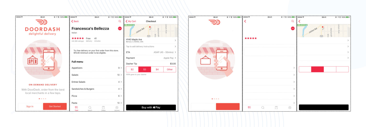
Rice. 1 — Example of an interface without text
- Thirdly, the designer must understand how to address the user, know the tone of voice of the product, and build the user experience as clearly and seamlessly as possible.
- And, fourthly, improper work with text can lead to negativity on the part of the user, a drop in conversion, retention, and more. And this has a direct impact on the monetization of the product! ?
And yet, according to StockApps, the number of mobile device users around the world is already about 5.5 billion, that is, almost 70% of the world's population. Therefore, you can't ignore these users! And since smartphones have their own limitations (small screen size, slow Internet, etc.), text is the main tool for transmitting information.
Our UX writing guide appeared because we wanted to understand this topic ourselves, and since we did not find anything useful, we decided to do it ourselves. ? Our approach was simple: buy and re-read everything available, draw conclusions, put them in a guide and give others our conclusions: WHAT EXACTLY A UX DESIGNER NEEDS TO KNOW and what you can or should not read to delve into the topic.
First, let's understand the basic terms and classification.
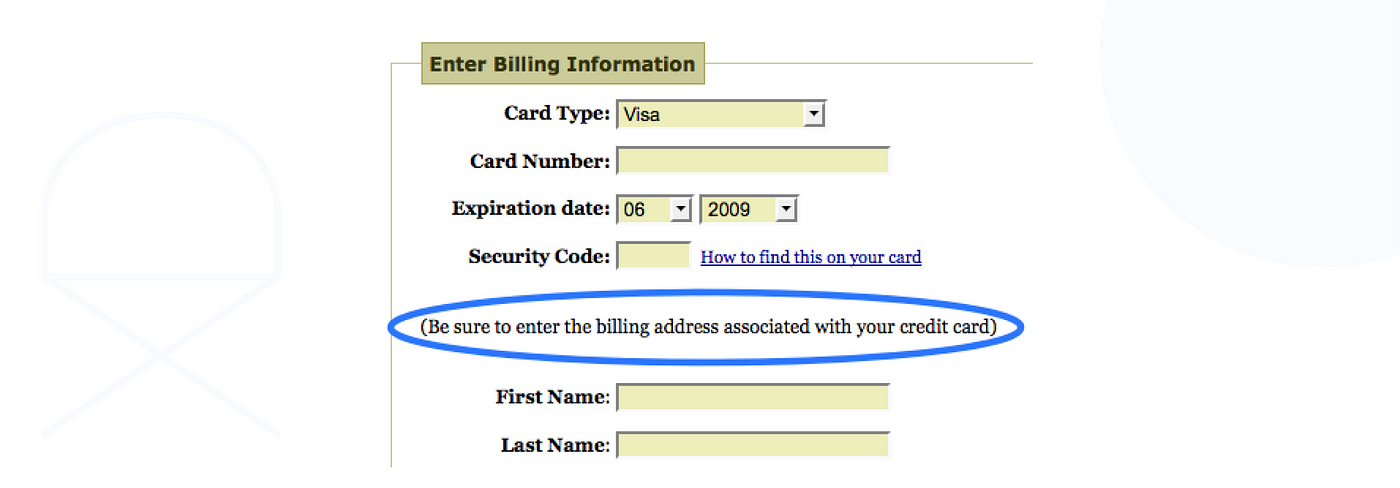
According to one theory, UX writing emerged in 2009 when Joshua Porter published a blog post titled Writing Microcopy. The post describes a situation where the designer noticed that 10% of transactions were unsuccessful due to user errors in the mail at the billing stage. Users were simply inattentive. To remedy the situation, the designer added the text next to the field: "Make sure to enter the mail associated with your credit card correctly." This simple text solved the problem and led to additional orders, which had a significant financial impact.
Probably, it was then that the request for well-written texts for interfaces appeared.
UX writing (also "UX writing ", "UX writing") is the creation and editing of written content that is or will become part of the user experience.
At its core, UXW is about how your product interacts with the user. It's not just texts on the site — it's how they interact with the user, what they do, where they lead, and what their logic is. In fact, a UX writer is the same as a UX designer, only the main artifacts of a designer's work are layouts in a graphic editor, and a writer has words in a text editor. At the same time, they can work on flows, analyze product analytics, create a persona, work with CJM, and do other design activities.
For example, here's a 404 page. Here, words have a very strong impact on the user's journey.
We don't see meaningless error numbers here like in Windows 95, the interface gently tells us what happened and explains what can be done. The site even gives us a choice: we can use the search or fall into the sitemap.
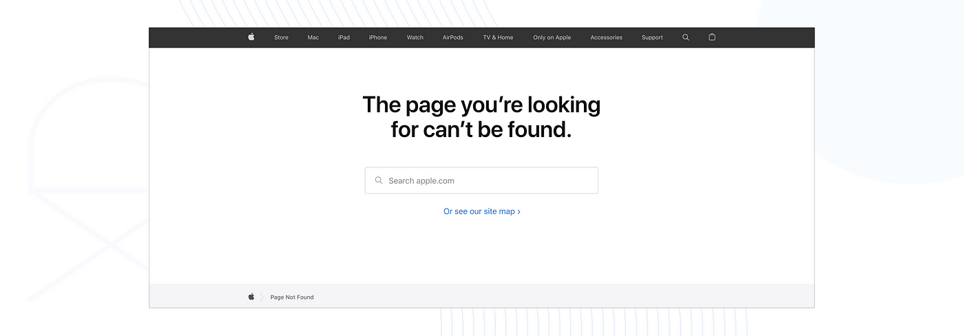
Agree that the main medium of information is text, and the design itself on the page is not enough. And the user's journey could end on this page and he would simply leave without performing the target action. Here's the simplest proof of the importance of texts!
Unfortunately, I couldn't find a classification of UX writing (if you can add to it, please write to me in private messages), but what I found I managed to divide into the following types:
- Editing/writing — writing commercial texts for various types of platforms (websites, social networks, etc.).
- Business correspondence — building written communication with clients, partners, writing documentation, etc.
- Microwriting is writing texts for interface elements, localizing them, and more.
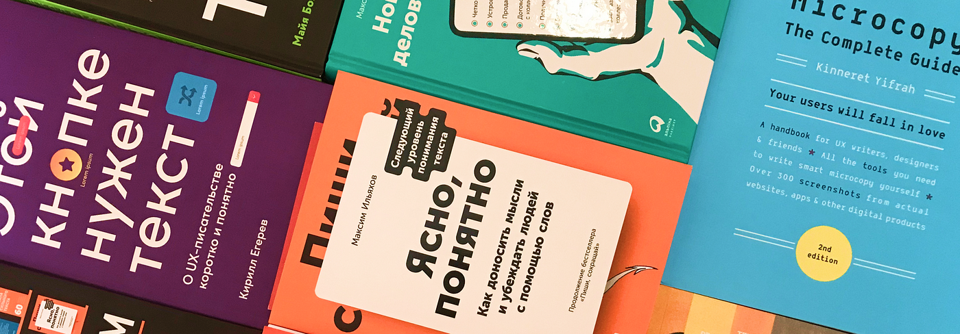
To get as much information as possible, we bought all the available literature on this topic, read more than 2000 pages, carefully analyzed it and now share all this with you. ?
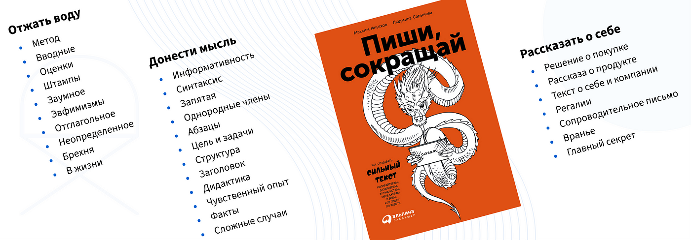
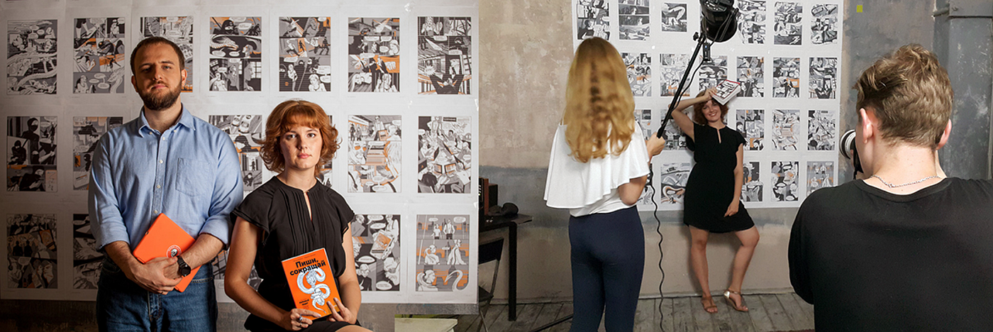
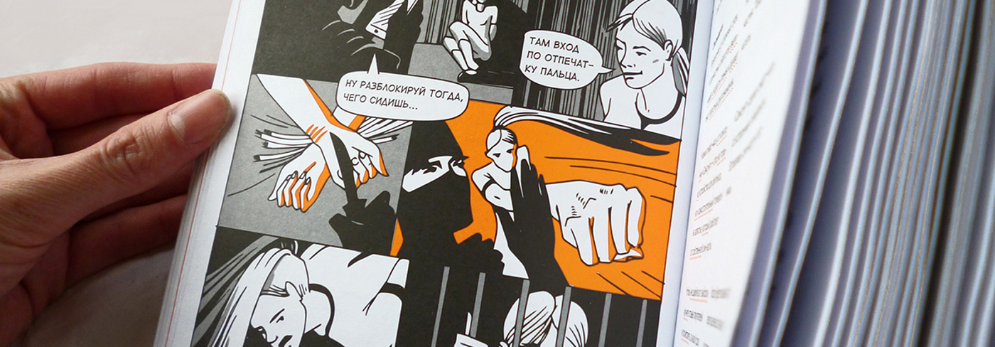
"Write, Shorten" by Maksim Ilyakhov & Lyudmila Sarycheva
Maxim Ilyakhov is a modern Russian writer, designer, editor, candidate of pedagogical sciences, rector of the School of Editors of the Gorbunov Design Bureau, developer of the Glavred text checking service. Today he works in the magazines "KOD" (Yandex Practicum magazine) and "Dagger" as editor-in-chief.
Ilyakhov was born in Krasnodar and wanted to become a designer, like his idol Artemy Lebedev. Ilyakhov's first work was translating texts. Then he took orders as a webmaster (combining the work of a web designer and a front-end developer) and gradually tried himself in the areas that attracted his attention. Later, he finally switched to working with the text and editing.
When asked about changing his profession, "moving from design to editing", Maksym answers as follows: now he is engaged in text design.
In 2017, the book by Maxim Ilkhov and Lyudmila Sarycheva "Write, shorten" was published. Today it is the most popular Russian-language book on writing and editing in an informational style.
At the beginning of the book, Ilyakhov gives 10 rules for a strong text:
- 01. The Power Lies in the Truth
- 02. Meaning Is More Important Than Form
- 03. The Simpler, the Better
- 04. Write As For Yourself
- 05. Read aloud
- 06. Give examples
- 07. From Simple to Complex
- 08. Benefits Ahead
- 09. Put a Headline
- 10. Respect and care
The book is divided into three parts:
- Wring out the water
- Convey an opinion
- Tell us about yourself
1. Wring out the water
In the first part of the book, Ilyakhov describes how to properly clean text at the word level. It talks about verbal garbage and how to deal with it. As a result of processing, all unnecessary water is squeezed out of the text. Below we will tell you what you can do with the text to remove unnecessary things from it.
If the text can be simplified, it should be simplified
Complex texts can be expressed in simple words. At the same time, the text should not become primitive, but retain the main idea (even if it is not simple). To do this, you need to remove unnecessary words, not to the detriment of the meaning of the text:
Example
Was:
None of the existing areas of design requires such a thorough and deep immersion in your client's world as the now popular UI/UX design.Became:
None of the design areas requires such a deep immersion in the client's world as UI/UX design.
The text has become clearer and simpler in meaning and syntax, while its essence has been preserved.
Simplifying text from small to large
First, we simplify at the level of words
Remove unnecessary words that clutter up the sentence, but do not affect the meaning in any way. The author calls them stop words.
Was:
Design thinking is a great method, it is now everywhere, but it sounds abstract and many people think that it was created only for designers or other creative people, but in fact, anyone in business or personal life can apply the method.
Became:
Design thinking is a great method, it seems to be made for designers or other creative people, but it can be applied by anyone in business or in their personal life.
Next, at the sentence level
Was:
Design thinking is a great method, it seems to be made for designers or other creative people, but anyone in business or personal life can apply the method.
Became:
Design thinking is a great method for designers, creatives, business or personal life.
At the level of meaning
Was:
Design thinking is a great method for designers, creatives, business or personal life.
Became:
Design thinking is a method that can be applied in various areas of life.
Adding useful information
To solve the problem, focusing primarily on the interests of the user, you can use the method of design thinking.
Outcome:
Design thinking is a creative way of solving problems that is applied in any industry, for example: think about a trip, launch a business, develop a logo and identity.
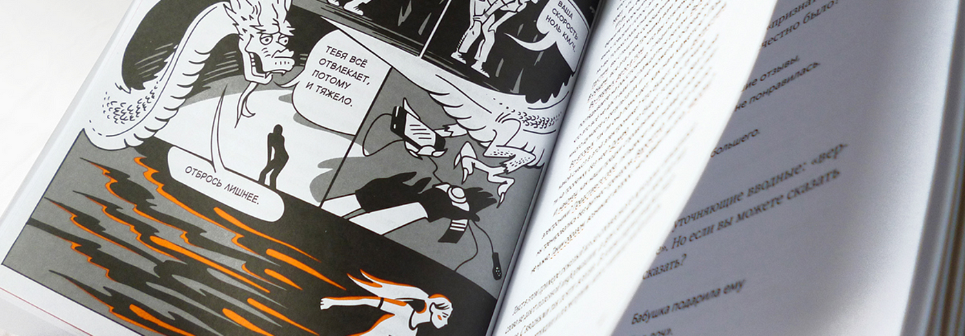
Stop Words
These are words, by removing which, the meaning of the text is preserved, while textual garbage is removed. The text becomes cleaner and clearer.
Example
With stop words:
Nowadays, screen addiction is one of the biggest problems of the new generation, leading to terrible intellectual and mental problems for young people.
No stop words:
Screen addiction is a big problem for young people.
After removing the stop words, you need to add useful information to make the text more interesting, persuasive, and useful.
Example
With stop words:
Nowadays, screen addiction is one of the biggest problems of the new generation, leading to terrible intellectual and mental problems for young people.
No stop words:
Screen addiction is a big problem for young people.
Let's add benefits:
Screen addiction is a big problem for young people. If you replace 30 minutes of smartphone a day with reading, your child will read 2 more books per month.
How to work with stop words:
- Study groups of stop words, figure out how they are harmful
- Learn to see stop words. You can check the text for stop words on "Glavred"
- Remove Redundant Words Without Compromising Meaning
- Fill with useful things. Make the text useful to the reader
Introductory Stop Words
To learn how to see introductory constructions, you need to pay attention to punctuation marks: commas, dashes, parentheses, especially if they are even, or close to the beginning of a sentence. It is also useful to check the text by reading aloud — if there is not enough air to finish reading the sentence, or you are confused in the intonations, then it is too complex
Types of introductory constructions
Common Knowledge
Example:
As you know,
It's no secret
In my opinion
Honestly
If something is known, there is nothing to write about it. If you don't know, we explain it or delete it!
Verbal numbering
Example:
first of all
Secondly
Finally
Thoughts do not need to be numbered with words, it is better to break them into paragraphs. One thought, one paragraph.
Introductory for example
Example:
For example
For example
Sometimes you can't do without "for example", but it is better to give examples than to use an extra word in the text. When giving examples, you should not try on potentially unpleasant examples on the reader.
Was:
Imagine, for example, that you are poorly prepared
Became:
You're Not Well Prepared

Appearance of courtesy
Example:
please
Be so kind
if it's not hard
sorry for the hassle
It is better to avoid an excess of polite addresses. Show concern in action: explain what is needed and why.
Example:
Good afternoon, dear Vladimir Petrovich!
Sorry for the concern, but I really need the Q4 2021 report. If it's not difficult for you, send it to me when you can!
Thank you in advance, yours sincerely, Peter Petrovich.If you remove the cloying politeness and give a little context, it will turn out much easier and clearer:
Good afternoon, Vladimir Petrovich.
Please drop the report for the 4th quarter of 2021 - it is very urgently needed to prepare an annual report.
By the way
There is no need to specifically highlight information with the word "by the way". Usually, "by the way" is followed by inappropriate text.
Brackets
Everything that is in parentheses must either be removed or taken out of them.
Example
With parentheses:
If there is a lack of time and resources for research, it is possible to conduct a heuristic evaluation of the interface (the most popular and common are Jakob Nielsen's heuristic principles of evaluation).
Without brackets:
If there is a lack of resources for research, a heuristic analysis of the interface is carried out. The most popular is Jakob Nielsen's heuristic analysis.

Evaluation
Your own conclusions are the strongest
Evaluation is a subjective characteristic of the author: a scandalous interview, a great man, irreparable harm, a healthy breakfast, etc.
In order for the reader to believe in the assessment, it is necessary to give him a support: information that he will be able to evaluate
Example
Subjective:
No Name is the most successful startup of 2021
Honestly:
No Name, one of the ten most valuable companies in the world in terms of estimated value, had a capitalization of $28.7 billion in 2021
Without research and facts, any text is idle chatter
Understand the topic, fill the text with stories and facts. Facts should be clear to readers, if they are incomprehensible, they need to be explained
Stamps
Clichés are popular phrases, the meaning of which can be expressed more simply. If there are a lot of clichés in the text, the reader quickly loses interest in it. Clichés are easy to identify — they look familiar and create a sense of advertising, magazine, formality, etc.
Stamp:
I spent the whole day fooling around with the task
Not a stamp:
I've been working on the task all day
"Nowadays" — remove
"These days" is one of the most common clichés of "parasites of time". It needs to be removed!
Stamp:
These days/today such prices are not found
Not a stamp:
I have not come across such prices
Get rid of clericalism
Staff:
In this form, provide information about the place of work
Not a stamp:
Indicate your place of work in this application form
Replace with one word
Don't overcomplicate things that can be said easily.
Stamp:
Has become a topic of discussion
Not a stamp:
Discussed
Don't use formalism
Stamp:
Changes will take effect after saving. Are you sure?
Not a stamp:
Save Changes
About respect
Show Care, Not Strength
You need to respect the reader. But it must be done for real. I think everyone has stumbled upon letters with the word "dear", but after reading it, it seems that you have been yelled at.
Rudeness:
Dear colleagues! It is FORBIDDEN to leave power supplies plugged in! Sincerely, administration!
Respect:
Do not leave power supplies on at the end of the workday. The office is located in an old building, a faulty wiring can lead to a short circuit
Don't smooth out the corners
Often, smoothing corners is detrimental to clarity.
Gently:
Taking actions not provided for by the governing documents is interpreted as illegal and is subject to liability sanctions
Abruptly but clearly:
Violation of the company's rules is punishable
Arrogant:
If you don't know how to spell it, write it easier
Arrogant:
A series of marketing research shows the positive dynamics of the company's development
Just:
The company is successfully developing in the market
Explain important nuances in detail
If you can't do without an arrogant word and it has an important meaning, you need to explain it in more detail
Facts are stronger than estimates. Even if the estimates are loud and reasonable
No:
Phenomenal success of the company
Yes:
Over the past year, the company's profit has increased by 150%
Using psychological and medical terms if you're not writing about psychology or medicine is bad form
We use the following terms:
Completed the work and closed the gestalt
Let's make it clear:
Completed the work and handed over the project
Euphemisms
The euphemism is used when they want to smooth out unpleasant words. In fact, it is uninformative and disrespectful to the reader
Euphemism:
You have a peculiar vision of the current situation
What was meant:
I don't agree with you
You can criticize a job, but you can't criticize a person
No:
He's a bad designer
Yes:
I don't like his work
Verbal
If there are actions in the text, the reader is more interested
No:
We provide services for solving business problems of our clients
Yes:
We solve business problems
Undefined
Vague words give inaccurate information
Define the uncertain
Specifics always work better than vague concepts. Remember this and give proofs to the user!
Yes:
In some deserts
No:
In the Arctic desertsYes:
More than 20 volunteers took part in the organization of the event
No:
24 volunteers took part in the organization of the event
Lie
Any Truth Is Good
A lie is about vague wording — not a lie, but it's not true either
For example
Lie:
Our curriculum guarantees you a good job and a secure future
Truth:
Our training program increases your chances of getting a prestigious job and decent earnings"
2. Get the point across
This section discusses how to move from words to sentences, that is, how to make what is written easy to read. How to move from sentences to paragraphs, how to organize them correctly so that the reader quickly scans the text and finds what he needs. Next, we climb the structure of the text and the logic of presentation.
The main points of this section are:
One Sentence, One New Thought
Let's say you need to convey the concept of Blockchain to the user.
You can write like this:
Blockchain is a continuous, numbered and hash-summed sequential chain of blocks containing information.
In fact, everything is written correctly and there is no water in the text, but the user will be frightened by such a huge number of new words and terms. Try to tell everything in order. In this way, a person will understand better.
For example:
A blockchain is a continuous, sequential chain of blocks containing information built according to certain rules. The connection between blocks is ensured not only by numbering, but also by the fact that each block contains its own hash sum and the hash sum of the previous block.
In the second case, the reader receives the same information, but consistently, and the chances of understanding the essence increase.
Read the text aloud many times. Rewrite everything you can stumble over
Surely you have encountered a situation where you are reading a text, but you stop, get lost in it, do not remember what was at the beginning of the paragraph. And there are situations on the contrary, when the text is easy to read, as if "pouring". Syntax is responsible for the perception of the text.
Syntax is about how words are linked into sentences.
Let's stumble upon the text:
At the stage of choosing and designing the iron you need in the online store, look at the reviews of other buyers and check how long the seller promises to deliver it to you.
The text flows:
When you design your iron, check reviews and delivery times.
To get a good syntax, you need to do 2 things:
- Read the text aloud many times.
- Rewrite everything you stumble over.
To process the text, read the draft version of the text aloud. Sentences should be long enough for the reader to read them.
Remove weak and inactive predicates from the text
A strong predicate is a verb aimed at active action. It's an action that can be captured.
A weak idle predicate is an inactive verb that describes a state. It doesn't work. There is nothing terrible in these words, but they should not be abused.
Strong predicate:
Kaspersky Security Cloud protects your computer from viruses, Trojans, and cyberattacks.
Weak idle predicate:
Kaspersky Security Cloud offers high-quality protection for your computer.
Separate "sticky-together" sentences
This rule should be applied in complex sentences, the parts of which are independent.
Molded sentence:
Our agency develops online stores, among our clients are the largest wholesale stores and retailers.
Shared:
Our agency develops online stores. Among our clients are the largest wholesale stores and retailers.
Improved:
We develop online stores for large wholesale stores and retailers.
Simplify indirect speech
Often, the firm hires a writer to write the text. Since the payment is made by the number of characters, a lot of garbage appears in the text. One of the ways to "litter" superfluous signs is indirect speech.
If you see "said that", "think that", "I suppose that", "I want to" in the sentence, remove it immediately.
With indirect speech:
Whenever Ivan came to the café, he always asked for a fresh, fragrant macchiato to be prepared for him.
Clean:
When Ivan went to the café, he always ordered a macchiato.
The problem with indirect speech is that it "smears" the text. The meaning is blurred by the number of unnecessary words.
The example above shows another rule:
If it sounds wise or too literary, simplify it
One Paragraph, One Thought
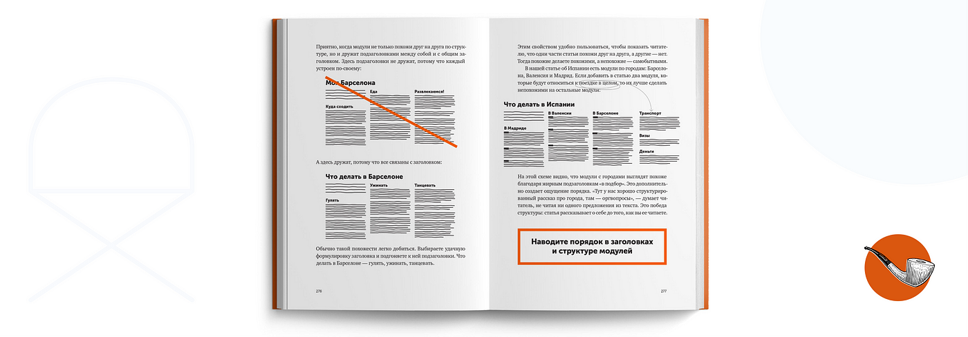
We won't stay here for long. All designers know about text scanning, F-patterns, and typography rules. When working with the text, it should be remembered that each paragraph should contain one thought. One important message. No more!
Try to break up the canvas of text and highlight important points where the user will stop. If the information is important to the user, they will start reading the text of the paragraph, if not, they will continue to scan.
Support everything abstract with concrete
What matters is how the user adopts specifics and abstractions.
Specificity is everything that a person has already perceived or can perceive with the senses: everything that we have seen, heard, felt or can imagine.
Examples of specifics: Cold, Heat, Water, Marble, Car, Newspaper, Dog, Laptop.
Abstraction is anything that does not exist in the material world. Abstraction is born, lives and dies only in the reader's head.
Examples of abstraction: Love, Irony, Quality, Protection, Decision, Order, Chaos.
The secret of persuasiveness is in specifics.
The specifics are easy to imagine, because the user has already accepted them. Abstraction is hard to imagine — it needs to be deciphered. It requires the effort of the user, so it is difficult.
Abstraction:
Jira is a task management system for the team, accounting and control of tasks.
Specifics:
With the help of Jira, the manager can assign a task to the performer, monitor the completion of the task, and inform the whole team about new ones.
But here it is important to understand that you do not need to remove the abstract! It's just that each abstraction needs to be deciphered with specifics.
3. Tell about yourself
The third part of the book tells not how to write correctly, but what to write about in order to draw attention to a product, a commercial offer, a cover letter, a job application, etc.
Here Ilyakhov talks about the following things:
- Using Illustrations
- Demonstration of benefits for the client
- How to tell about a product
- How to Talk About Customers
- How to apply for a vacancy
- etc.
Since this section is mainly important for salespeople (marketers, journalists, managers, content managers), it is not very useful for UX designers.
The book is very easy to write, it presents the basic concepts of working with the text and in fact it is an entry point into writing!
What's Your Reaction?


![[VIP] DesignCode: Build Beautiful Apps with GPT-4 and Midjourney](https://design.rip/uploads/cover/blog/designcode-gpt4.webp)
![[VIP] AppCoda: Mastering SwiftUI - Professional Packet (Updated 04.2023)](https://design.rip/uploads/cover/blog/appcoda-mastering-swiftui-professional-packet-worth.webp)
![[VIP] AppCoda: Beginning iOS Programming with Swift (Updated 04.2023)](https://design.rip/uploads/cover/blog/appcoda-beginning-ios-programming-with-swift.webp)
![[VIP] Whoooa! 156 vector Lottie animations](https://design.rip/uploads/cover/blog/whoooa-156-vector-animations.webp)


![[VIP] Motion Sound Vol. 1](https://design.rip/uploads/cover/blog/designrip-svx.webp)

