I just reviewed 370 UX applications
What is wrong with all these applications for 2 positions.
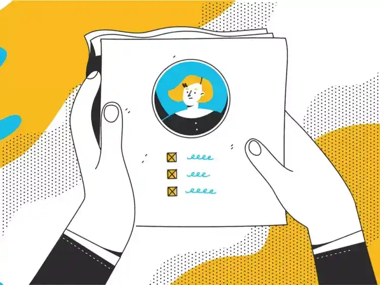
Around the end of last year, I was hiring for my team, I had two open positions for UX Designer and Product Designer, I made a decision to hire Junior talent. Why? Because I believe we need to give way to the emerging talent and not keep hiring already seasoned talent for every open spot we have in our companies.
So, I sat down, thought really carefully about who exactly we needed for the team, what will be their function, contribution, impact on the team and product, and drafted a job description… we posted to only two platforms, LinkedIn and AngelList.
What happened next, was both a welcome surprise and a shock! The influx of applications for Jr. UX Designer and Jr. Product Designer roles was overwhelming! We received over 600 applications for the two positions.
Now seeing this number of interested people in your team, your company, your positions on the team, and in you as a design leader is incredibly flattering, not gonna lie!
As I started sifting and looking through applications, I began noticing a trend… most of them, pardon my bluntness, are crap. I reviewed about 370 applications from all 600 (apologies for not getting to all of you, but I physically did not have the time to go through every single one of them). And here’s what I discovered…
- People don’t actually read the important parts of a job description, how do I know this? It was clearly stated that at this time we do not hire anyone from outside of the US, and yet, about 15+% of applicants were from outside the US.
- For some odd reason, people think that just because they put UX or Product Designer in their titles, that its all that matters… an overwhelming number of people, about 20% did not have their portfolio links on their submitted applications, among which, about 30% did not have any portfolio links whatsoever, not on the application, resume, cover letter or anywhere else. Because I don’t have much time to go through each application and spend time playing an investigator trying to find your portfolio, if I don’t see one right away on the application, I* move on to the next applicant.
- Attention to detail is non-existent… you are applying for a job that literally requires you to see details others don’t, and pay attention to the smallest things… and yet, about 70% of all applicants had major detail flaws that to someone like myself is a huge deal. I saw a good few dozens of resumes with “I’m a UX or Product Designer” and when visited their portfolio, it still had “I’m a skilled Engineer” or “Experienced Web Developer” or other sorts of tech field titles… I get it, you transitioned into UX/Product Design, I love that! But you made a choice to be in this field, take it seriously, do your homework, iron out your image, make sure all your public-facing documents speak the same language, and say the same thing. And for the other people among this 70%, highly recommend making sure that when you copy and paste text, images, or other visual aspects to your portfolios, make sure it is properly organized, has some flow and hierarchy to it, not just a dry list of visuals and some text to it.
- Stop designing for yourself and start designing for your users. Just because you think your portfolio looks cool or has “everything” your Bootcamp said you need to have on your portfolio, does not mean that your portfolio will do you any good. A badly designed portfolio will be more harmful to you than not having it all. You are a designer, more so, you are a UX or Product designer, by definition of this title, your job is to empathize with your user, understand their needs, how they consume and navigate a product and design the product in such a way that your users don’t feel like throwing something at their screen. And that ultimately means, don’t make a hiring manager or a recruiter work extra hard to understand your case studies, navigate your site, find vital information, etc. Do your research and design your portfolio for us, not for you.
- Copying others is how we learn, but come on… I can not say this enough: 90% of all applicants' portfolios look the same. Seriously, if I had a massive printer where I could screenshot all of the portfolios, laid them out next to each other, printed them out, and hung them on a wall, I would see the same sites with just different colors and names on them. Only about 10% of all 370 portfolios that I saw, were different, unique, original, and interesting. You have to remember, your landing page has one job, and it is capturing my attention within the first 1.5 seconds of me landing on it. If it doesn’t, it’s being closed, and I move on to the next candidate. So please, copy, but make it yours, make it a representation of yourself, who you are not who you think someone else expects you to be.
- Effort goes a long way. I don't know if this is laziness, or lack of knowledge, or whatever that is, but about 40% of portfolios that I saw, had the exact same problem… an entire use case laid out in Figma, exported as a single massive CVS type list of visuals and text, and placed on a webpage, and voila! You got a case study or project, whatever you want to call it… I can think of a million wrong things about this approach, some of them that come to mind when I see this are, ignorance, lack of empathy, and my favorite is the “who cares” attitude. I know for a fact this is not true, I know people have good intentions, but sometimes, or in this case, oftentimes, it results in an outcome that is hard to read, low-resolution quality, accessibility flaw, and simply bad design. Here’s some advice that I hope you will remember for the rest of your career… in any digital product, such things as text, must never, and I repeat, never, be an image!
I think this concludes my rant about all the problems that I have experienced going through all these applications.
···
The mass-production of UX and Product designers
It seems like, we are as a creative industry, keep shooting ourselves in the foot over, and over, and over again.

Throughout our recent history of the past 20 or so years, digital design has been rising and falling, titles emerging, disappearing, shifting, pivoting, shaping, etc. which is normal for any industry, but the one field of recent design practice took on a whole new shape in terms f explosion of interest.
I am fully aware that we live in an unprecedented time… COVID-19 has changed everything! Companies migrated to digitalization a lot sooner than they planned and anticipated by people globally. This in turn lead to an explosive demand in making digital services more usable, better looking, more human, and accessible.
Related reading:
The case study factory

Is the formulaic approach to case studies endangering young designers' capacity for critical thinking?
However, as many people decided to change careers and transition into UX and Product Design, which I fully support and admire… an ugly side of this have also emerged, and that side is Bootcamps, don’t get me wrong, I have nothing against bootcamps, I think they are needed and very useful, however, my personal beef with said bootcamps, is their romanticization of our field, and all the false promise that they make.
I’ve been mentoring designers for decades, but due to COVID and the birth of an amazing platform ADPList.org, I’ve mentored transitioners more than I have mentored designers, and it was on steroids! I have mentored 1-on-1 over 100 people in the last few years and spoken to almost 1,000 during my monthly Transitioning into UX/Product Design sessions.
I can tell you enough how many people I’ve met that went through bootcamps, bootcamps that promised a job, lured people in with a dream of making 6 figure salaries straight out of a bootcamp, and the list of promises goes on, while at the same time, none of it actually happened.
More so, the problem with making such promises of “See how YOU can make $100,000 in UX Design!” or alike. I personally was targeted by some ads for bootcamps with such types of catchy punchlines. So of course people want to make that much money, and I don’t blame them, many other industries unfortunately pay peanuts their employees and thus employees leave (aka Great Resignation) and change careers, seeking other ways of making money, and end-up in tech, unfortunately, none of these bootcamps will ever tell anyone that they should first learn what this field is, what the job entails, what will take for them to actually get to that $100k.
And so here we are, everyone wants to be a UX or Product Designer, but with such an oversaturated market with “UX/Product designers” we ended up in this predicament… 600 applications for 2 positions, cookie-cutter portfolios, people who don’t actually know or understand what it means to be a UX or Product designer, bad designs, and now thousands of unemployed people who odds are spent most if not all of their savings or worse borrowed tens of thousands of dollars to pay for bootcamps that ultimately lead them to 12 months later still having no job in the field.
So yeah, I dont blame people who want a better job, a more exciting career, better pay and benefits, I blame the education system that instead of educating people about the industry, job, and what it means to be an actual UX or Product Designer, simply jumped on the wave of people wanting something better, and selling them dreams.
My personal advice to every one of you who wants to transition into this industry, please, take a course, watch educational videos on youtube, reach out to working designers and ask to talk, ask questions about what does it actually mean to be a UX or Product Designer, what is the realistic pay for junior designers, how many years it’ll take until you reach that 6 figure salary, etc.
···
Here are some useful resources
Designer salaries:
Mentorship:
Courses:
If you want to learn more about Transitioning into UX/Product Design directly from me:
And as always, never stop learning!
What's Your Reaction?





![[VIP] DesignCode: Build Beautiful Apps with GPT-4 and Midjourney](https://design.rip/uploads/cover/blog/designcode-gpt4.webp)
![[VIP] AppCoda: Mastering SwiftUI - Professional Packet (Updated 04.2023)](https://design.rip/uploads/cover/blog/appcoda-mastering-swiftui-professional-packet-worth.webp)
![[VIP] AppCoda: Beginning iOS Programming with Swift (Updated 04.2023)](https://design.rip/uploads/cover/blog/appcoda-beginning-ios-programming-with-swift.webp)
![[VIP] Whoooa! 156 vector Lottie animations](https://design.rip/uploads/cover/blog/whoooa-156-vector-animations.webp)


