Dieter Rams: ten rules of good design based on his work
How he applied them to his products and how they can help the modern designer.
Dieter Rams worked as an industrial designer at Braun for 40 years. He designed household appliances such as blenders, juicers and shavers. In the 1960s and 1980s, almost every family in Germany had items that Dieter had worked on.
Rams formulated ten principles, which are followed by such designers as Jony Ive, Konstantin Grcic, Naoto Fukasawa. We tell you what these rules are, how Dieter himself used them and how they influenced the objects around you.
By the way, note that none of Dieter's products contradict his principles.
Principle #1
Good design is innovative
Until 1956, vinyl turntables were made in closed cases. For example, this is what the Dual 300 turntable looks like - its case looks like a suitcase.
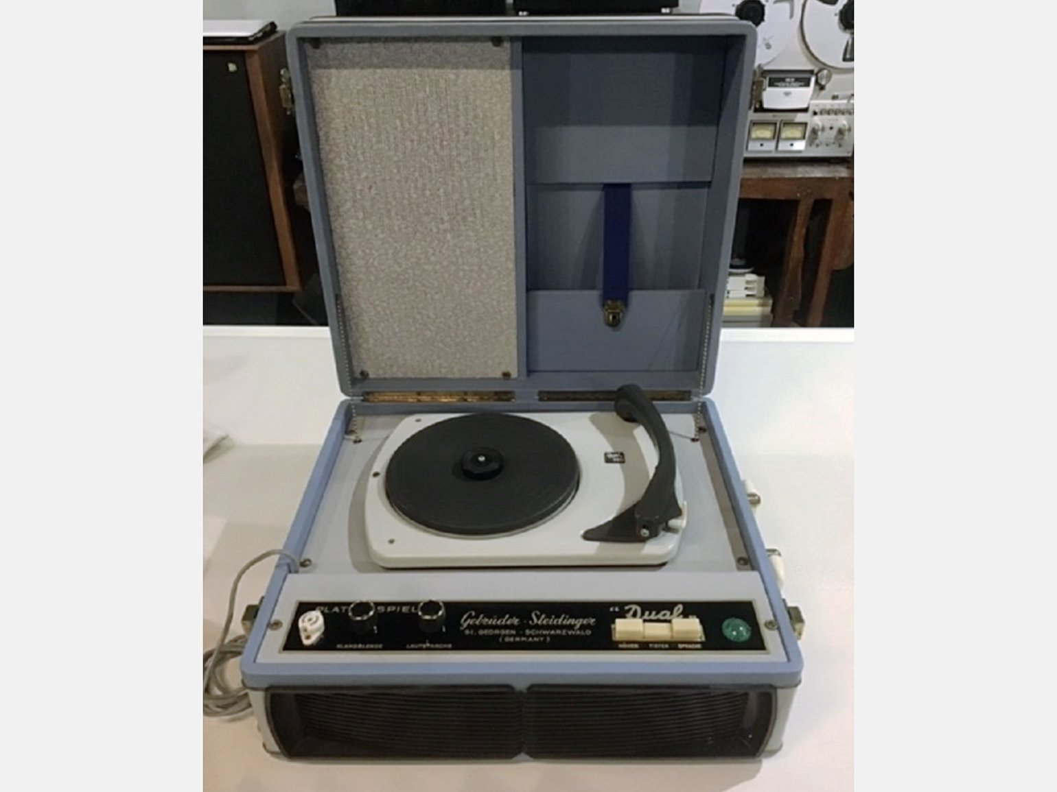
Dual 300 turntable, 1950 Photo: Pamono
Dieter made a transparent cover of plexiglass for the SK-4 vinyl turntable so that the mechanisms of the turntable would always be visible and dust would not get on them. That's why SK-4 was nicknamed “Snow White's coffin”. By the way, the same plexiglass used to be used to make windows for airplane cabins.
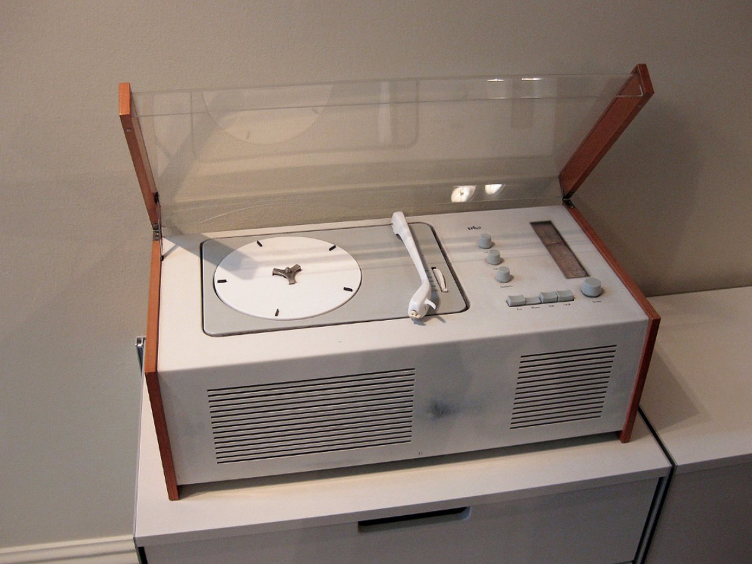
Braun SK-4 turntable, 1956 Photo:With Associates / Flickr
After the SK-4, competitors changed the design of their turntables. They also began making the top cover transparent so that the turntable could be seen even when it was not running.
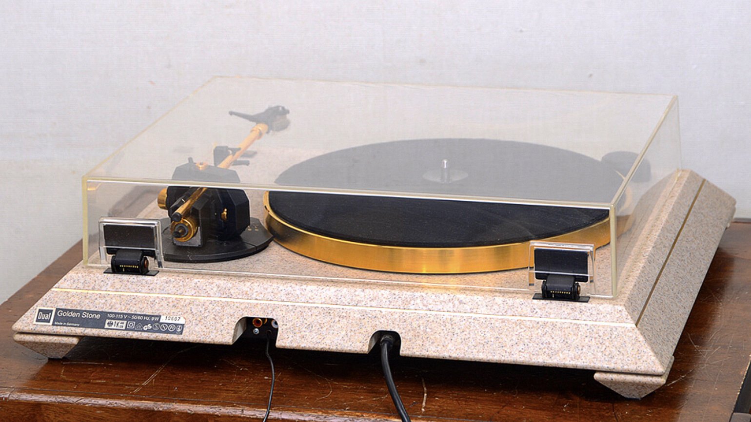
Dual Golden stone, 1994
Photo: Just Friends
The designer not only thinks about the basic elements of the product, but also complements it with new ones.
Principle #2
Good design is useful
In the fifties, Germany was rebuilding after the war and building new housing. There was no room in the new apartments for the bulky cupboards and sideboards that had been popular in the first half of the 1940s. People wanted furniture that was multifunctional and non-massive.
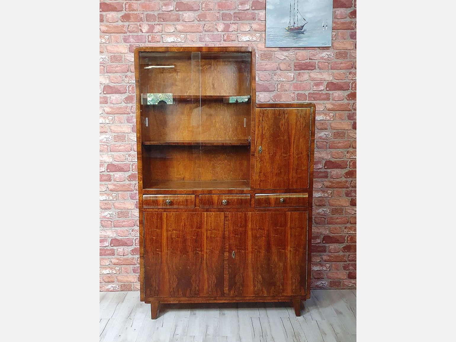
A typical representative of 1940s furniture in Germany Photo: Pamino
Dieter designed the “606” shelving system for Vitsoe. It has shelves for open storage and drawers for things that don't need to be in plain sight. The “606” can therefore be used comfortably in the bedroom, kitchen and office.
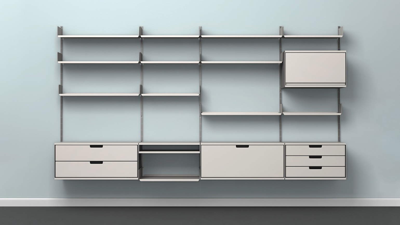
Vitsoe 606 shelving system, 1960 Photo: Vitsœ
Different companies produce such shelving systems. Here, for example, is the IKEA universal shelving unit - it has been designed so that it can be used in different rooms.
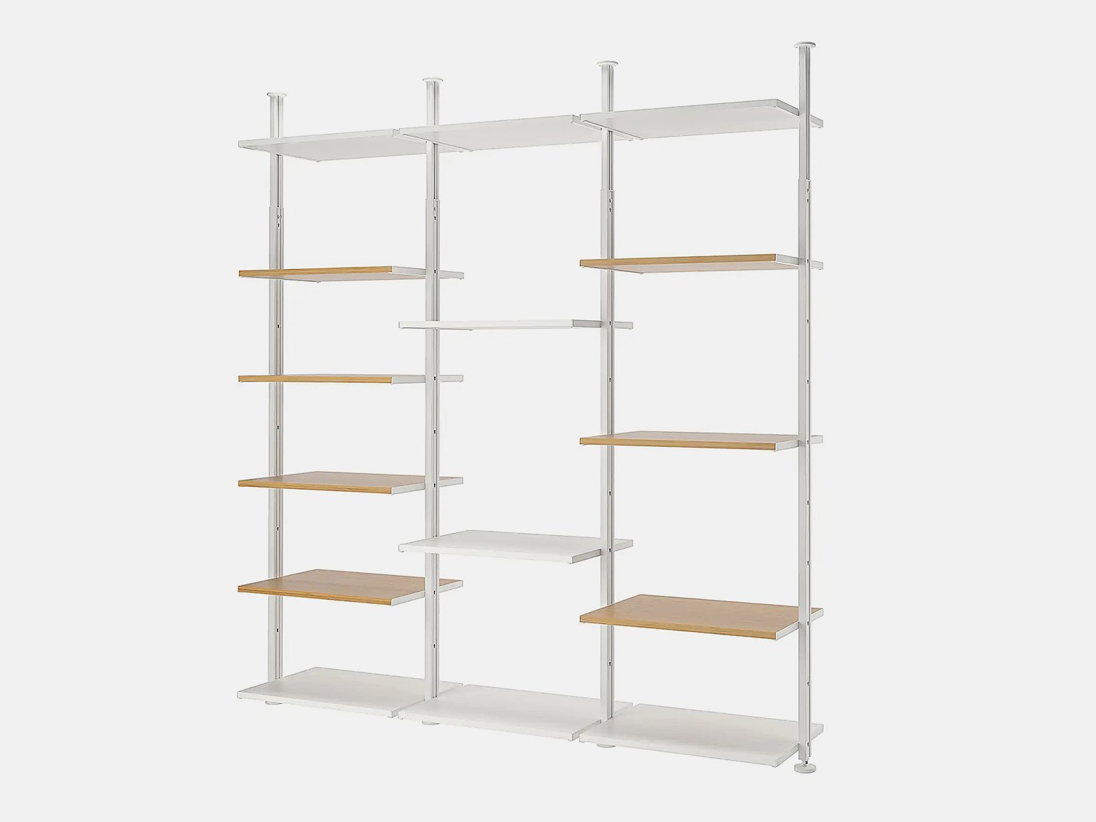
IKEA, Elvarli Photo: IKEA
The designer designs the product so that its usefulness is obvious.
Principle #3
Good design is aesthetically pleasing
Before Dieter Rams took over the design of radio receivers, they looked like Nordmende's Stradella. It fulfilled its function - you could choose which wave you wanted to listen to. But no one thought about the aesthetics of radio at that time.
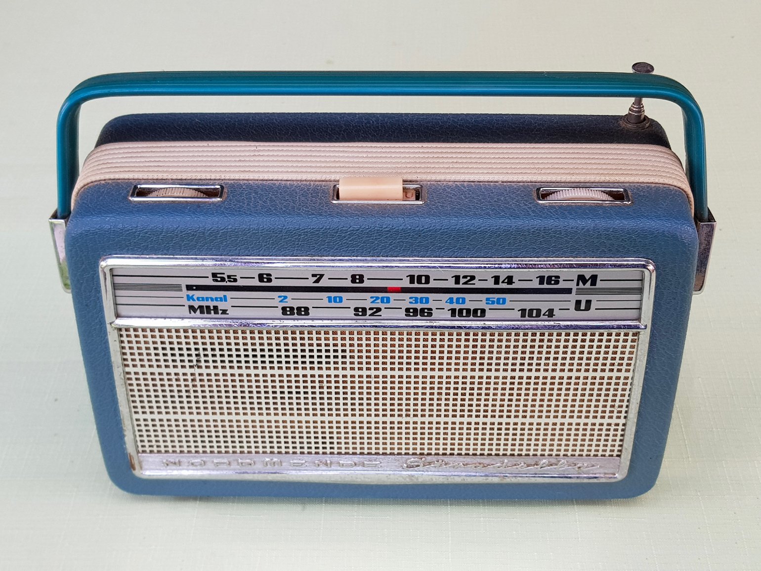
Radio receiver Nordmende, Stradella 1960 Photo: Wikimedia Commons
Dieter came up with the design of the Braun T1000 radio. In 1963, it was the best among its competitors - technically and aesthetically - at the German Radio Show.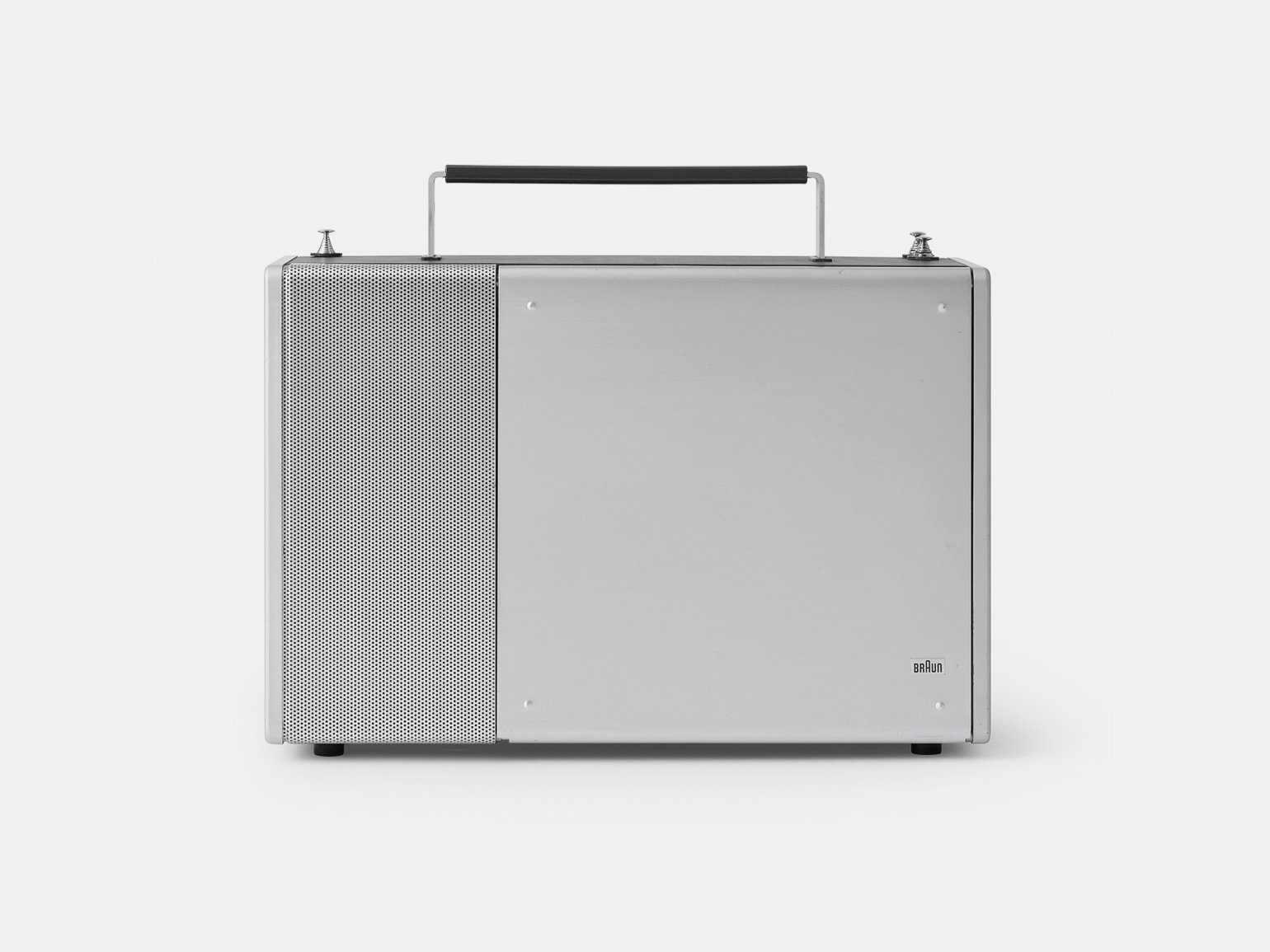
Radio receiver Braun T1000, 1963
Photo: Museum der Dinge
Later Nordmende adopted the design of the T1000 receiver for its products. The design of the devices became more concise.
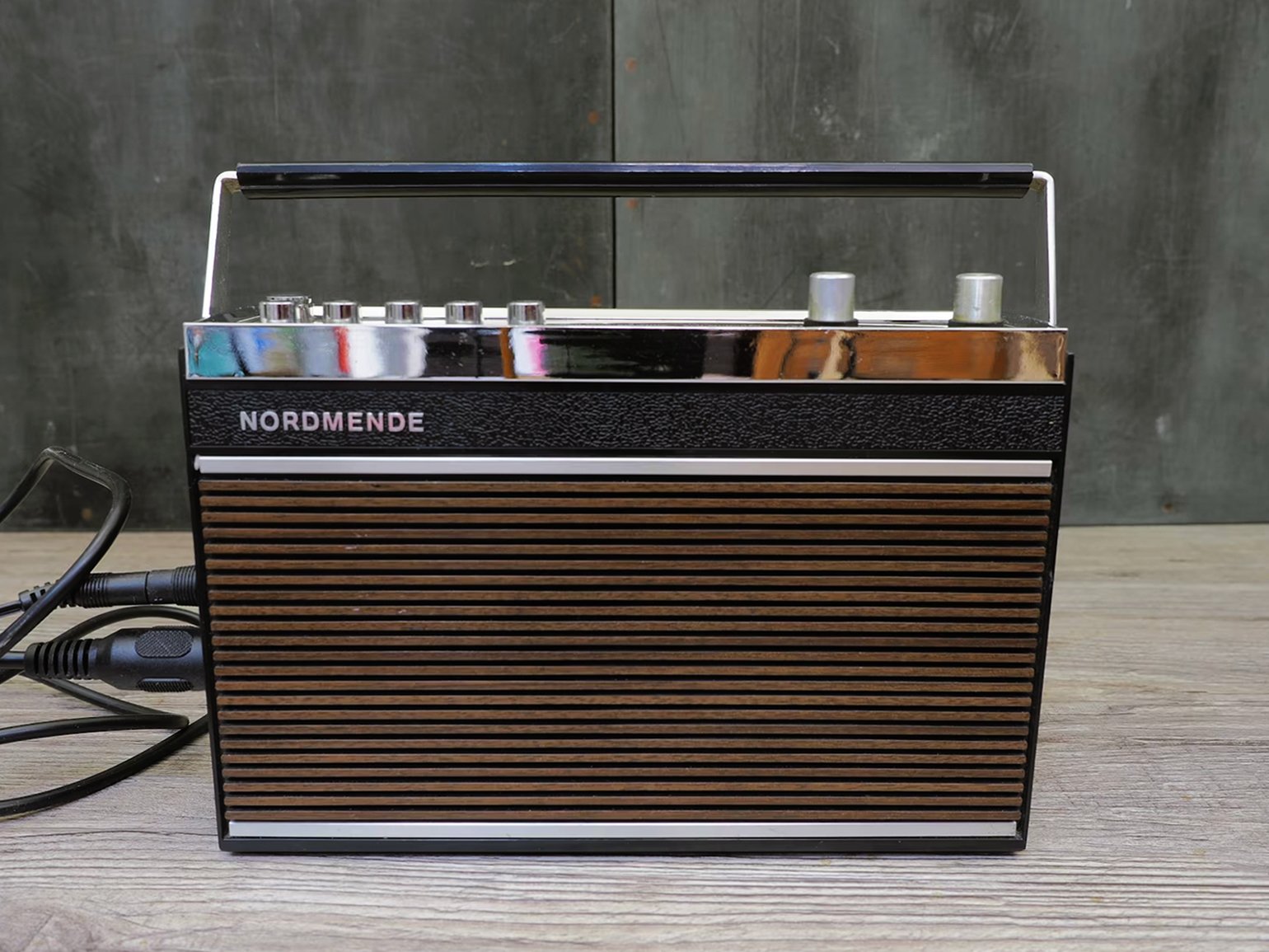
Radio receiver Nordmende, Corvette, 1975
Photo: Tom Göbel / Etsy
The objects that surround a person form his aesthetic intelligence. If an object is beautiful, you want to use it more often.
Principle #4
Good design is understandable
In the fifties, the lighter interface was complicated. In order for a fire to appear, you had to know where to press and where the flame would come from.
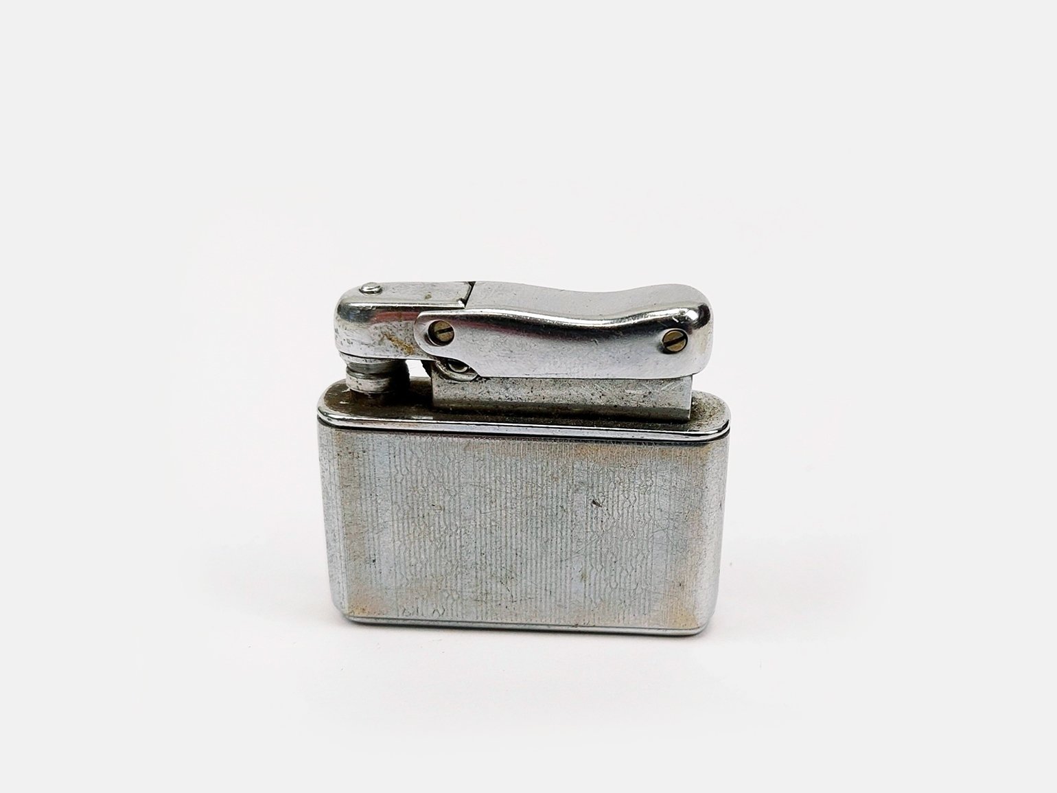
Lighter Ibelo, 1950
Photo: Sally Antiques
Dieter Rams made the design of the T2 lighter very clear. It has only one big button on the body - it is immediately clear to a person what will happen when you press it.
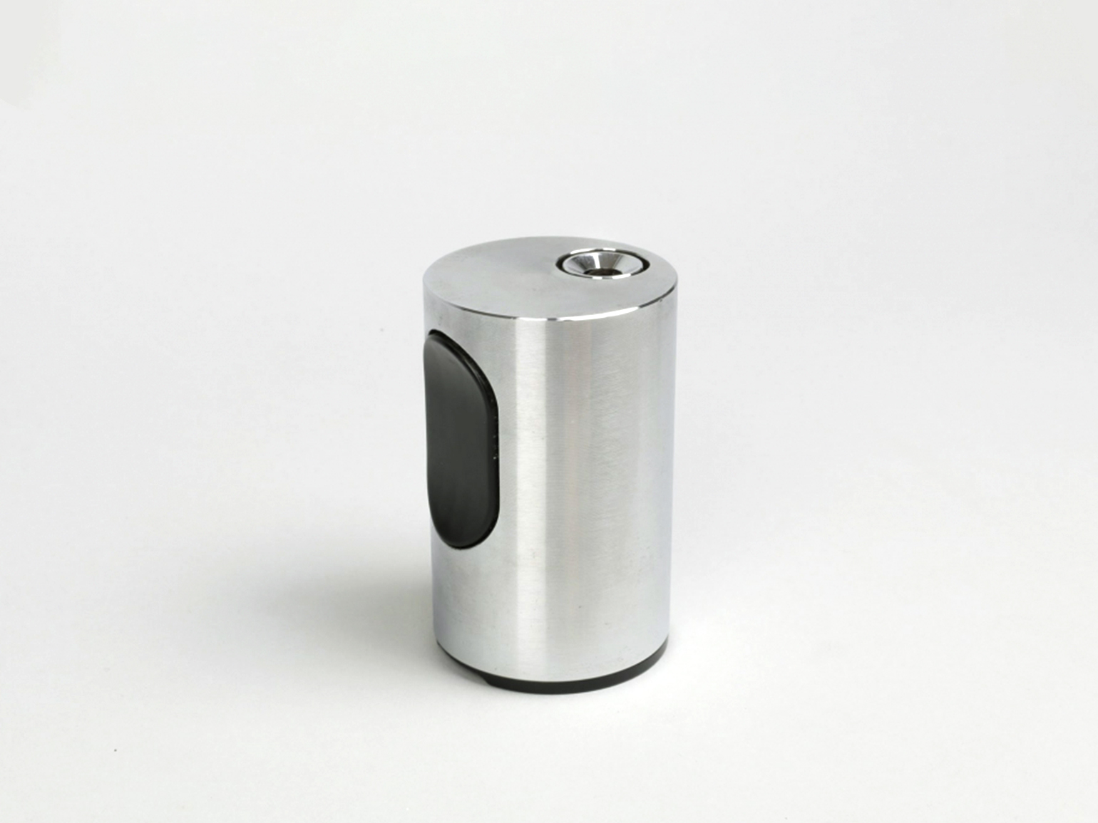
Lighter Braun T2, 1968
Photo: Only / Once Shop
Now this principle has become standard - most modern lighters, even the cheapest ones, have only one button.
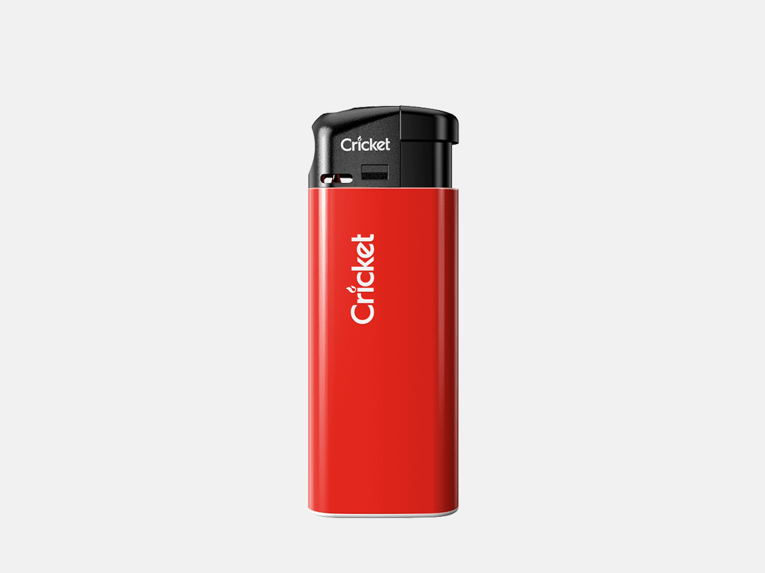
Lighter Cricket, Electronic Mini
Photo: Cricket Lighters
The designer designs the product so that users are not confused by the elements. If there is an opportunity to simplify navigation and interaction, it should be done.
Principle #5
Good design is unobtrusive
In the late fifties, pocket radios were a new product on the market and looked like the General Electric 674. Almost all devices have a contrasting shade of metal, color of the case and controls.
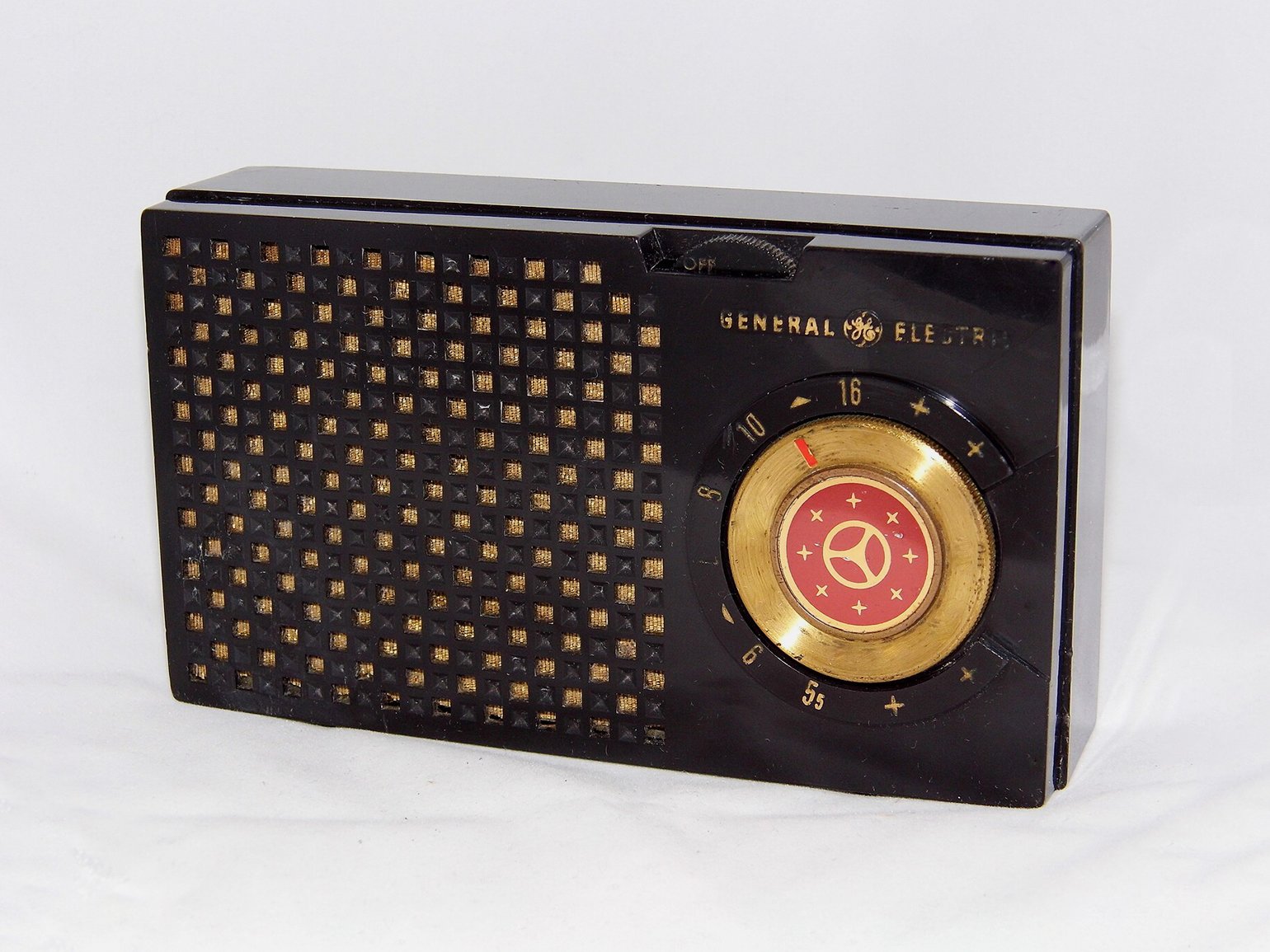
Pocket radio General Electric 675, 1955
Photo: Joe Haupt / Flickr
Dieter made the design of the T3 radio receiver's case restrained in color and shape. The interface is designed with clear elements - where the arrow points, the radio plays the station.
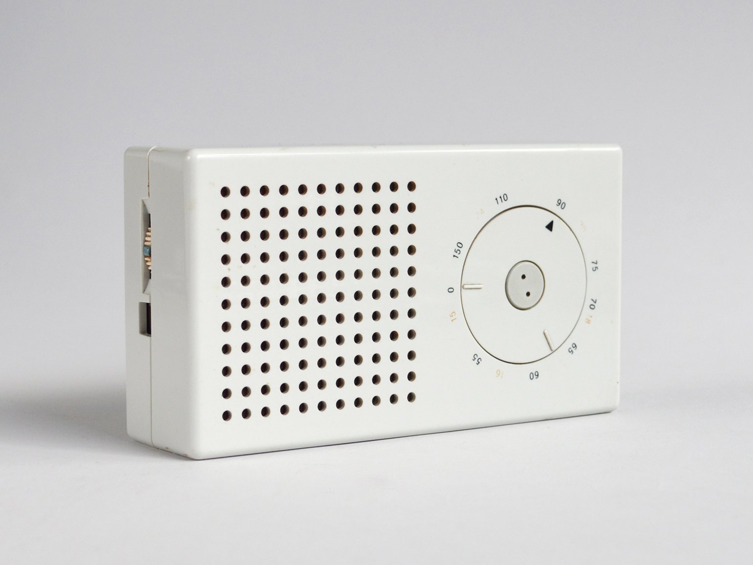
Pocket radio Braun T3, 1958
Photo: dasprogramm
Nachrichtenelektronik Greifswald has adopted the design and logic of the T3 interface and created the G1020 radio receiver.
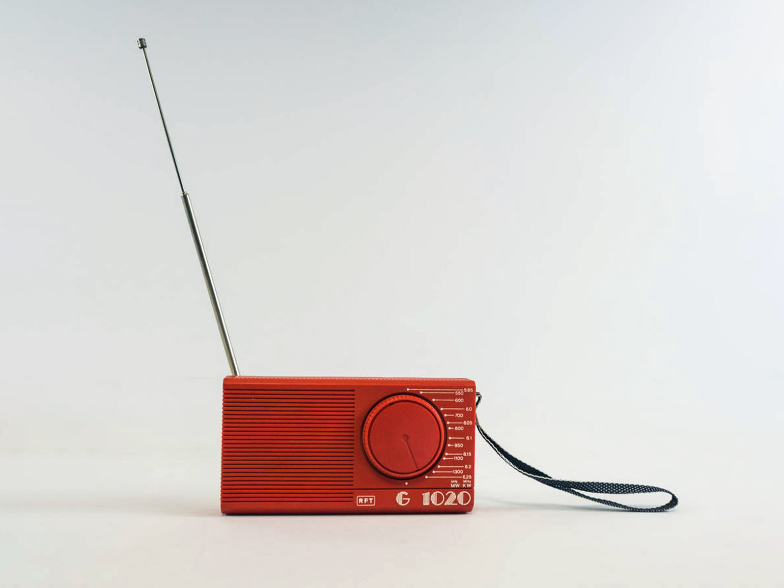
Pocket radio Nachrichtenelektronik Greifswald G1020, 1986
Photo: DDR Museum
The designer designs the product with its intended use in mind. The design should not detract from the function by excessive decoration.
Principle #6
Good design is honest
Fifties calculators are a gadget that can be confusing. For example, Casio's MG-880 has game and calculator modes - the average user may not immediately realize it. And above each button there are additional inscriptions, the meanings of which are not always clear.
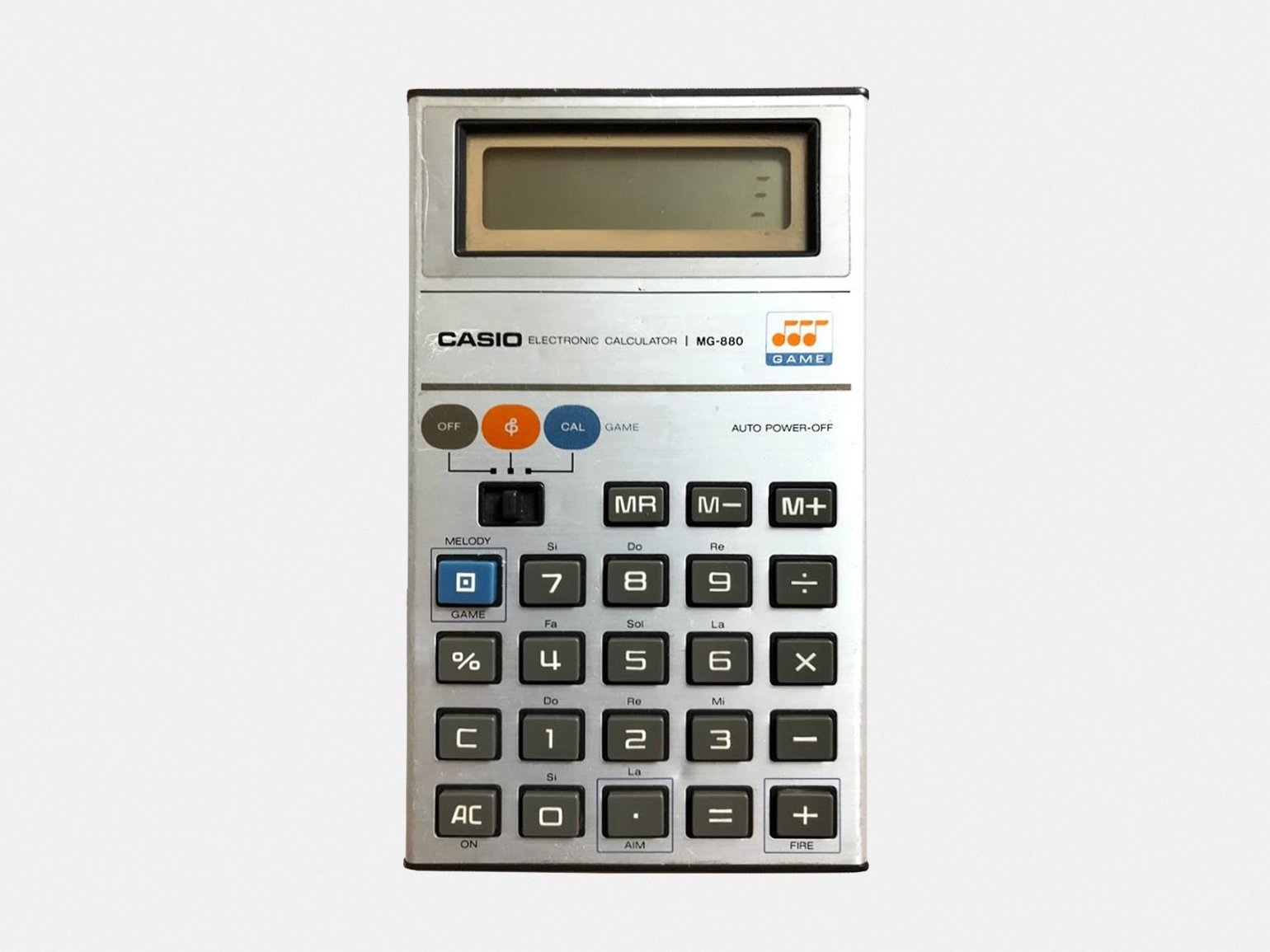
Calculator Casio MG-880, 1980
Photo: truckdriver / Carousell
The Braun ET66 calculator shows at a glance what it can do and how to use it. There are no unnecessary modes, and there are no puzzles above the buttons. The design is clear and the functions are obvious.
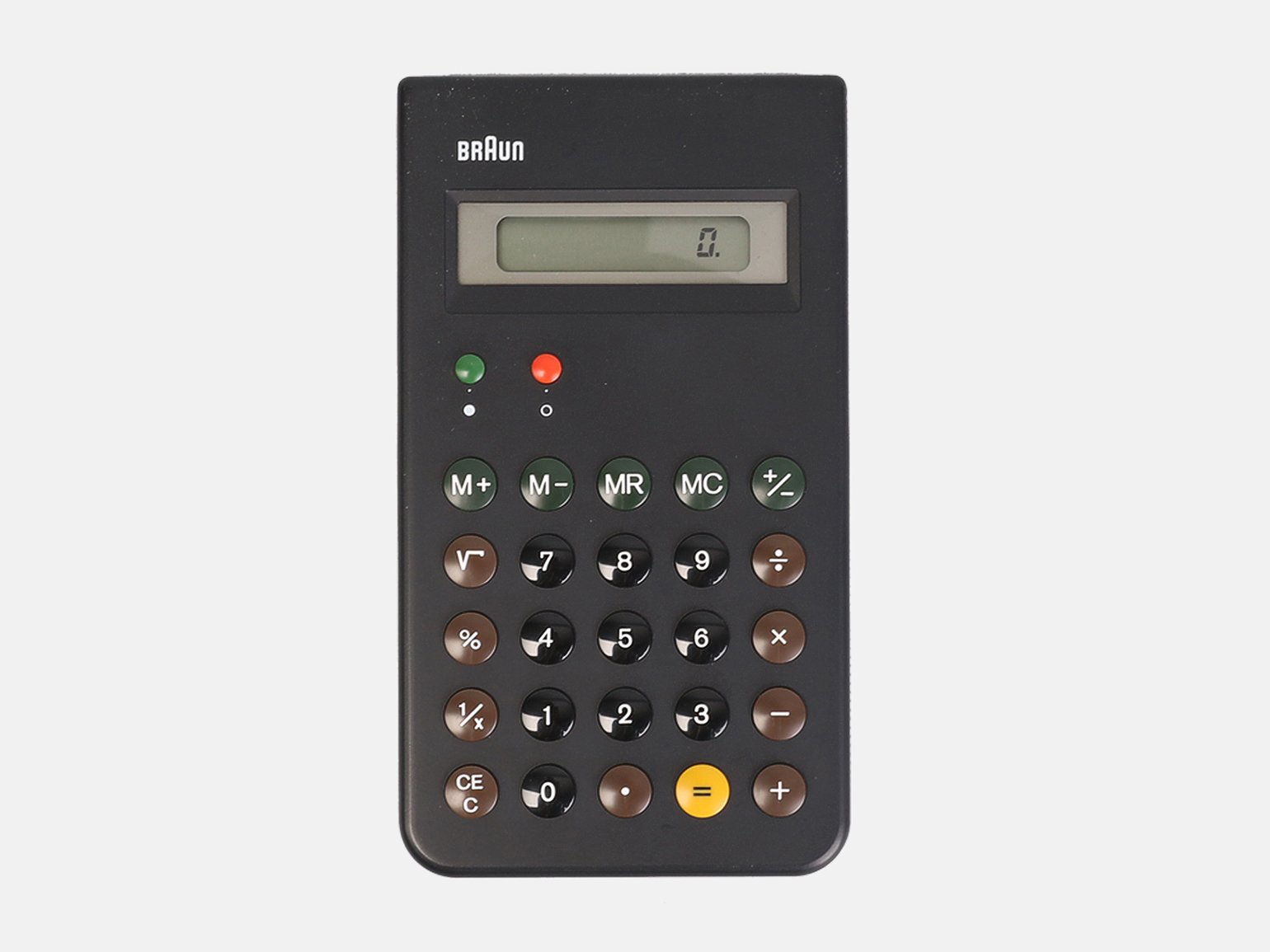
Calculator Braun ET66, 1987
Photo: Only / Once Shop
Later, Casio also made the design of calculators clearer. The colors of the buttons suggest the main functions, and the single ON sign does not distract you during calculations. Calculators in Android, iOS, Windows and macOS are designed according to the same principle.
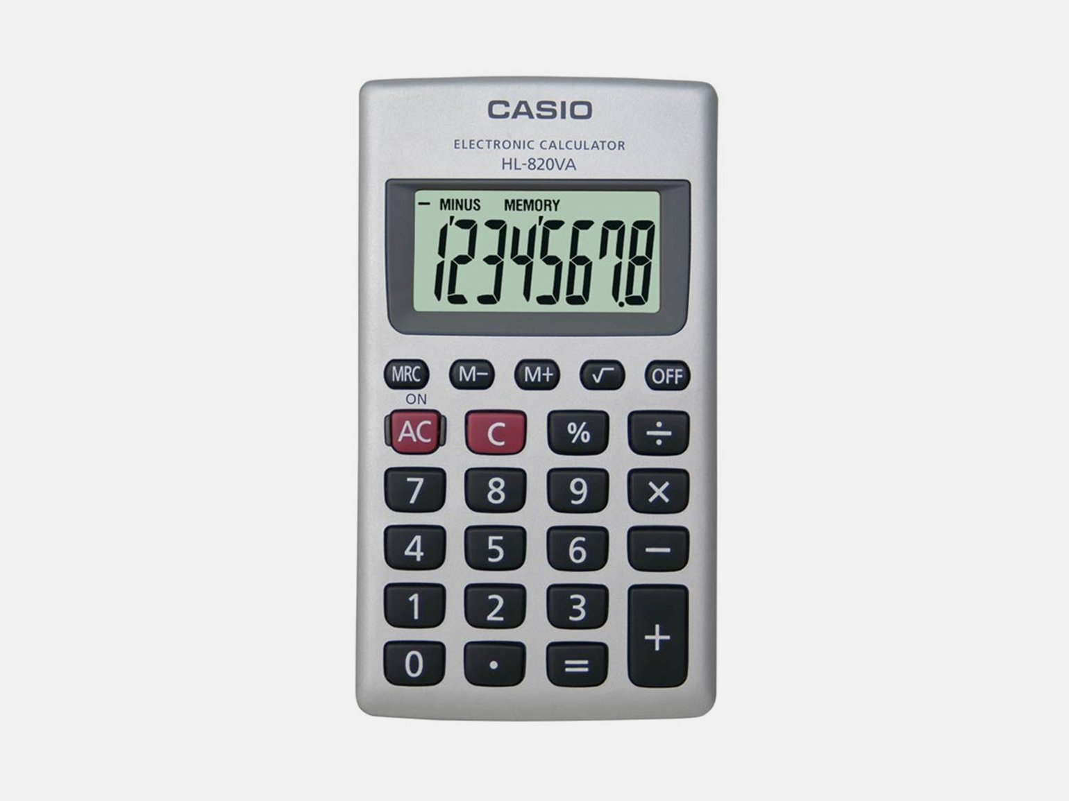
Calculator Casio HL-820VA, 2005
Photo: CASIO
The designer designs the product so that it does not mislead the user.
Principle #7
Good design thoughtfulness
Televisions in the fifties had a wooden case, like the Philips Starenkasten model. This design did not fit well with the interior of the apartments of the time, and the layout of the controls was confusing - the knobs were too close and the captions were very small.
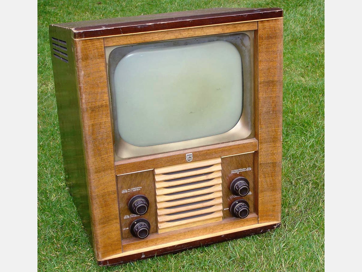
TV Philips Starenkasten, 1952
Photo: Marcels TV museum
In 1964, Dieter came up with the design of the Braun FS80 TV set. The controls are placed at the bottom of the unit to make it more convenient for the user. Thanks to the stand, there is no need to buy another chest of drawers. The housing is made of metal and plastic, which does not deteriorate as quickly as wood.
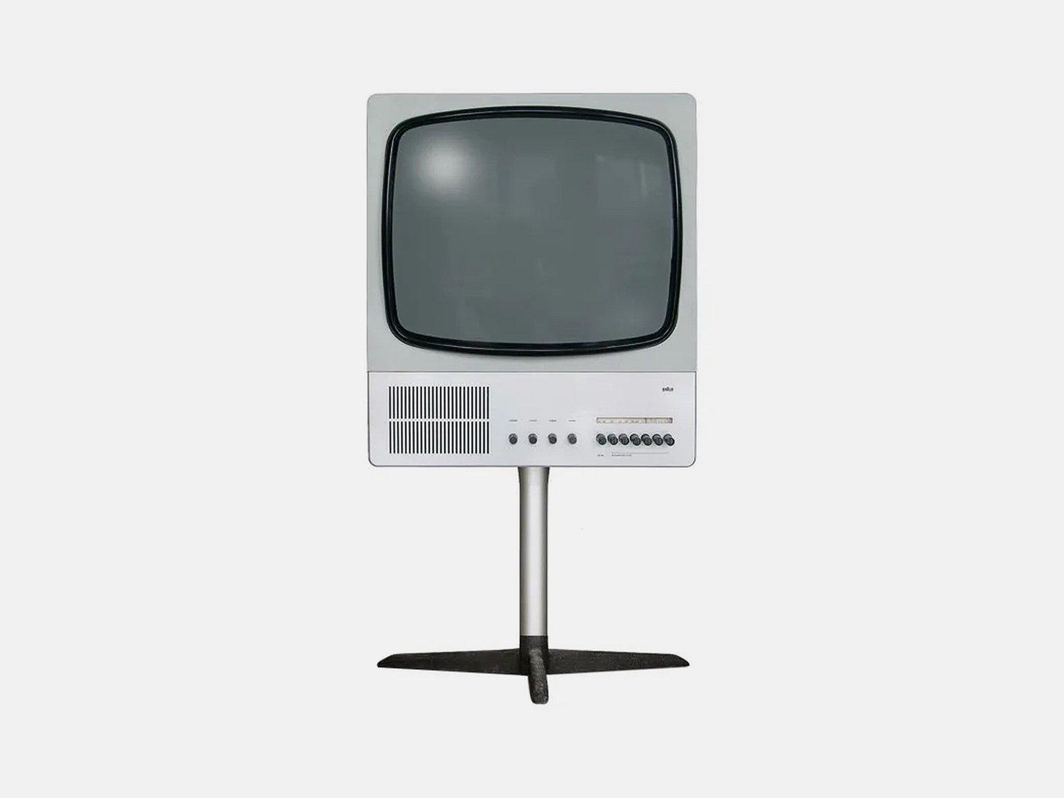
TV Braun FS80, 1964
Photo: Future Forms
Competitors have adopted Dieter's TV design. The Grundig brand launched the W 7600 nine years after Braun. The principle of the interface design has not changed.
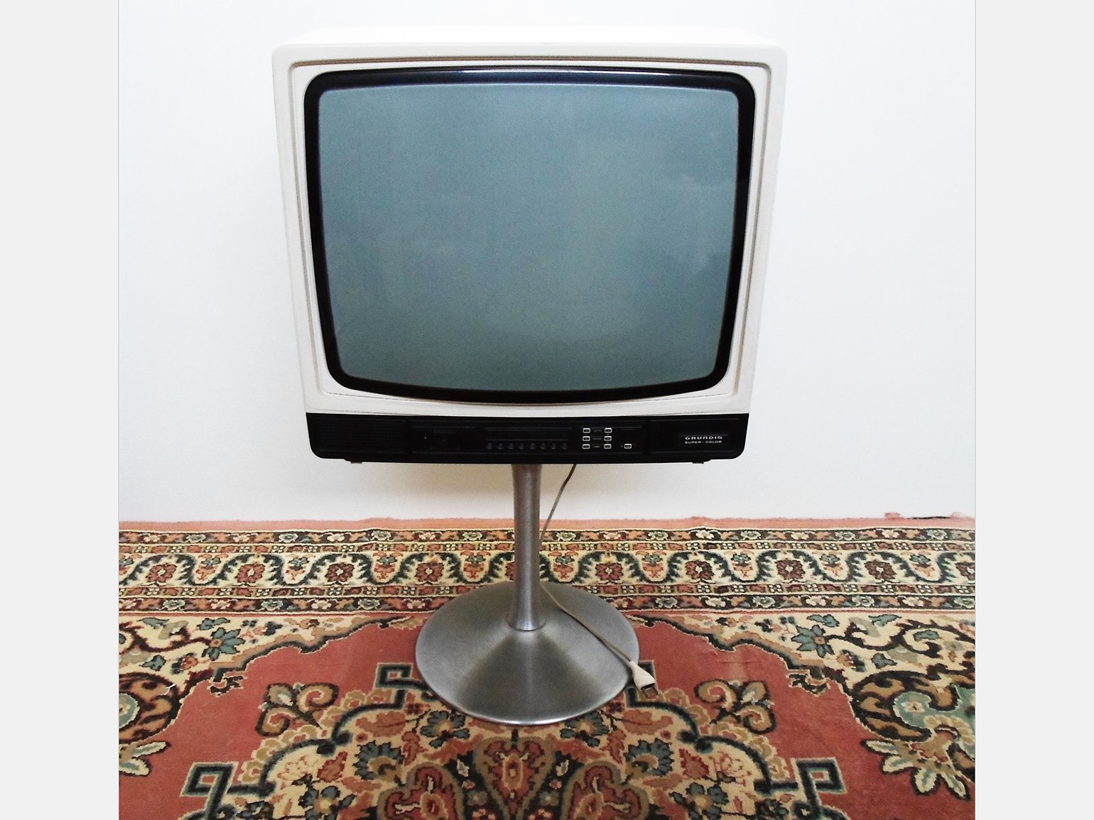
TV Grundig W 7600, 1973
Photo: Catawiki
The designer draws on the users' experience to create a product and solve their problem.
Principle #8
Good design is durable
In the 1950s and 1960s, Germany was recovering from the war and people needed new upholstered furniture for small apartments. Back then, manufacturers made it functional, but its design was not thought out enough to be quoted to this day.
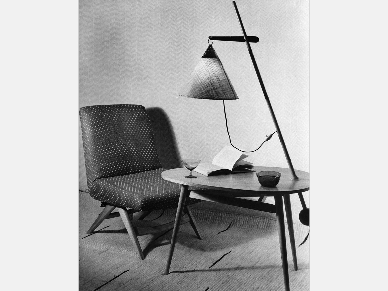
A typical living room in Germany in the fifties
Photo: ullstein bild / ullstein bild / Getty Images
Dieter Rams designed the “620” armchairs for Vitsoe in 1962. This model is still in production today. The upholstery color options have been added, but their construction has not changed.
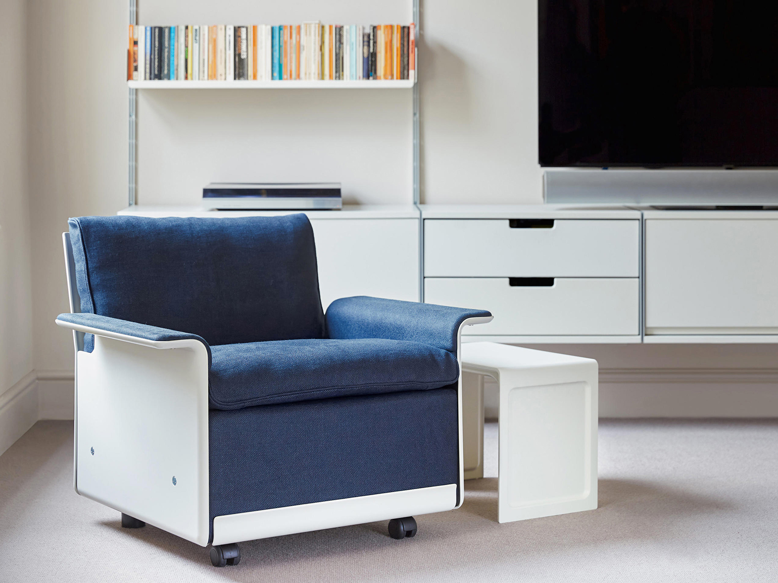
Chair Vitsoe 620, 1962
Photo: Vitsœ
Art Nouveau furniture is becoming popular due to its calm form and compactness. In 1970, designer Hans Wegner created an armchair based on the “620” model.
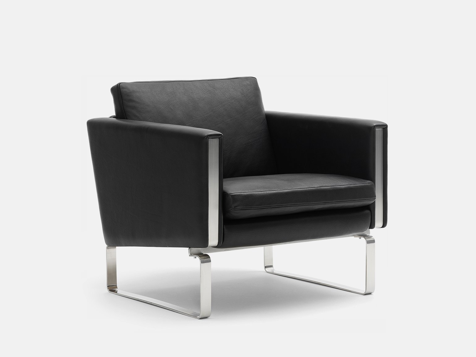
Chair Hans J. Wegner CH101, 1970
Photo: Carl Hansen
A designer develops a product so that it will be relevant for longer. He does not rely on trends, but works timelessly.
Principle #9
Good design is environmentally friendly
Juicers in the seventies were made of plastic. To get juice, people pressed on the body, which often caused them to break. There is no way to repair plastic parts - you can only throw them away and buy a new juicer.
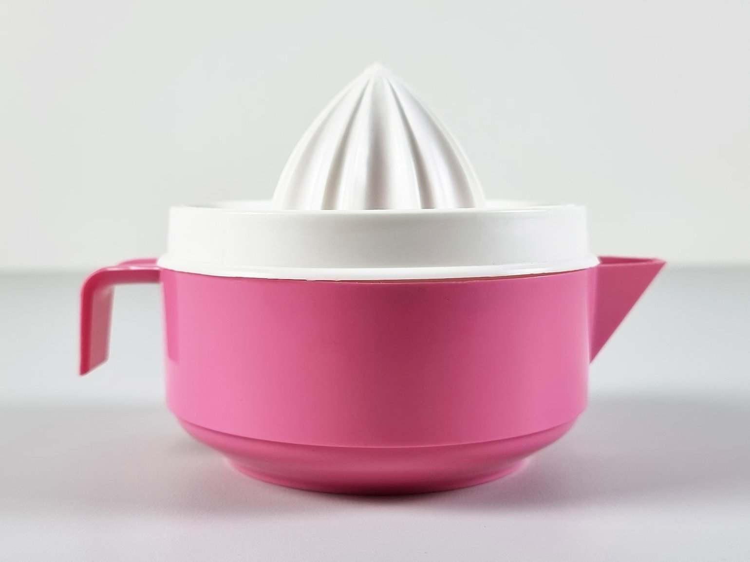
Hand juicer DBP Antwerp, 1970
Photo: NeospaceObjects / Etsy
Dieter designed the MPZ 21 electric juicer. If a part of the appliance broke, it could be repaired at the service center. Braun still produces this juicer and its accessories. Only the name has changed - Tribute.
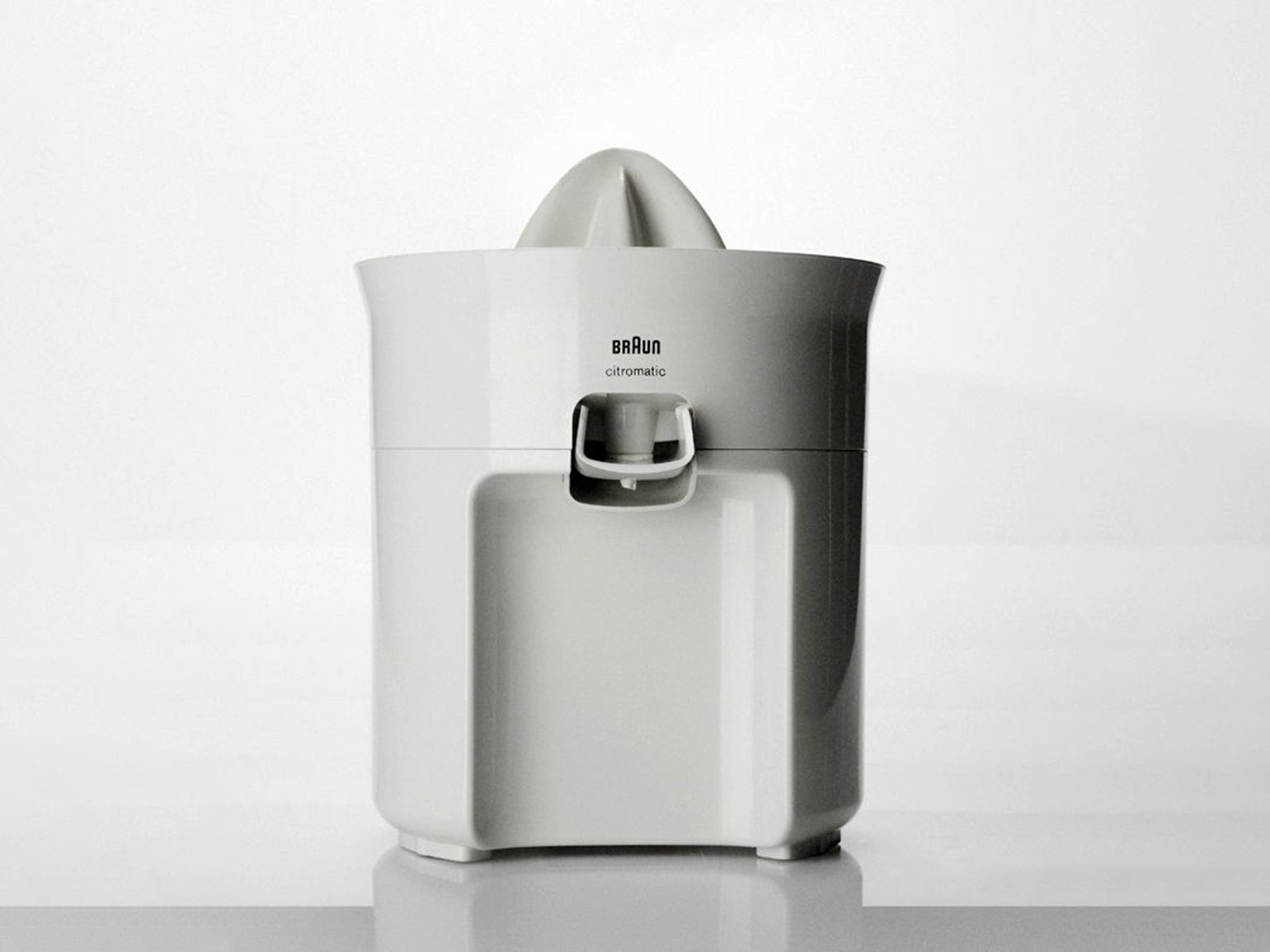
Juicer Braun MPZ 21, 1972
Photo: Braun
The principle of eco-friendliness is not only about the fact that appliances can be repaired, but also about the material from which they are made. Bosch, for example, makes juicers from plastic that does not poison the soil when it decomposes.
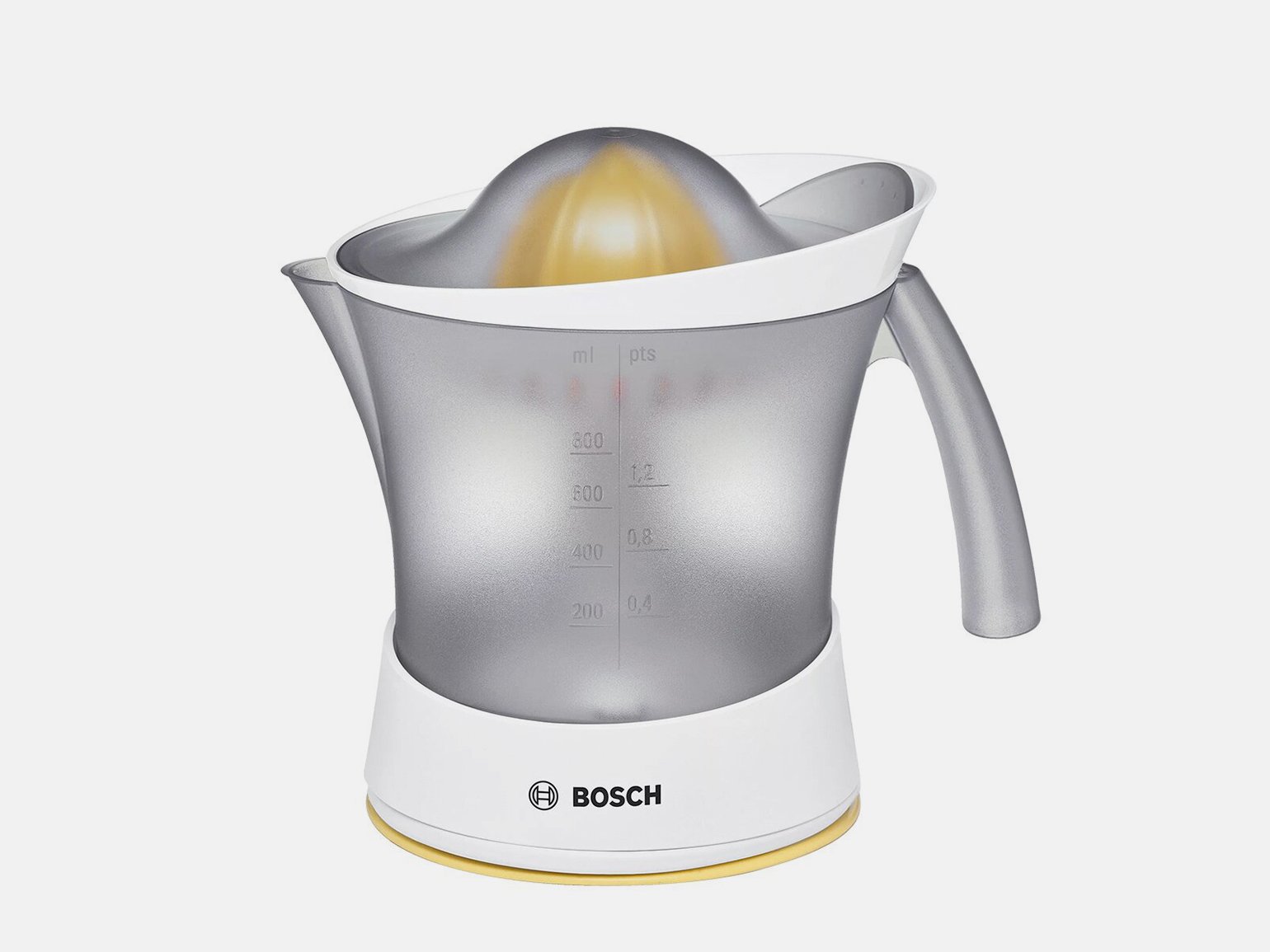
Juicer Bosch VitaPress MCP3500N
Photo: Bosch Global
Designer designs a product from natural or less toxic materials. Designs products so that they last longer and can be repaired.
Principle #10
Good design is as little design as possible
In the fifties, speakers were not the most popular gadget. They have a solid wood cabinet that makes them look like kitchen cabinets.
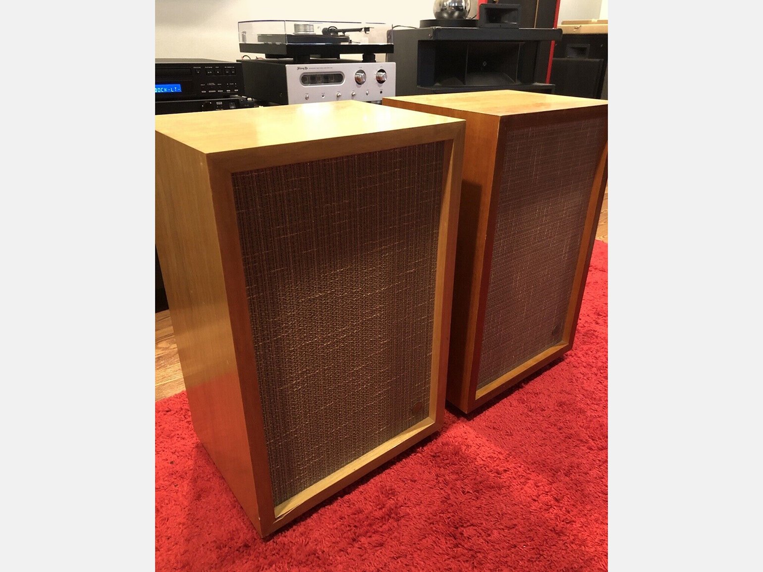
Speaker Stephens Trusonic 80FR, 1958
Photo: audiolux-86 / eBay
Dieter designed the LE1 speaker without decoration. It looks beautiful thanks to the materials - perforated front panel, thin aluminum frame and glossy metal feet. There is not even a manufacturer's logo on the front.
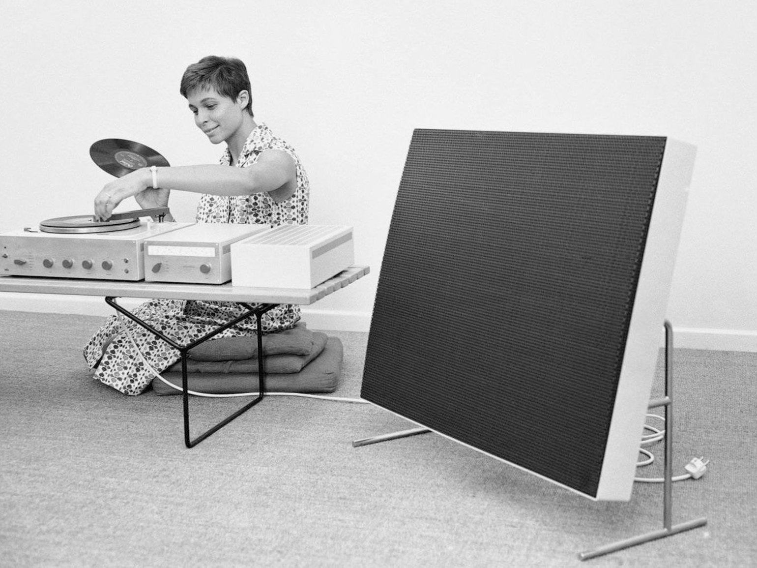
Speaker Braun LE1, 1959
Photo: Braun
The principle of “Good design is as little design as possible” has been adopted by competitors. For example, Ampex made a very similar speaker:
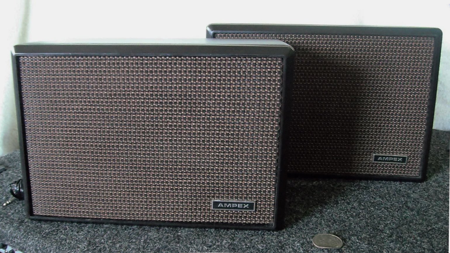
Speaker Ampex 406, 1970
Photo: STAN’S GEAR LOCKER / Reverb
A designer, when he designs a product, needs to stop in time. Do not hide the essence of the product with decoration.
What's Your Reaction?


![[VIP] DesignCode: Build Beautiful Apps with GPT-4 and Midjourney](https://design.rip/uploads/cover/blog/designcode-gpt4.webp)
![[VIP] AppCoda: Mastering SwiftUI - Professional Packet (Updated 04.2023)](https://design.rip/uploads/cover/blog/appcoda-mastering-swiftui-professional-packet-worth.webp)
![[VIP] AppCoda: Beginning iOS Programming with Swift (Updated 04.2023)](https://design.rip/uploads/cover/blog/appcoda-beginning-ios-programming-with-swift.webp)
![[VIP] Whoooa! 156 vector Lottie animations](https://design.rip/uploads/cover/blog/whoooa-156-vector-animations.webp)


![[VIP] Motion Sound Vol. 1](https://design.rip/uploads/cover/blog/designrip-svx.webp)

