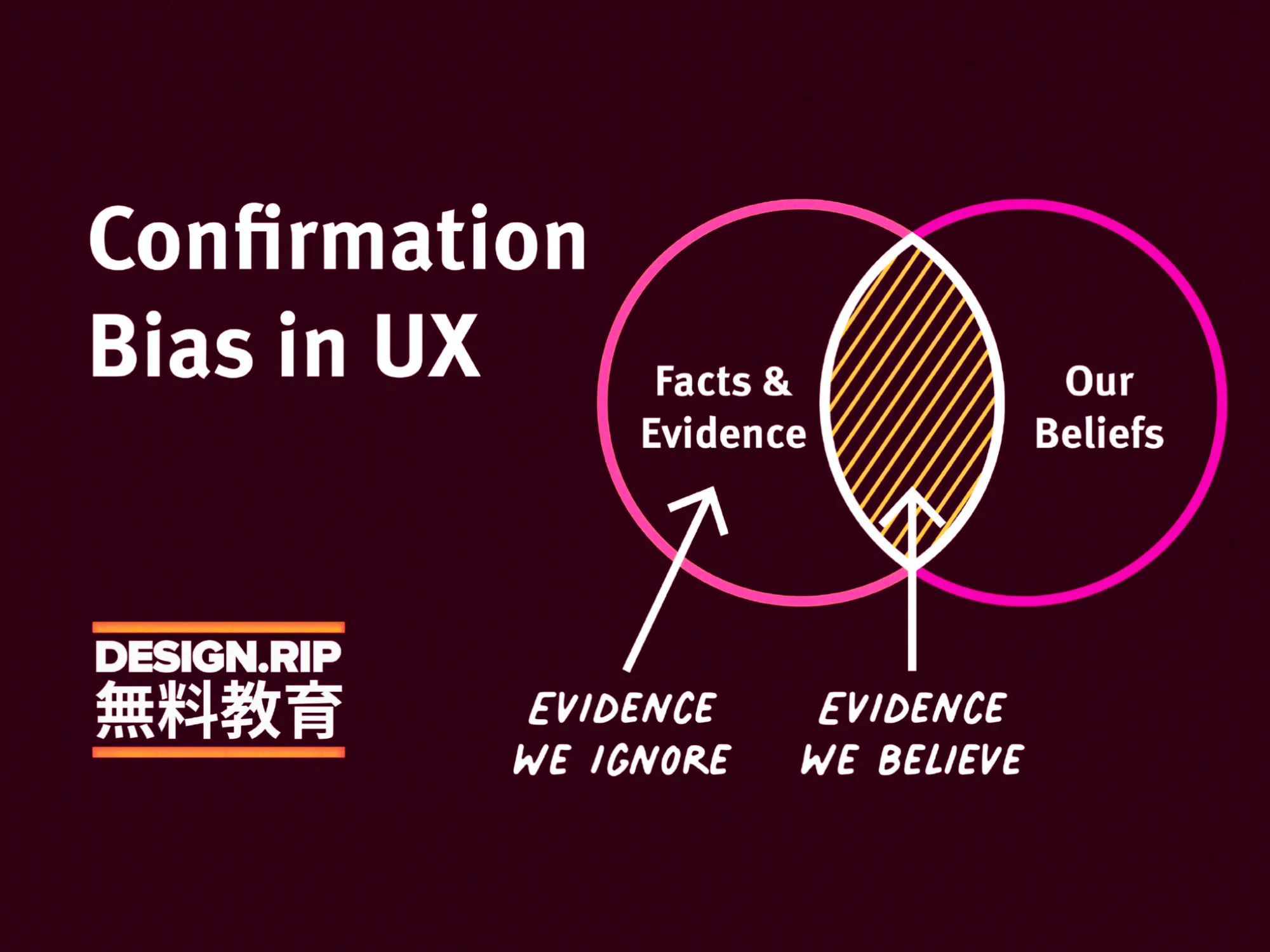
Confirmation Bias in UX
Confirmation bias can have serious consequences in UX research and design because it can distort practitioners’ perspectives by excluding alternative options and delegitimizing disagreement.

Summary: People tend to prefer information that confirms their existing beliefs and to undervalue information that contradicts their beliefs. With the appropriate research methods, the confirmation bias can be recognized and avoided in UX design.
When scanning your social-media feeds, did it ever happen to you to ignore articles posted by friends with political views different than yours? Yet, you probably paid attention to the content shared by those who are on your side of the political spectrum. This is an example of confirmation bias — a term that was first introduced by psychologist Peter Wason in 1960 and that refers to the tendency to let prior beliefs influence how we perceive new information.
Definition: Confirmation bias is a cognitive error that occurs when people pursue or analyze information in a way that directly conforms with their existing beliefs or preconceptions. Confirmation bias will lead people to discard information that contradicts their existing beliefs, even if the information is factual.

Confirmation bias can be seen as an instance of priming — our prior beliefs influence how we search for new information and distort how we interpret it. It is a cost-efficient way to understand the world — after all, it’s easier to stick with a hypothesis than to discard it and come up with another one instead.
Here are some typical ways in which confirmation bias manifests:
- People tend to ignore information that challenges their existing beliefs. Often, this is because our egos get in the way of unbiased thinking. Ego can cloud our judgment, causing us to feel uncomfortable with information that challenges our beliefs.
- People tend to seek information that confirms their existing beliefs. Not only is confirming information more comfortable to interpret, but doing so helps us justify our beliefs and fuels our confidence in the subject.
- People exhibit this bias when they selectively gather or recall information or when they interpret it in a biased manner. This can look like hearing only one side of a news story or interpreting the story in a way that confirms prior beliefs.
The impact is greater for emotionally charged issues and deeply ingrained beliefs, such as religion, race, politics, women’s rights, or climate change.
Of more importance to those working in UX, the more invested you are in your assumptions about the design or the users, the stronger the confirmation bias. For example, if you have worked for months to create a design, you will be very likely to believe usability evidence that says that the design is fine and be skeptical of any findings that show problems with the design. On the other hand, if you only worked for a day or two on a paper prototype before running a usability study, you will be less biased in interpreting the findings.
Confirmation Bias in UX Research and Design
Confirmation bias can have serious consequences in UX research and design because it can distort practitioners’ perspectives by excluding alternative options and delegitimizing disagreement. Recognizing and overcoming confirmation bias will lead to improved decision making, research, and, eventually, better products and user experiences.
For example, imagine an ecommerce site that, in spite of a lot of traffic and users who put products in their bags, has low sales. The designers hypothesize that the inferior performance is due to a poorly designed checkout button (preconceived belief). They decide to collect feedback and ask the following survey question:
Was the red checkout button difficult to locate?
There are several problems with this question:
- The focus on the checkout button biases the study to collect evidence in favor of the prior hypothesis that designers started with. Even if the responses indicate that yes, the button was difficult to find, that issue might not be the biggest issue users have with the site or with the checkout process.
- The negative language (difficult to locate) primes participants to think about the issues with this button (rather than about whether the button was effective or not).
- The close-ended binary question leaves users with no room for providing context about the actual experience and issues that they encountered.
A better, nonleading question is:
How was the checkout process? Please explain anything that you liked or disliked about the process.
This question avoids priming the participants and does not cater to designer’s confirmation bias. It recognizes that the checkout process might be the problem and allows the respondents to elaborate and give contextual feedback.
To summarize, there are many ways that in which confirmation bias can affect UX professionals:
- Asking biasing questions and (more generally) setting up a test so that it seeks to confirm the researchers’ assumptions rather than investigating other possible issues and causes for a problem
- Ignoring evidence that points in a different direction (e.g., in a usability test)
- Interpreting ambiguous evidence in the favor of the researchers’ prior hypotheses or assumptions
Tips for Preventing Confirmation Bias in UX Research
Being aware of confirmation bias is the first step in avoiding it. Here are a few ways in which UX researchers and designers can prevent confirmation bias:
Research rather than validate. UX professionals should start with an open mindset and aim to test hypotheses and assumptions instead of validating them. The goal of research is to uncover things we did not know beforehand, not to confirm our expectations. Designers should be nimble and able to quickly recognize that they are on the wrong path instead of spending time and resources to dig deeper into an unpromising design solution. To avoid this cycle of validation, where designers assume that the test will confirm what they already believe to be true, understand that the planning stage of any user study should include a comprehensive review of the test objectives.
Get early data. As mentioned above, the less time, resources, and emotions you have vested in a certain design, the less biased you will be when interpreting observations from user research. Thus, the sooner you get empirical data from the target audience, the more likely you are to be relatively unbiased when analyzing the data and acting on the findings.
Ask nonbiasing questions. When UX practitioners gather feedback from users, whether through usability testing, diary studies, or interviews, avoid asking leading questions. Leading questions prime the test participants and make them sensitive to those issues that the researchers may be interested in.
Often, when you have a specific hypothesis, it can be difficult to come up with a question that is not leading (like in our checkout example). Always step back and ask yourself: is there any way in which this question may be suggesting a response to the participant? Could the participant guess what my hypothesis is from this question? If the answer is yes, rephrase the question. Participants are human beings and they will often want to feel helpful and please the facilitator by trying hard to consider what they think may be the researcher’s interest and point of view.
Use triangulation. Multiple data sources can not only boost the credibility of your research, but can prevent confirmation biases. It can be easy to twist and turn one research finding to match your hypothesis, but it’s a lot more difficult to do so with data coming from several different sources such as user testing, analytics, quantitative studies, or customer-service logs. In the example above, imagine that the designers looked at the site’s behavior flow in some analytics software before seeking user feedback. They might have found that most dropoffs happen later in the checkout flow, long after the checkout button was clicked. This observation alone could lead them to ask better questions. Or, let’s say that the user feedback indicated that users didn’t have any issues with the checkout process, but the analytics data clearly shows that users aren’t making it through the entire process. Here, perhaps the survey didn’t ask the right question, ignoring the real reason behind the high abandonment rate.
Involve fresh eyes in research planning and analysis. Whenever possible, ask a colleague who is not directly involved in your project to go through your study plan and sit in your presentation of the findings. Often, someone who has no background knowledge about prior assumptions can bring a new, neutral perspective and more easily help you identify the effects of confirmation bias.
Why Confirmation Bias Is important
Confirmation bias can cause people to hold strongly to false beliefs or to give more weight than the evidence warrants to information that supports their beliefs. People may be overconfident in their beliefs because they have accumulated evidence to back them up, even though much evidence refuting their beliefs has been overlooked or ignored. In UX, confirmation bias can cloud judgement, impact the ability to empathize with users, lead to poorly designed research studies, and cause misinterpretation of feedback results. By understanding how confirmation bias can impact both researchers’ output and users’ responses, UX practitioners can use practical methodologies for collecting actionable data that leads to well-designed products.
References
Hallihan, G. M., & Shu, L. H. (2013). Considering confirmation bias in design and design research. Journal of Integrated Design and Process Science, 17(4), 19-35.
Wason, P. C. (1960). On the failure to eliminate hypotheses in a conceptual task. Quarterly Journal of Experimental Psychology, 12, 129-140.
What's Your Reaction?


![[VIP] DesignCode: Build Beautiful Apps with GPT-4 and Midjourney](https://design.rip/uploads/cover/blog/designcode-gpt4.webp)
![[VIP] AppCoda: Mastering SwiftUI - Professional Packet (Updated 04.2023)](https://design.rip/uploads/cover/blog/appcoda-mastering-swiftui-professional-packet-worth.webp)
![[VIP] AppCoda: Beginning iOS Programming with Swift (Updated 04.2023)](https://design.rip/uploads/cover/blog/appcoda-beginning-ios-programming-with-swift.webp)
![[VIP] Whoooa! 156 vector Lottie animations](https://design.rip/uploads/cover/blog/whoooa-156-vector-animations.webp)


![[VIP] Motion Sound Vol. 1](https://design.rip/uploads/cover/blog/designrip-svx.webp)


