[VIP] Baymard Institute: Mobile E-Commerce Usability - An Original UX Research Study
How do you design a user-friendly shopping experience for a 5-6 inch screen? At Baymard we'd conducted the world's most comprehensive research study of mobile e-commerce UX - spanning more than 20,000 hours only testing mobile user...
![[VIP] Baymard Institute: Mobile E-Commerce Usability - An Original UX Research Study](https://design.rip/uploads/cover/blog/baymard-research-mcommerce-usability.jpeg)

Mobile traffic has soared in recent years and now often constitutes 50% of all traffic on many e-commerce sites. However, it’s not uncommon for mobile e-commerce sites to still have a significantly poorer conversion rate than their desktop counterpart – in some cases converting less than half as many visitors into customers.
At Baymard we’d conducted the world’s most comprehensive research study of mobile e-commerce UX - spanning more than 20,000 hours only testing mobile user behavior. This mobile usability study examines how the touch interface, the small screen, and users’ mobile behavior introduce a whole host of pitfalls to watch out for when designing and running a mobile e-commerce site.
Despite testing the mobile sites of 50+ of the largest e-commerce players in the world, the test subjects encountered a staggering 3,600+ mobile-related usability issues during the test sessions. These usability issues have been analyzed and distilled into 340+ mobile UX guidelines on how to best design and structure a high-performing mobile e-commerce site, as well as documenting how end-users perceive and interact with mobile sites in a shopping context.
This page provides you an overview of our research specific to Mobile E-commerce UX. All of this research is available as part of Baymard Premium.
···
The Current Mobile E-Commerce UX Performance
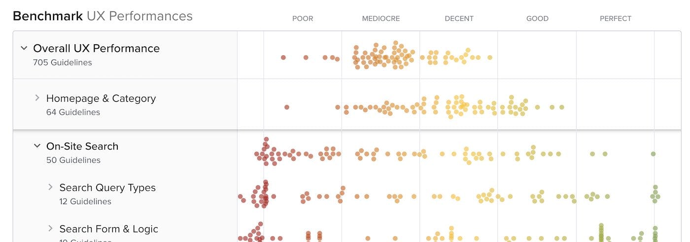
Based on the findings from the qualitative usability research study we’ve also benchmarked the full mobile user experience of 93 of the largest US and European mobile sites. This provides you with 9,000+ worst- and best-practice mobile UX examples, and 12,300+ mobile UX performance scores.
The UX benchmark of the 93 major mobile e-commerce sites provides a clear picture of the general state of mobile e-commerce performance, and identifies common design flaws as well as strategic oversights and opportunities.

The Mobile E-Commerce UX performance for the average top-grossing US and European e-commerce site is “mediocre”, with none of the mobile sites benchmarked having a “decent” or “good” UX implementation and performance. This leaves nearly all sites in a tight cluster of 52% “mediocre” (or worse), and 48% “acceptable”. That said, while there aren’t any standout performances, there are also very few “poor” or outright broken experiences.
In comparison, in most of the other e-commerce UX studies we’ve conducted at Baymard Institute the average UX performance also amounts to “mediocre”, but also tends to have a wider spread of variation and performance scores.
This benchmark dataset thus shows that there’s ample room for improvements when looking within the specific topics of the mobile user experience — in particularly the UX within Mobile Homepage, Mobile Main Navigation & Categories, Mobile On-Site Search, Mobile Forms, and Mobile Sitewide Features & Elements. These topics carry issues for many sites, and also include some “missed opportunities” for the e-commerce industry as a whole. Also, note that this is an analysis of the average performance across 177 top-grossing US and European e-commerce sites. When analyzing a specific site there’s nearly always a handful of critical UX issues along with a larger collection of worthwhile improvements — this is the case even when we conduct UX audits for Fortune 500 companies.
In Baymard Premium we provide an in-depth walkthrough of the UX performance and competitive landscape within the 31 topics of Mobile E-Commerce UX, along with “missed opportunities” to be extra alert to.
Lastly, and most importantly, it’s worthwhile mentioning that the mobile platform is truly difficult to design for – the lack of screen real estate causes a dramatic loss of page overview for users (as described in this article). As a result, most of the best-performing solutions and patterns, including those identified in this study, are, in the end, still a compromise. They provide the best attainable results and mobile UX given the limitations of the mobile platform.
This is a sub-set of the full benchmark which includes 177 e-commerce sites.
View our full UX benchmark
···
31 Research Reports on Mobile UX
PAID RESEARCH CONTENT
All 340+ mobile UX research findings are available as part of Baymard Premium, and are divided into the following 31 topics (2,020 pages of research findings in total):

What's Your Reaction?


![[VIP] DesignCode: Build Beautiful Apps with GPT-4 and Midjourney](https://design.rip/uploads/cover/blog/designcode-gpt4.webp)
![[VIP] AppCoda: Mastering SwiftUI - Professional Packet (Updated 04.2023)](https://design.rip/uploads/cover/blog/appcoda-mastering-swiftui-professional-packet-worth.webp)
![[VIP] AppCoda: Beginning iOS Programming with Swift (Updated 04.2023)](https://design.rip/uploads/cover/blog/appcoda-beginning-ios-programming-with-swift.webp)
![[VIP] Whoooa! 156 vector Lottie animations](https://design.rip/uploads/cover/blog/whoooa-156-vector-animations.webp)


![[VIP] Motion Sound Vol. 1](https://design.rip/uploads/cover/blog/designrip-svx.webp)

![[VIP] The Complete Freelancing Bundle](https://design.rip/uploads/cover/blog/freelancerbundle.webp)
![[VIP] Thе Futur: Brand Messaging Kit](https://assets-global.website-files.com/5d816b07d269382588dbcab1/5e4d8baf291197225248055c_bmk-overview1.jpg)
