Why do product designers need to understand metrics?
In my life, I've often heard from junior/middle designers that metrics are for analysts and product managers, while designers are creators and don't need all those complicated numbers. I strongly disagree with this statement and believe that it is critical for a product designer in an IT company to understand metrics at a sufficient level. In this article I want to understand why it is important and what level is sufficient.
In my life, I've often heard from junior/middle designers that metrics are for analysts and product managers, while designers are creators and don't need all those complicated numbers.
I strongly disagree with this statement and believe that it is critical for a product designer in an IT company to understand metrics at a sufficient level.
In this article I want to understand why it is important and what level is sufficient.
User path in the product

It is very important for a designer to know how a user behaves in a product (Product User Flow). Without it, it is impossible to understand the strengths and weaknesses of the product, and it is difficult to improve anything.
In addition, user behavior can tell you where something went wrong, and where, on the contrary, the functionality became super popular, although no one expected it.
That's why I want to cite a few basic stages of the user's life in products, which a designer should rely on in his work.
Acquisition
The user journey doesn't usually start with your website or app. The user gets into the product somehow. And it's actually a good idea to understand how that happens: whether it comes from Google, or a partner site, or another part of your ecosystem. The solutions you can offer may depend on that. For example, if a user comes to your site from an Email newsletter, the landing page may look very different from what would come from Google. After all, if you have an email, you may have a name and a previous history of life in the product. This already allows you to use personalized offers or customize the look of the product to your needs.
The main thing a designer needs to know is: where do users end up on the site?
Activation
Not everyone who encounters your product can understand its value. Activation is therefore a critical step. It is the design decisions that play a key role here. After all, you need to show the user in seconds what the product is, how to use it and how to maximize value.
Frightening figures can be seen on Google, with an average bounce rate of 50% on stock sites.
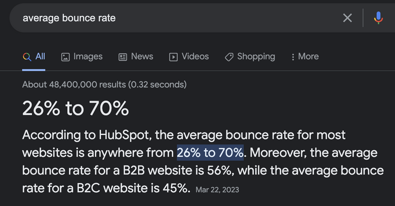
What does that mean? That half of the users enter the site and immediately leave it! One can only imagine that even more users, although not leaving the product immediately, do not understand how to use it or do not achieve the goal for which they came.
So activation is measured differently in each product, but it is important to understand the current level, and if it needs to be improved, move in that direction.
What questions should the designer ask: Are we measuring activation? If so, what do we consider activation? What is a set of user events? Do we know the failure rate of our product?
Engagement
Next, we interact with the website. After the user has figured out what the product is and why, it is important that they use the available functionality and close their pain for which the product was created.
Of course, it's important for the designer to focus on how all the elements of the product work, which ones are most popular, and for which segment of users. Only then can something be improved.
What questions should a designer ask: do we understand what percentage of users use what functionality? If there are complex funnels in the product, it's important to know about their progression. For example, there's a 5-step registration form, what percentage of users go through each of those steps? What percentage even start to sign up? What percentage finish? Is there anything of interest to this segment of users? This is also where you can find out the average length of a user session in your product, this will give you an understanding of what range you're working with. If you come up with a super cool feature, but it takes the user 1 minute to use it, and he spends a total of 4 minutes on the site, there is a small chance that he will be willing to allocate 25% of the time the user allocates to your product to the new functionality.
Retention
And of course, the main goal of most products and the criteria for success is to have users return to the site or app. This is Retention, the higher the Retention, the more likely you can be sure that your business is working well, users have figured out the product and it is creating more value for them.
This is where the brand is already strengthened because your audience becomes the core that even with a small injection of money into campaign marketing will still support the company and the product.
For example, the Netflix brand has already become so well known that most people who visit the site simply kill the domain with their hands or save it in their bookmarks. People don't Google it: they watch a movie and just type netflix.com into their browser and go straight in.
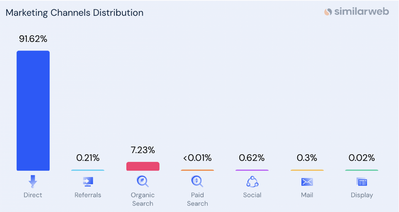
What questions should the designer ask: What is the company's current Retention level? Over what period does the company calculate Retention? Week/month/year? Why is this the case? What is factored into Retention? What if a user has just returned or needs to take an additional action?
Experiments and hypotheses
Having understood the current picture, the designer can already start forming hypotheses on how to improve certain metrics.
Usually the stages described above highlight weaknesses: either users disappear immediately, or do not use the functionality at all, or return to it very little.
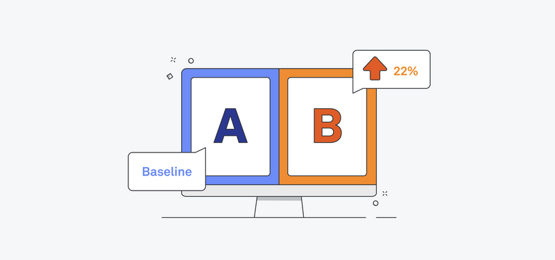
Based on this, you can formulate ideas for improvement and validate them with AB tests of the product.
There is another distortion here that only analysts can analyze the AB-test, and the designer just waits to see if the idea will work or not.
But why limit yourself and depend on other people?
In fact, a designer can definitely understand the key metrics on the basis of which decisions are made on AB tests, and with the help of ready-made tools, understand what is happening with an idea and how it has performed.
Where to start. Typically, a company will decide on AB tests based on a few metrics that provide insight into changes in business value and user value. So start there. Business value is a metric that correlates with the company's revenue. This could be subscriptions, or revenue right away $$$$. User value is a little more complicated, these metrics need to show that you haven't made things worse for the user. It could be the same adapted Activation/ Engagement/ Retention.
And now we already have two metrics that are not easy to get lost in. If your company doesn't have an analytical tool where you can look at the change in these metrics, request one :)
You should not expect analysts to parse every experiment, of course, that the final word is likely to be yours, but the intermediate results, the dynamics, the understanding of whether things are good or bad, the designer can quickly understand and use in his daily work. I went in, looked at which tests were definitely at a disadvantage, and went to think about next steps. The experiment may drag on for a few more days until the minus becomes statistically significant, but by then the designer will have already formulated the next steps.
Well on top of that, I would recommend taking 1-2 hours of consulting on an analytical tool.
If the company uses Tableau, Amplitude, MixPanel, Google Analytics - please tell us how to use them, what you can find interesting there, film this meeting in Zoom and come back to it if necessary.
In my experience, collaborations with designers have varied from "we don't know each other's names" to daily meetings to analyze text results and metrics. And of course, the second option brings much more money to the business, because the changes and ideas of the person responsible for UX/UI are based not only on experience or intuition or the latest trends in design, but also on the real facts of a particular product. This makes the ideas better and the probability of success of AB tests higher.
Company goals

I'll add one last thing about company goals, though it's probably the most important. Understanding metrics allows designers to design a product that contributes to strategic business goals. If we understand that the company's goal is money and only money, with "we need to reach 3x the previous year", then 10 Adsense banner ads might not be a bad idea! But if we see that the business is aiming to triple the activation metric in one year, then it might be better to do away with ads altogether, because sometimes you can lose in the moment but win in the long run. Opting out of advertising can increase not only activation but also user return to the product, which in turn can be good for things financially.
None of this can be consciously suggested without a clear understanding of where the company and you as part of it want to go.
What's Your Reaction?







![[VIP] DesignCode: Build Beautiful Apps with GPT-4 and Midjourney](https://design.rip/uploads/cover/blog/designcode-gpt4.webp)
![[VIP] AppCoda: Mastering SwiftUI - Professional Packet (Updated 04.2023)](https://design.rip/uploads/cover/blog/appcoda-mastering-swiftui-professional-packet-worth.webp)
![[VIP] AppCoda: Beginning iOS Programming with Swift (Updated 04.2023)](https://design.rip/uploads/cover/blog/appcoda-beginning-ios-programming-with-swift.webp)
![[VIP] Whoooa! 156 vector Lottie animations](https://design.rip/uploads/cover/blog/whoooa-156-vector-animations.webp)


![[VIP] Motion Sound Vol. 1](https://design.rip/uploads/cover/blog/designrip-svx.webp)

