The Implementation of Design Guidelines for Small and Medium Projects
One of the preparatory stages of design development for any project is always the stage where the basic rules are laid down.
One of the preparatory stages of design development for any project is always the stage where the basic rules are laid down. Depending on the scale of the project, these may be some guidelines (if it is a small project involving one designer, such as a landing page), or large-scale design systems that combine several interfaces, in the work with which a group of designers participates.
Regardless of the project, implementing these rules allows you to achieve consistency throughout the project, making it easier for the user to understand the interface. Also, a system of stable rules organizes all design elements and significantly speeds up the process at advanced stages; you will not have to design each individual element during scaling. It will be enough to select the necessary component and its state.
Next, I will describe the basic set for a small project and the implementation process. Okay, let's start with the task. First, let's see what we have. Do we (or the design customer) have any guidelines? This could be just a logo drawn with a pen on paper. For some, it is a link to some color palette; for someone else, it is already their own corporate guideline, which already contains information about some accepted design elements.
That is, there is always some starting point. If there is nothing at all, no problem, this is also a starting point. Often, even more advantageous.
Let's assume that we are exactly in it. This means that we are currently limited exclusively by our imagination. Great! The main thing is not to spoil anything. To do this, you need to tune in, anything will do, the main thing is to be well inspired by something. Let's assume, however, that we already have a logo and such processes as benchmarking and elaboration of the central idea of the design have been completed.
Then, we boldly create our new cover and can even announce the launch of our latest project in all social networks.

Choose a font if it is not regulated by the brand book. Do not underestimate this task. The font must match the brand. Plus, it is not always possible to painlessly change the font at the layout stage. In short, there are a lot of resources on the Internet for selecting a font and even a font pair. So, it is worth collecting several options and evaluating how it will look in the environment, on several screens.
Then it is worth choosing a more suitable option, taking a break, and looking again the next morning. If there are no doubts, then this is a good option, if something confuses you, it is worth digging around at this stage.

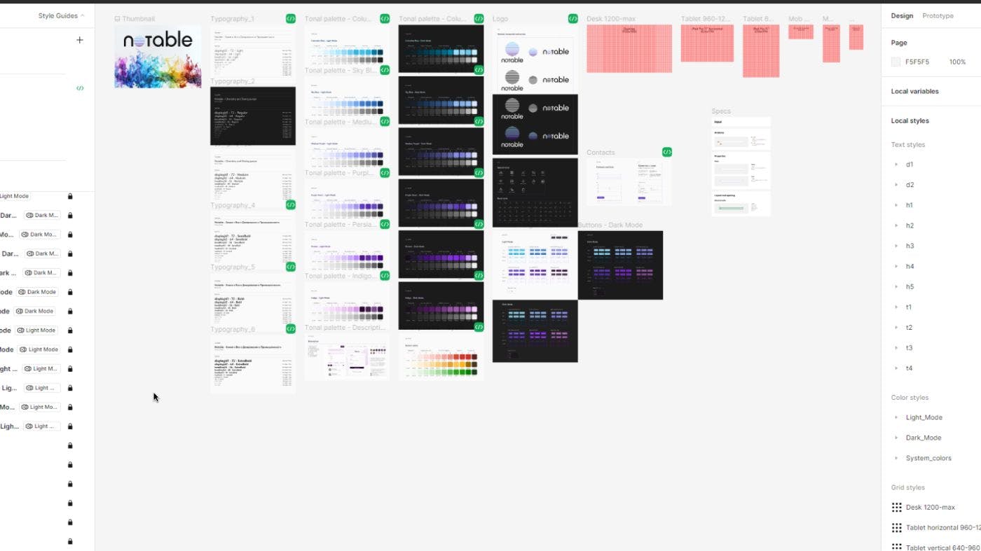
Having chosen the appropriate font, we form the text styles, thus, laying the foundation of the design system. There are several principles here. Everything should always be a multiple of 8 px. There is no way around it, especially if the indentation system and grid are also a multiple of 8 px. Then the logic is as follows - select several font sizes for the first screen. For this, again, we use a beautiful screen, a slogan, and see how it works.
Then we determine the font sizes for the h1-h4 headings and at least two font sizes for the t1-t2 text, or better four t1-t4.
We understand that the projects have the main text, various descriptions in cards, decorative elements, information about rights, etc., and with all this, we need to achieve a good level of hierarchy so that the user does not get tired when scanning the text and quickly finds important information for himself.
Well, and then all the same is repeated for different styles. I have six of them in the project from L to EB. This whole process takes some time, especially at first, and I agree that there are plugins that allow you to save this time. But there are also advantages if you do everything yourself.
Firstly, you will better understand the library of your styles, and it will be easier for you to choose the right style. Secondly, your library will be customized as much as possible.
Working with a color palette. I already had a color palette, but to make it easier to work with the project, it is worth preparing shades for this palette in advance.
In this particular project, I decided to use Radix, because this resource helps achieve an even greater level of consistency and reduces your time. Here, you can get not just a set of shades, but 12 different shades at once that are tied to individual design elements (text, buttons in different states, dividers, etc.).
Plus, in one click, you can get a palette for the light and dark theme of your interface. Next, we load the resulting palette into Local variables.
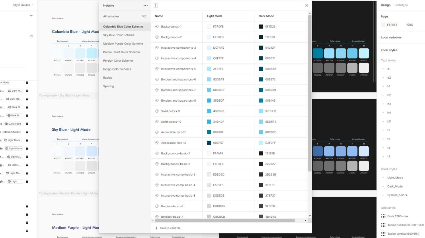
You can make several mods right here (light, dark, multi-colored, as many as you like). So, that in the future, by setting a certain color to different elements of the frame, you can change the color scheme of this frame in one click. This operation significantly saves time at later stages of working with the design.
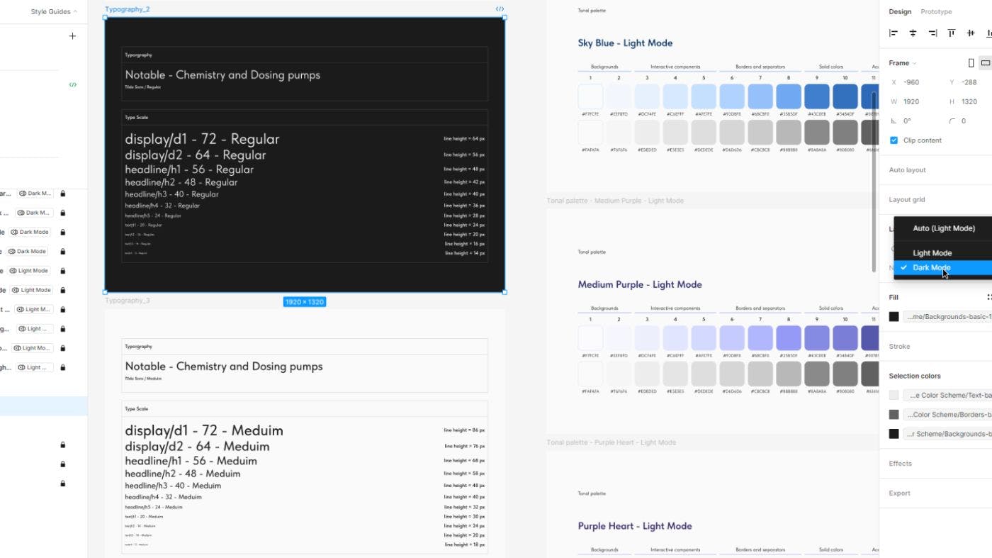
Also, in Local variables, it is worth immediately entering the values of the rounding radii and indents. As usual, everything is a multiple of 8 px. For the radii, I make 5 values from XS to XL; more is possible. Smaller values are used for the smallest elements, such as buttons, and larger ones are used for graphics. This is worth doing so that, during the work process, you do not have to go back and look for the logic of decision-making at an earlier stage.
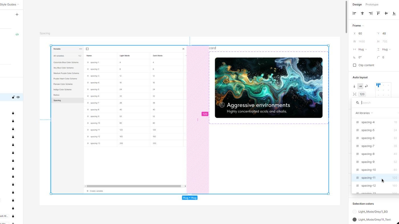
With indents, the principle is the same, but there are more values, I set 13. It looks like this. When working with auto layouts, you do not need to remember the values, for example, of indents or paddings that were used earlier; they are simply pulled from the library.
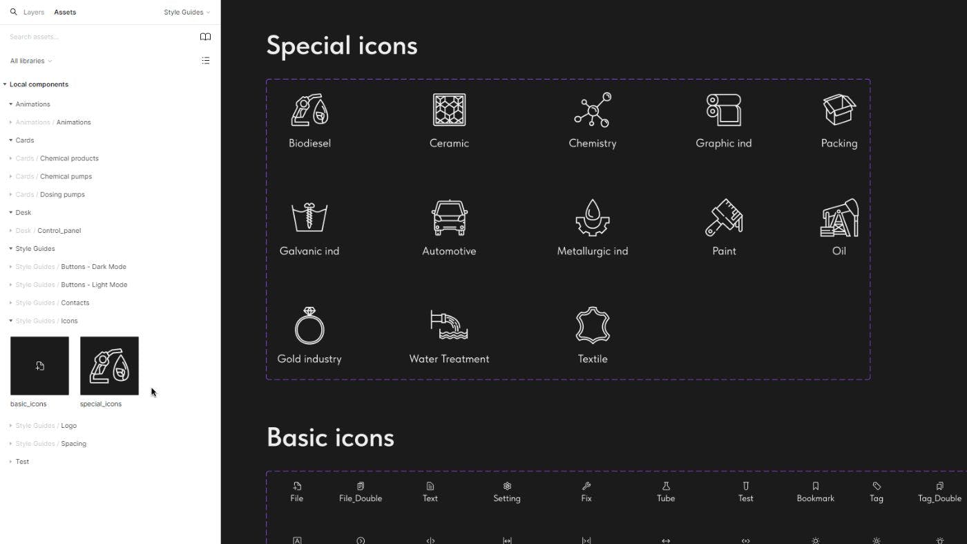
Let's move on to icons. For my project, I decided to use the following types of icons: special and basic. I drew the special icons, but they needed to be made more detailed. Basic icons can be found in the community. Think in advance about where these icons can be used and choose a suitable set. I planned to use them in buttons, cards, forms, etc. There is no point in overloading the library with irrelevant elements.
At the moment, we have ready-made basic elements of our design guidelines:
- typography;
- color palette;
- rounding system;
- indentation system;
- set of icons;
- so there were logos for various formats and color schemes;
Plus I prepared grid styles.
Now, it's time to move on to more complex components, consisting of basic ones - these are buttons, various forms, cards, header, footer, etc. But this is a topic for the next part of the tutorial.
What's Your Reaction?







![[VIP] DesignCode: Build Beautiful Apps with GPT-4 and Midjourney](https://design.rip/uploads/cover/blog/designcode-gpt4.webp)
![[VIP] AppCoda: Mastering SwiftUI - Professional Packet (Updated 04.2023)](https://design.rip/uploads/cover/blog/appcoda-mastering-swiftui-professional-packet-worth.webp)
![[VIP] AppCoda: Beginning iOS Programming with Swift (Updated 04.2023)](https://design.rip/uploads/cover/blog/appcoda-beginning-ios-programming-with-swift.webp)
![[VIP] Whoooa! 156 vector Lottie animations](https://design.rip/uploads/cover/blog/whoooa-156-vector-animations.webp)


![[VIP] Motion Sound Vol. 1](https://design.rip/uploads/cover/blog/designrip-svx.webp)

![10 UX/UI Design Portfolios That Will Inspire You [Updated for 2022]](https://design.rip/uploads/cover/blog/10-ux-ui-design-portfolios.webp)
