2024 Figma Revamp and Feature Updates
AI Feature Module, Product Experience Optimization, Dev Mode Revamp, Figma Slide Presentation. June is the time of the year when many designers stay up late to watch Figma's annual release, and this time around, Figma has risen to another level with the release of many exciting new features in Config.
June is the time of the year when many designers stay up late to watch Figma's annual release, and this time around, Figma has risen to another level with the release of many exciting new features in Config.
This time, the many features and experience updates are all focused on the pain points of designers' workflow and collaboration with engineering, and I believe that it will be a great help and change (definitely a good direction) for designers' future work style.
Let's share the content and direction of this revamp (special thanks to)
(Live from the U.S.!)
A quick look at all the features Figma has updated this year
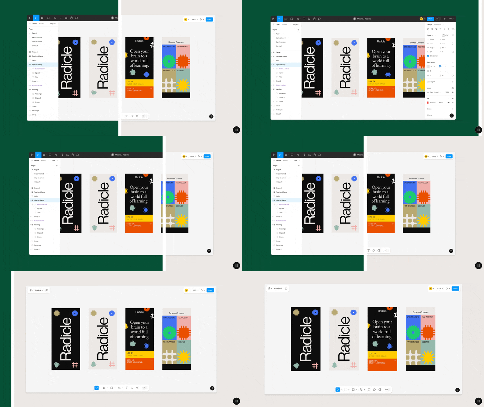
1. New Figma interface UI3 - allows designers to focus more on board content
This is Figma's third redesign of the software's interface, which aims to consolidate features introduced in the last decade, bring the user experience closer to that of novice and professional designers, and remove noise from the design process so that designers and collaborators can focus more on what's on the canvas.

This includes the following major changes:
- Interface Renovation: Adjust the overall visual and layout of the interface to make it more modern and simple.
- Work screen adjustment: The toolbar has been moved from the top to the bottom, the sidebar has been hidden, and the width of the side panels can be adjusted, making the overall work screen more spacious and flexible.
- Icon Style Adjustment: Figma's sharp style has shifted to rounded corners, and over 200 function icons have been redrawn by the designer, with the ability to open the tool icon's description text freely.
- Contextualized function arrangement: In different situations (e.g. when selecting different objects), the order of functions on the panel will be optimally organized according to the current context and context.

The new interface is much cleaner and more modern, which should increase productivity dramatically!

With the unified interface style, the experience of switching between different product lines will be smoother and seamless.
The main panels and icons have been redesigned.
2. Smarter Auto Layout, Built-in Design Module UI Kit, Responsive Prototype Viewing
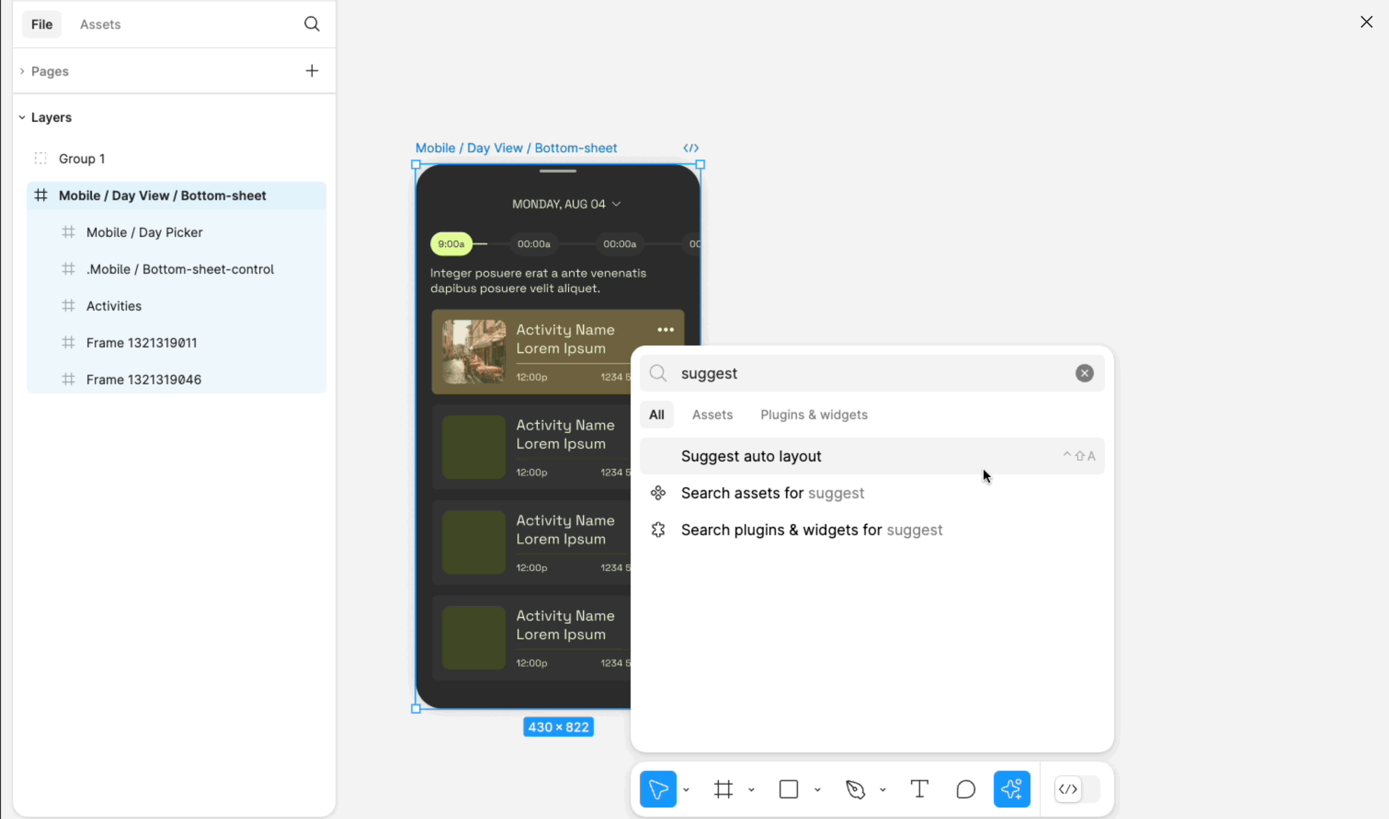
Although Figma's Auto Layout is powerful, it often takes a lot of effort to learn and understand how to structure the layout to achieve the best results, but now Figma has introduced the Suggest Auto Layout feature, which will directly detect your design and help you add suitable frames and apply the Auto Layout effect, which basically can be done! You can basically organize your design in one click!

In addition, Figma has also launched a native UI Kit function (currently supports iOS18, Material 3, Simple Design System, etc.), as long as you go to the Asset panel, you can find the relevant UI Kit to directly call the components and modules inside to quickly build the desired UI, which is very helpful for those who want to quickly communicate the concept will be of great help.
Another useful feature is the Responsive Prototype Viewer, which allows you to set up a responsive mode in the Prototype Viewer when the design has a full set of Auto Layout, so that the design can be adapted to different devices! (Very helpful when doing user testing!)
3. Increase Productivity and Imagine Boundless Creativity - Figma AI Series Features
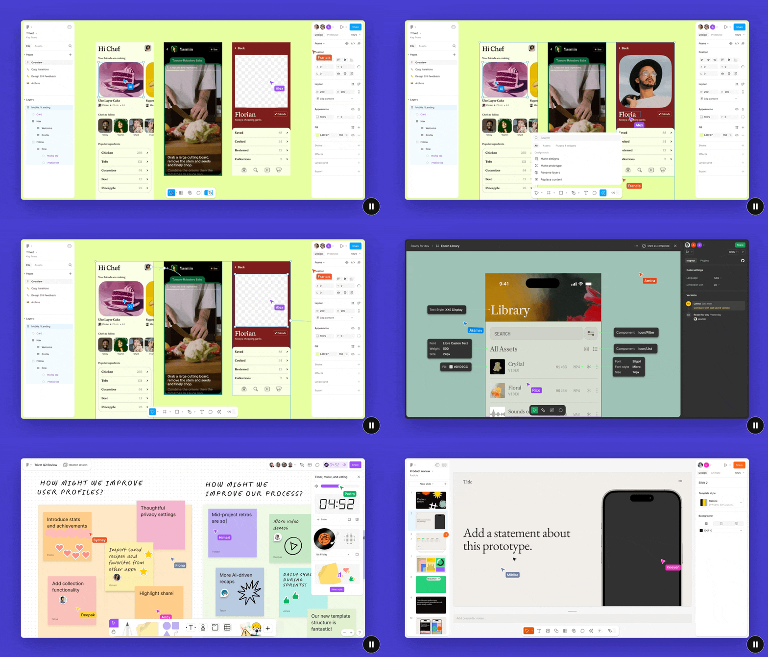
One of the main focuses of Config is to improve the productivity of designers through AI, helping designers start their design journey better, stay focused on the design process, and help users find what they need faster.
Watch the demo to experience the magic of AI!
Here are some of the key updates:
- Automatic design generation and Prototype linking: You no longer have to be afraid of facing a blank canvas, just type in a description and Figma automatically generates the interface and content, as well as automatically linking pages to Prototypes.
- Improved search experience: Reorganization of the designer's process of creating a design, not only from 0 to 1, but at any stage of design exploration, has led to the introduction of the following features:
- Visualize search: Use static screenshots to find similar (and editable) design images in internal design databases and external communities.
- Asset search: Use context to do fuzzy (smart) search, e.g. when you want to search for the primary button, you don't need the exact right keywords, just type btn_large to find the related material easily.
- Automatic Layer Naming: Designers can stop arguing about naming layers because Figma AI can help you do it for your content, making it clean and clear.
- Copy modification and multi-language support: AI can be used to help modify copy, adjust the tone of voice, and even translate the interface to find the most suitable sentence length for each language and adjust the interface.
- Realistic Content Generation: Figma AI can help you generate text & image content that is closer to the product, and can even quickly de-emphasize images, so that your interface can achieve a closer to "real" product experience faster.


4. Make Presenting Design Results Easier and Smoother - Figma Slide Presentation
In the past few years, there are too many users who use Figma directly for presentations, so Figma directly launched Figma Slide to let you better present and communicate your design concepts and results, and of course, it also includes many familiar and practical presentation features, so that you can better prepare for presentations, manage presentations, and interact with the audience.
Here are the key features:
- Seamless: Figma Slide operates in much the same way as Figma, making it very easy to get started and using the existing Design Library directly.
- Mode switching: Slide Mode and Design Mode are divided into two modes, allowing you to focus on adjusting the details of each page of the presentation, or looking at the overall structure of the presentation and making simple changes.
- Grid view: In addition to the traditional top-to-bottom view, Figma Slide also provides a Grid view that makes it easier to manage the order of slides and blocks, making organizing the presentation very easy.
- Two-Way Interaction: Figma Slide provides features for audience participation, such as Polls, Alignment, and so on, so that you can make your presentation less like playing the piano to the bull, and more audience participation.
- Prototyping: You can directly copy and paste Figma's interactive prototypes and operate them directly in Slide, and if there are design changes, they will be updated immediately, so you don't have to keep copying and pasting them all the time!

My experience and conclusion
After reading so many content updates, I wonder what are your thoughts and feelings? Are you excited or nervous? I myself am more excited than anxious, so I'd like to share with you my three main thoughts after watching Figma's presentation:
- In the future, designers will be able to spend less time on tedious tasks (e.g., layer structure, naming, delivery files, etc.) and more time exploring design solutions to solve more complex and important product problems.
- In the age of AI, designers basically have the superpower to quickly realize their ideas from 0-1, and even through the assistance of AI, they can quickly iterate and improve their designs.
- "Soft power" and "thinking ability" will be an important key ability for future designers, because the threshold of basic core technology is getting lower and lower, and really need to be able to make a good design, often need to think in more dimensions and understanding of the nature of things, but also need a variety of soft power, such as communication and coordination, leadership and management, strategy proposal, etc. in order to enhance the height of the design.
Other Related Resources
If after reading the above, you want to know more about all the updates, you can watch Config's replay video or the official article, I believe you will have a clearer idea about the direction of the development after understanding:
- Figma Overview of all features in this release
- Figma UI3 — Introducing the latest Figma UI revamp!
- Figma AI — Introducing Figma AI Features
- Figma Slide — Introduction to Figma Slide
Thank you for taking the time to read this post, if you think it's well written and helpful, I hope you'll give me a little "pat on the back", and feel free to leave me a comment below to let me know what you think, and I'll add a little more fuel to the fire to write more content!
- 10 taps: You like this article, thank you. 2. 20 taps: You think this article is great and would like to share it with your friends!
- 20 taps: You think this article is great and would like to share it with your friends. 3. 30-40 taps: I hope I can write more articles on this topic in the future!
- Shoot "30-40 times": I hope I can write more articles on this kind of topic in the future!
- 50 pats: My greatest encouragement, this will support me to continue writing and sharing my experience!
Clapping Tip: Just keep the mouse (or finger) pressed on the palm icon and you can clap your hands continuously, try it!
What's Your Reaction?


![[VIP] DesignCode: Build Beautiful Apps with GPT-4 and Midjourney](https://design.rip/uploads/cover/blog/designcode-gpt4.webp)
![[VIP] AppCoda: Mastering SwiftUI - Professional Packet (Updated 04.2023)](https://design.rip/uploads/cover/blog/appcoda-mastering-swiftui-professional-packet-worth.webp)
![[VIP] AppCoda: Beginning iOS Programming with Swift (Updated 04.2023)](https://design.rip/uploads/cover/blog/appcoda-beginning-ios-programming-with-swift.webp)
![[VIP] Whoooa! 156 vector Lottie animations](https://design.rip/uploads/cover/blog/whoooa-156-vector-animations.webp)


![[VIP] Motion Sound Vol. 1](https://design.rip/uploads/cover/blog/designrip-svx.webp)


