Space, grids, and layouts
The organization of space is key to every great design. Spatial systems, grids, and layouts provide rules that give your designs a consistent rhythm, constrain decision making, and help teams stay aligned. This foundational scaffolding is a requirement for all design systems. In this guide, we’ll walk through the basics of defining spatial base units, creating relationship rules with grids, and bringing it all together for modern UI layouts.
The organization of space is key to every great design. Spatial systems, grids, and layouts provide rules that give your designs a consistent rhythm, constrain decision making, and help teams stay aligned. This foundational scaffolding is a requirement for all design systems. In this guide, we’ll walk through the basics of defining spatial base units, creating relationship rules with grids, and bringing it all together for modern UI layouts.
What is a spatial system?
Designers make spatial decisions every day from the height of a button to the space around an icon. A spatial system is a set of rules for how you measure, size, and space your UI elements. Uniformity on a spatial level allows your product to be more consistent, your team to communicate better, and reduce the number of decisions designers have to make in a day. One example of a spatial system is “the 8pt grid.” However, there are many variations and configurations to choose from.
As an example, notice how the login form feels when it does not have an immediately recognizable spatial pattern. To users, the design can feel cheap, inconsistent, and generally untrustworthy. The predictability of a rhythm is visually pleasing and something you’ve come to expect from brands you trust.

When this same login form is adjusted to follow an 8pt spatial system the rhythm becomes predictable and visually pleasing. For users, the experience is polished and predictable. This increases trust and affection for the brand.
No matter who is working on the design, there’s now a consistent spatial language and the choices you have to make are greatly reduced. You can easily pick up where another designer left off or comfortably build in parallel. Since these decisions are also captured in the codebase you save time on red-lining for engineers.
How do you start a spatial system?
Defining your base unit will allow you to create the scale of supported sizes in your spatial system. Looking at different products around the web you’ll see a few different approaches to this. You’ll see 4pt, 5pt, 6pt, 8pt, 10pt increment systems. There is no wrong answer here as long as you are aware of what some of these directions promote and prevent.
My preferred method is an 8pt linear scale for elements with a 4pt half step for spacing icons or small text blocks. I prefer a 4pt baseline grid for my typography which means the line-heights of my font choices will always be divisible by 4. This system is meant to reduce confusion but also be easy to implement.

Be reasonable about your needs as you explore building your own spatial system. Here are some things to consider:
User needs
Think about your design’s users and the general brand aesthetic you’re going for. Do you want a spacious UI with large font styles and a limited number of actions? Do you need to build for information density with intricate data tables and multiple actions for a technical user? Survey your existing designs and create a mood board to get clarity and alignment for you and your team.
Number of variables
Choosing a smaller base unit like 4pt, 5pt, or 6pt can open you up to too many variables in your system. It becomes more difficult to eyeball the difference between a 12pt and 16pt padding difference, which can make it hard to enforce consistency across a team. I find that 8pt increments are the right balance of being visually distant while having a reasonable number of variables. I also utilize a half unit of 4pts for spacing icons or adjusting small blocks of text.
Odd numbers
Introducing odd numbers, like a 5pt base, into spatial rules can make it difficult to center elements without splitting pixels. For example, centering text and icons in a 25px height button could create blurry split pixels for some users. On a similar front, scaling UIs for different mobile and desktop screens that require 1.5x scale will result in split pixel blurriness.
How do I apply a spatial system?
Applying the spatial scale to your UI elements can come in the form of padding, margin, height, and width definitions. The following examples show that sometimes your paddings cannot be enforced at the same time as a strict height definition.
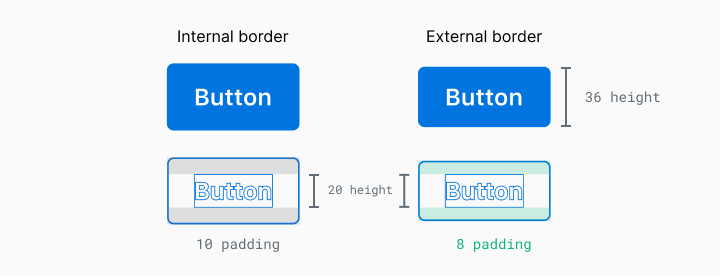
In this example, you can see that the line-height of this text is 20px but if I used an 8px padding on the top and bottom, the button will have a height of 36px. Which measurement should I prioritize? There are two ways to address this:
Element first (strict element sizing)
In this approach, the sizing of solid elements takes priority when matched to your predetermined spatial system.. This includes things like buttons and form inputs. These elements are more likely to have predictable content and are key to creating rhythm in the overall composition.
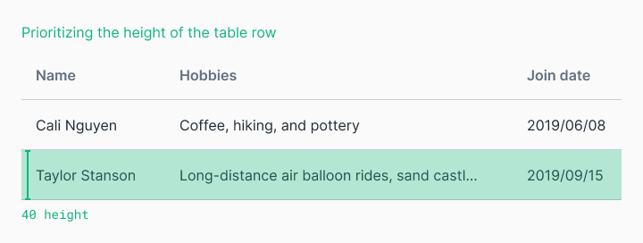
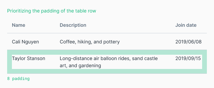
Content first (strict internal padding)
When the content is less predictable and we care about its display, we will want to enforce strict internal padding and allow element sizes to be dictated by their content. These element’s sizes may still fall into your spatial system’s rules but that is secondary to the spacing around the content. This is useful for tables with indeterminate user content.
Border placement inside or outside
Outlined elements like buttons or cards can throw a wrench in things. How do you count that 2px border? It’s counted differently in code than it is in Figma. Which one is your source of truth?
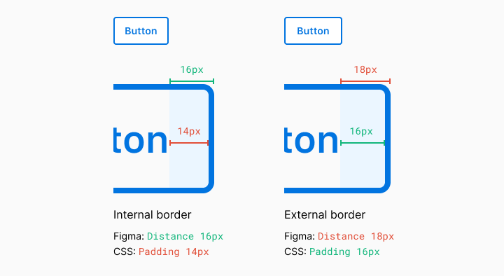
Figma measures the element and not its border. On the web, this is handled in two different ways. The box-sizing property can be border-box or content-box. To see it in action check out this codepen and read this article to learn more. The TL;DR here is that most of the modern web runs on border-box.

You can almost always wrangle the code to be pixel perfect but you may be sacrificing simplicity and extensibility if you’re not aligned with your team on the implementation. Again, have these conversations with your team to define your own position.
What is a grid?
Spatial systems define the rules of sizing and spacing while grids help you arrange your content into structured propositions. Early print designers utilized grids to organize text blocks and images into pleasing visual hierarchies that aided readability. As design has evolved, the same basic principles still apply to the two-dimensional organization of information.
Column grid
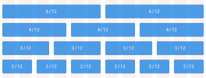
A column grid helps you organize content into evenly spaced vertical columns. The space between columns is referred to as the gutter size. Applying your spatial system rules to the gutters will help drive home a consistent rhythm in your designs. A common example is the 12 column grid because it allows you to divide the given area into half, thirds, fourths, sixths.
Modular grids
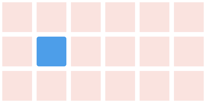
A modular grid takes columns and rows into account to organize content into a matrix structure. Modular grids are ideal for a strict format layout like a book but can break down for a relative sized responsive web layout. Keep in mind this doesn’t have to encompass the entire page layout. Modular grids are an organizational tool. You decide where it starts and stops.
Baseline grid
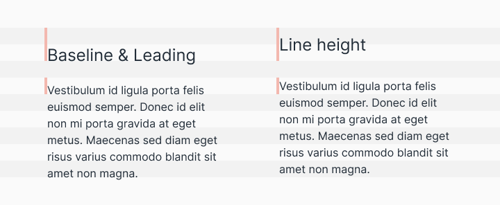
Traditionally in graphic design, a baseline grid was used to set the leading from one line of text to the next. However, on the web, we place text by line-heights instead of the baseline. It’s a subtle difference but you should be aware of it when designing across platforms. Regardless of how your typography is measured, the same basic principle applies—setting the typography onto a consistent grid will be easier to organize, create vertical rhythm, and be aesthetically pleasing.
Composing a layout
Layouts are the culmination of defined spatial rules and the organization of content into one single composition. Bringing together your content into thoughtful structures is the easy part, making it all flow together with a clear hierarchy across a sea of changing platforms and screen sizes is the hard part.
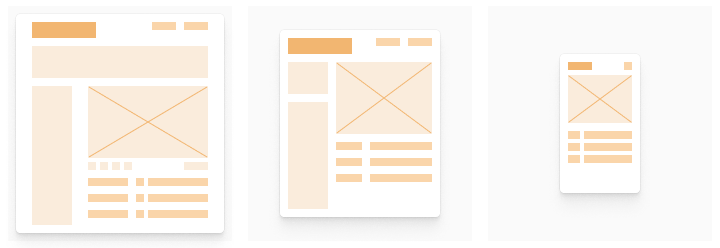
Defining the scaling logic is now a requirement for both native and web apps. From desktop to mobile and everything in between, the screen sizes and scales can vary widely. There are three main concepts for crafting a layout that can scale gracefully. Some designs will call for all three of these concepts at once.
Adaptive
An adaptive layout is one that changes entirely based on the format it is presented in. For example, loading different experiences based on desktop, tablet, and mobile devices. This promotes a more tailored experience for the user’s device but can become expensive to rebuild the same functionality into multiple formats.
Responsive
A responsive layout is fluid and can adapt to a changing format size. This is a common practice on the web and has become a necessity for native apps as screen size variations have increased. This allows you to build a feature one time and expect it to work across all screen sizes. The downside is that touch and mouse interactions are very different and it’s expensive to account for all devices and use cases.

Strict
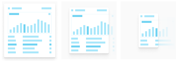
This layout will not flex with a changing format size. Fixed layouts are often used to promote a specific interaction or informational layout that would be degraded at a smaller size. Data tables and graphs will often create a scrollable strict layout at a specific size because the legibility and interactions would be significantly degraded below a certain size.
How do I implement a spatial system on an existing set of designs?
Starting from scratch is easy. The challenge is retrofitting an existing set of designs. The first step is to bring your other collaborators into the conversation. Convincing team members and stakeholders to change a current product development process can be difficult without laying out the value relative to their role. Engineers want clearer requirements and to spend less time with a fussy designer telling them the padding is off. Product managers want user and business value delivered faster. Designers want their designs to be translated directly into coherent user experiences quickly and efficiently. All of these things can be attained by investing in a shared spatial system.
Start small. Rebuilding everything to fit into a newly defined spatial system can seem daunting. Look for simple components to convert, like buttons, and then spread into their common sibling elements, like form fields. Build up momentum and understanding with your team along the way. Policing the design system is like herding cats. Empower the folks, like engineers, who will be implementing the system to maintain and enforce it.
Make balanced decisions. Prove to stakeholders how this work reduces design/tech debt and improves speed along the way. After completing a section of work, like organizing your icon workflow from design to implementation, take a moment to capture the before and after by interviewing the team. Use those quotes from teammates about the time saved to reinforce the value of your work. Whether you’re working for a scrappy startup or a massive enterprise, the common reason to not invest in design system initiatives is that the business is directly sustained by providing value for users not organizing the perfect spatial system.
Keep up the momentum. Once you begin, have a vision and a date in mind to complete the changes. Getting stuck with half of your work adhering to a spatial system and the other half in limbo is a rough place to be. It makes creating new value for your users more complex. Have a plan with clear milestones, create visibility for the team, and share progress along the way.
What's Your Reaction?







![[VIP] DesignCode: Build Beautiful Apps with GPT-4 and Midjourney](https://design.rip/uploads/cover/blog/designcode-gpt4.webp)
![[VIP] AppCoda: Mastering SwiftUI - Professional Packet (Updated 04.2023)](https://design.rip/uploads/cover/blog/appcoda-mastering-swiftui-professional-packet-worth.webp)
![[VIP] AppCoda: Beginning iOS Programming with Swift (Updated 04.2023)](https://design.rip/uploads/cover/blog/appcoda-beginning-ios-programming-with-swift.webp)
![[VIP] Whoooa! 156 vector Lottie animations](https://design.rip/uploads/cover/blog/whoooa-156-vector-animations.webp)


![[VIP] Motion Sound Vol. 1](https://design.rip/uploads/cover/blog/designrip-svx.webp)

