[$] Prime: Design System v.6.0
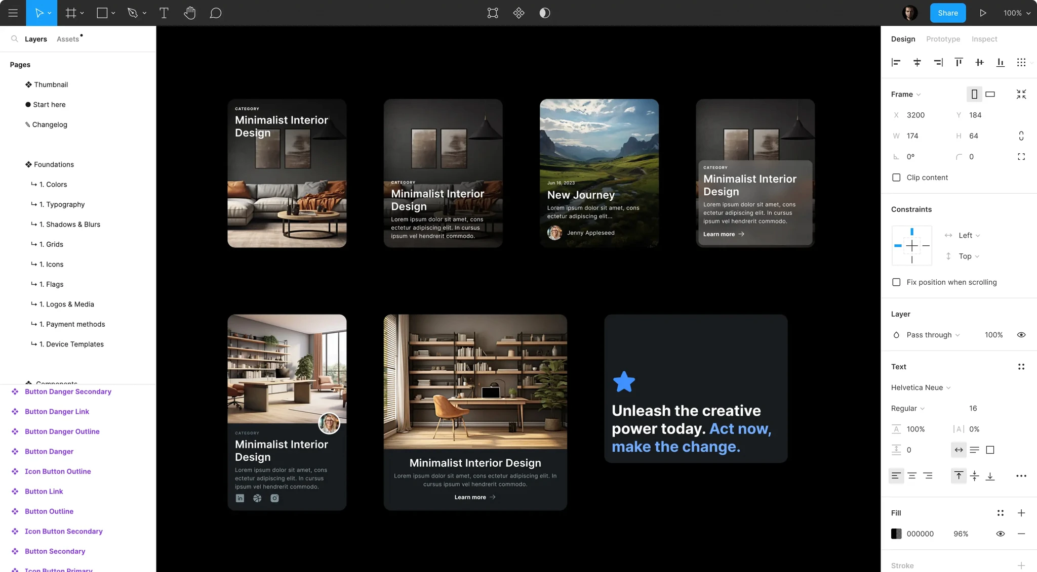
Supercharge your design workflow with top Figma & Design System techniques. Powerful components with tokens to complete every project 10x faster. It's far more than just a UI Kit.
Start every project with ease. Supercharge your design workflow with top Figma & Design System techniques. Powerful components with tokens to complete every project 10x faster.
For full details check: primedesignsystem.com
Best Figma Techniques
-
Tokens prepared with Variables
-
Auto layout 5.0 with wrap content & min max values
-
Component Variants & Properties
-
Dark & light mode with Variable modes
Best practices for Design System
-
Semantic Tokens (General + Component)
-
Proper component properties
-
Easy icon component search with keywords
-
Atomic design structure
-
More than WCAG - colors made with APCA
-
Balance between constraints & flexibiltiy
-
Easy to customize & extend
-
No additional plugins needed
Best practices
World-class standards inside
- Semantic tokens
Meaningful styling is the foundation of design systems. Use techniques from world-class design systems, not random UI kits.
- Proper component exposure
When you need to find component, swap an instance you see the preview of the main UI element. So fast and convenient!
- Component excellence
Thanks to the right naming conventions, consistent structure, components keep overrides, helping you to iterate faster
- 4pt soft-grid system
Design with consistent layout spacing & radius system thanks to variables. With modes you may prepare themes for spacing.
- True accessibility in mind
More than WCAG, colors are using APCA, and they are synced with each other, so you may easily swap tones from the palette.
- Universal typography
Well-crafted typography scale allows you to prepare design for all devices from web, desktop, mobile or even wearables.
- Variables & styles
Professional set of variable collections to configure colors, spacing, radius. Prepared to be easily customized & expanded.
- Top-notch effects
Glassmorphic blurs, shadows and other effects combined together to work for you under one beautiful & consistent system.
- Auto Layout
All new features including wrap content options are used to get most of the Figma to create easy to use components.
- Variants & properties
Configure components conveniently with the set of intuitively prepared properties.
- Phosphor Icons
Set of world class Icons used as a base iconography elements within the kit. Outline & fill styles included.
- Dark & light modes
All components with proper variable tokens setup include the dark mode. Works automatically.


What's Your Reaction?


![[VIP] DesignCode: Build Beautiful Apps with GPT-4 and Midjourney](https://design.rip/uploads/cover/blog/designcode-gpt4.webp)
![[VIP] AppCoda: Mastering SwiftUI - Professional Packet (Updated 04.2023)](https://design.rip/uploads/cover/blog/appcoda-mastering-swiftui-professional-packet-worth.webp)
![[VIP] AppCoda: Beginning iOS Programming with Swift (Updated 04.2023)](https://design.rip/uploads/cover/blog/appcoda-beginning-ios-programming-with-swift.webp)
![[VIP] Whoooa! 156 vector Lottie animations](https://design.rip/uploads/cover/blog/whoooa-156-vector-animations.webp)


![[VIP] Motion Sound Vol. 1](https://design.rip/uploads/cover/blog/designrip-svx.webp)

![[LS] Design Starter Kit](https://design.rip/uploads/cover/blog/ls-graphics-dsk.webp)
![[VIP] Nemesis: NFT Market Collection Apps UI Kits](https://design.rip/uploads/cover/blog/nemesis---nft-market-collection-apps-ui-kits.webp)