Evolution of Apple's website design
As we reach the present day, the Apple website has truly evolved into a dynamic, visually impressive, and interactive platform. Check out our YouTube video showing the history of the Apple website! It has all the images and captions from this page, and is easy on the eyes.
Check out our YouTube video showing the history of the Apple.com website! It has all the images and captions from this page, and is easy on the eyes.
1994

We will begin the story in 1994, as it was possible to find the first screenshots of the Apple website for that year.
The average internet speed at the time was about 20 kb/s. Home internet access was very limited and slow by modern standards, as it was based on dial-up technology. In 1994, several important websites and services were launched.
For instance, Yahoo! was founded in January 1994 by David Filo and Jerry Yang. In March, Netscape Navigator was launched, which became one of the first popular web browsers
Screen resolutions of 640x480 pixels were popular at that time. Meanwhile, Apple’s website was flooded with textures and texts with shadows and glares.
1996

Look at the shape of this skeuomorphism-style badge. Amazing!
It’s notable that a large section of the website is dedicated to the Macintosh versus Windows 95 rivalry.
During 1994–1995, the rivalry between Microsoft and Apple that started in the 80s continued. Microsoft was strengthening its position in the corporate sector with Windows and the Microsoft Office suite. They were preparing to launch Windows 95, which was a significant upgrade to their operating system. On the other hand, Apple faced problems due to the high cost of Macintosh and a lack of software.
1997

In 1997, the website became more sophisticated. Now, some of the content was formatted as actual text instead of being embedded in images. The width of the site expanded to fully utilize 600 pixels. The website started featuring an abundance of news and information
A year earlier, Steve Jobs had returned to Apple, although it’s unlikely the website redesign was related to him.
The years 1996–97 were significant in Apple’s history. The company was in a difficult position due to financial difficulties and an outdated product line. However, this year marked a turning point as it led to Steve Jobs’ return to Apple.
1998–1999

In 1998, the website began to look more airy and fresh. However, the header of the site was placed at the bottom? ?
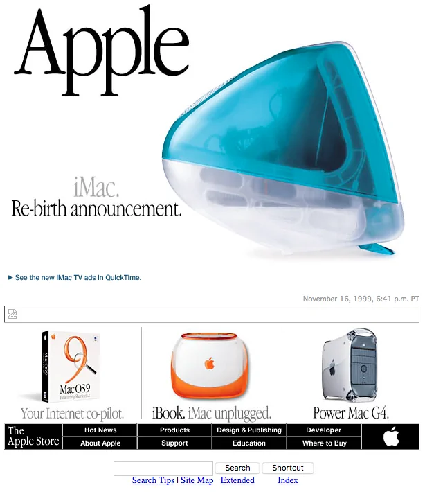
The most significant event of this year was the introduction of the iMac. This computer was a complete reimagining of what a personal computer should look like. With its bright, colorful design, all-in-one form factor, and emphasis on ease of use, the iMac became a big hit. It not only boosted Apple’s sales but also set a new design style for consumer electronics.
1999

2000
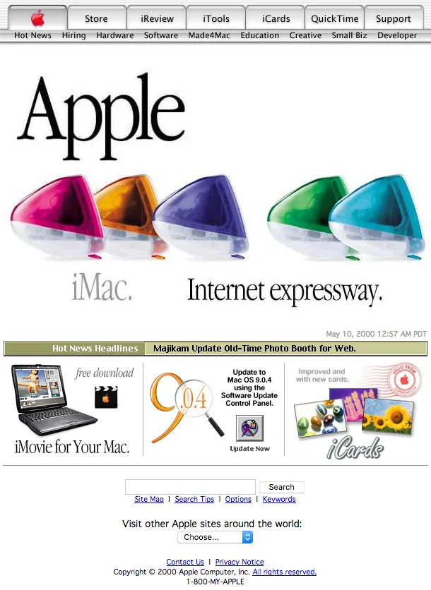

Aqua-style design elements have appeared
2001

2003–2006


More elements in Aqua style
From 2000 to 2006, Apple introduced several key products and services, including the Mac OS X operating system, iPod, and iTunes Music Store. The company also launched the Safari web browser. In 2006, Apple switched to using Intel processors in its Mac computers, improving their performance.
2007


2007 was of course about the iPhone. For such an event, Apple removed banners and announcements from the main page, something they would do frequently in the future. We also see a new header design and a beautiful metallic logo.
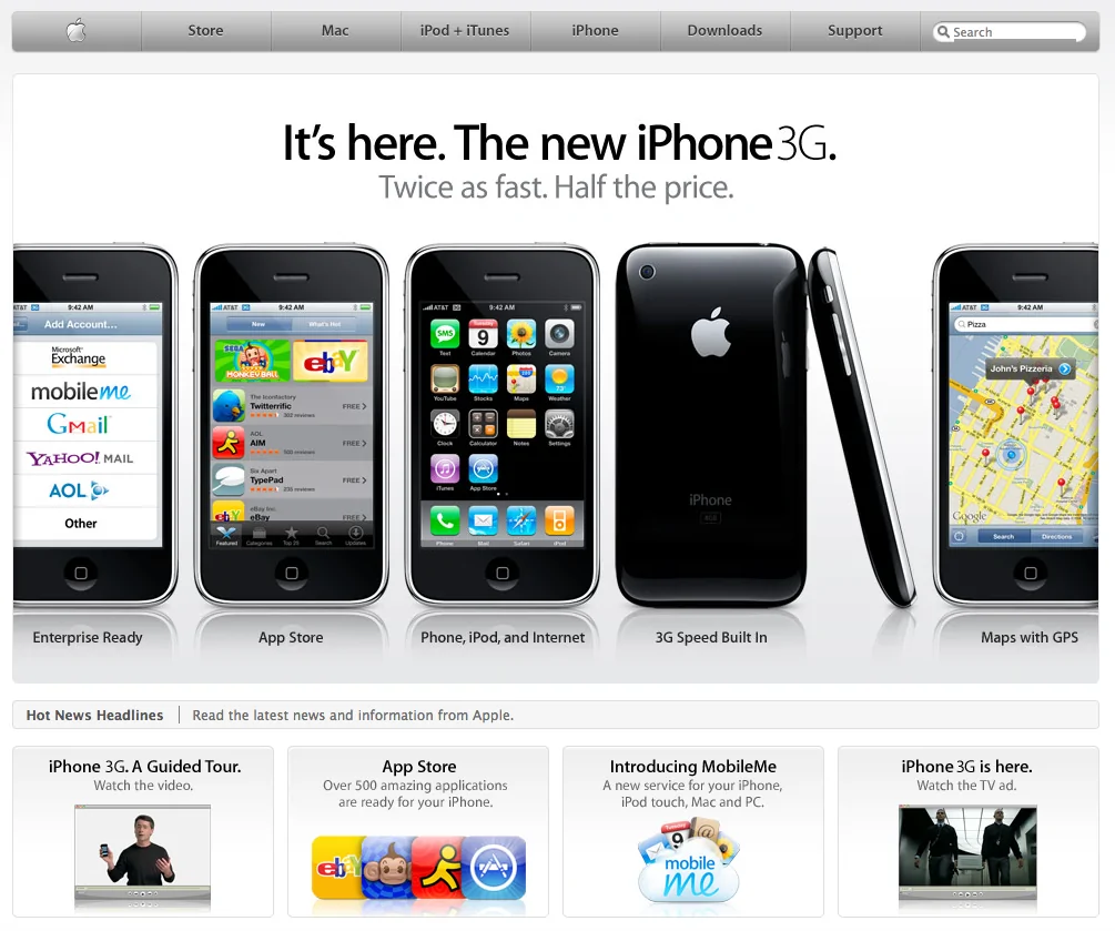
From 2007 to 2010, Apple introduced a series of breakthrough products. In 2007, the company released the iPhone, revolutionizing the smartphone industry. In 2008, Apple launched the App Store, creating a platform for mobile apps. In 2010, the iPad was introduced, a device that opened up a new market for tablets.
2008
2010

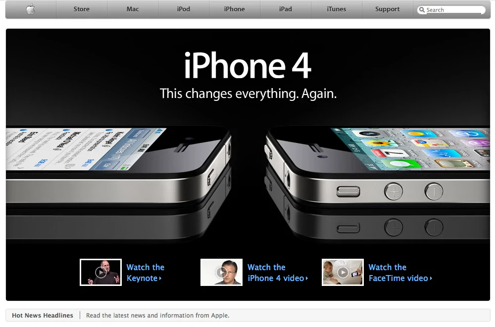
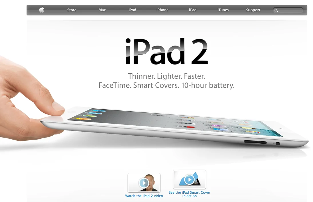
2011

The Death of Steve Jobs
2011 was a significant but tragic year for Apple. Several new products and services were introduced this year, but it was also marked by the loss of co-founder and long-time CEO, Steve Jobs.
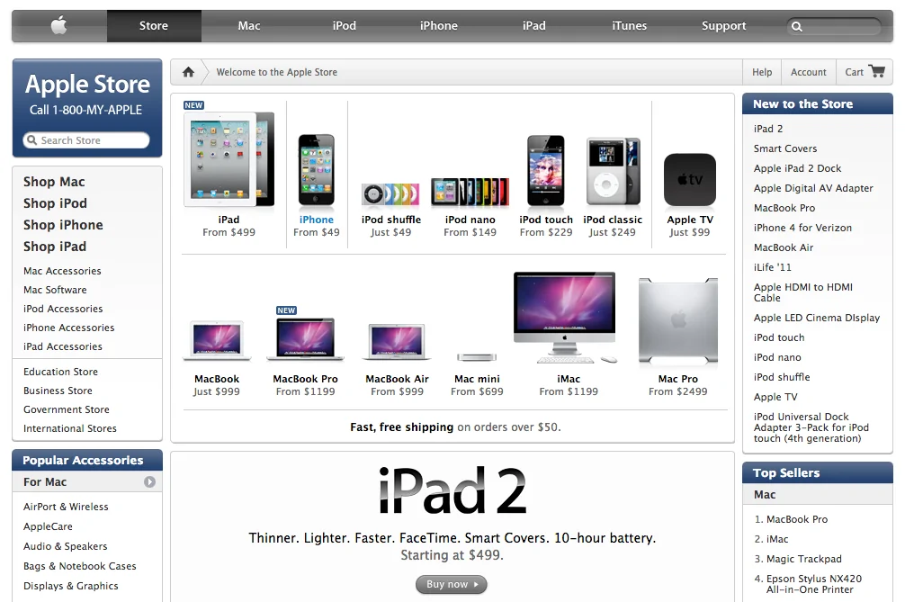
2013
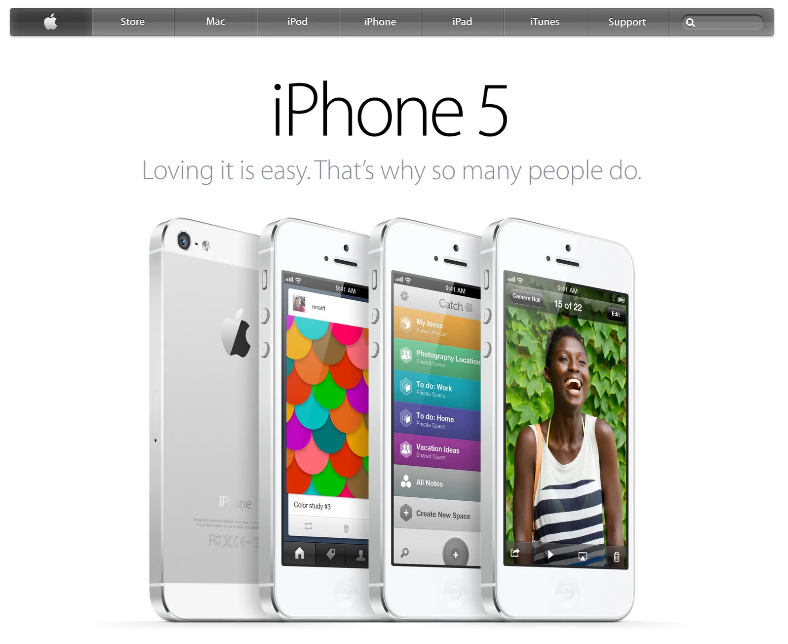
2014

Homepage celebration of 30 year Mac anniversary (2014)

Homepage with Apple CEO Tim Cook (2014)
2015

At the 2013 presentation, a flat concept for iOS was introduced. A completely flat header on the website was created in 2015. Also, Apple developed San Francisco, used thin fonts, and titles were made as images.
From 2011 to 2015, Apple introduced several key products and services. In 2011, the company released the iPhone 4s with Siri, but the year was overshadowed by the departure of Steve Jobs. In 2012, the iPhone 5 and iPad mini were released. In 2013, Apple introduced iOS 7 with a new interface design. In 2014, the iPhone 6 and 6 Plus were introduced, as well as Apple Pay and Apple Watch. In 2015, Apple released the iPhone 6s and 6s Plus with 3D Touch, iPad Pro, and introduced the new San Francisco font.
2016

Apple homepage showing iPhone 7 (2016)
2017
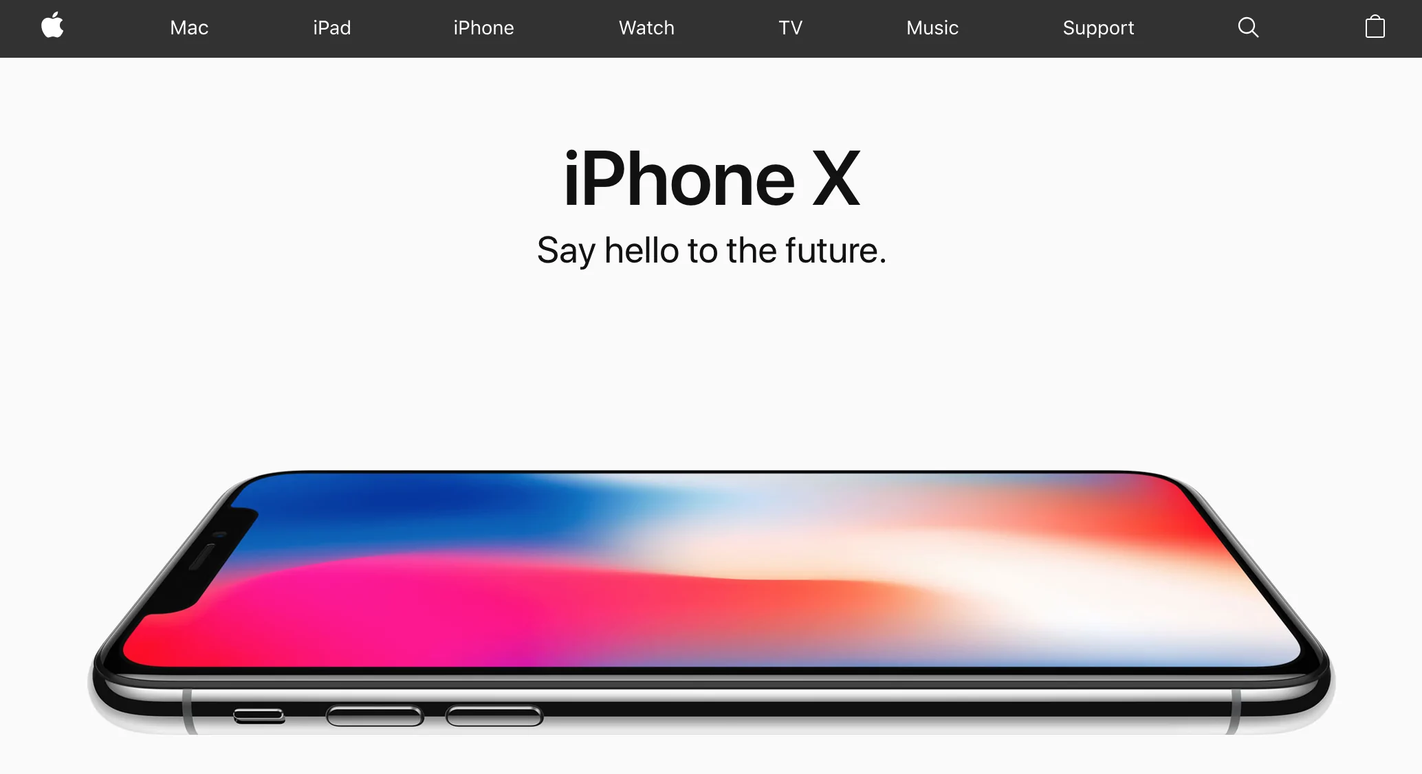
Apple homepage showing iPhone X (2017)
2018

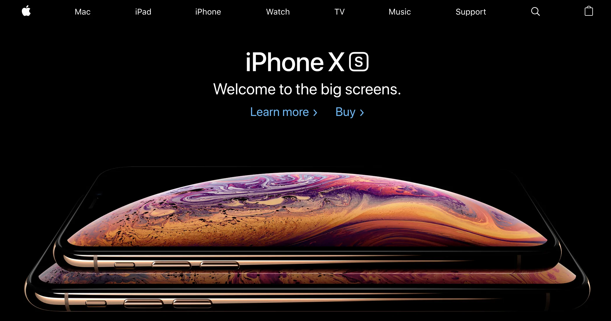
In 2018, a style was adopted that is still used today. Bold headlines, bright juicy illustrations, and lots of video.
From 2015 to 2018, Apple introduced several new products and services. In 2015, the iPhone 6s and 6s Plus, the iPad Pro, and the Apple Music service were released. In 2016, Apple introduced the compact iPhone SE and the iPhone 7 and 7 Plus models. In 2017, marking the tenth anniversary of the iPhone, Apple introduced the iPhone X with a new design and Face ID. In 2018, Apple continued the iPhone X lineup, releasing the iPhone XS, XS Max and XR models, as well as updated iPad Pro models.
2023
A header that changes background colors on different pages:

Grids of rounded cells:


Gradients in text:

Lots of animation and video effects:

Pages consisting of large full-size video blocks:

As we reach the present day, the Apple website has truly evolved into a dynamic, visually impressive, and interactive platform. The header that changes background colors on different pages is a relatively new design element that Apple has implemented. This, along with grids of rounded cells, adds a unique visual character to the site, maintaining Apple's brand identity of sleek and modern aesthetics.
The use of gradients in text and lots of animations and video effects have made the website more engaging for visitors. This goes beyond a mere design preference and is a strategic decision by Apple to increase visitor engagement, ensuring that the users get an immersive and interactive experience while visiting the website.
One of the significant design changes in 2023 is the use of pages consisting of large full-size video blocks. This visually immersive experience not only showcases the products and services in an attractive and engaging way, but it also serves to tell a story. Every detail is designed to be an integral part of the user's journey through the site.
In conclusion, the evolution of Apple's website reflects the brand's journey from a fledgling computer company to a global tech giant. Every change and update in the design, be it the color palette, typography, or multimedia content, represents an era in the company's history and aligns with its overall vision and mission. The current design with its dynamic visuals and interactive features mirrors Apple's emphasis on innovation and user experience, which has been the driving force behind its success.
As we anticipate what the future holds for Apple's website design, it's safe to say that it will continue to embody the brand's ethos of innovation and user-centricity.
What's Your Reaction?




![[VIP] DesignCode: Build Beautiful Apps with GPT-4 and Midjourney](https://design.rip/uploads/cover/blog/designcode-gpt4.webp)
![[VIP] AppCoda: Mastering SwiftUI - Professional Packet (Updated 04.2023)](https://design.rip/uploads/cover/blog/appcoda-mastering-swiftui-professional-packet-worth.webp)
![[VIP] AppCoda: Beginning iOS Programming with Swift (Updated 04.2023)](https://design.rip/uploads/cover/blog/appcoda-beginning-ios-programming-with-swift.webp)
![[VIP] Whoooa! 156 vector Lottie animations](https://design.rip/uploads/cover/blog/whoooa-156-vector-animations.webp)


![[VIP] Motion Sound Vol. 1](https://design.rip/uploads/cover/blog/designrip-svx.webp)

