The ideal line length & line height in web design
Today, you’ll draw a line in the sand, look at its length and height and commit to always consider it! Best opener ever – I know – but seriously, this is something a lot of people don’t pay attention to.
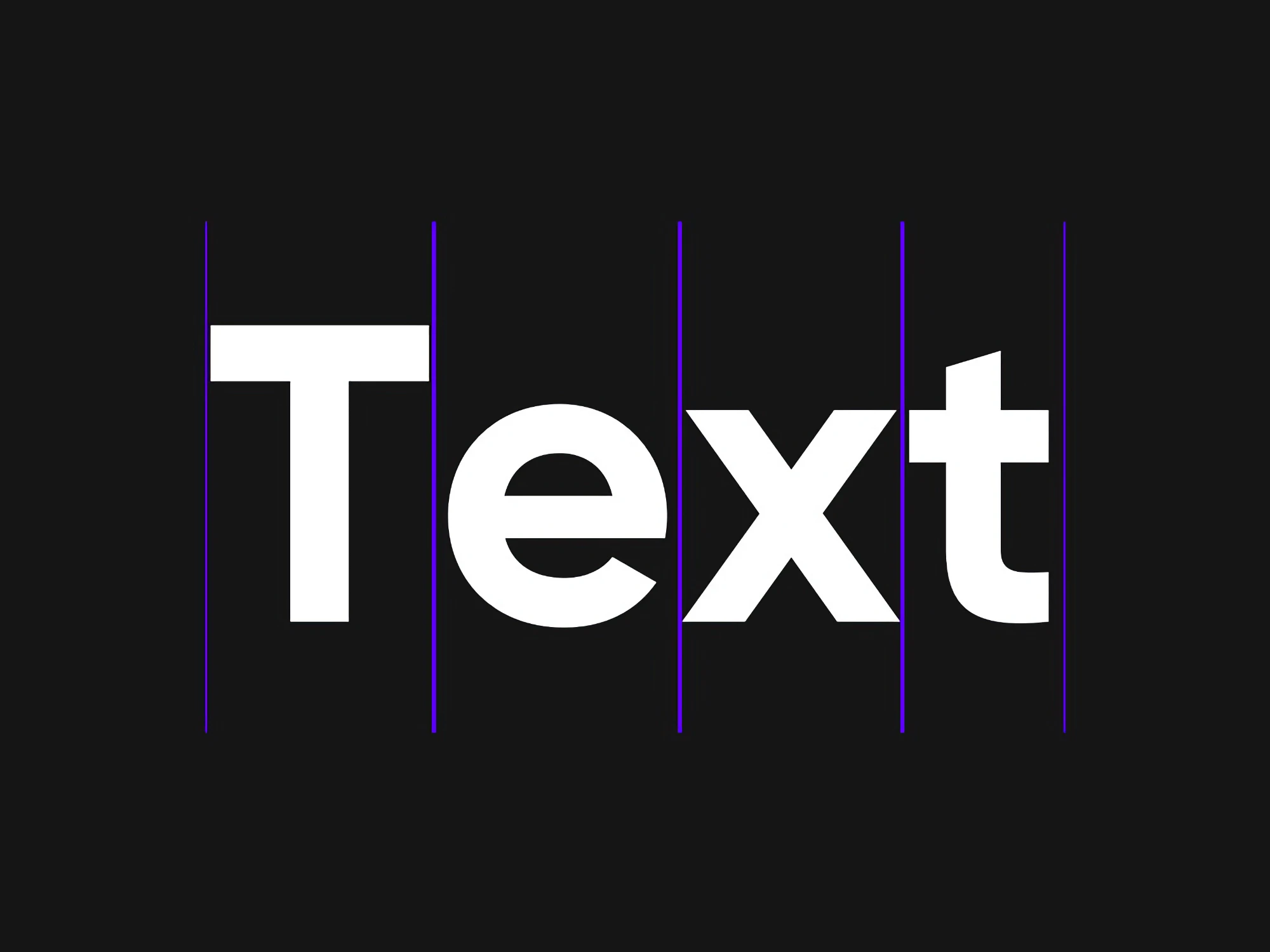
Today, you’ll draw a line in the sand, look at its length and height and commit to always consider it! Best opener ever – I know – but seriously, this is something a lot of people don’t pay attention to. Line height and line length are crucial if you want to set your text properly, and in this article and video will tell you what you should pay attention to when setting it.
TL;DR: For reading text on desktop devices, the ideal line has a length of 60 to 80 characters with a line height of around 1.5 to 1.6. It always depends on your typeface, and the shorter the line, the lower the line height can be, especially for headings. Over all, make it as compact as possible but as loose as necessary.
This article is the second part of my miniseries about the basics of setting your text right, and follows the one about font size. There, I already covered the concept of the holy trinity of typography – font size, line length, and line height. So let’s move on to worship the duality of the two latter. I will mostly focus on setting continuous long reading text for web design, but I’ll also cover mobile, touch on headings, and other display text as well.
What’s the goal behind it all?
The goal with well set text is an even typographic color. And by color I don’t mean blue or red, I mean that you want your text to be inviting to read, not too dense and not too loose. You’ll get what I mean when you take a look at the examples below and pay attention to what you feel by just looking at them, not necessarily reading them. If you read this article on a phone, you might want to rotate it to landscape orientation, since the line length is oriented towards desktop screens here.
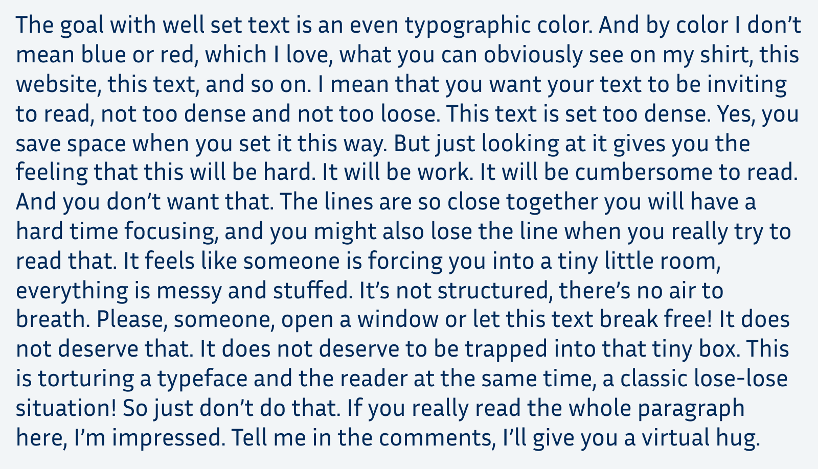
Line height: 1.2 – definitely not what we want. This typographic color is too dark.
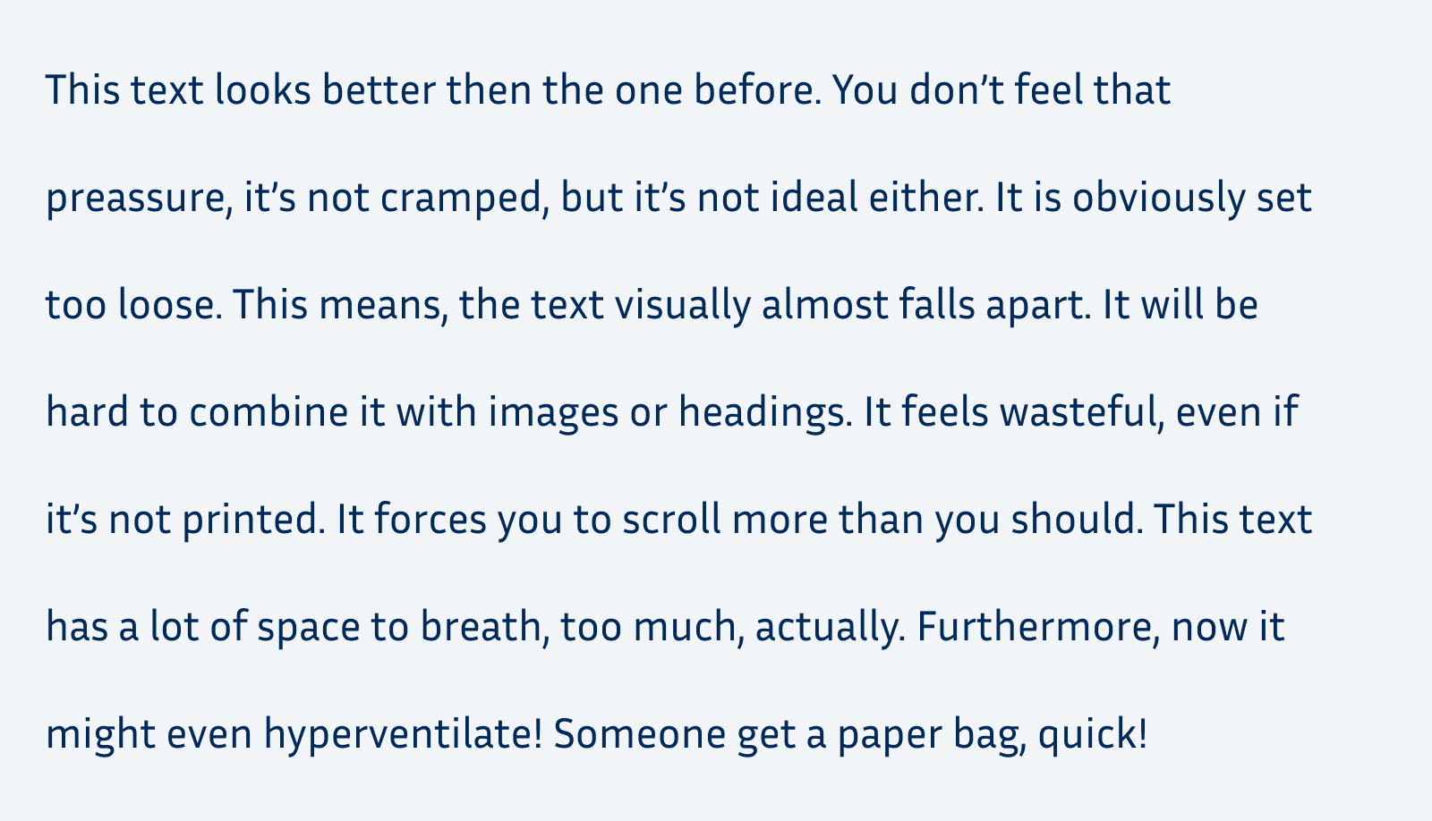
line-height: 2.2 – better, but not what we want either. This typographic color is too light.
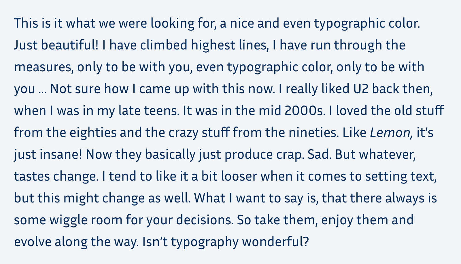
line height: 1.6 – Yes! This typographic color is just right!
All the examples above are set in the same typeface, Inria Sans, at the same font size and have roughly the same line length of about 75 characters. The thing that differentiates them is the line height. So you see how much influence it has, how compact or airy you set your text.
There is no magic number that will always look right
But for many typefaces, there is a range of numbers that will look okay, often better than the browser defaults. I’ll share mine with you at the specific points of the article. But what I most want this article to be for you is an eye-opener. If you’re new to the subject, or you lack confidence in it, I want to guide you through the process and teach you what you should pay attention to. Why it looks better or more appropriate in a certain way. Typography is more art than science, all my advices here are guidelines base on my experiences as a UI designer for the past 15 years. In the end, always make your own decisions.
Choose your typefaces first
The first step should always be choosing appropriate typefaces for your different kinds of text (display text, body text, and functional text). Why? The visual appearance and the metrics of each font can be different. In some cases, it is obviously different, like when switching from a monospace font to a proportional serif font. In other situations it is not, like when switching from Helvetica to Arial – which you would never do, because you would never have used them in the first place, right? But the risk is always having to adjust everything again. So decide upon your typeface first, then tinker with setting it. This will save you a lot of time and hassle.
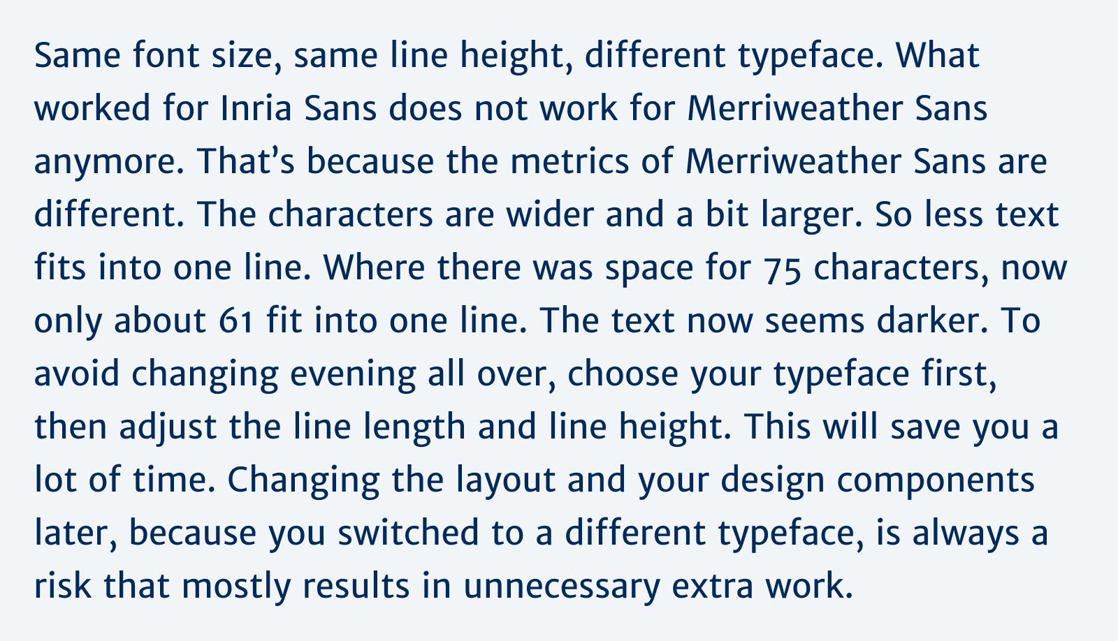
Too dark and too large. Hard to believe, but what looked smooth in the earlier example with Inria Sans, now only looks okay with Merriweather Sans.
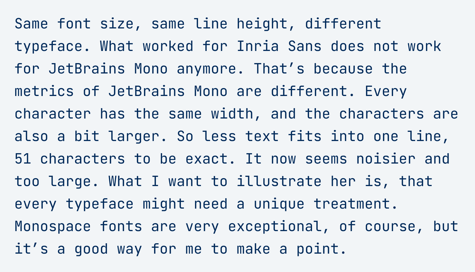
Oh no! Same line height and font size again, but a very different result with JetBrains Mono. It seems dull, dense and too large.
So before we really dive into it, here’s the over all process again:
- Choose an appropriate typeface
- Set it in the right font size
- Pick a decent line length
- Adjust the line height accordingly
Then set your measure, aka max-width
In typographic terms, line length is called measure, and traditionally we want to avoid very long lines. For reading text, the ideal line is said to be around 60 to 80 characters long. Please know, this is not backed by research, shorter lines do not seem to increase reading speed, as Mary Dyson points it out brilliantly in her recent in depth article Line length revisited. Nevertheless, these 60 to 80 characters are something we might be familiar with from books, and relating to that is not a bad idea. And even if it was not for the reading speed, the reason why you want to set a max-width is, that it becomes more compact, and you can base the line height on it later in the process.
When you set your text in relative units, like rem, you can assume that one rem is approximately two characters wide. This means you can set your max-width between 30 and 40 rem. Decide on what looks better on the right margin of your left aligned text. In what situations do most words fit into one line, and you will achieve this even typographic color we are looking for?
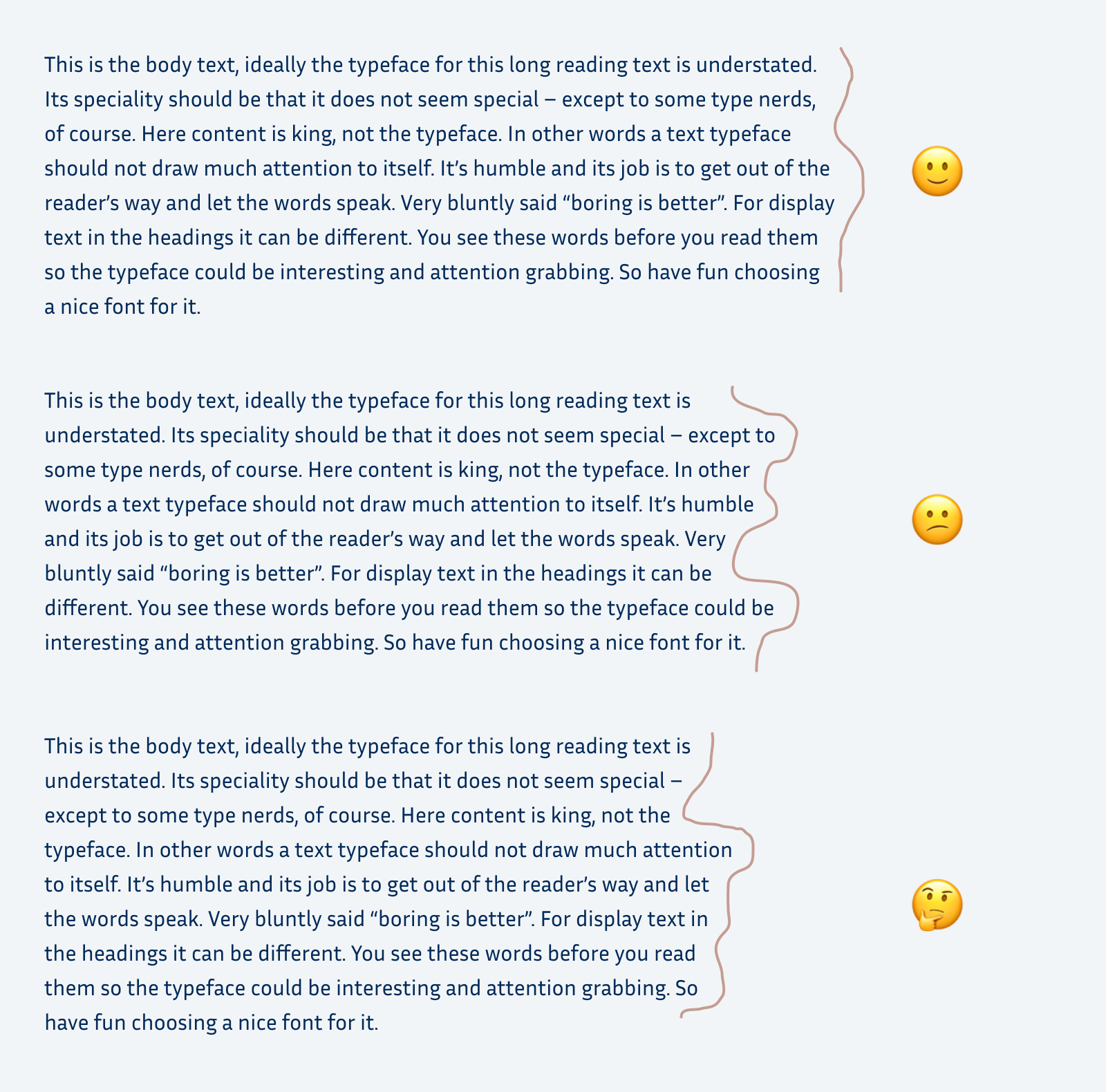
This example is a bit tricky. Even though, the top one has the least steps in the right margin, the bottom example might be the most practical one. That’s because the lines are shorter. I just want to encourage you to take this into consideration.
Of course, this depends on the language your text is written in. English has shorter words than German, so a slightly longer leading might be beneficial. Always avoid lorem ipsum in your designs. If it’s available to you, use the actual text for your design. If not, use a draft or at least a dummy text in the language the text will be.
As Kim pointed out in a comment, I should not leave unmentioned that there exists a characters unit in css. The ch unit is based on the width of the 0. The advantage here is, that you don’t have to take the font size into consideration when setting the max-width, it could look like:
p {
  max-width: 64ch;
}
A reason why I don’t pick it, is because I set the rest of my spaces in rems and wanted to stick to them. But there are definitely cases where it will be helpful!
Set the line height according to the line length
Leading, that’s the fancy typographic term for line height, always goes hand in hand with measure. And you should almost always adjust it. Depending on the user agent, desktop browsers use a default value of roughly 1.2. For body text, this is obviously too little.
Longer lines need more line height, shorter lines need less. When long lines are too close together, it’s harder to catch the beginning of the next one. This effect shows itself in paragraphs with more than ten lines. You lose orientation, feel the urge to use a ruler or highlight the text with your cursor, or to just seek revenge for this experience. Because it is not your fault, it is bad typography’s fault. I’ll repeat the examples from the beginning of the article to show you that.

☠️ Line height: 1.2 – long lines and little line height are a deadly combination. Pretty easy to lose orientation here.
With a measure of let’s say 34 rem, and the font size set to 1 rem, the line-height could be something like 1.6. This looks clean, open and friendly in the typeface I choose.

Line height 1.6 – ideal for a wider column, and in this typeface.
Now we come to the part where line height and line length are connected to each other. What looked too dense with a line height of 1.2 in a wide column, almost seems okay in a narrow column. You will most likely not lose your orientation when reading this, because the way to the next line is shorter. Nevertheless, it is not ideal either and still seems very dense. With an increased line height to a value of 1.35 it looks much better.
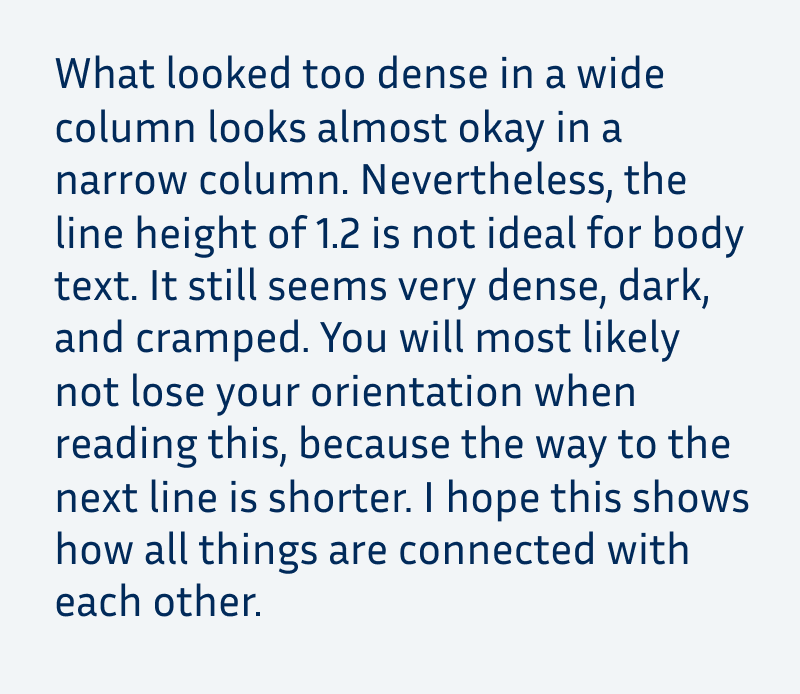
Line height 1.2 – looks better on mobile, but it’s still too dark.
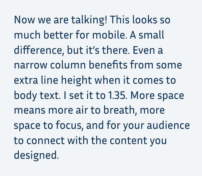
Line height 1.35 – a small but noticeable change makes a big difference.
And when you take a look at what worked for desktop with a line height of 1.6 it’s not that ideal on mobile again. There, it’s too loose but still better than the first version with a value of 1.2.
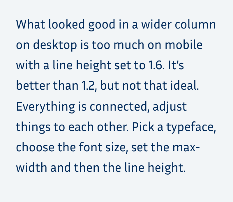
Line height 1.6 – a bit too much for a narrow column.

Line height 1.35 – as a comparison again.
I hope this made it clear, how it all connects. If you want to play around with the settings, you could use my example on CodePen for that. And there is the perfect triangle game by Matej Latin that illustrates how font size, line length and line height are interconnected in an interactive fun way. Try it out! And thanks to Paul for sharing it in the comments, where you can also see how I scored ????.
What does this mean for mobile and app design?
On a phone, measure is not that important, since the screen is very narrow anyway. Don’t set the text too small (14 to 15 px minimum). Then you automatically won’t fit that many words into one line. This means your column might have a width of something around 20 to 25 rem. Now you can mostly fiddle around with the line-height. The narrow column, is more forgiving, especially when it comes to larger line heights. I’d go for a value between 1.3 and 1.45, again, depending on the typeface.
If you have to use one value for desktop and mobile, I’d go for around 1.5. It might be too little for desktop and too much for mobile, but it’s better than the default. And sometimes it’s not possible due to technical limitations to adjust it.
In an ideal world, you could make the line height fluid and locked to the column width. There are techniques for that, and I’m thinking about creating some content on this as well. If you’re interested or have any great resources about it, let me know in the comments!
Different kinds of text need different line heights
This article was mainly focused on body text, but now let’s just briefly cover the other kinds of text.
Headings
Headings should be set compact, a lot of websites tend to forget about that. When set at a larger font sizes than the body text, they could have a line height of around 1.1. Just make sure, that the ascenders and descender won’t overlap. Always look at your headings with line breaks in between. You never know when it will be too long and go across multiple lines. I focus on that in this typographic review of a fashion website.

The example of my review: On the left side the line-height is set to 1.3, the heading seems to fall apart. On the right side, it is set to 1.1 and more compact.
Other display text
Like a lead paragraph that is set in a larger font size. When you fit less text into one line, you can decrease the line height as well. I show this in a review of a blog here.

Before: lead in is too light and too far apart, with a line-height of 1.8.
After: lead in is stronger and has less line height now (1.5).
UI Components
Short info text, notifications, buttons, or navigational elements, benefit from a shorter line-height as well. They are set in a smaller size, a value of 1.2 to 1.3 is something I often use. In rare cases, like with buttons, I set it to 1, so no line height at all. This way, they won’t use up that much space, which is always helpful when it comes to UI design.
If this article was helpful to you, let me know and share it with a friend who might benefit from it! If you have any questions or additions, I’m happy to read them in comments.
What's Your Reaction?







![[VIP] DesignCode: Build Beautiful Apps with GPT-4 and Midjourney](https://design.rip/uploads/cover/blog/designcode-gpt4.webp)
![[VIP] AppCoda: Mastering SwiftUI - Professional Packet (Updated 04.2023)](https://design.rip/uploads/cover/blog/appcoda-mastering-swiftui-professional-packet-worth.webp)
![[VIP] AppCoda: Beginning iOS Programming with Swift (Updated 04.2023)](https://design.rip/uploads/cover/blog/appcoda-beginning-ios-programming-with-swift.webp)
![[VIP] Whoooa! 156 vector Lottie animations](https://design.rip/uploads/cover/blog/whoooa-156-vector-animations.webp)


![[VIP] Motion Sound Vol. 1](https://design.rip/uploads/cover/blog/designrip-svx.webp)


