[VIP] Baymard Institute: Homepage & Category Navigation UX
How do users perceive your homepage and navigate your categories? This study on e-commerce homepage and category navigation is the culmination of 2 years worth of usability testing and research, distilled into 61 usability guidelines.
![[VIP] Baymard Institute: Homepage & Category Navigation UX](https://design.rip/uploads/cover/blog/baymard-research-homepage-and-category-usability.jpeg)

·
This study on e-commerce homepage and category navigation is the culmination of 2 years worth of usability testing and research, distilled into 61 usability guidelines.
Product finding is key to any e-commerce business – after all, if users can’t find it, they can’t buy it.
This original usability study focuses on how users navigate, find and select products on e-commerce sites. A group of users age 21-56 were recruited to test 19 of the leading e-commerce websites across 8 different verticals (mass merchants, apparel, electronics, jewelry, home decoration, toys & gifts, specialty equipment, and health & drugs). The tested pages and design elements include the homepage, category navigation, site taxonomy, category pages, and cross-navigation.
Throughout the test sessions, the subjects would repeatedly abandon sites because they were unable to find the products they were looking for. Indeed, the subjects encountered 900+ usability-related issues, and this is despite testing multi-million-dollar sites. All of these usability issues have been distilled into 61 concise usability guidelines that will help you design a user-friendly homepage and category structure so your customers can find the products they’re looking for.
This page provides you an overview of Baymard’s research specific to Homepage & Category Navigation UX. All of this research is available as part of Baymard Premium.
·
The Current Homepage & Category Navigation UX Performance
To accompany the usability test sessions we’ve also benchmarked 177 top-grossing US and European e-commerce sites across each of the 61 Homepage & Category Navigation usability guidelines. This has resulted in a benchmark database with 10,980 homepage and category navigation elements manually reviewed and scored by Baymard’s team of UX researchers, along with more than 5,875 categorized best and worst practice implementation examples from leading e-commerce sites (all categorized and performance verified).
·

·
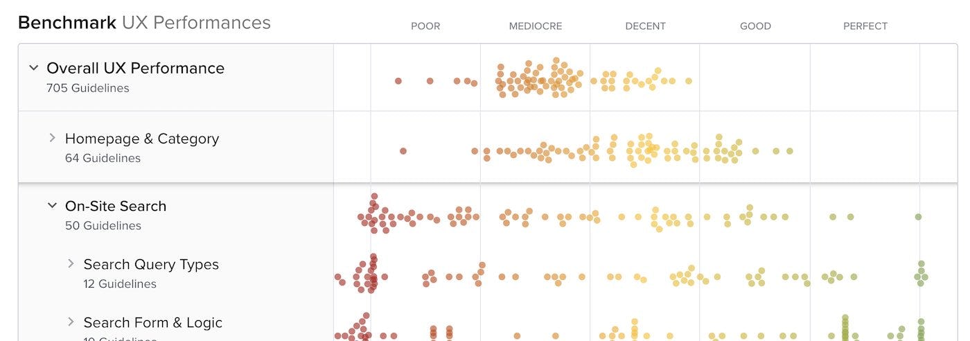
The 6,168 UX performance scores for the benchmarked sites’s navigational is plotted in the interactive scatterplot above.
The Homepage & Category UX performance for the average top-grossing US and European site is “acceptable”, made up of 28% “decent”, 45% “acceptable, 24% “mediocre”. There are almost no sites that perform either exceptionally well or exceptionally poorly here, making for a much more narrow spread compared to other parts of the online shopping expereince. This also means that there are the fewest examples on either end of either massive performance issues, or “State of the Art” implementations.
In comparison, in most of the other e-commerce UX studies we’ve conducted at Baymard Institute the average UX performance only amounts to “mediocre”. For instance, in our Search UX, Product Details Page UX, and Mobile Web UX research themes the average site performance is significantly below acceptable. In other words, Homepage & Category navigation is the part of the user journey within e-commerce where the average site performs the best.
Even given the generally “acceptable” performance of sites, the benchmark dataset shows that there’s still room for improvements when looking within the specific topics of the user experience — in particularly the UX within Category Taxonomy, Main Navigation, and Intermediary Category Pages. The issues identified in these topics cause problems for many sites, and include some “missed opportunities” for the e-commerce industry as a whole. (All areas explored in-depth in our full research catalog.)
·
5 Research Reports on Homepage & Category Navigation UX
PAID RESEARCH CONTENT
All 61 Homepage & Category Navigation UX research findings are available as part of Baymard Premium, and are divided into the following 5 topics (200+ pages of research findings in total):

What's Your Reaction?


![[VIP] DesignCode: Build Beautiful Apps with GPT-4 and Midjourney](https://design.rip/uploads/cover/blog/designcode-gpt4.webp)
![[VIP] AppCoda: Mastering SwiftUI - Professional Packet (Updated 04.2023)](https://design.rip/uploads/cover/blog/appcoda-mastering-swiftui-professional-packet-worth.webp)
![[VIP] AppCoda: Beginning iOS Programming with Swift (Updated 04.2023)](https://design.rip/uploads/cover/blog/appcoda-beginning-ios-programming-with-swift.webp)
![[VIP] Whoooa! 156 vector Lottie animations](https://design.rip/uploads/cover/blog/whoooa-156-vector-animations.webp)


![[VIP] Motion Sound Vol. 1](https://design.rip/uploads/cover/blog/designrip-svx.webp)

![[VIP] ChatGPT for UX/UI Design Top Prompts and Expert Tips for Maximum Impact](https://design.rip/uploads/cover/blog/chatgpt-for-ux-ui-design.webp)
