A comprehensive guide on creating UI designs for iOS apps
I’d like to share a guide on how to create UI designs for iOS mobile apps. This guide covers essential topics that we need to know to make high-quality designs that are consistent with Apple’s guidelines.
I’d like to share a guide on how to create UI designs for iOS mobile apps. This guide covers essential topics that we need to know to make high-quality designs that are consistent with Apple’s guidelines.
Structure:
- Layout and Grid
- Colors
- Typography
- Iconography
- Components
- Transitions
Layout and Grid
In Figma, you can find different artboard sizes for iPhone, and you could ask yourself which one you should pick for the design. The thing is on a code level, XCode automatically adjusts the layout design to the selected device, so you can choose the artboard size for the most popular iPhone and design UI considering the layout specifications of this model.
The image below demonstrates layout regions and specifications for the iPhone 14 Pro.
Layout regions and specifications for the iPhone 14 Pro
Grids help arrange content in a structured way. Commonly, they are used in responsive website design, however, they are still useful for mobile apps.
How to define a grid for a mobile app:
- Create 8 point grid to place elements precisely on a screen.
- Define left and right margins with a minimum size of 16pt, it is the standard for iOS.
- Define the number of columns that is optimal for your needs. The gutter size of 16pt is the most common, however, if you need to define a smaller or bigger size of the gutter, you need to consider, that in stretch grids, the gutter size affects the column width, so the more gutter size the less column width.
? Check out this great article to learn more about mobile grids.
Example of a mobile grid
Colors
iOS has a defined set of system and semantic colors that automatically adapts to vibrancy, accessibility settings, and appearance mode.
A semantic color is a color that has a name that explains its purpose. Each semantic color has color variants such as Primary, Secondary, and Tertiary, that are used to differentiate content based on their level of hierarchy. For example, if you want to define a custom color for a Primary Background, the color name could be appPrimaryBackgroundColor where app is the short name of your brand/app and PrimaryBackgroundis the semantic name of a color. It is worth mentioning that the name of a custom color should not be the same as the iOS system color.

Example of custom colors defined in Figma
? We will go over how to create a custom color palette with Apple’s guidelines in mind.
Primary Color
A primary color should convey the personality of your app. This is a basic color of a palette. This color is displayed frequently on most of the screens and components and it is used to indicate the primary actions. You can also use primary color shades to accent specific UI elements, as well as UI states for interactions like Tap, and Press.
To generate color shades in Figma, you can use this plugin.
Primary colors defined in Figma

Examples of primary colors in popular mobile apps
Secondary and Accent Colors
Secondary colors are used to support the primary color and add depth and variety to the design.

Examples of secondary colors in popular mobile apps
In addition to a secondary color, you may come across the “accent” color term. You can consider accent colors as part of secondary colors, which are used to highlight important actions and controls.
Accent colors are best for:
- Selection controls, like sliders and switches
- Highlighting selected text
- Progress bars
- Links and headlines
To find secondary colors that complement the primary color, consider using color scheme generators like Coolors. Commonly, the app should have 1 primary, 1–2 secondary, and 1–3 accent colors.

Fill Colors
In iOS, the fill colors are used for UI elements, that allow the background color to show through. The fill colors share the same color value, but with varying levels of opacity for each color variant.
iOS Fill colors variants:
- Primary Fill Color — for thin and small shapes, such as slider's track.
- Secondary Fill Color — for medium-size shapes, such as the background of a switch.
- Tertiary Fill Color — for large shapes, such as input fields, search bars, or buttons.

iOS Fill colors

Background Colors
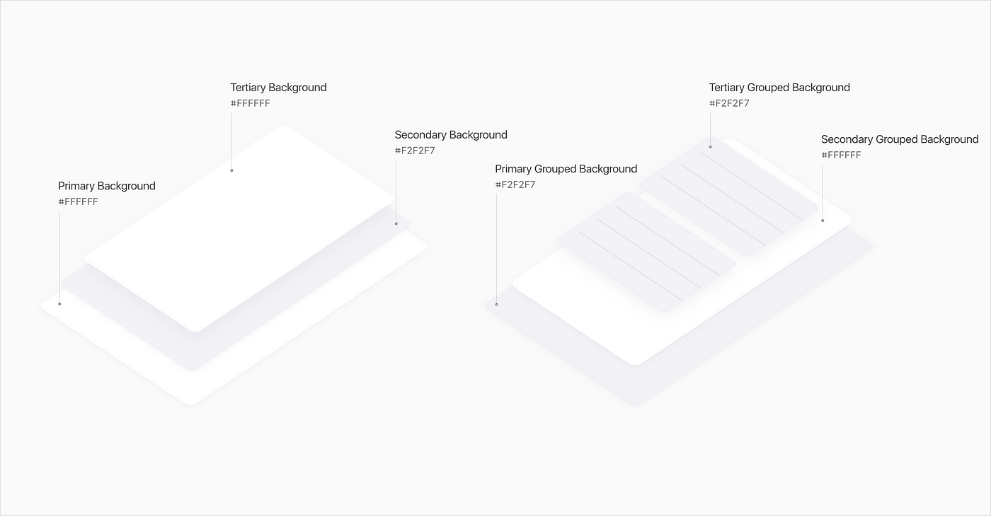
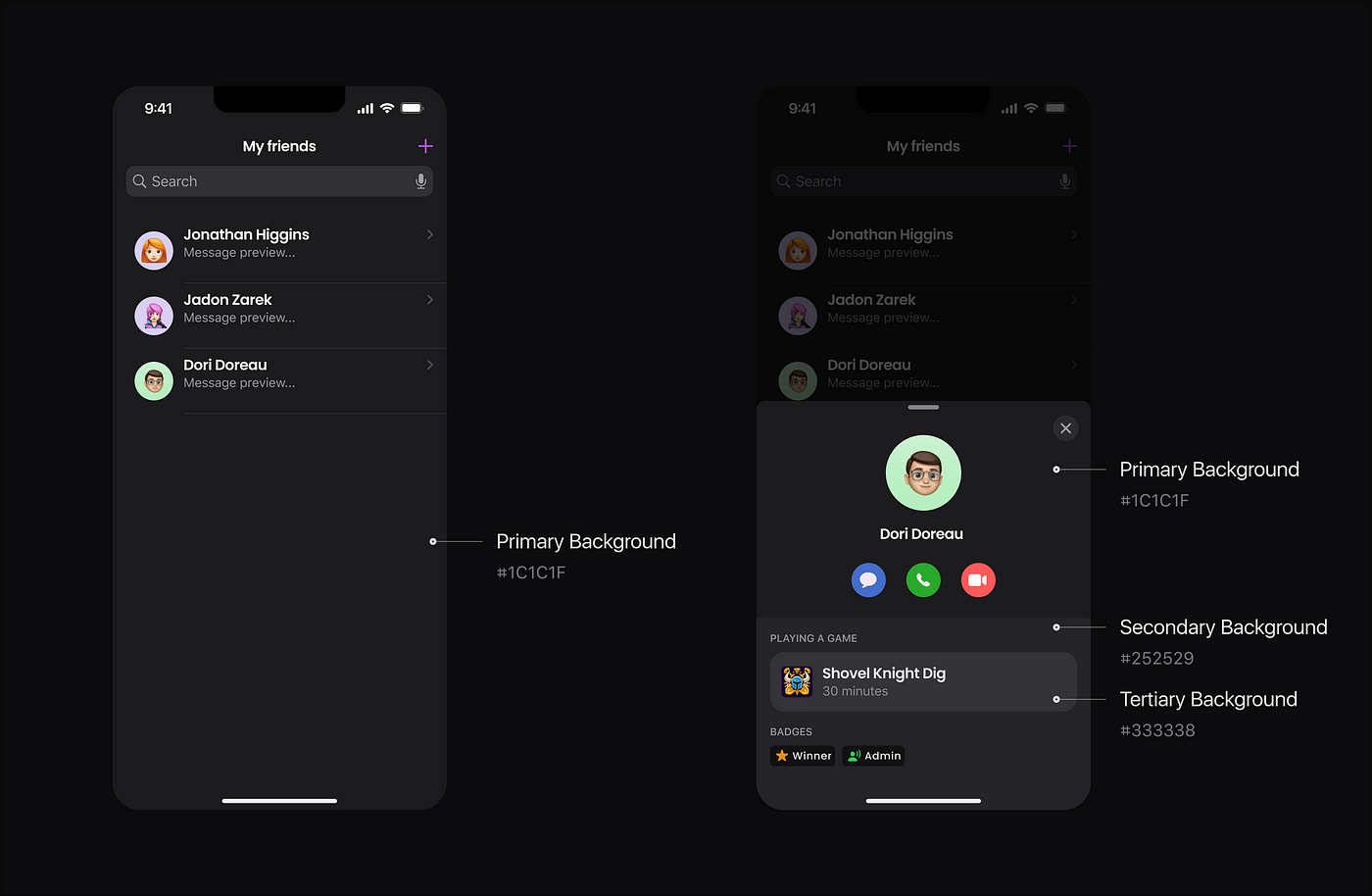
iOS defines color variants for the background color to differentiate grouping content and elements.
- Primary for the overall view, the main background of your app.
- Secondary for grouping content or elements within the overall view.
- Tertiary for grouping content or elements within secondary elements.
Label colors
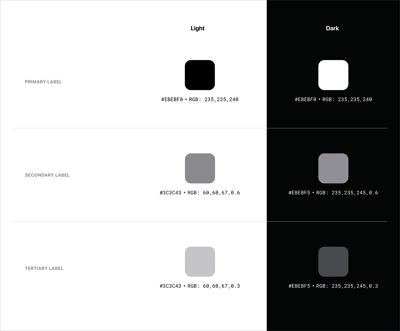
A label color has primary, secondary, tertiary, and quaternary color variants. Depending on the level of importance the color has its own level of transparency.
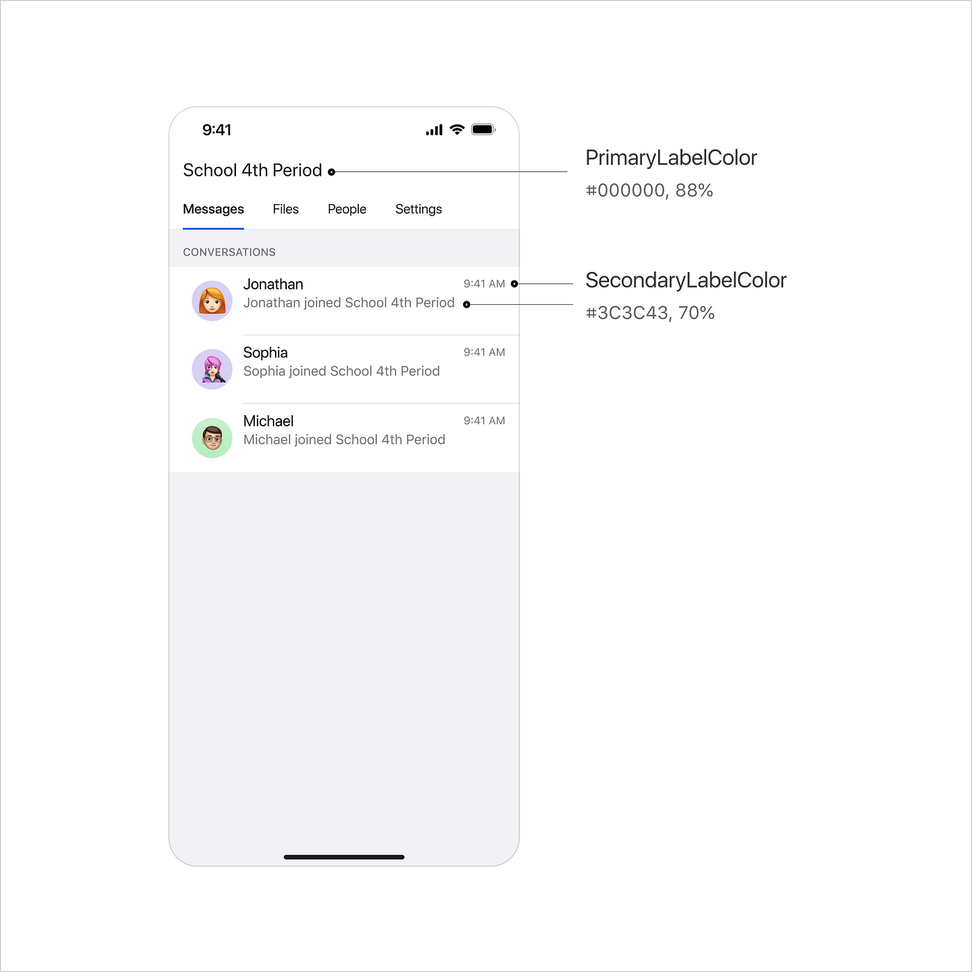
- Primary Label Color for highlighting important text or content that needs to be displayed prominently to the user. For example, you can use primary color for titles and headlines, labels of the pages in the navigation bars, field labels, or input control in forms.
- Secondary Label Color for displaying captions or supporting information. A secondary label can be used in forms and input fields to provide additional context or instructions for fields or input controls, and in lists or tables to display secondary information and details about a list or table items.
- Tertiary Label Color for displaying even less important text or content, such as supplementary information or details that are not essential to the user’s understanding of the app.
Separator colors
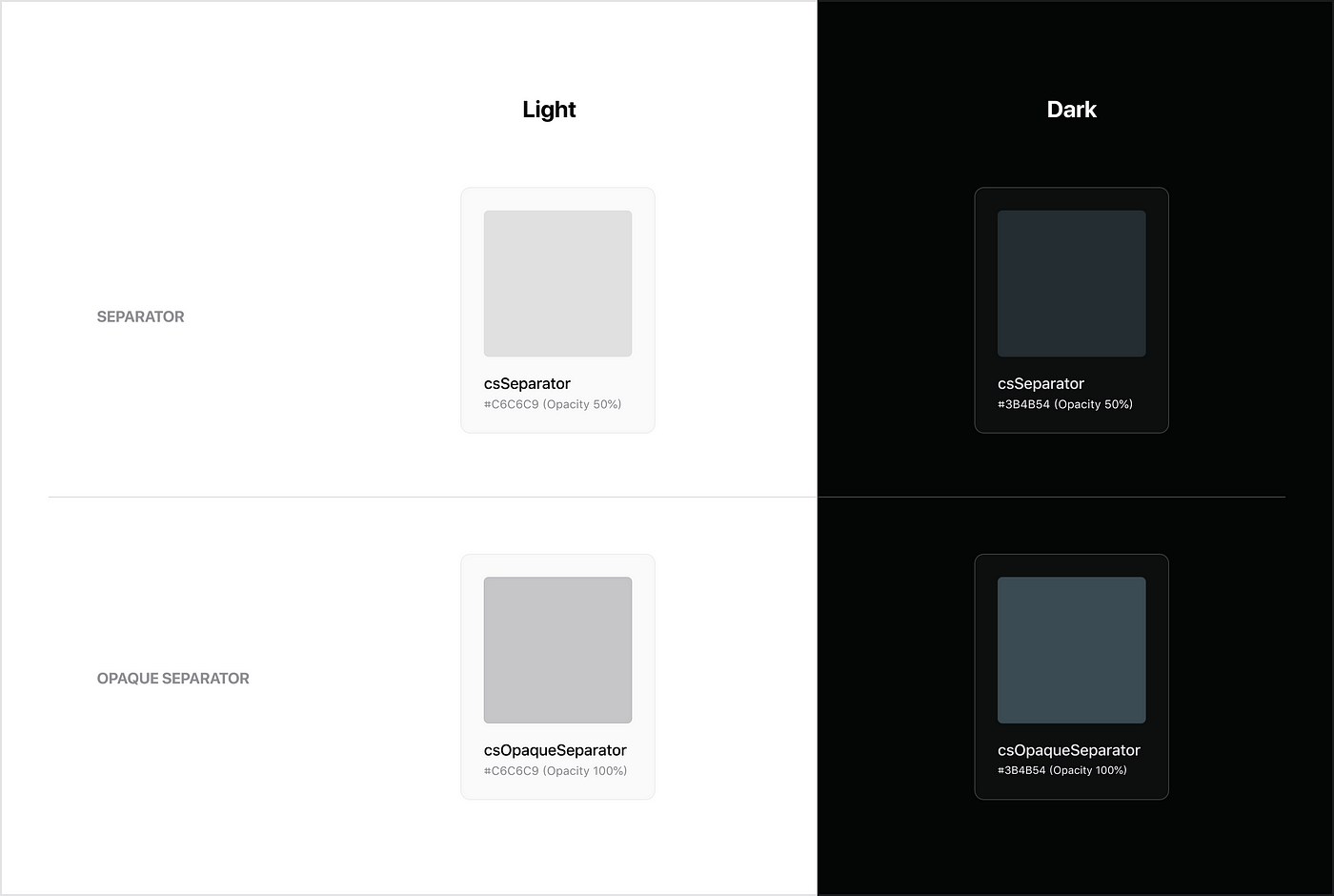
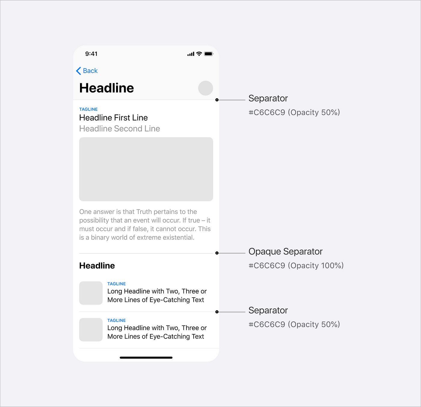
A separator is a thin, horizontal line that is used to separate groups of content visually. They are often used in table views, collection views, and other parts of the user interface to create a visual hierarchy and help the user understand the structure of the content.
iOS defines two types of separator colors: Separator (with a level of transparency) and Opaque separator (regular separator).
Functional colors
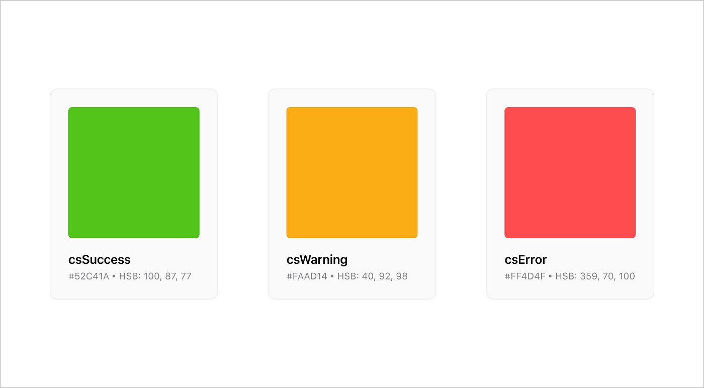
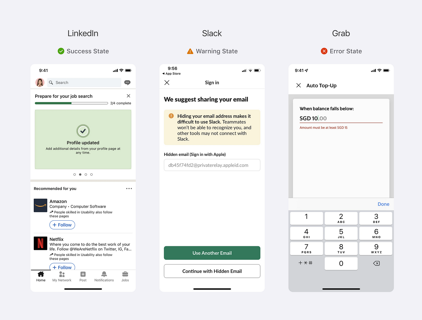
Functional colors are used to indicate the state or status of an element or to provide context or a message to the user.
Guidelines for functional colors:
- Success state: Green is often used to indicate a success state. This might be used to show that a task has been completed successfully or that a form has been filled out correctly.
- Warning state: Yellow or orange are commonly used to indicate a warning state. This might be used to alert the user about a potential issue or to indicate that a required action has not yet been completed.
- Error state: Red is often used to indicate an error state. This can be used for text or background colors, or for elements such as icons or buttons.
Color Management
There are many Figma plugins available that can help with color management:
- Color Palette Generator generates a color palette based on a single color that you provide.
- Color Contrast Checker helps you ensure that your color choices meet accessibility guidelines by checking the contrast ratio between two colors.
- Colorblind Simulator allows you to view your designs as they would appear to someone with a specific type of color vision deficiency. This can help you ensure that your designs are accessible to all users.
- Dark Mode Magic allows you to generate a Dark theme based on the Light theme you create.
Typography
Apple has a set of built-in typefaces such as San Francisco and New York.
There are several variants of San Francisco, including SF Pro, which is the standard version of the typeface.
If you wish, you can still use custom fonts, and there are a few things to consider:
- Make sure that the font is legible. There are several factors that affect legibility: character recognition, stoke width (thickness of the lines that make up the characters), tracking (letter spacing), leading (line spacing), font sizes, and font styles.
- Limit the number of typefaces and fonts in your app. Commonly, we should use a maximum of two fonts in a mobile app to keep a simple and harmonious interface.
- It’s important to consider how well fonts complement each other. Avoid pairing font types that are too similar, otherwise, it will be hard to distinguish them from each other.
Consider using Google Fonts to preview different font combinations. You can also use a ready-made Google Font type pairing palette created by Figma.
Font styles and font sizes
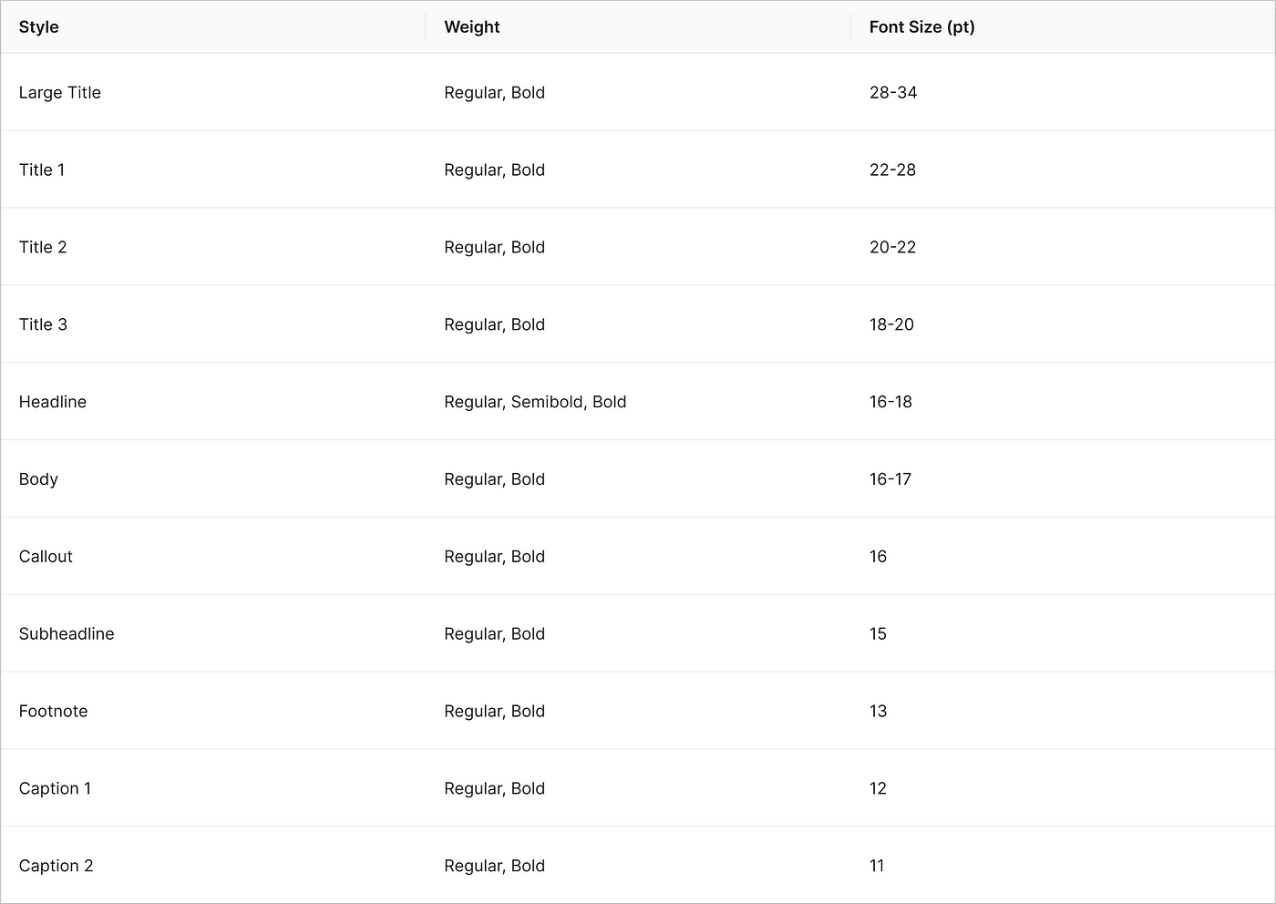
We use different font sizes and weights to differentiate between text styles such as titles, headings, body text, and captions. By default, iOS has a set of pre-defined text styles, such as Large Title, Title 1, Title 2 and etc. Each of these text styles has an associated default font size and dynamic type sizes.
Dynamic Type is a feature in iOS that allows users to adjust the font size of the text in their apps. If you want to use a custom font, be aware that in addition to the default font sizes, the dynamic type sizes also should be defined on a code level to make sure that a user can adjust the font sizes of the text.
Consider using the following table as a guide for selecting default font sizes for your custom font styles.
Text Layout
Tracking and leading are essential text properties that allow us to fine-tune text layouts for optimal readability and legibility.
Tracking is the spacing between glyphs. In CSS, it’s called “letter-spacing”, so tracking and letter-spacing are synonyms words.
Leading is the spacing between lines of text. In Figma and CSS, the property is called “line-height”. Increasing or decreasing line height can help to improve readability. Leading is measured from the text’s baselines.
?A few tips for tracking and leading:
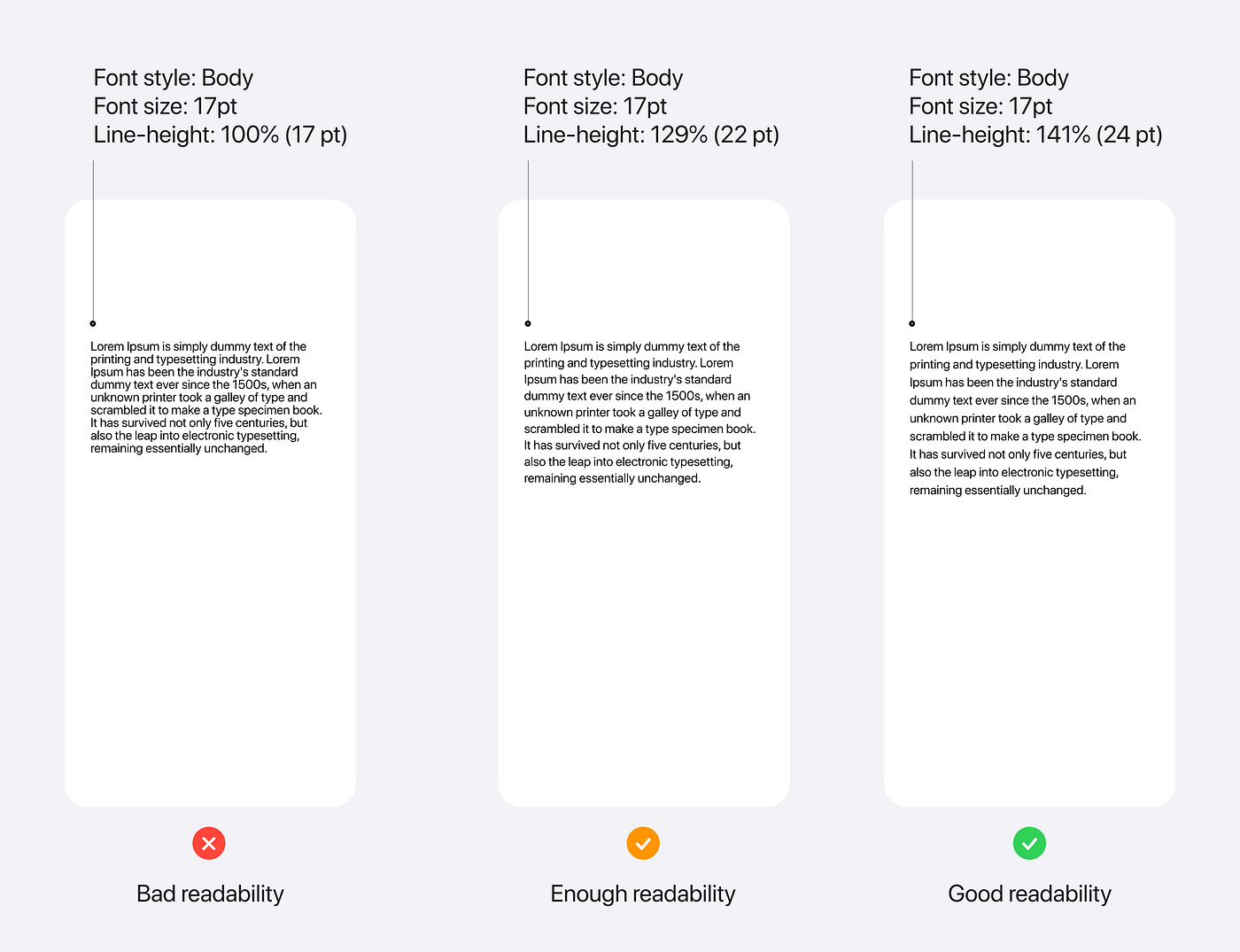
- Increase leading when you want to achieve good readability. Figma recommends setting line-height 1.125 times the font size (112.5%) as a minimum to get readable text, however, the value could vary depending on the typeface. For example, Apple defines the leading for body text (SF Pro font) 129% (22 pt) as a minimum value. However, they recommend increasing leading to 141% (24pt) if we want to achieve good readability for a long paragraph of text.
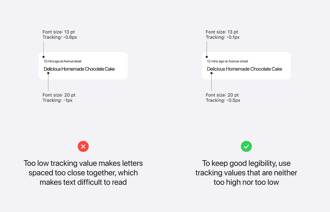
- To maintain good readability, it is best to avoid using tracking values that are too high or too low in relation to font size. You can refer to Apple’s tracking table, which outlines optimal tracking values for the system font.
Iconography
Icons are graphical elements that should communicate the meaning of the interface items, actions, and states. Effective icons are simple, familiar, and easy to understand for the users.
iOS provides a set of vector icons (SF Symbols) that you can use in your iOS app. Here is a Figma file where you can find SF Symbols. You can also edit and create custom SF Symbols, and here is a detailed video on how to do it.
A few tips for using icons in iOS apps:
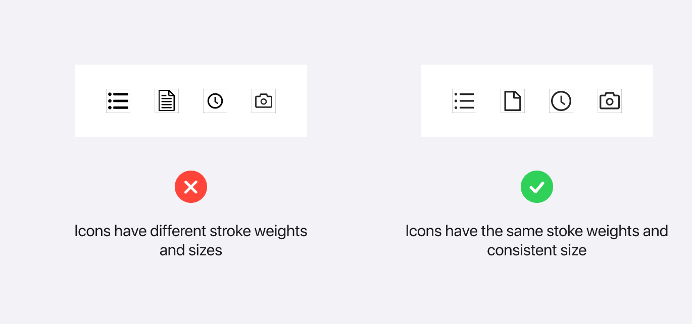
- If you want to use custom icons, ensure that they have a consistent style, sizes, and weights.
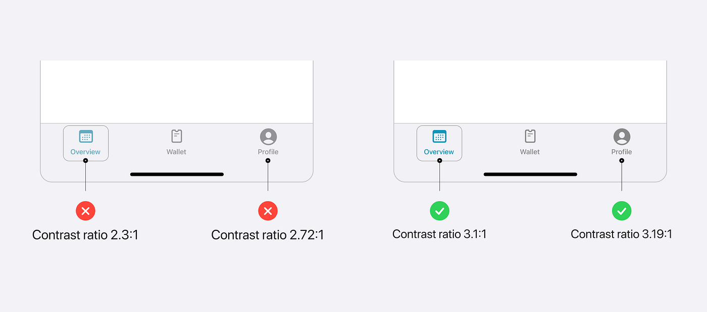
- Test your icons for contrast ratio. According to W3C, “graphical objects” such as icons should have at least a 3:1 contrast ratio.
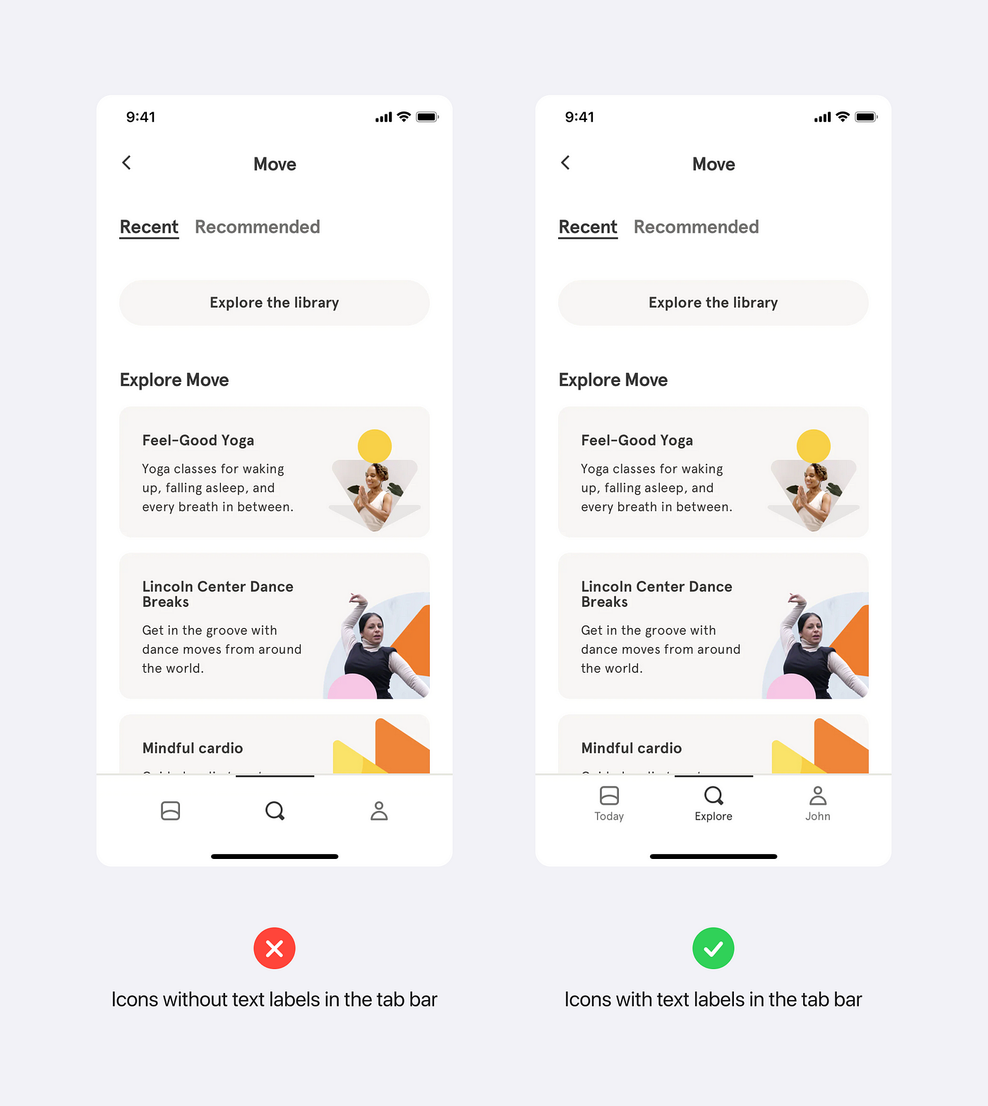
- If your icons are not recognizable at glance, add text labels where it’s possible. In the example below, if Headspace would not have text labels, it could be hard to quickly understand the meaning of the left icon (Today).
- Make sure to use icons in a vector format like SVG so that they could work for all the standard screens with 1x resolution and retina displays with 2x and 3x resolution.
- Icons should be legible and easy to tap.
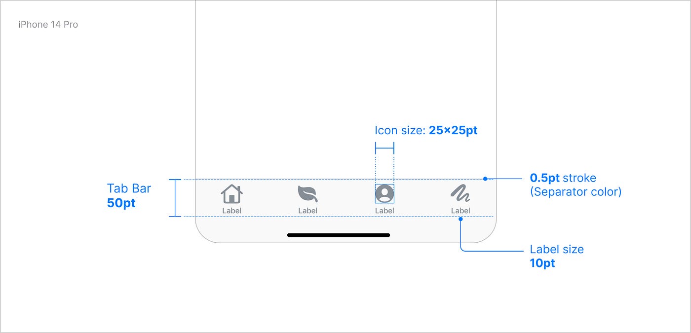
- Icons in the regular tab bar icon should be at least 25x25pt, and icons in the navigation bar can be 20x20 or 30x30pt.
To get more information about icons in iOS, check out Apple’s documentation.
Components
iOS has a huge library of different types of components, you can find all of them in the documentation. I’d like to cover the three most popular components — List, Tab Bar, and Navigation Bar — which you can find in almost every iOS mobile app, and highlight the best practices for each of them.
Lists and tables
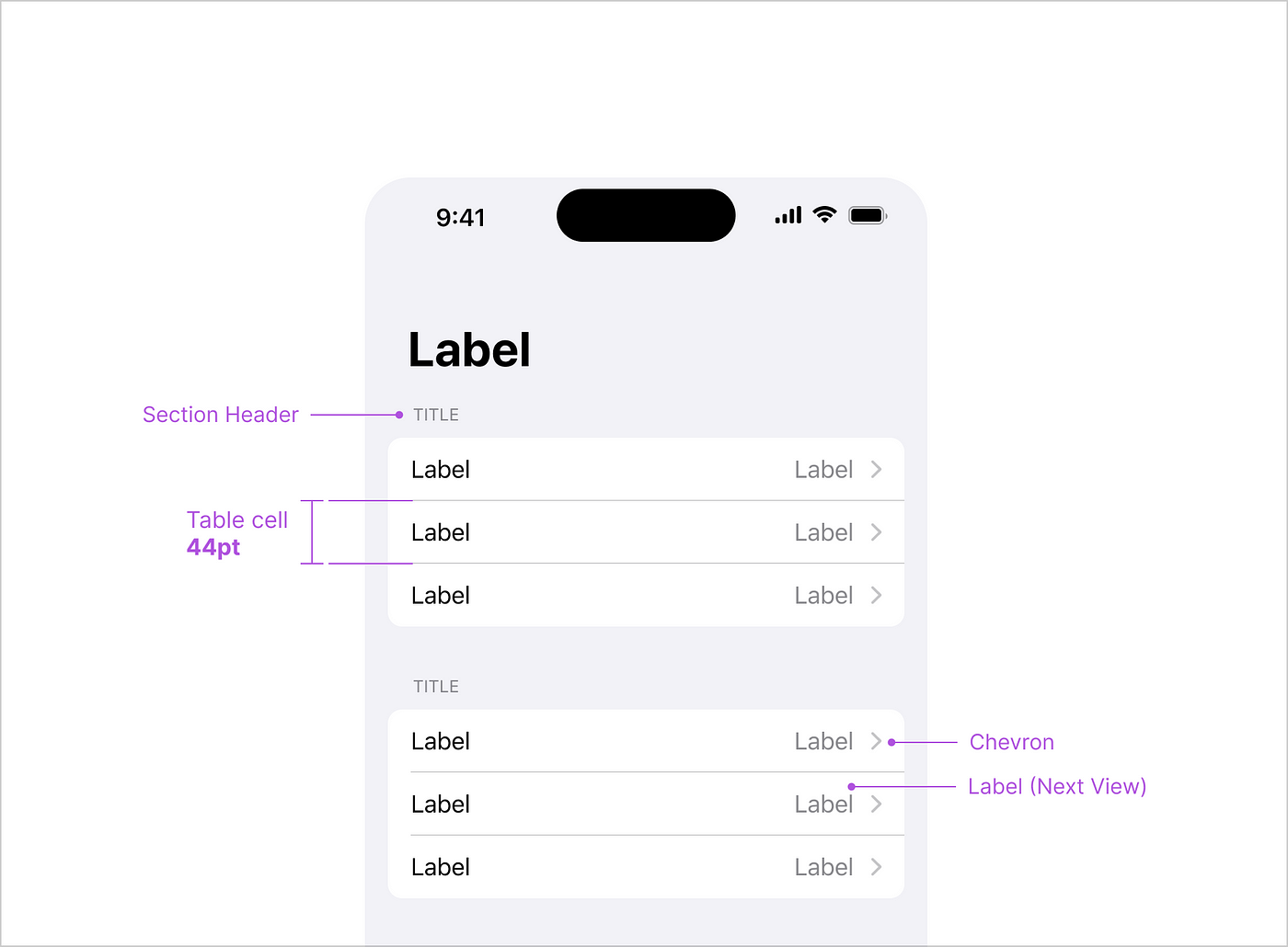
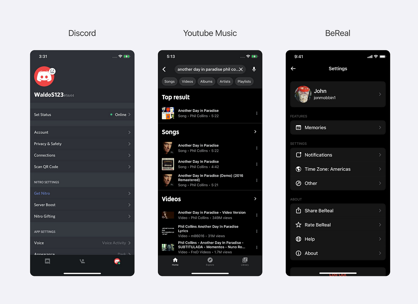
A list and a table are ways to display collections of items. These items can be text, icons/images, or a combination of text and selection controls.
Best Practices
- Use a different color for the overall background to create a visual contrast between the background and groups of content.
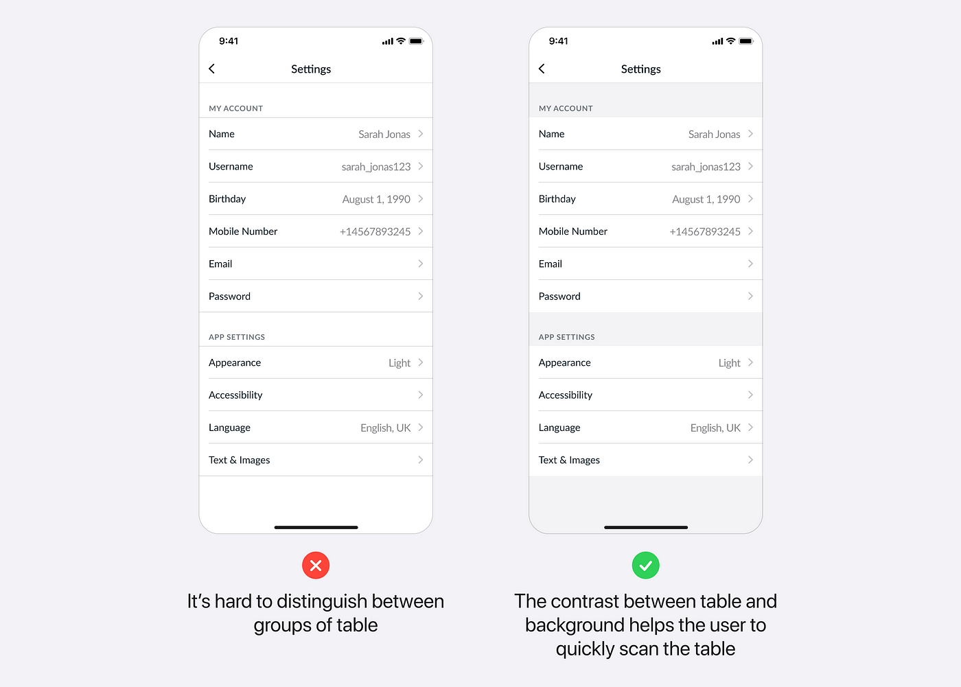
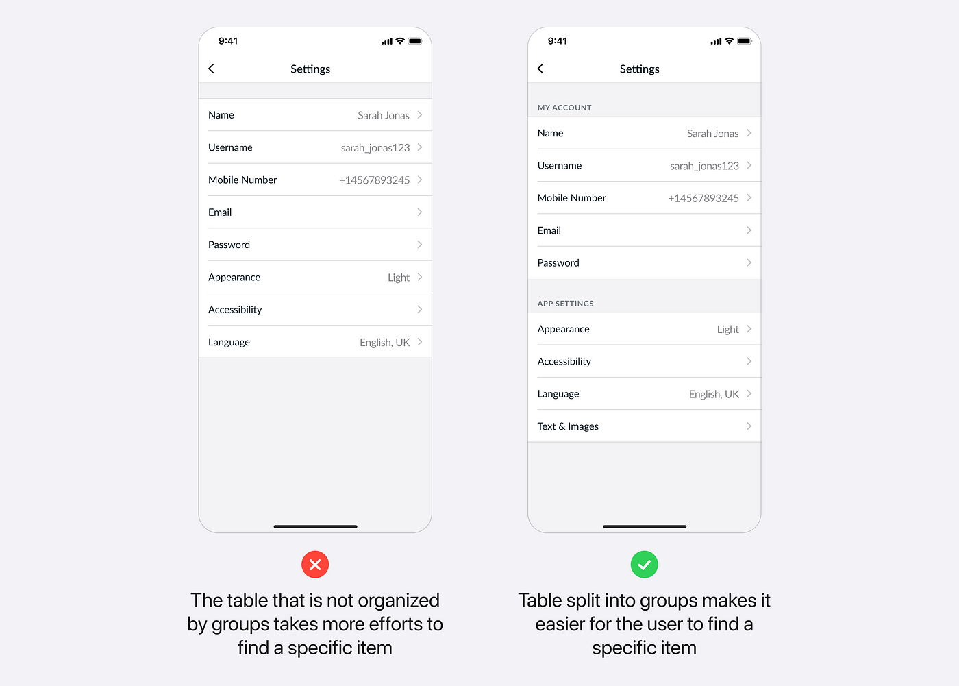
- Split table content into logical groups and add headings to visually separate them so that the user can easily find specific items in the table.
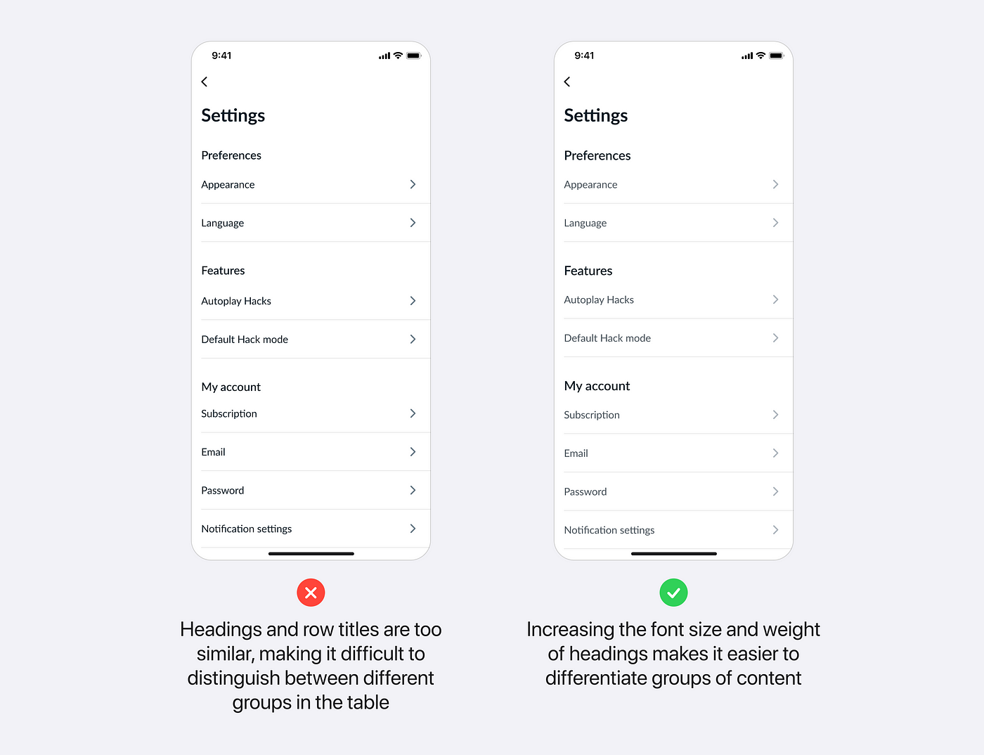
- Avoid using similar font styles for the heading and table row title in the table, otherwise, for the user, it will be difficult to distinguish between the groups of content.
Tab bar
A tab bar is a global navigation control that enables users to switch between different views within an app. Each tab should be meaningful and descriptive.
Best Practices
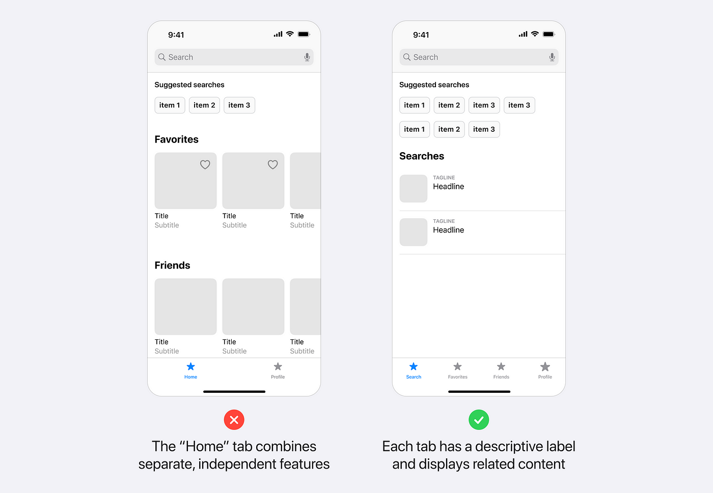
- Avoid grouping unrelated content in a single tab, such as “Home” or “Overview”. For example, the below image demonstrates how the tab “Home” combines unrelated features like “Search”, “Favorites”, and “Friends”, that makes it harder for the users to find what they need. To fix this, separate the content into different tabs by identifying key features and sections and group only related content in each one.
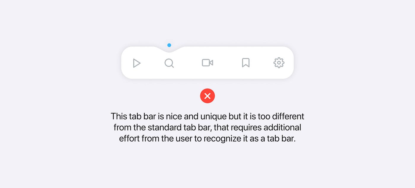
- Make the tab bar design consistent with the standard iOS tab bar to avoid unnecessary user adaptation to the unfamiliar design.
Navigation bar
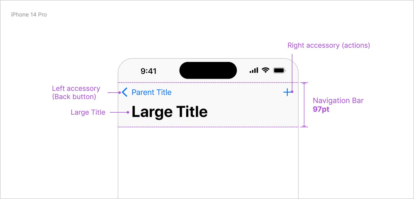
A navigation bar is a navigational control that allows you to navigate through the hierarchy of the app.
Best Practices
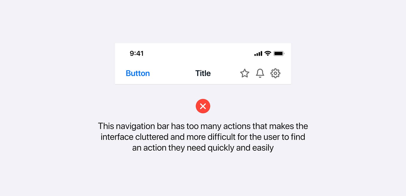
- Avoid adding too many actions in a navigation bar, that makes the interface too cluttered.
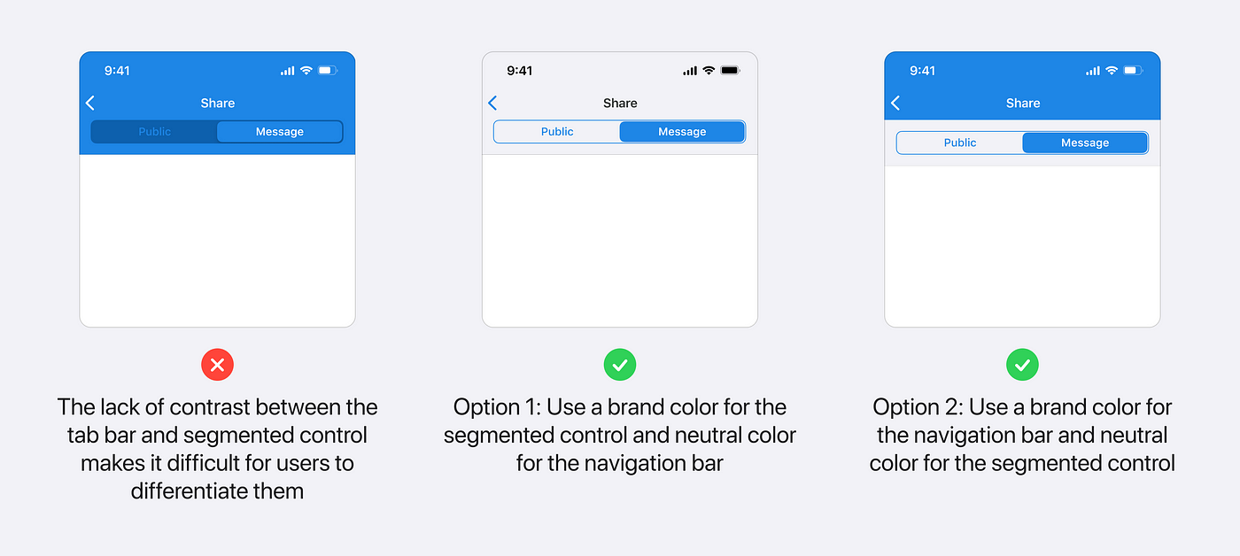
- Ensure that there is sufficient contrast between the navigation bar and other elements in it such as filters, segmented controls, and etc.
Transitions
Transition is the way of changing the appearance of one view or set of views to another.
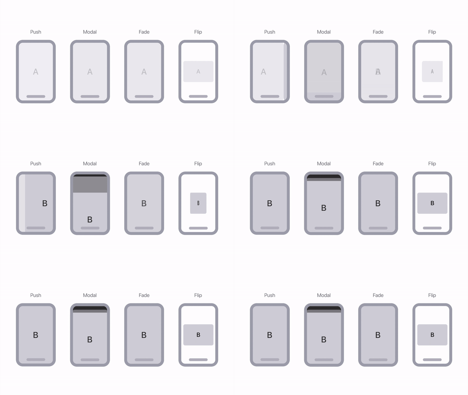
iOS provides a set of standard transition styles. If you wish to create a custom animation, ensure that it follows the iOS standard style, otherwise, it will lead to additional efforts from the user to get used to them which can cause a reduction in user satisfaction.
Best practices to keep in mind:
- Avoid using complex or flashy transitions, as they can be distracting for the user.
- Use consistent durations and timings to create a smooth and seamless experience for users.
- Avoid using transitions that are either too fast or too slow, as they can distract the user’s attention.
- Make sure that on a code level, your custom transitions will respond to accessibility settings when “Reduce motion” is off.
Some of the tools that allow you to create custom transitions without code:
What's Your Reaction?
 Like
0
 Dislike
0
 Love
0
 Funny
0
 Angry
0
 Sad
0
Sad
0
 Wow
0
Wow
0



![[VIP] Product Design Toolbox: Product Design Resource Pack (PRO)](https://design.rip/uploads/cover/blog/product-design-resource-pack-pro-notion-library.webp)


![[VIP] Rigging and Animation in Maya](https://design.rip/uploads/cover/blog/maya.webp)
![[VIP] 3D Character Design Party](https://design.rip/uploads/cover/blog/motiondesign-school-3d-character-design-partymaker.webp)
![[VIP] DesignCode: Build Beautiful Apps with GPT-4 and Midjourney](https://design.rip/uploads/cover/blog/designcode-gpt4.webp)
![[VIP] AppCoda: Mastering SwiftUI - Professional Packet (Updated 04.2023)](https://design.rip/uploads/cover/blog/appcoda-mastering-swiftui-professional-packet-worth.webp)
![[VIP] AppCoda: Beginning iOS Programming with Swift (Updated 04.2023)](https://design.rip/uploads/cover/blog/appcoda-beginning-ios-programming-with-swift.webp)
![[VIP] Whoooa! 156 vector Lottie animations](https://design.rip/uploads/cover/blog/whoooa-156-vector-animations.webp)


![[VIP] Jaka Smid: GigaGrowth Bundle](https://design.rip/uploads/cover/blog/gigagrowth-bundle.webp)
![[VIP] Dоmеstika: Bundle](https://web.archive.org/web/20221021070151im_/https://i.ibb.co/LJgTk37/87209-original.png)


